PROP, PERFORMANCE, STAGE
EXERCISE 1. Object as a stand-in for the body
Method:
.
- Select one or more items of clothing
- Using the clothing as a reference point, remake it either in a different material or enlarge it
- Look at work of artist Yinka Shonibare MBE – histories and issues addresses through his choice of materials
- Work with the re-made clothing prop over a period of time
- Explore the clothing
- Locate the clothing
- Consider it’s status as its is moved from place to place
- Photograph these explorations and make notes in skecthbook
- Make a series of painted studies – in colour
- Consider composition – the prop in relation to its environment, how it reflects my reading of this objects and how its speaks about human presence or absence
Yinka Shonibare MBE
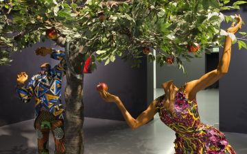
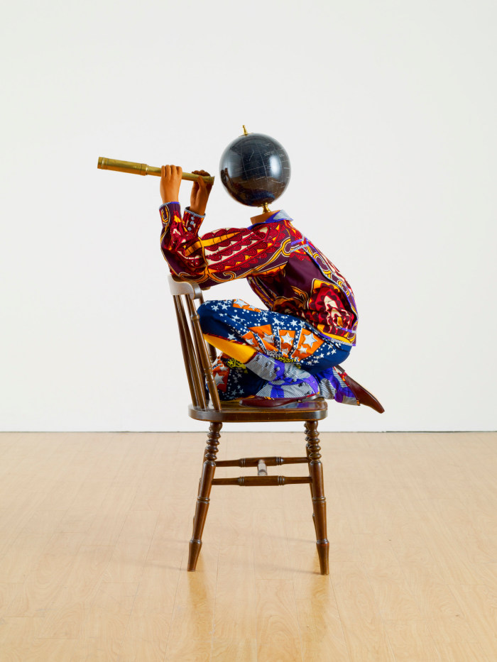
Shonibare is a multi-media artist above work was viewed on the website of the Royal Academy of Arts and a video discussing the work was accompanied. It is a young boy sitting on a chair, an old-fashioned globe, from the Victorian era, is his head and he holds a brass telescope. One is confronted with cultural and geographical identity – the globe reflects the room, on closer observation one sees the markings of the stars and night sky – the boy could be looking at that. The boy is dressed in bright-colored clothing – orange, blue, yellow, purple. To me it is African cloth I relate to, I even think it is done by hand – Batik work, but used as different patches of an assortment of cloth. On the website I read the following about the cloth: ” The patterned, batik fabric has come to symbolize Africa but it is traditionally made in Indonesia, produced in Holland and sold in West Africa. The Victorian style of clothes, chair and globe act as reminders of British colonial history. Shonibare uses the fabric as he is interested in how something that symbolizes one culture can have a hidden, multicultural history. This represents his belief that cultural identity is enriched when hybrid. He explores the relationship between Africa and Europe and the boundaries between the two.” This cloth is known as Ankara in West Africa and reminds me of Shweshwe, a printed cotton, in South Africa. I believe textiles have a wide and rich history in many cultures.
I think the fact that he has a multicultural identity contributes to his own search for authenticity and identity, as well as how we as a society construct these identities. I think this work celebrates culture, as well as asking the viewer to reflect on class and identity in our globalized world and critiquing the history of colonialism.
His use of the fabrics reminds me of the blankets the Basuto people wear around them and the cultural significance of blankets in some of our local African tribes, such as,
- Traditional wedding ceremonies
- Childbirth
- Rites of passage
- As a gift
- Death and funerals
- Public life
The blanket was part of a wide spectrum of European cultural goods introduced to the Basotho nation during the 19th century, especially during the colonization by the UK. Up to that time, animal skins were used as blankets. Originally the blankets were made in the UK, but now it is made in Gauteng by the Aranda blanket company.
The protocol contained in the correct wearing of blankets are:
- A male would wear the darker side outwards, and a female the lighter
- Blankets are worn with their stripes always in a vertical position, symbolizing growth and prosperity
- The blanket should be folded at the top, and adjusted to the right size
- It should drape and open to the right side for males, or the front for females
- A pin should secure the blanket, either on the right shoulder, or the front, and be displayed prominently for females, but hidden for males.
METHOD
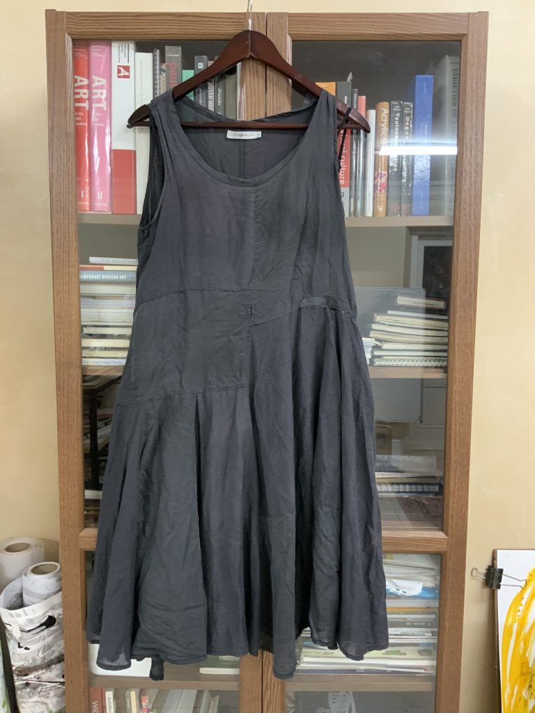
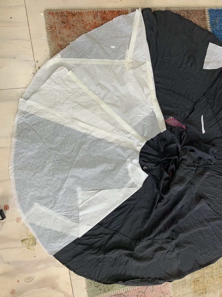
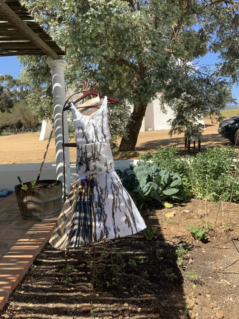
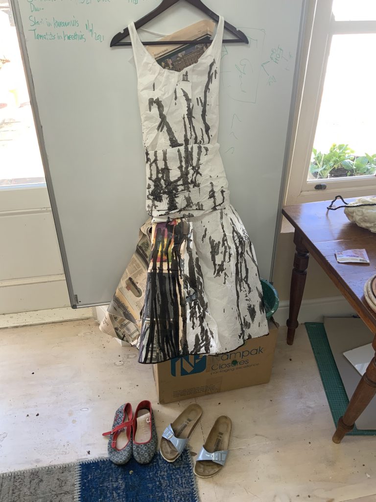
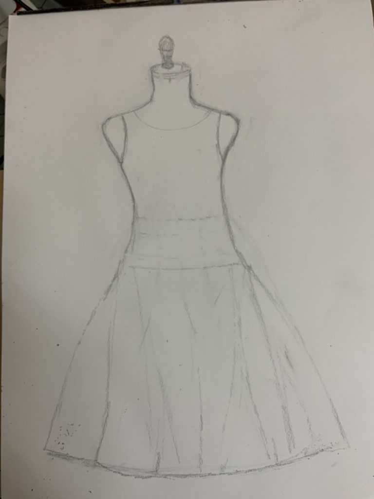
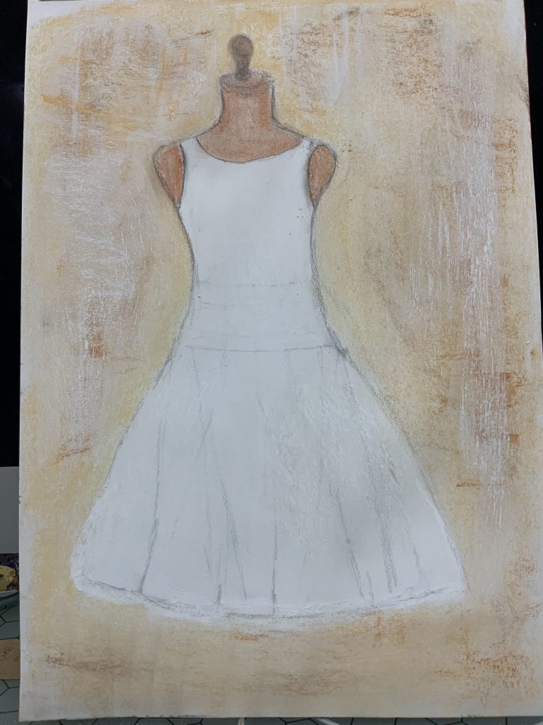
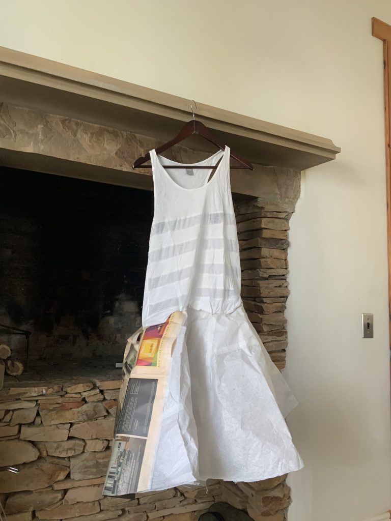
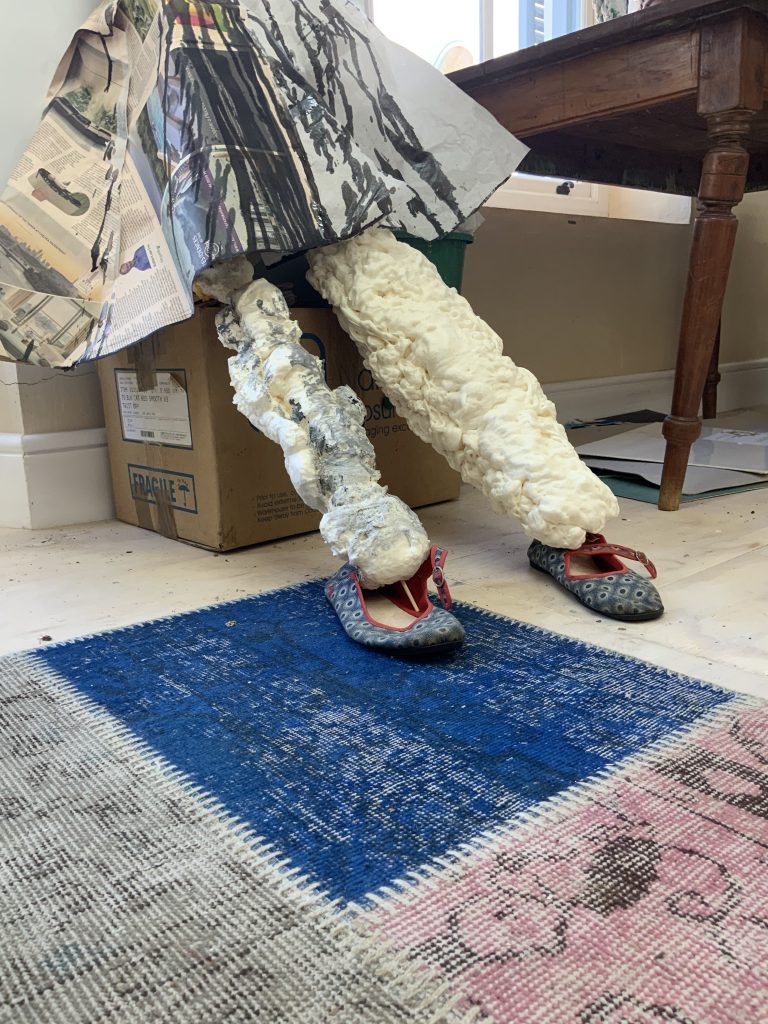
I chose an old black dress, which should have been thrown out by now. It is the style and fabric that made this such a pleasure to wear… it travels well if you do not mind its natural inclination to crinkles. It is now faded, torn, and just a memory, but a personal one.
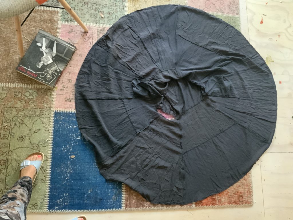
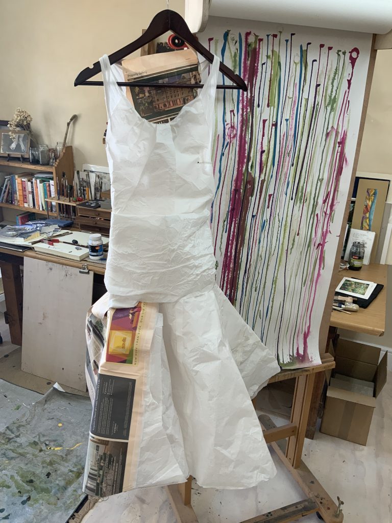
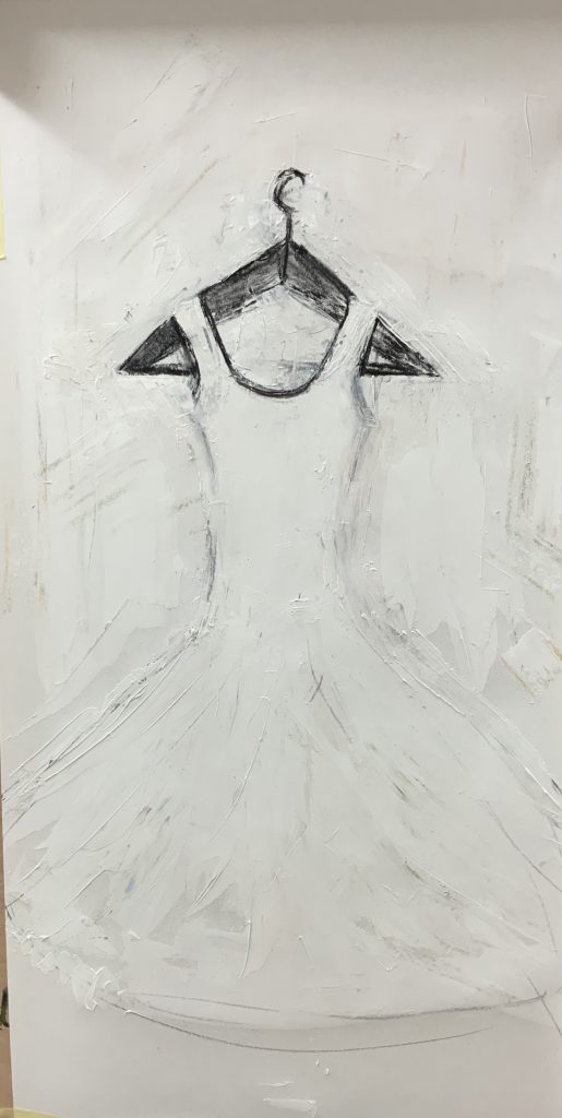
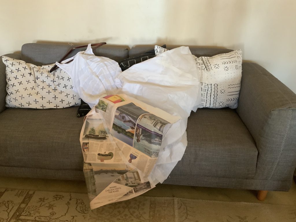
I chose tissue type paper and started with the flared-out skirt. The paper is something that also reminds me of something old – I keep things I want to protect or archive between these papers and it is soft and reminds me of the dress. Does the paper also remind of dressmaking patterns – the same texture or materiality? I make peace that it will not have the same softness as the black dress. I add newspaper panels into the dress – also something which gives it a history of time, news that was relevant and important, but now also forgotten, or history. I attached an old t-shirt to the paper skirt with pins and then covered the shirt with more paper. The top part is longer than that of the original model.
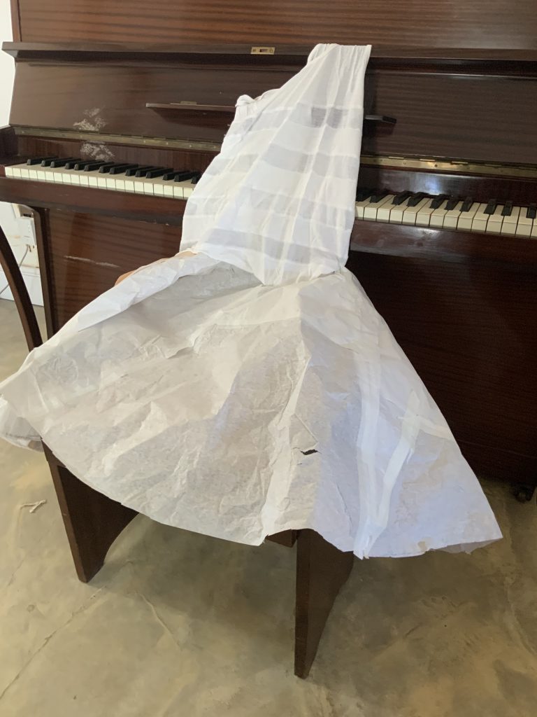
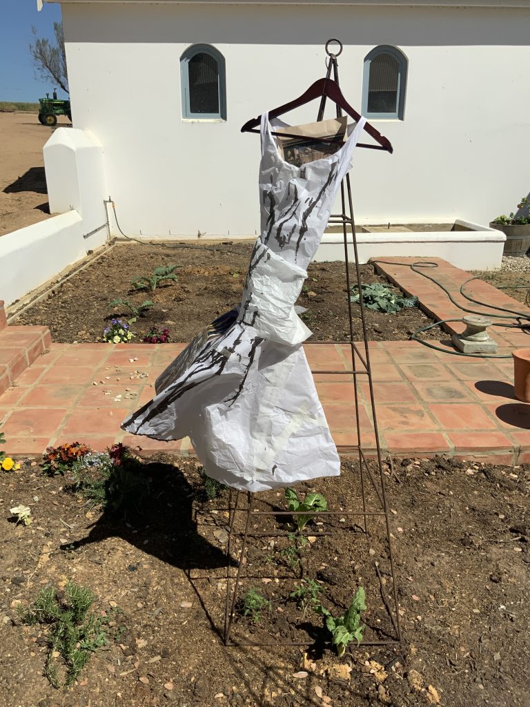
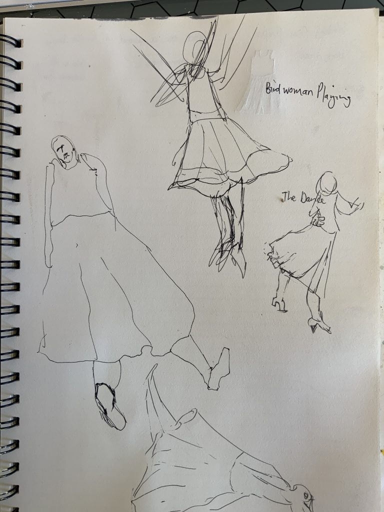
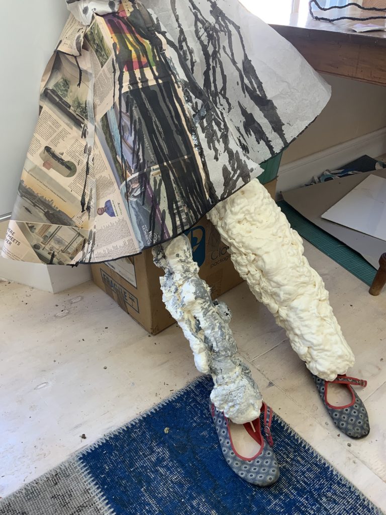
I can already imagine long legs creeping out under the dress, with feet itching to twirl and dance… I consider how I could pad it out as if it were being worn. I could put Paula Rego in it – give her the dance she longed for. Below are quick drawings from my sketchbook. Here I am looking at Paula Rego’s works, Birdwoman Playing and The Dance.
My first painting is with gesso and charcoal on wallpaper and then a sketch on A3 Acid-free drawing paper. The gesso painting is playing with ideas of erasure, texture and a fast study with palette knives and charcoal lines. The drawing, made with a B8 graphite pencil. I feel here are memories and nostalgia. I would like to develop this in smaller painting studies.
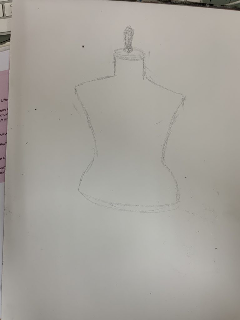
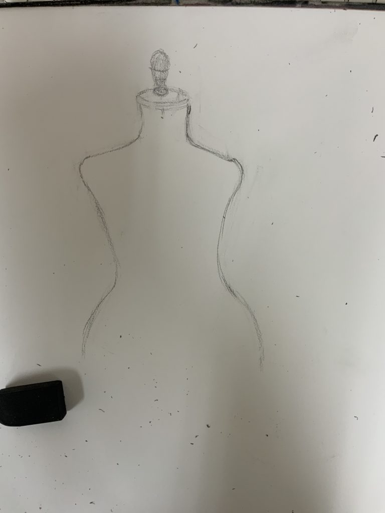
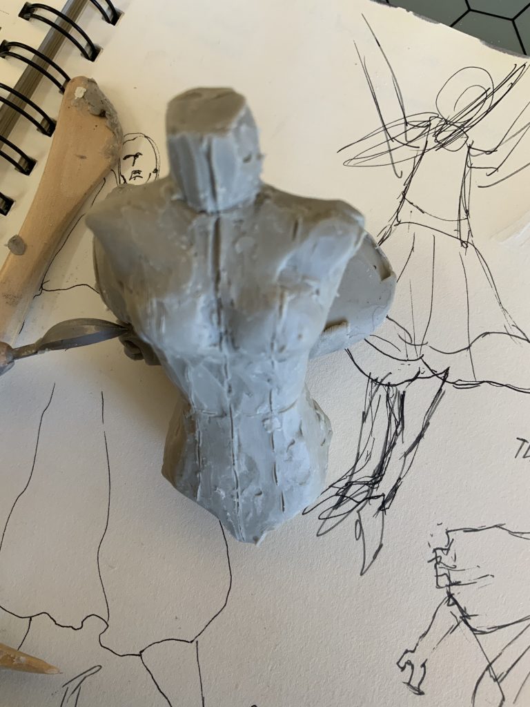
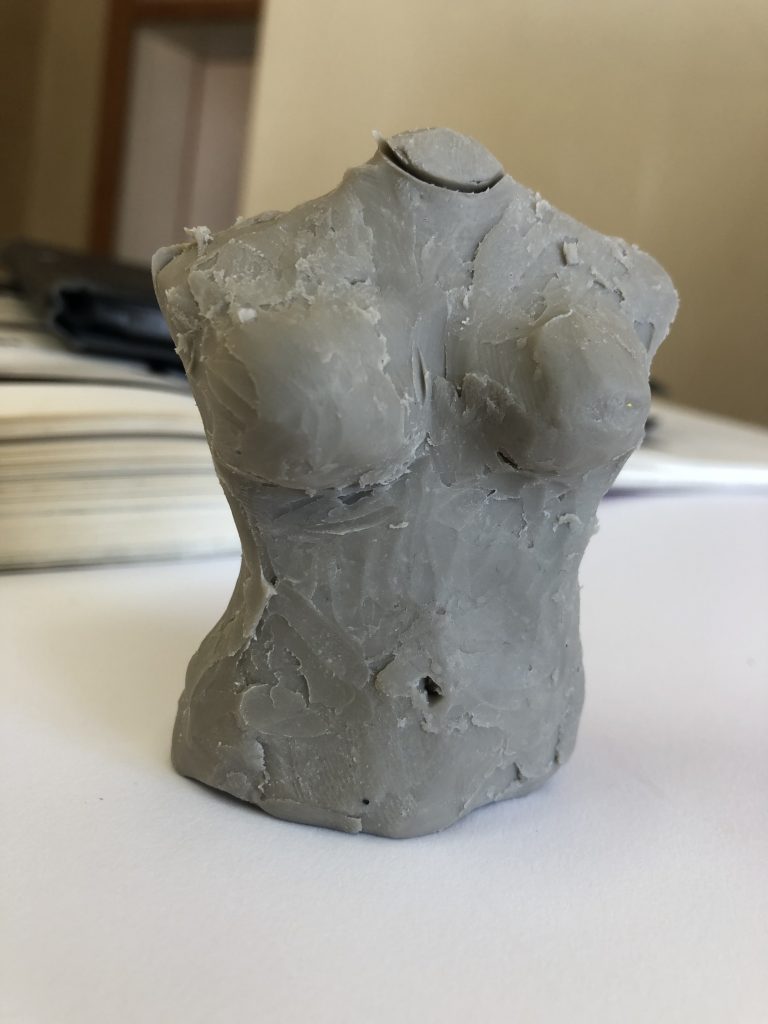
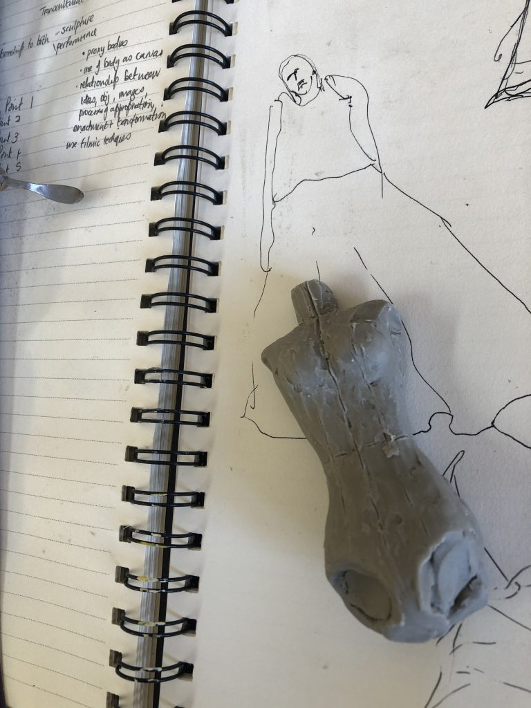
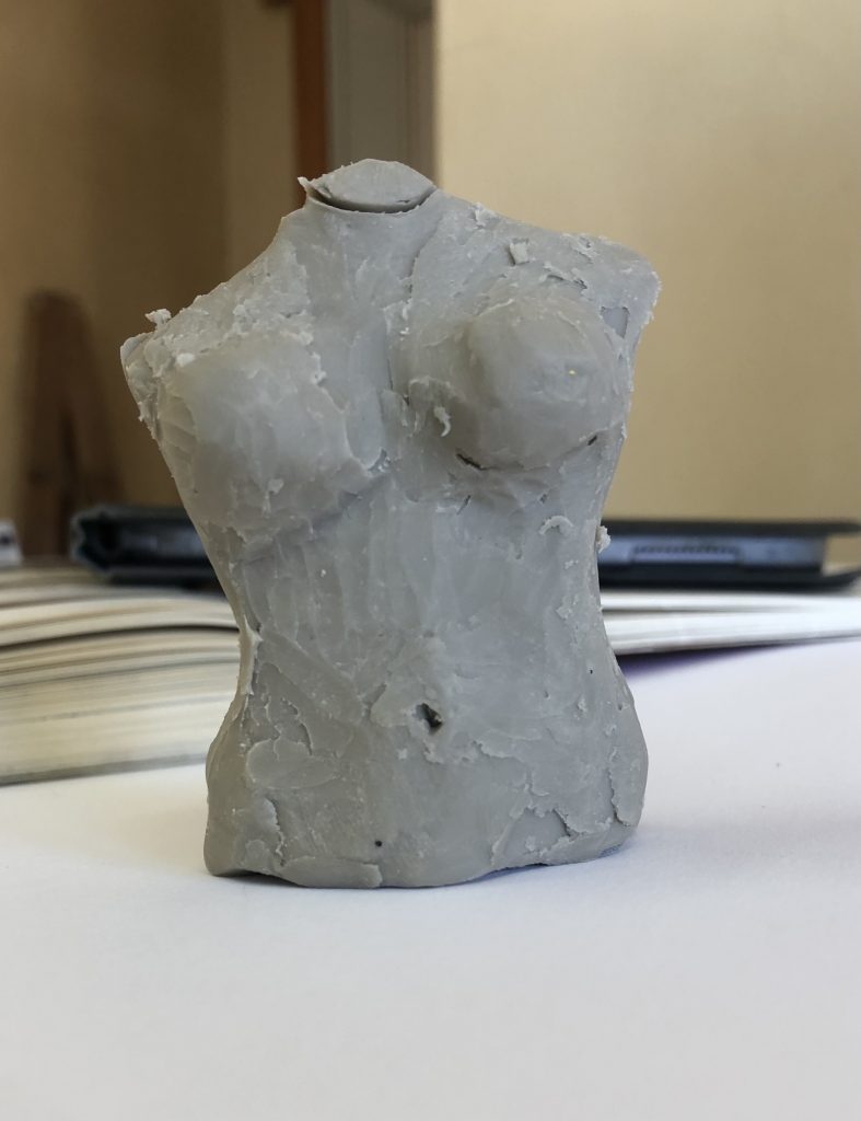
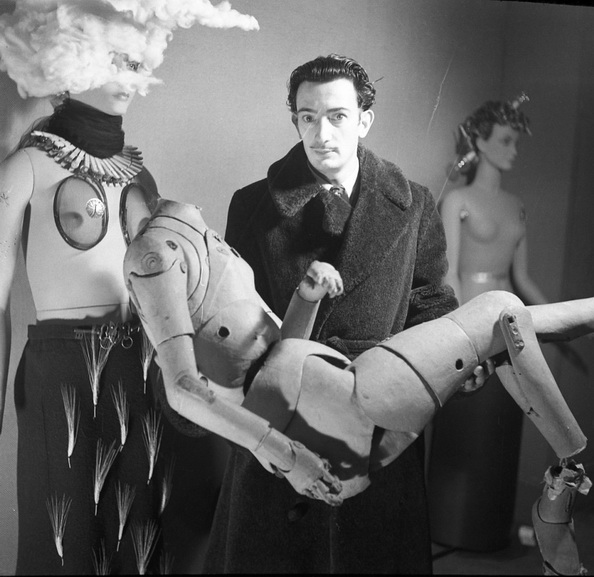
Looking at making a 3d object. I made this little object with my Bongo putty and modeled it after a female dressmaker model prop. These props are functional (height-adjustable, detachable parts), and are made as kids, male, female torsos, half bodies or full bodies, with arms and legs.
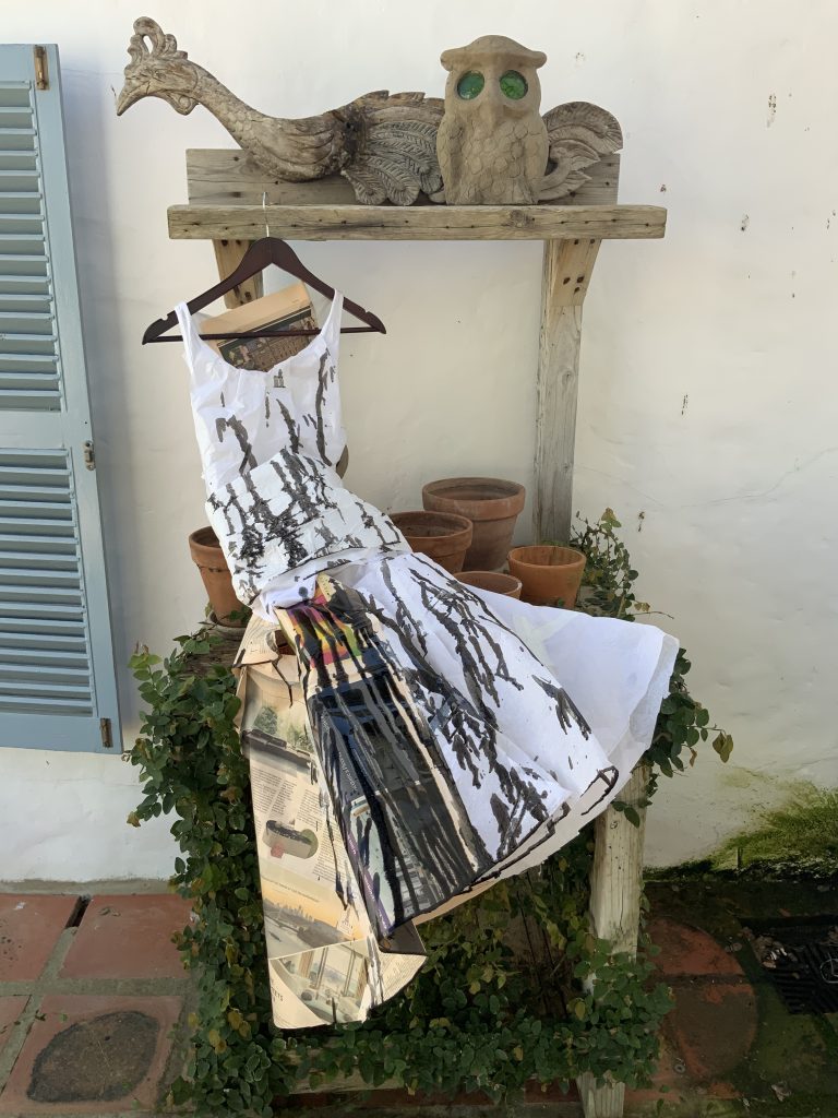
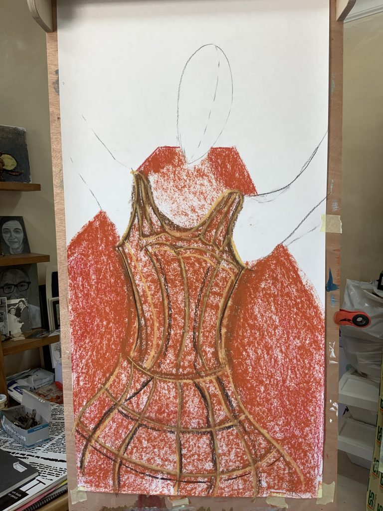
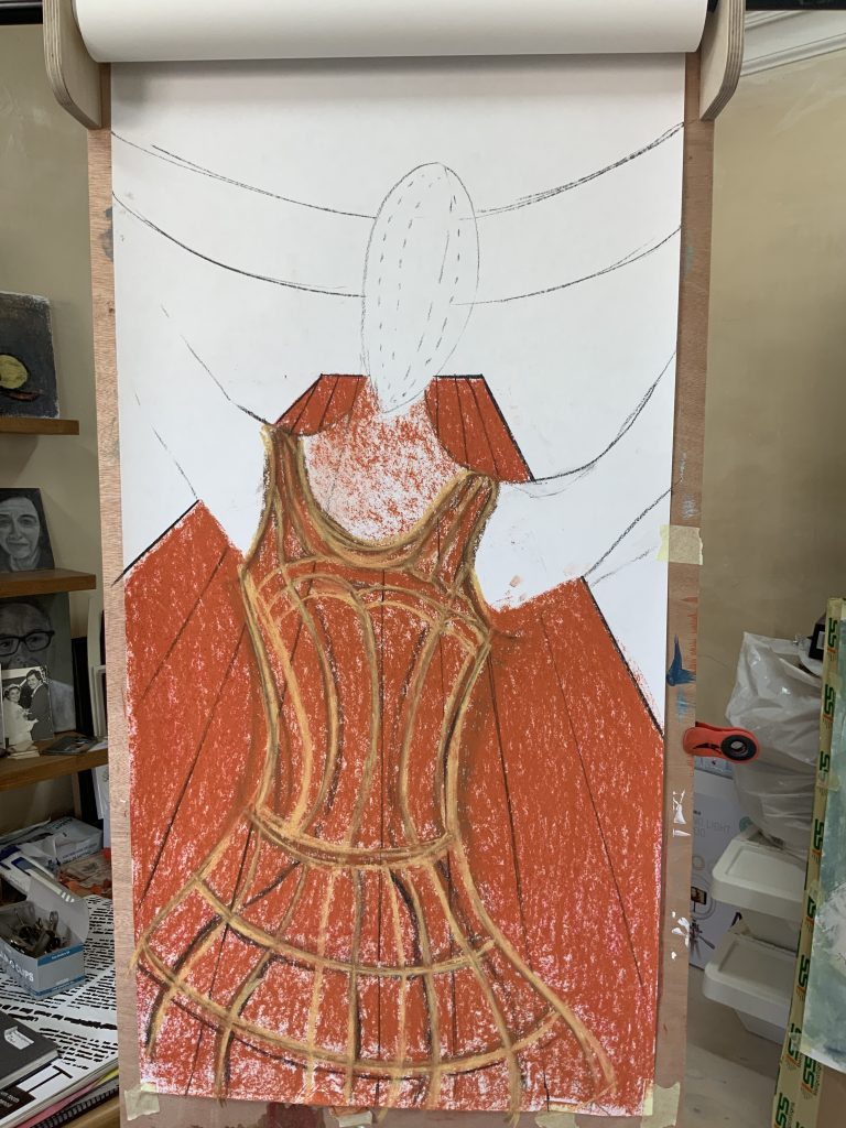
I decided to add paint onto the wallpaper painting and making use of big marks, two thick brushes I painted with acrylic paint, mixed with a mat medium. I worked with quick strokes and my colors were mixed on palette paper and then onto the paper (artist paper pad) which I could throw away after finishing the work. I wanted an abstract background. The big palette knife was used to bring the form to the body contours of the dress.
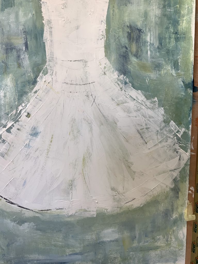
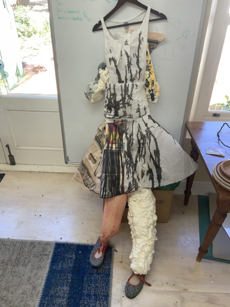
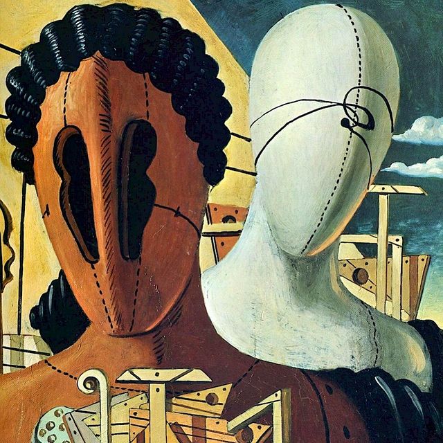
I am inspired by how Richard Guston worked with the history of art in his paintings/drawings – his way of representation and learning from the Italian artist, Giorgio de Chirico (1888-1978) These faceless figures look like they are constructed from the primary forms, namely a circle, a cube, and a cylinder.
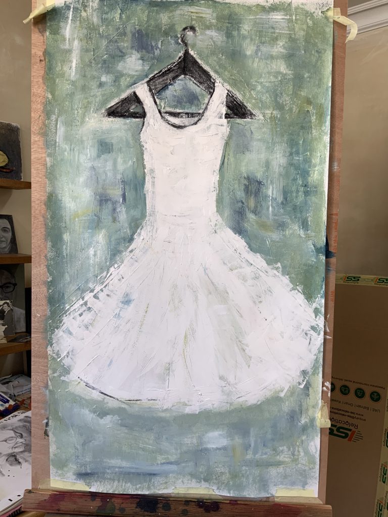
For the Surrealists, the body, as a machine, a fragment, a doll, was a central theme. In The Polka, by Rachel Baes,(1912-1983), see image below, one gets the feeling of the dummy showing female suffocation and the need for female liberation. This artist was lonely after the death of her lover and deals with psychology from a feminist point of view in her work. Here the dress becomes a cage, a space a woman finds herself in.
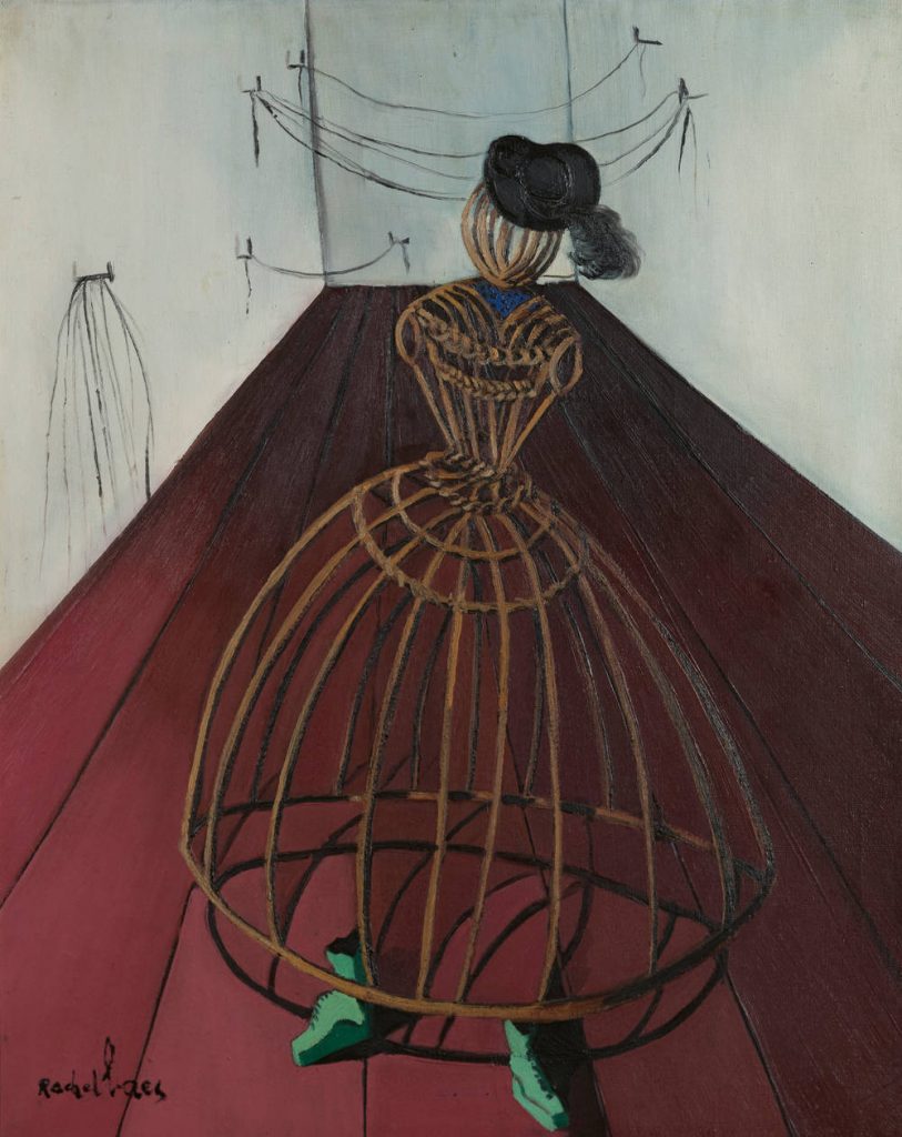
I read the following: Rachael Baes’ doll figure in “La Polka” (1946) is neither erotic nor childish. Appearing as a tailor’s dummy fashioned from wood, her figure sporting a hat and boots takes a step towards the observer. There are no windows or doors in the bare room behind her, but it is crisscrossed by strings hung loosely between hooks on the walls. Strings that could tie someone up, a room with no way in or out, a body that itself looks like a cage – here the doll is depicted in a state of momentary or even permanent incarceration.
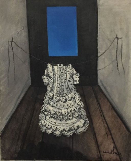
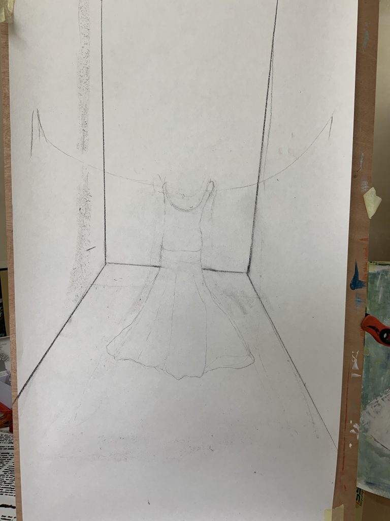
The above image of the dress suspended over a room reminds me of the previous image but feels even lonelier. I ask myself, why this space? What does the black wall with blue indicate? When I look at her other work I get the sense of space which is dark, isolated, and inwards. She uses perspective to show the room and the despair inside. I like her use of shadows in the works, it contributes to the feeling of loneliness/eeriness around these objects. I work on wallpaper with pastels and charcoal, and explore the effect of clothing in a space….looking for a sense of complex meanings around objects/clothing, as armor, as protection, and as a symbol for dealing with loss or alienation and identities. I wonder about thingification, anonymity, loss of identity, and the idea of playing or working between real and unreal, a questioning of my own reality. The idea of the dress hanging in a space-occupying a space and not a body is interesting and leads me to the artist, Kathleen McDermott, who I discuss in Research point 1 as another artist who has used clothing in their work. Performance comes to the front in these ideas and I see the work growing into an installation or video piece.
REFLECTION
Compare the use of paint in three works (p58) study material. (See images below in discussion around the works). In these images, the paint appears to have been applied quickly but to a different effect. Consider how you might work with colour when working quickly, do you might paint prior to applying it, or do you mix it on the canvas or paper? What are the advantages of each approach?
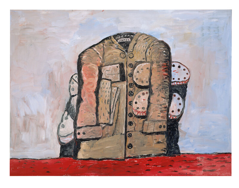
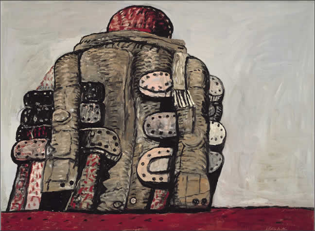
The Coat, 1977, Philip Guston (oil on canvas)
Guston (1913-1980) painted loose, and changes his mind whilst busy painting. I see these objects as part of how the artists show a lived experience. He feels strongly about image-making and lines, as drawings become prominent in these works for me. I do value the open space on the canvas – almost like an exercise in brushmarks. Tate described this painting as sensuous and rich on the surface. On the Tate website, where I viewed his lithographed print of Coat, I read, that after 1969 Guston renounced his previous interest in abstraction in favour of ‘ a world of tangible things, images, subjects, stories like the way art always was’. Here it is also stated that ‘Coat’, relates to ‘Back View’ and ‘The Coat’ both of 1977. I imagine he was working wet-into-wet with these works.
A pair of shoes, 1886, Vincent van Gogh (oil on canvas)
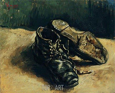
Like with the work of Guston, there is little information about why van Gogh painted a series of shoes, or to who it belongs. Is it the shoes of a peasant, a worker, thrown after a day’s work – the person/feet are absent, but we see worn-out leather shoes? Or do the shoes belong to Van Gogh? It could also be a choice of composition and as part of a study for a bigger picture/scene inside a home. I am asking myself why did I consider the above thinking when the question is asked to reflect on how to colour in the work was probably applied quickly. I do believe in this case the object gave him the opportunity to study form, When I want to work in realism, if consider the chosen pallet and try to mix colours, but I have to admit that when work is done quickly and loosely I need the freedom of changing options and work over something/or erase something. That is why I find working with charcoal and pastels comfortable.
I added the image below, another of Van Gogh’s paintings of shoes – I do like this composition and use of colour. According to the MET, this painting was done later, in Arles, and evidence of a return to his earlier paintings of shoes. It is said that “……Van Gogh has placed the shoes within a specific spatial context: namely, the red-tile floor of the Yellow House. Not only may we identify the setting, but perhaps the owner of the shoes as well. It has been suggested that this “still life of old peasants’ shoes” may have been those of Patience Escalier, whose portrait Van Gogh executed around the same time, late summer 1888.”
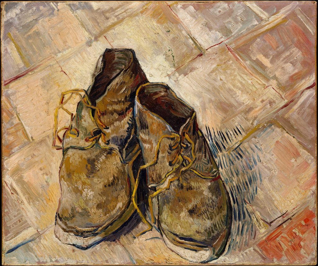
Oil on canvas 44.0 x 53.0 cm. Arles: August 1888
New York: The Metropolitan Museum of Art
The absence of information about what the painter intended has perhaps fuelled the imagination (not that we would suggest there is a resolvable relationship between stories of ‘‘origins’’ and outcomes, that might finally ‘‘settle’’ interpretation).
Shoes, 1985, Lisa Milroy (oil on canvas)
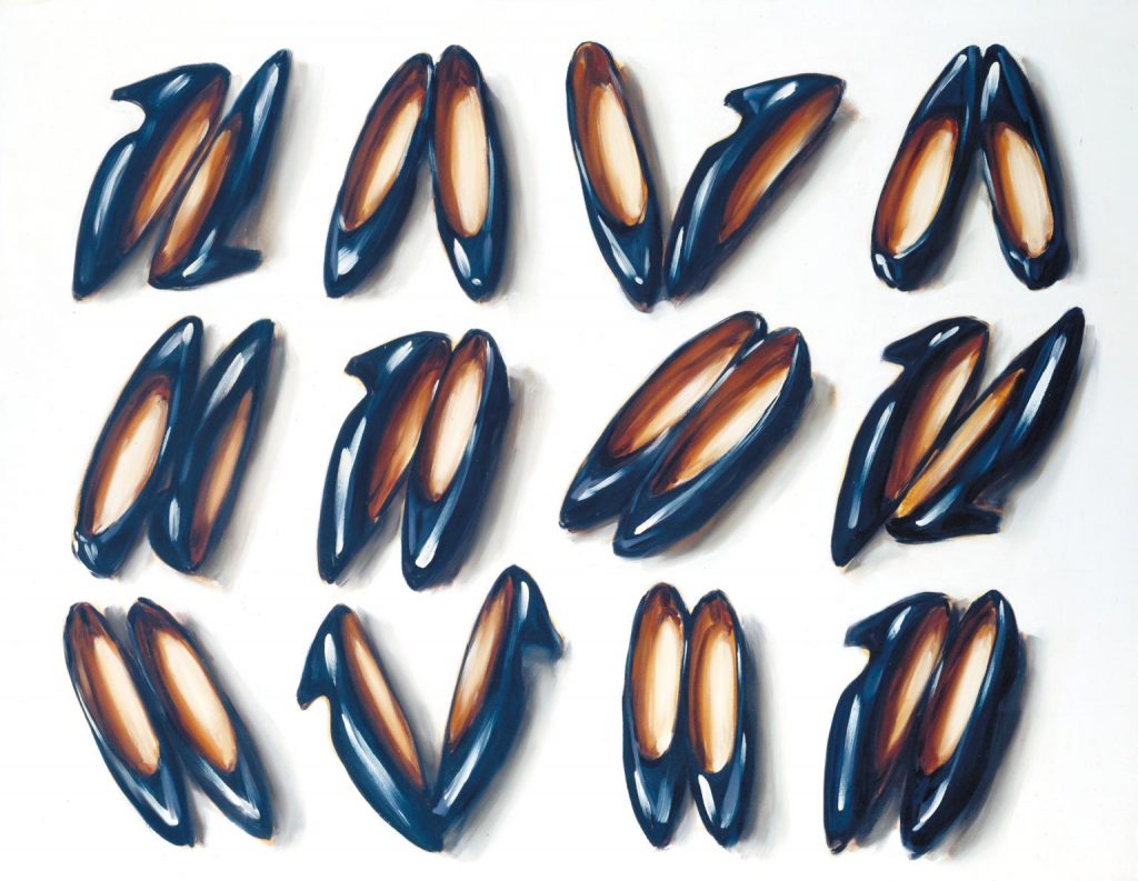
I learn that this artist presents her objects in their most characteristic profile. Here the serial ordering with side-on or view from above is shown. On the Tate website, I read: ” They are alienated from any context, set against a neutral, most frequently white ground. This absorbs the shadows and contrasts with the objects’ three-dimensionality, allowing ambiguity in the viewer’s relation to the object. They can be seen equally as placed on the floor or hung vertically on a wall. Our perception of them as objects diminishes as our appreciation of their abstract qualities and their serial ordering increases.” I later read that her works were done in a short period of time. Colour wise it is a monochromatic painting, so easier to mix the paint from the onset and then repeat the painting process in an almost grid-like way. In an article where she is in conversation with Rosalind Duguid, she says the following:”….These paintings, all completed from start to finish in a single day, were characterized by a quick gestural application of paint. Fast painting delivers three things at once: the imagined representation of a thing; a record of my painting actions; and an embodiment of energy and touch in paint. The emphasis in “fast painting” is on the performative.” (In the run-up to her retrospective Here and There at Parasol Unit, Lisa Milroy speaks about looking as a form of work, still life as a mindset, and the difference between “fast” and “slow” painting. Words by Rosalind Duguid)
I do think she is also very much concerned with form in her paintings (grids, lines, patterns, rows, groups), and in this way, one looks differently at everyday objects. The surface and shape of the shoes draw my attention to this work.
A google search brought this up:
What materials does Lisa Milroy use?
The Spectrum artists’ oil colors are thinned with turpentine for the thin initial drawing and mixtures of turpentine and linseed oil for the main painting. In correspondence with the artist, 22 January 1994, Milroy described the process of painting: ‘Painting first drawn in with very dilute paint in turpentine.
Later in my parallel project, I explored the figure again – I consider it as a holder for fungi and made a small figure with paper clay, and filled the body with the medium of coffee grounds and woodshavings. This was kept in a dark box to see if mycelium would grow and if mushrooms would pin out of this body. The inspiration is from an artist whom I researched for learning how to create 3d objects with mushrooms as the material. The work took around 4 weeks to develop as mycelium covered the clay figure.
BIBLIOGRAPHY
Shonibare Yinka Artist profile [online] At: https://zeitzmocaa.museum/artists/yinka-shonibare/. [Accessed on 26 September 2021].
Shonibare Yinka Profile as published on RAA [online] At: https://www.royalacademy.org.uk/art-artists/name/yinka-shonibare-ra#cv [Accessed on 26 September 2021].
ILLUSTRATIONS