By now I realise that mastery of value was more important than colour in the work of the Renaissance painters. Chevreul’s laws of harmony and contrast of colour is now coming forward.
I came upon the work of Josep Albers who, in 1950, at the age of 62, began what would become his signature series, the Homage to the Square. On the Tate Website I read that he produced hundreds of variations on the basic compositional scheme of three or four squares set inside each other, with the squares slightly gravitating towards the bottom edge. What may at first appear to be a very narrow conceptual framework reveals itself as one of extraordinary perceptual complexity. In 1965, he wrote of the series: ‘They all are of different palettes, and, therefore, so to speak, of different climates. Choice of the colours used, as well as their order, is aimed at an interaction – influencing and changing each other forth and back. Thus, character and feeling alter from painting to painting without any additional ‘hand writing’ or, so-called, texture. Though the underlying symmetrical and quasi-concentric order of squares remains the same in all paintings – in proportion and placement – these same squares group or single themselves, connect and separate in many different ways.’ (https://www.tate.org.uk/art/artworks/albers-study-for-homage-to-the-square-t02312)
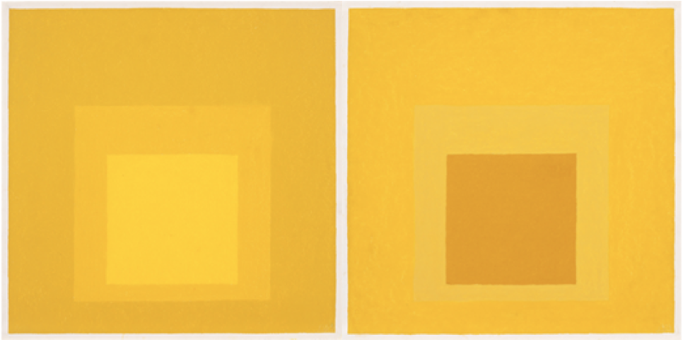
I am intrigued with his art making as a process – my tutor discussed this in her feedback and suggested I look at work processes of other artists. The series is defined by his adherence to one pictorial formula: the square and how colour relationships can create optical effects. He created color contrasts and the illusion of receding and advancing plane. It seems his intent was not so much to deceive the eye as to challenge the viewer’s faculties of visual reception. On the Guggenheim website, the gallery refers to his process as : “This shift in emphasis from perception, willed by the artist to reception engineered by the viewer is the philosophical root of the Homage to the Square series. Albers tried to teach the mechanics of vision and show even the uninformed viewer how to see. He was always proud that many non art students took his classes at Yale.” ( https://www.guggenheim.org/artwork/173) It seems he made at least 2000 of these works. His paint process to investigate the interaction of colours with one another, adjusting hue, tone and intensity to explore optical effects. According to the Tate website, in his writings of the period Albers also examined the psychological effect of such optical experiences on the viewer. The paint was applied with a palette knife directly from the tube (with some exceptions) onto a panel prepared with a white ground. Isolated flat squares of colour give the illusion of receding or advancing. At times the isolated colours seem to fuse to generate new colours that appear to hover in front of the picture plane, leaving the viewer with after-images.
For the exercises in this project I need a neutral grey ground and work on dampened cartridge paper for a series of exercises which I will place under headings
Exploring contrasts
Exercise:Choose a colour I like and mix series of several colours that are close in the spectrum of my chosen colour.
In the small squares are my chosen colour, , and it is surrounded each time with one of the colours I mixed.
Exercise: Mix a colour and its complementary, in the small square the brightest and around the complementary, but made equal tonally by adding white. I choose green and orange/red. It is about the intensity contrast.

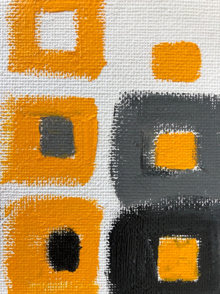
Exercise: Make squares and paint white underneath, leaving a square gap in middle. Mix neutral grey of beige colour and fill each central square with this colour. Interesting how colours can enhance each other – I do think this can work more effectively on flat shapes – where one could be cold and use hue as contrast. The bright colours with the neutral greys in the middle can again give the impression on great contrast., like below.
In terms of using it in a painting the contrasts can be used to great effect -example to use the background as neutral and make the image in the bright colour. To me value contrasts is easier to see when using monochrome colours.

Successive contrast
The work of Yayoi Kusama immediately comes to mind, after reading the passage in the study notes. Art-making has been a life-long compulsion, as well as a way of escaping her mental disturbances. Of her practice, which is mostly bright colours and repetition of subjects, she once remarked: “……all of us live in the unfathomable mystery and infinitude of the universe. Pursuing ‘philosophy of the universe’ through art under such circumstances has led me to what I call ‘stereotypical repetition.'” ( Southebys website: 1 Facts about Y Kusama) Knowing that Georgia O’Keefe was her mentor, also makes her an interesting artists in subject of colour –
- the way she uses optical effects of colour to share her own moods and way she perceives the world around her
- her practice is consistent and creative
- she does not define her work – the viewer is open to find his/her own response – which seems mostly uplifting and positive.

Still life colour studies – in this part of the project i need to combine my colour work and experience with still life by painting a series of still life colour studies. I have to admit at this stage that I do find these exercises difficult – with regards to explore the effects on my chosen still life composition. I think a more contemporary choice would have been ‘easier’. I take this thought with me, as I realise I need to do a still life for the assignment at the end of this part of the course.
Exercises
Colour accuracy
In this half of this project I have to combine my colour work and experience with still life by painting a series of still life colour studies. I will explore different colour interpretations of the same subject and compare the effects achieved using each approach. I decide to use a photo image of flowers in front of a mirror. The flowers are purple/ lilac and deep pink roses as well as delphiniums, with some green leaves. It is arranged in a cut glass vase, stands on a marble top in front of an old mirror.
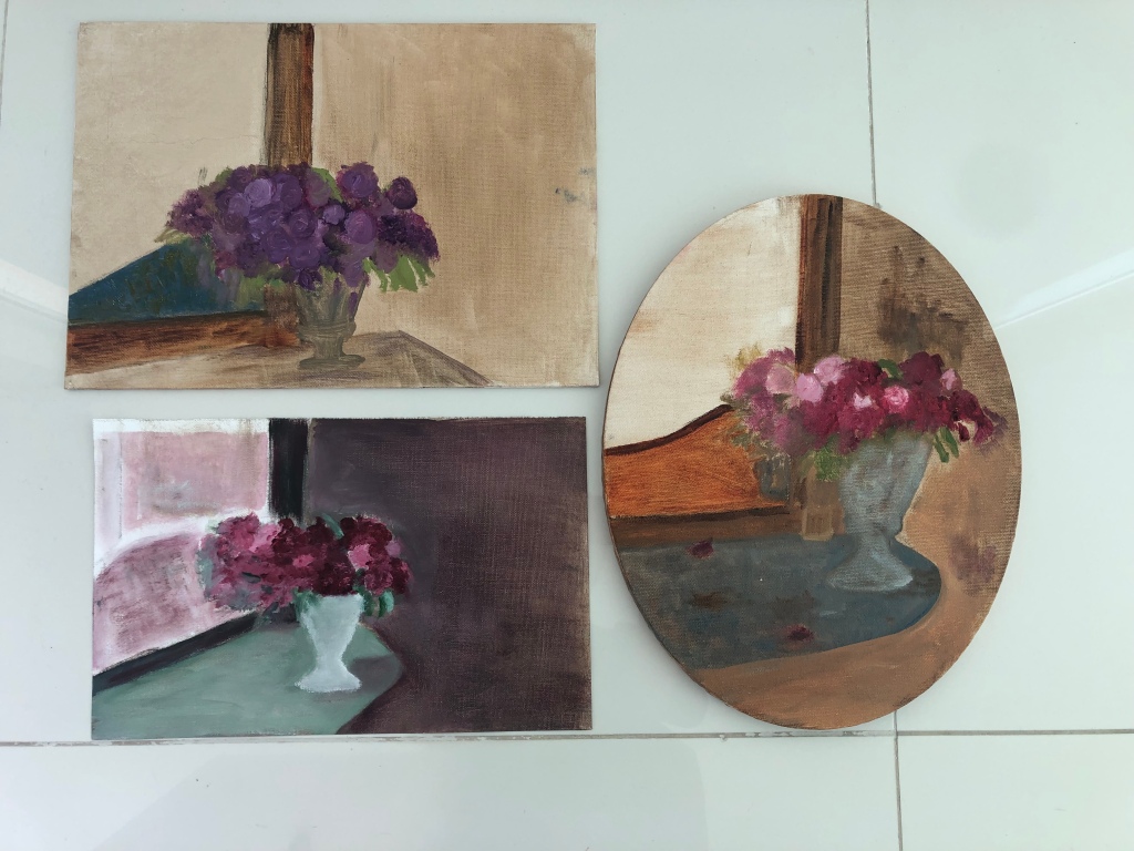
In the first painting I tried to be as close to the original colours as possible – I used Cobalt Violet and Magenta as main colours. For the study below (left) I worked with red and green ( Terra Verte and Permanent Crimson Lake. For the last, oval shape study, I wanted to portriat decay and neglect and used muted colours of blue, permanent crimson lake and burnt sienna.
I would like to go back to these studies – did rush through this and do think there is a lot more to be experiment with.
I started a painting with a pair of shoes and will continue to finish this.


I used a dark wash of Prussian blue as my ground colour.