Still life
I have decided to draw a plate with lemons and oranges set on a table which is ready for dinner to be served. The intended viewpoint is that of looking onto the lemons and standing sitting to the right of it, at the corner of the table. Light is falling from the right and hitting the lemons and plate. I used a photo image and a previous drawing in pastels as part of my reference material, as I had to work inside. I have some fresh lemons to use for colour studies.

My canvas paper is prepared with an acrylic grey wash. I draw my idea onto the paper, after I did a small drawing in charcoal and get to mixing my yellows. I will mainly use, Cadmium Yellow Hue and well as Pale, Lemon Yellow Hue and Indian Yellow , and I need to mix green and blues for the table setting. I had the lemons in a wooden bowl, but opted for a ceramic plate.
The setting is outside and late afternoon light plays an important role. I try to focus the view on the plate of lemon/oranges, and decide to work with a palette knife – I like the buttery consistency of the paint as I apply it. Many attempts at layering the serviettes does not bring the expected result to the part where the table setting is seen – too flat; I wanted the texture of the bamboo placemats, reflections in the cutlery and on the faded dove blue serviettes to be seen. Was not so easy to show the silver knife and fork lying left of the plate of fruit. I do find the mixing of my blues difficult and cannot say I think it did a good job of adding white, should have explored using black and more grey values. I did not get a relaxed feeling of being outside on a bright sunny day and became frustrated with my idea of thick paint. At a stage I thought it would have been a better choice to focus just on the plate – I do think it would have shown the viewpoint and create a better story around the objects. Painting the striped tablecloth was also a struggle – I am thinking about how I planned the different objects – more time and focus on these would seem a good choice from a working process. I did some colour washing with the blues to create tonal difference on the table.
I think what I learned from all my above comments is the difficulty in judgment, whilst working to bring together a idea and created reality – instinct and pressure ruled. I missed the opportunity to enjoy the vibrancy that I was originally after. More studies and learning about starting the process and designing the idea that I want to paint – time taken with this, could also help my practice. I am more motivated to listen and view other artists at work. I do feel that experience with oil painting helps with decisions and this will come with time and guidance from my tutor.

I decided to go back an view the work of Matisse and Cezanne. Of Cezanne I read the following which I think I can learn from: Broken bits of colour and short brushstrokes ( like the impressionists) Cézanne came to use regularly, although with a different effect, in his later work. Even while under Pissarro’s guidance, however, Cézanne painted pictures clearly indicating that his vision was unique and that his purpose was quite different from that of the Impressionists. Although he used the techniques of these young artists, he did not share their concern with emphasizing the objective vision presented by the light emanating from an object; rather, his explorations emphasized the underlying structure of the objects he painted.

With regards to Matisse I looked as this organisation of space in a painting – did he create an illusion of depth by using perspective drawing? His scale and position of objects in relation to one another is something I appreciate and believe should be better understood if I focus more on reading and learning more about perspective drawing – there is a hierarchical order which he creates and I need to understand how. I know I can go back to this painting and to more work. I will let it stand for the moment and come back to it after my tutor’s feedback, and some time away from it.
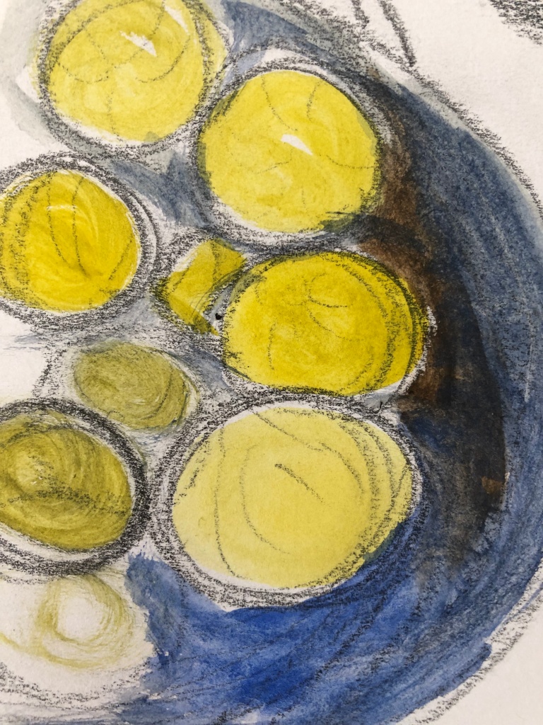
On the photo below I show using dark lines on the edges of the objects which could help define form and structure to the objects which are mostly flat on the table. I look again at the objects that did cast some shadow – the spoon, the fork the serviettes and the plate, as well as the fruit touching each other.
