COLOUR
“Painting is a physical thinking process to continue an interior dialogue,” she has said, “a way to engage in a kind of internal discourse, or sub-linguistic mumbling.” Her process-based work, suffused with humor and conceptual exploration, employs vibrant color and intense layering and drawing, and seeks intensity rather than beauty. ( Artnet, Amy Sillman,)
Exercise 1.4. 3D colour chart
The work of Gerhard Richter, 192 Colours, 1966 shown in the study material is an interesting way of looking at art, he he was presenting a colour chart as a work of art. Looking at the work I understand the artist copied paint sample cards he saw in a hardware store, but it was also his first series of work where he worked with industrial colour, he used gloss paint. Thinking about our limited language on how we classify colour as different societies it is a good thing that tints, pigments, dyes capture more hues of colour is available, but I do understand there is a different ‘theory’ at play between how we as art students learn about colour and how colour is shown and understand in different cultures. There is clearly not just an influence from colour scientists at work – big corporates have made lots of money around colour not just in art, but decorating, advertising, etc I also had a moment of thinking about the rainbow and the colours we see – they are blurred or blended into a continuous spectrum, not pure colours, such as blue, green and red.
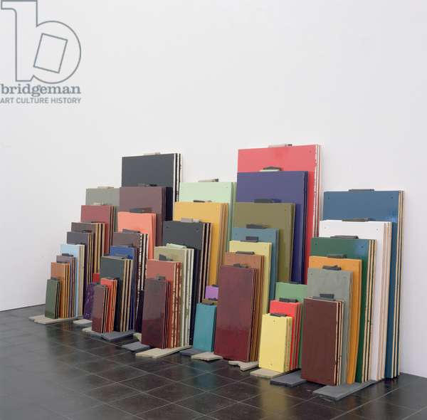
The work by Thomas Schutte, Store, 1978, (the other image shown in my study guide) below, was done on wood, and during his student years at the Dusseldorf Art Academy. I wonder why wood? Other artists have used and or since used supports like glass, canvas, fabrics like silk, paper, reflective metals, etc. Interesting that it takes me back to earlier learning in this part of the course, such as the surface and paint as material.
From the Artforum website, I understand that this work questions the fake and the functional, something which is defined by the terms of the site and the commission. I like the idea that it takes a painting to be a sculpture or an installation. For me to understand why I need to explore this project, reminds me of Petra Lange-Berndt, who in her essay, How to be complicit with Materials (2015, 12-114) discuss ‘Get Dirty’ – that place where one engages with the materials and she talks about material complicity. I wonder in which ways would I be able to explore possibilities of colour in this project? Conceptually I think I am asking what is the relationship with materiality when I look at colour as charts – the project asks me to do 5 things:
- Produce a series of colour charts on paper – Site/Place is important criteria here
- Translate one of those colour charts into a 3 dimensional colour chart by locating rectangular planes of colour in
- Consider my choice of surface
- Consider way in which I order, arrange or hang the 3d chart
- Reflect on my descisions
Do I need to read more around the ideas of indexicality and notions of context of the Modernist paradigm, as it seems this is mostly the critique these mentioned artists in the study notes (p87) refers to. I do think their work did become bold and the gestures are seen as monumental. By grouping or arranging the works so that it just looks like a pile of coloured boards leaning against a wall (storage) does it question the nature of art and ideas around space, I do think so. There is also something that reminds me of how we today curate our own spaces – ideas around how we display and do interior decorating, which is not related to colour theory or are we ‘pretending’ it does? I also think about the work I have seen of Daniel Buren and still have a memory of his commentary on his vertical stripes, where he referred to them as his ‘visual tool’ – making us the viewer see the surface, making it ‘visible’. To him, paint hides the canvas, but there was also something about hanging the work onto the walls of the gallery – the space becoming the support or a place where the work can function? Does this mean that the wooden panels of colour function standing against the wall gives them a new level of meaning? Something that goes like as a context the works are a stand-in for the content? I now find myself between the theory that really becomes a muddy (colour punt?) puddle for me, as I need to make and observe studies around colour. I go back to my own writings during Understanding Visual Culture (2) and look at the work of Kenneth Noland, namely his stained paintings. The monumental scale in which he produced colour as a material to look at, is what I found most interesting. I feel pressurised to take cognition of the surface of the canvas – the influence and role of colour or no colour on it, forget about figuration, lines, marks – just the material. On the Frieze website the comment around Store (fig. 1) is my inspiration for now: “It is almost a disturbance when he presents these works stacked behind each other against a wall in the gallery.” (I feel unsure about the unfamiliar places I need to explore – but I am willing to take a chance)
Method
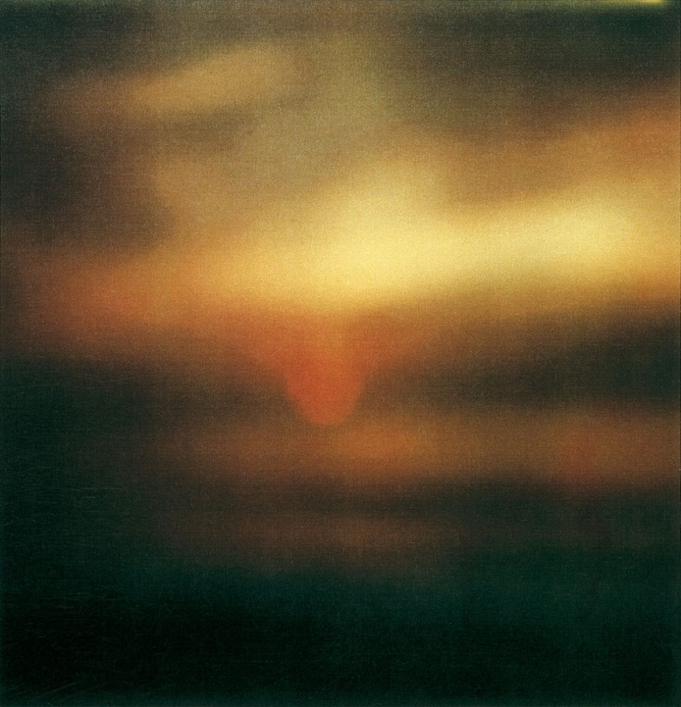
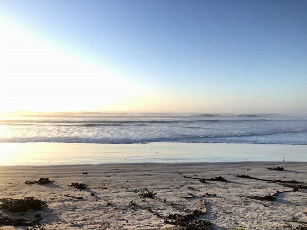
Reflecting on place – during December and January we have been spending a Summer holiday at the beach. This is situated on the West Coast, and a colder and harsher environment, than the coastal areas of the Eastern and South Western coast of our country. Wind and fog are a regular occurrence and we experience lovely sunsets (directly Westen view) over the ocean. I have spent a few hours painting and drawing outside to capture the landscape and contemplate the lovely colours as the day moves towards evening. This month (January 2022) with the full moon and winds we had exceptionally wild waves and the water’s edge almost covered the whole beach area for a few days. Seaweed was strewn on the beach and the water felt especially cold. I can almost ask the viewer to imagine an arrival during the dark night – having to rely on sounds to create a visual image of place – I am sure colours of the beach, the sun, the sky, the waves, the sea, the sand will come to mind.
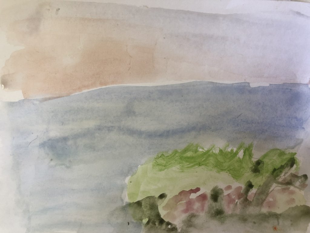
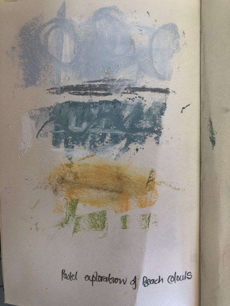
Below are sketches from my sketchbook of the beach in front of our cottage, done earlier in January, before full moon and Spring tide. I did it to capture colour its experience on my senses. I feel the reason I chose seaside scenes is because of the atmospheric colours and light during the different times of the day/ when it was covered with fog and or stormy and or windy. The sounds of the waves and seabirds are also part of this story. I think using watercolour in my sketchbook is because there is a softness and temporality in the landscape I wanted to capture.
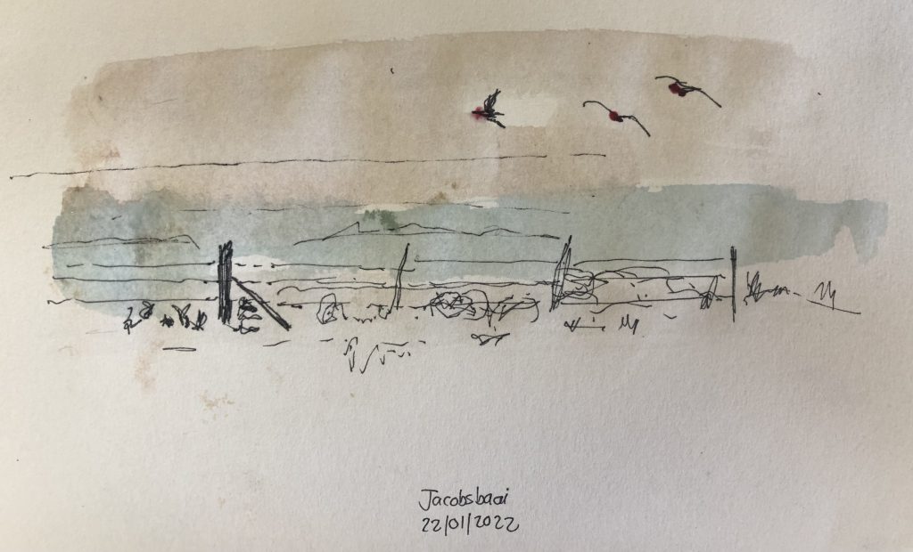
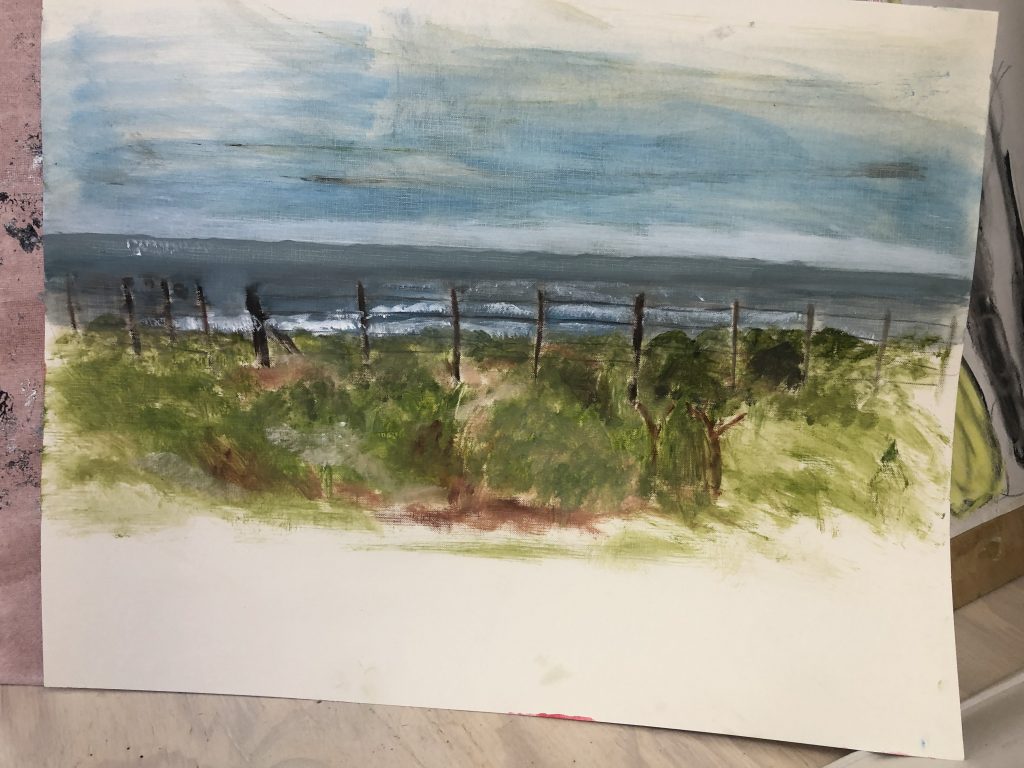
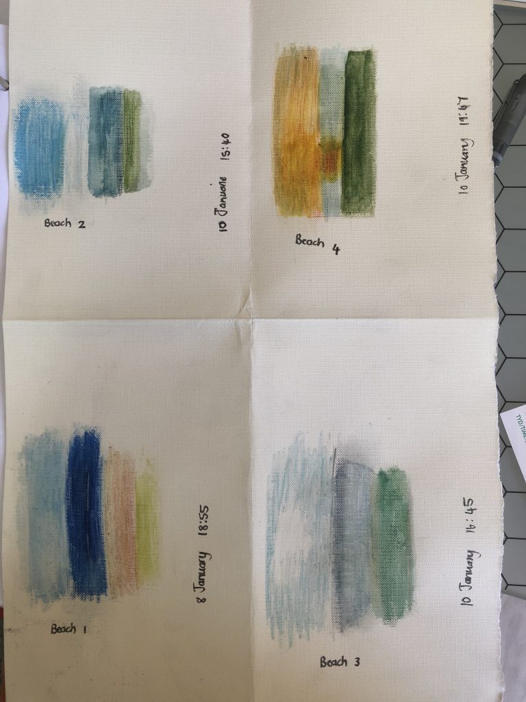
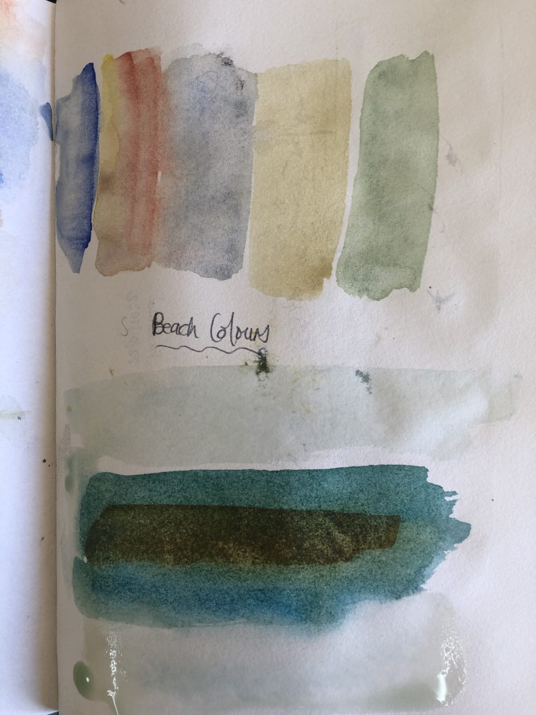
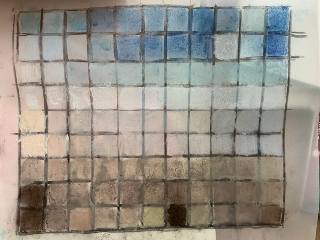
In my mind’s eye, I try to visualize these colours as rectangular shapes. I think about work I have researched during my studies of the artist, It made me research the work of Klee who I know used blocks/shapes to start his colour works. Beach and horizon colours late afternoon between 8 January and 10 January 2022 @ Jacobsbay, South Africa, is shown as 4 separate colour charts below. In a way I see these charts more about time and light – I do not think I did justice to the colours as skill to mix became challenging with my limited materials. My painting in oils (fig. 4) is an attempt to capture colour at a moment in time, not just a view. I could not continue to paint on-site and eventually have to rely on photo images. The moment is lost – is it not just an ephemera? A fellow student recently spoke about “a work under investigation” – for me I think this moment has gone, I can now only continue with memory and photo images, that moment in time is lost.
Consider using charts for the above locations:
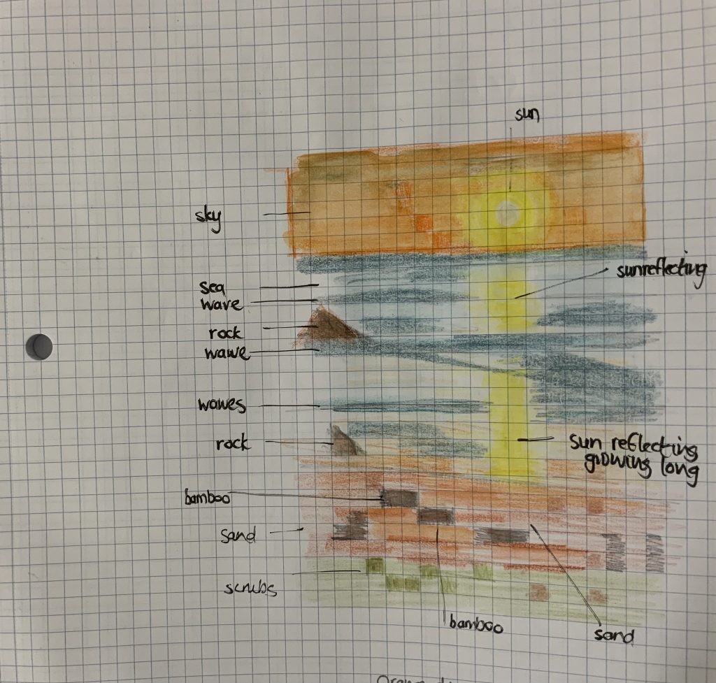
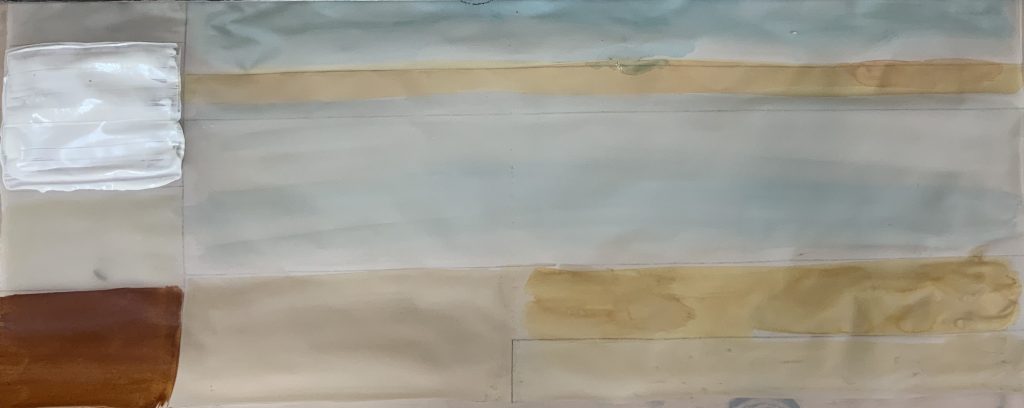
In the charts below I started with Staedtler Aquarelle pencils to show the view of the beach in front of our cottage and then added water to blend the colours. I worked on canvas paper for these small colour studies marked as Fig 5. and recorded the times of the day in each. I attempted a colour chart/diagram (?) drawing of a sunset on the water, Fig. 6. on graphic paper.
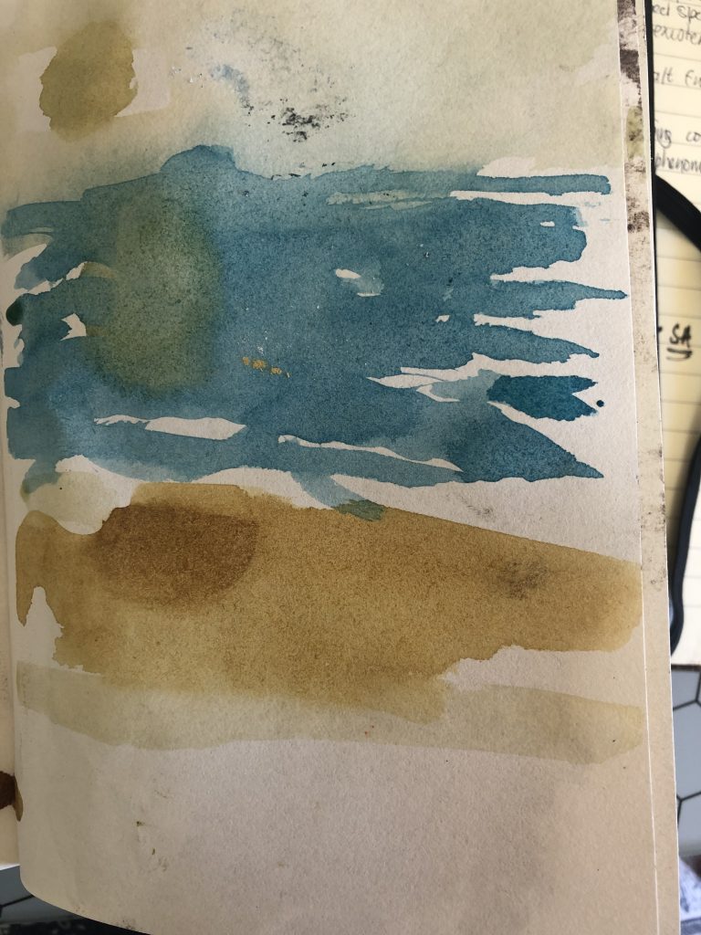
More explorations followed with soft pastels, ink and watercolour, done on-site during the day:
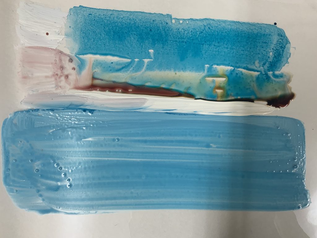
I do like the way the paint connects with the film material – when I mixed acrylic medium into the paint it became buttery – even made me question why I never tried butter as a medium to paint with.
I was still hesitant about making a 3 dimensional colour chart and started reading the Amy Sillman pdf mentioned in the Reading Points and would like to discuss my learning here. It will be shown that I found a video where she read and discuss this essay – the visual materials she shares make it a more interesting discussion on colour for me, and my notes is mostly from the video. I attempted to add pause notes as a form of quotation.
Reading point: (pdf of Amy Sillman, On Color) I found it enjoyable how she wrote about naming colour and how the origin of pigments is so interesting and as she writes is “mythic”. I then found a talk on this essay she did at the Whitney on 12/11/2014 and enjoyed the illustrative, humourous and interactive way she dealt with this essay on colour, its materiality used by society, the corporate world, cultures. (see youtube video below: 16.50 min)When she talks about colour swatches and the corporate production of paint I cannot but think again about the work of Richter as shown above in the study material (p 87) and understand a little more of his critique (17.07min). Referring to the ‘best brushes’, the Kolinsky brushes were really just funny on our ‘fetish’ with tools of our ‘trade’., but then also a history of paint production which links colonialism, slavery, bad working conditions, health risks for the workers, corporate greed and our materialism and drives to acquire and develop and then the theory which is still standing around colour where she ends her list with the Bauhaus (18.03- 18.08min) I do like her honest description of how she as a student perceived colour theory in the days she went to varsity – the time when painting was dead, ‘no’ colour theory, describing it as a schizophrenic diet and ‘productive misunderstanding’. It says so much about Modernism and the time of strong influences in her development as an artist, where painting was not always practiced by art students, colour theory was seen as a form of astrology, on the other hand, ‘ready made (22.34 min) was always available at the art supply stores. (giggling again at our consumerism and use of materials without really understanding it history?) In giving information around the Munsel index (20:11– 20:44 min) I felt she placed me in a better position to understand why colour was looked at critically by artists mentioned in the study material. I see myself as a ‘benefactor’ of the widest range of colours possible (can buy whatever colour I need), but clinging to my own belief of using a limited palette and creating my own colours – my own reality of what I see and eventually getting down onto the surface. Does it say something about my lack of skill, or lack of investing time and money into growing my colour collection of paint?
If I want to be really honest my first inclination is to go monochrome in my work. When I started painting oil portraits I wanted to follow the masters in making an underpainting with a limited palette of umber and black. When I draw, my first inclination is to reach for charcoal, but then also soft pastels if I look for texture. When it comes to the landscape I would go to oil and or watercolour and it is here I think in my practice, where colour happens – I try to make what I see, by mixing colours on my palette before applying. Sillman spoke about time and how it is for her inseparable from colour because it is all about change – she shows how she kept images of works as she progressed and put in into an I-movie – and then uses some of those images to paint. I like that she sees herself as a drawer – building slowly on a work. I understand there are emotions that come with time, which is part of her process. Thinking about the meaning of colour for me, it is not always that I can (experience this) seeing and light – brightness, life – it could be the emotions that go with colour, which can be dull, dark, depressing, sad, alone. Immediately I understand that I am most definitely associating colour with emotions but also things/ideas – a dull dark story, a depressing colourless day, a bright red dress, getting the chills when I look at a peachy coloured sunset over the mountains late afternoons, a soft pink cheek of my granddaughter. I do think of colour as a phenomenon.
Words that stay with me are about painting and (colour) from her essay are: slushing, drip, touch, smell, sound, pouring.
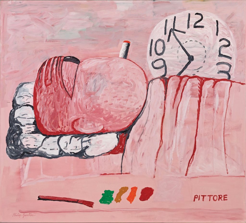
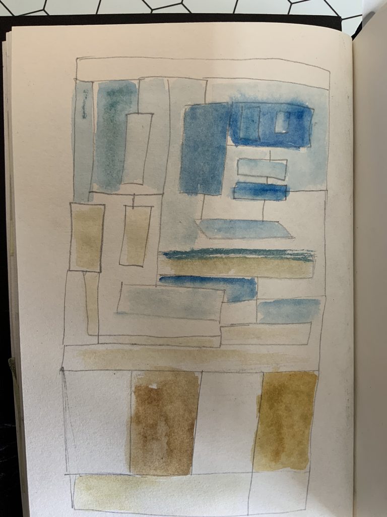
I kept thinking about how the surface could affect the colours and how I could bring this to a 3-dimensional colour chart as the exercise requires. I remembered a painting done by Hodgkin, In the Bay of Naples, and then thinking of Rothko – here paint is loaded with meaning, it is emotional and expressive about the experience and/or feelings, but not necessarily representative of reality, that is meaning I can immediately understand what the work is about. I can enjoy the colours, techniques of how the paint was applied to create form and mood. I enjoy looking at the expressive works by Frank Auerbach, Cy Twombly and Philip Guston.
I had a memory of work I saw on Instagram where the artist who works with walking, used her walks as colour palettes. It took me a while to find these images, which was posted around December 2020. I remember she used an app on her iPad which helped to change a photo image into different pixel squares.
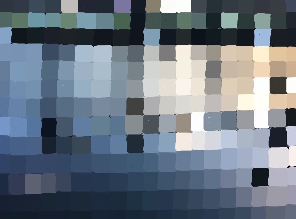
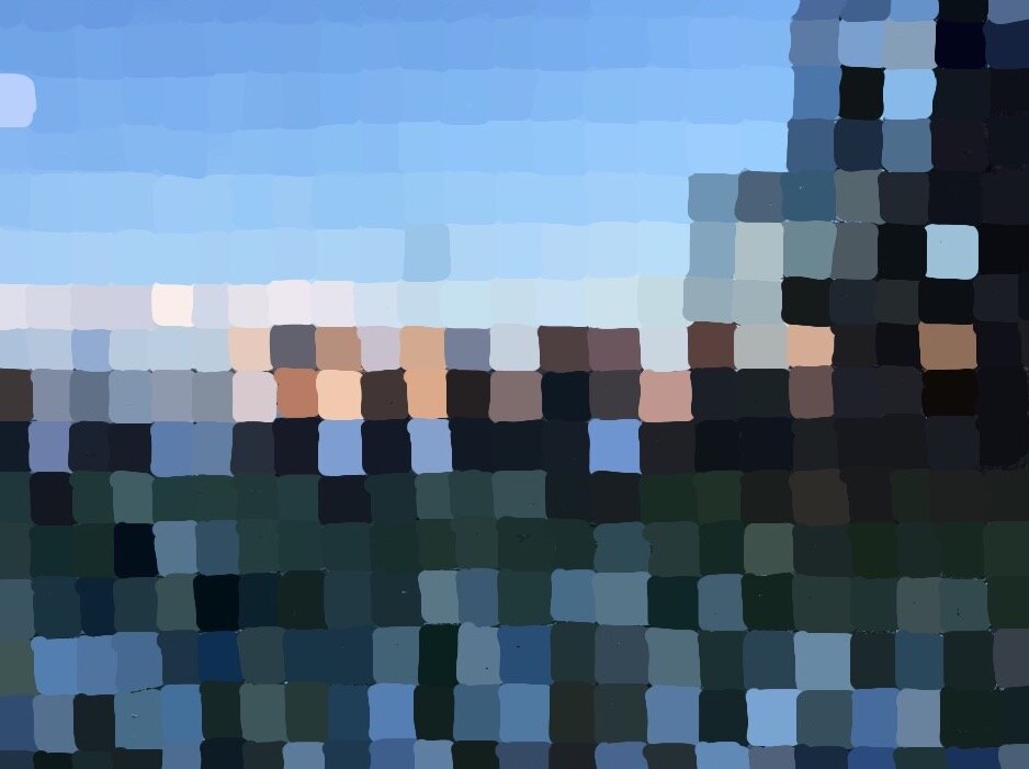
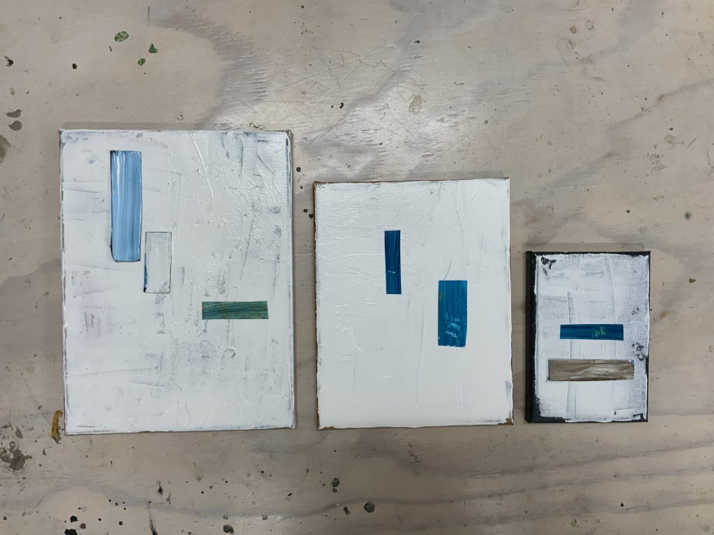
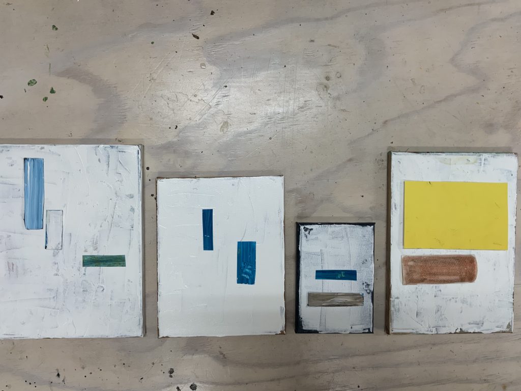
I tried her idea on my Ipad, and use the Procreate program to develop these images as pixels. The block was divided into 12×9 blocks: I then cut glass tiles to add up to the blocks and transferred this diagram onto velour paper. I want to create two works that can be seen as planes and then transfer them somehow to a 3-dimensional colour chart; I am inclined to think it should hang.
I worked with soft pastels to create as near as possible the same colours as on my photo pixellated image.
I can imagine hanging this at the place I stood where I took the photo (Swartriet, Jacobsbay, Western Cape, South Africa). It will not be possible, as I am back on the farm by now. I feel a bit reluctant about my explorations as my colours are square shapes and I see it as a grid. I need to ask myself how I arrived at squares instead of rectangles. Is it about order and how I get to a specific choice of form when working in an ordered manner? I should also think about space – how colour ‘sits’ in space – as rectangles and also become a landscape as the original space I looked at. In that way, I can see the seascape in rectangular forms – the sky, clouds, waves, sand, seaweed, lying in different directions as I viewed them. By now I am also thinking that I “get” Thomas Schutte – minimalist and constructivist art, as well as architecture, played such a big role in his art experience. I almost see these colour charts as a language of colour and art, where materials and shapes are also experienced by the viewer. I am thinking about upscaling in this case – or use of other materials, such as aluminium or copper plates.
Developing the idea to make a 3d colour chart in my sketchbook. I worked with watercolour and placed colour into drawn rectangular shapes.
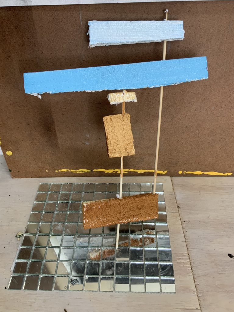
Translate a colour chart to a 3-dimensional colour chart: I used polystyrene which I paint to represent my colour chart and make the standing-like flags/signposts indicating their meaning, but not representative of place. Had I placed descriptive words on them they would be understood as a chart that indicates a seascape.
I was also looking at the work of Simon Carter – I like his landscapes, which to me are all about colour and shapes.
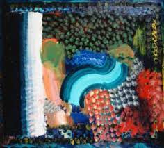
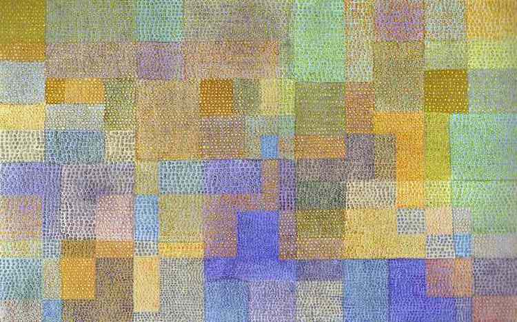
I do like the work below by Paul Klee – “He started every picture with an abstract mark—a square, a triangle, a circle, a line or a dot—and then allowed that motif to evolve or grow, almost like a living organism,” (My Modern Met.com, art historian Richard Dorment)
I can see how he became involved in mark-making or textures and using transparencies that overlaps in the different blocks – did it start as a colour or a block, but I can see how one colour goes on a walk in different tones, as a whole there are many shades of blue, green, blue and red which I think is why he called the work Polyphony. I studied music and the description of Polyphony by Robert Najlis as follow makes sense: “Polyphony describes the general class of music where two or more voices acting as independent lines of melody are acting at the same time. This differs from homophony in which there is one melody line and line of chordal harmonics.” (
In Mondrian’s work, I understand to look for his ideas as deeply rooted in philosophy and represented in this painting by the vertical and horizontal lines, showing how different individual parts can click together to form a larger whole. I am also thinking of how I have looked at the brush marks of V van Gogh – the made rectangular layers of colour. I recently painted sunflowers (the last from my garden) and looked at his, Twelve Sunflowers in a Vase, Arles, Aug 1888. Here the oil strokes on the vase as colour and form are made of rectangles in different tones and colours.
I also wanted to look at textures of found items in my studio:
- I had recently made the gold and black painting – an inspiration by work I saw done by Rashid Johnson. I love how Johnson places his black works in space.
- The drawing was made in a OCA practical workshop and I translated a 3d object into a drawing. It reminds me of vessels used in Africa as well as something found (imaginative) as an archaeological find, with a history of a culture.
- I combined my fabrics collected from my love for handmade fabric and prints.
- As a colour chart I would use gold, orange, black and a tinge of blue.
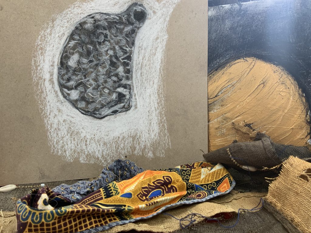
Looking at the work as it was composed, I wanted to change the background colour of the object drawn onto paper, see Fig. 25 below as the first part of the outcome and further investigation into this colour palette I could develop.
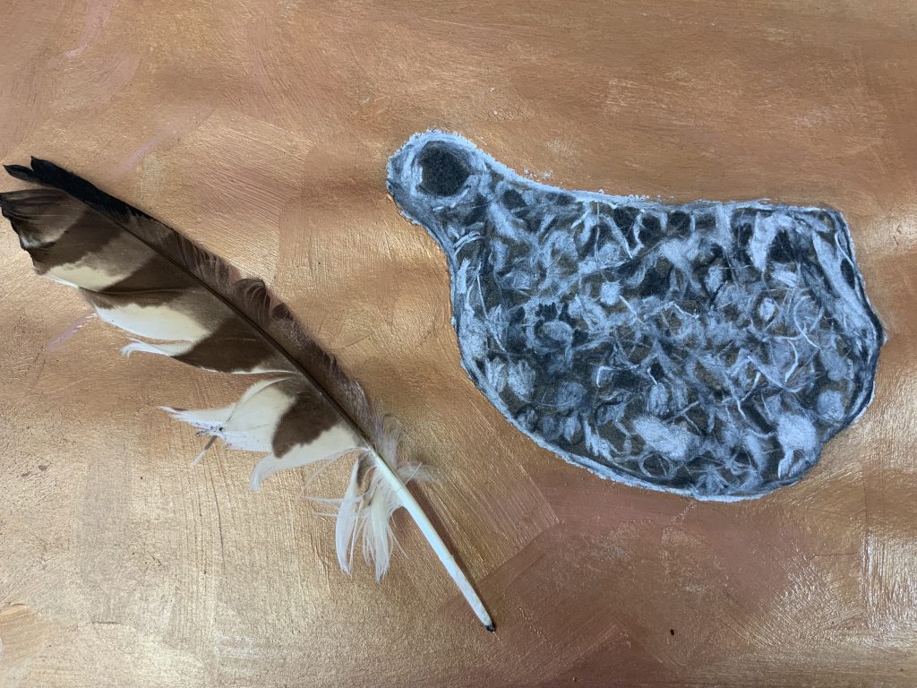
I will continue to develop this work as an assemblage of colours found around me – some carry memories others made me imagine another reality. I also like how the object is now placed in space onto the gold ground layer on the surface. It almost looks like a musical instrument – a type of whistle.
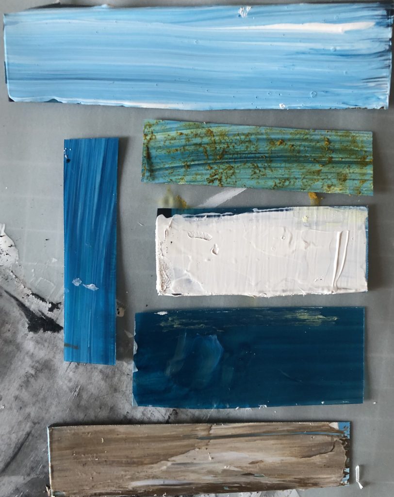
looking at surfaces to paint on and placing them flat on the floor. The colours are painted and found ones (yellow) I painted the colours onto plastic (cut outs from a plastic box container). I used acrylic medium to soften. The green chart was a ‘mistake’ – I dipped the brush into turmeric powder.
By now I feel the geographical location, namely the sea in this work, needed a cooler yellow-orange light. I do think the blues has a contrast and talks of the robust summer light reflected on the ocean.
LIST OF ILLUSTRATIONS
Fig.1 Schutte Thomas. (1978) Store [Wood and Varnish] At: https://www.bridgemanimages.com/fr/searchfilter_text=Thomas%20Schutte,%20Store,%201978&filter_group=all&filter_region=ZAF&sort=most_popular (Accessed on 8 January 2022)
Fig. 2 Stander, K. (2022) Sketchbook paintings [watercolour and ink pen] In possession of: the author: Langvlei, Riebeeck West.
Fig. 3 Stander, K. (2022) Sketchbook painting [watercolour] In possession of: the author: Langvlei, Riebeeck West.
Fig. 4 Stander, K. (2022) Beach landscape in progress [oil paint on canvas paper] In possession of: the author: Langvlei, Riebeeck West.
Fig. 5 Stander, K. (2022) Colour studies [Aquarelle pencils on paper] In possession of: the author: Langvlei, Riebeeck West.
Fig. 6 Stander, K. (2022) Colour chart [Aquarelle on graphic paper] In possession of: the author: Langvlei, Riebeeck West.
Fig. 7 to Fig. 10 Stander, K. (2022) Colour chart exploration on paper [watercolour, pastels, acrylic ink] In possession of: the author: Langvlei, Riebeeck West.
Fig. 11 Stander, K. (2022) Colour chart exploration [Dura film and acrylic medium] In possession of: the author: Langvlei, Riebeeck West.
Fig. 12 Hodgkin, H. (1980-82 ) In the Bay of Naples. New York College Park Corporation [oil on wood ] At: https://howard-hodgkin.com/artwork/in-the-bay-of-naples ( Accessed on 15 January 2022)
Fig. 13 Twombly, Cy. (19) Sunset at Gaeta [Instagram screenshot of photograph] At: https://www.instagram.com/p/CJ5t6tMnoQS/?hl=en (Accessed on 14 January 2022)
Fig. 14 Guston P. (1973) Pittore [Photograph] At: https://www.vip-hauserwirth.com/gallery-exhibitions/philip-guston-1969-1979/ (Accessed on 13 January 2022)
Fig. 15 and Fig 16 Instagram post by Churchill A. (2020) [Instagram screenshots] Accessed on 22 January 2022)
Fig. 17 Stander, K. (2022) Beach at Jacobsbay [Photograph, landscape] In possession of: the author: Langvlei, Riebeeck West.
Fig. 18 Stander, K. (2022) Procreate image of pixels [Photograph] In possession of: the author: Langvlei, Riebeeck West.
Fig. 19 Stander, K. (2022) Colour grid [Pastel drawing] In possession of: the author: Langvlei, Riebeeck West.
Fig. 20 Stander, K (2022) Colour chart exploration [watercolour, acrylic inks and velour paper] In possession of: the author: Langvlei, Riebeeck West.
Fig. 21 Stander, K (2022) Sketch for 3d model in sketchbook [watercolour and ink on paper] In possession of: the author: Langvlei, Riebeeck West.
Fig. 22 Stander, K. (2022) Beachview in 3d model [polistyrene, acrylic ink and bamboo sticks] In possesion of: the author: Langvlei, Riebeeck West.
Fig. 23 Klee, P. (1932) Polpyphony [photograph] At: https://mymodernmet.com/paul-klee-art-and-music/ (Accessed on 22 January 2022)
Fig. 24 Stander, K. (2022) Combine of found objects with a colour palette I like [paint, drawing, fabric, feather] In possesion of: the author: Langvlei, Riebeeck West.
Fig. 25 Stander, K. (2022) Object on gold painting [Acrylic metal paint and charcoal on paper] In possession of: the author: Langvlei, Riebeeck West.
Fig. 26 Stander, K. (2022) Considering 3d rectangular planes of colour in space [plastic, wood, paint] In possesion of: the author: Langvlei, Riebeeck West.
Fig. 27 Stander, K. (2022) Memories of colour at Jacobsbay [Acrylic on wood panel, paper and plastic] In possession of: the author: Langvlei, Riebeeck West.
Fig. 28 Facebook post by Landwater (2022) [Iphone screenshot] At: https://www.facebook.com/LandWaterSA/photos/a1437526273006655/48285505705858/?type=3 (Accessed on 02/02/2022)
BIBLIOGRAPHY
Frieze.com (2005) Heroes and Villains Issue 89 [online article] At: https://www.frieze.com/article/heroes-and-villains (Accessed on 12 January 2022)
Lange-Berndts P. (2015) Introduction, How to be complicit with materials from Materiality, In: Documents of Contemporary Art, London: Whitechapel Galler and The MIT Press: p 18-19.
Mattheus-Berr, R (2010) The Senses and Society Textiles in Art and the Social Fabric, Vol 5, Issue 2 (pp 285-291)Downloaded article from Researchgate.net. (Accessed on 8 February 2022)
VOLUME 5, ISSUE 2
PP 285–291
Sillman, Amy. (2014) Colour as Material Seminars with artist series [Video] At: https://youtu.be/Stk38nsVyos (Accessed on 22 January 2022)
REFLECTION
I have to read George Szirties ‘Colours” from a link on the course resource. This was published in his book, Bad Machine, 2013.
I understand Szirties is a poet. The poem reads in two different ways. In the first part, I read words and find some known as descriptive and others invented language (about colours), I relate this part to colours, in terms of the project work I have just done, and ask myself, how would Burleywood, Chartreuse, Gainsboro, Honeydew, as a colour look. After a short google search I see colour charts of a few of these words and wonder how can use this in the work if I would consider developing some of the work. In the second part of this poem, he is more descriptive with the words and then words are described as things I can relate to: ‘had these been voices, the first line – I can imagine a cold wind being Ghostwhite, and thunder and lightning as the beating of a red drum On the artist’s blog I read the following about this poem, dated 2/12/2010: There are two linked sonnets. The first, unrhymed, consists of nothing but real or personally invented, names of colours. The second, half-rhymed, reflects on the catalogue. (https://georgeszirtes.blogspot.com/2010/12/colours-new-poem-on-front.html) I am not sure to which catalogue Sxirties is referring to, as I have come under the impression that the colour names came from different catalogues.
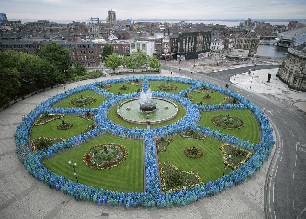
Thinking about the colours of the seascape at Jacobsbay during our holiday time at the beach I can create names for those colours. Whilst living in Dubai I understood that blue is representative of nature, namely the water and the sky. I am also thinking of the many colours of the blue I see in the ocean and the sky, but in the English language the word blue has to cover all these shades. I have to ‘invent’/mix my blue colours to get as close possible, just as one uses language to describe blues we have not named. I have always had this wonderful feeling of joy when hearing the French describing their blue hour:” L’heure Bleue ” – in our home we made our own language for that description, with has more to do with the feeling/experience, than a description of colour – we call it Holy time (heilige tyd in Afrikaans) In my mind I think of Picassos ‘Blue Period’ and Yves Klein, the French artist who had a Klein blue paint named and developed by him. On the internet, I found an interesting series of work done by a New York photographer, Spencer Tunick, Sea of Hull. He used 300 naked locals in the town of Hull (England) to be painted in four shades of blue.
Below is my list of invented words for my 3d work of a seascape:
Clouds – Pillows
Sun -Westcoast yellow
Sunset – Westcoast Cocktail (I do like the colour Burleywood, a pale orange, due to it having 87%red, 72%green and 53% blue)
Sky – Blue Hour
Sea – Foam bath
Beach sand – Holiday tan
Seaweeds – Sea Compost
Thinking about my paint colours, there are definitely names that I had no understanding of why it has that name (Origen): Indian Yellow, (Indian cows eating mango leaves and the urine is dried as pigment) the blueish colour, Viridian Hue, ( Italian viridis=green) Alizarin Crimson, Crimson Lake, VanDyke Brown, Prussian Blue, Raw Sienna, Sienna Yellow, Ochre Yellow…….
Then I looked at colour charts of a local paint company
Looking at why these names have been created by the manufacturers:
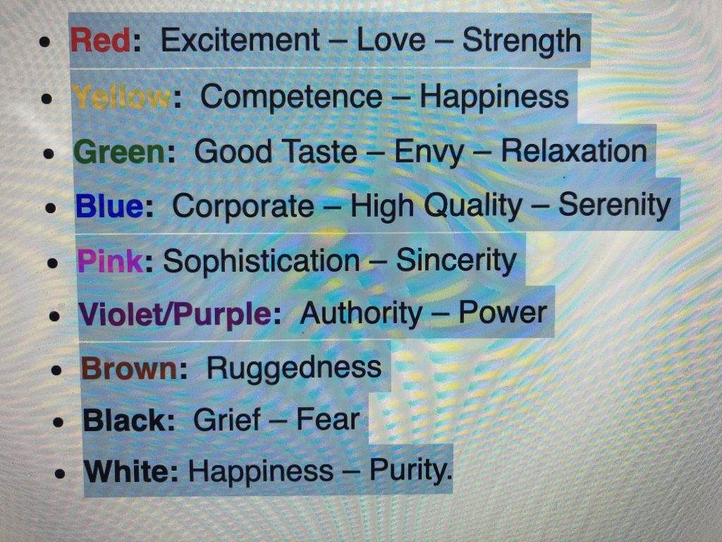
Below is a list of emotions linked to colours:
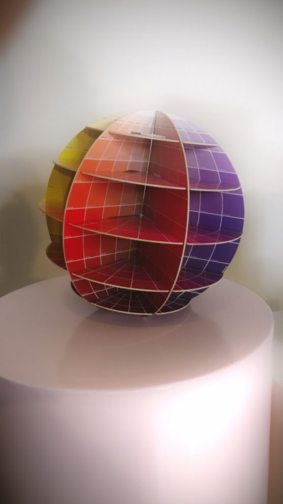
Then I found this incredible 3d tool for learning about colour theory
List of Illustrations
Turnick, Spencer, (2017) Sea of Hull [photograph] Viewed online on BBC.com. Original work belongs to Ferens Art Gallery
Bibliography
Szirtes, G., 2014. Bad Machine. Tarset, Northumberland: Bloodaxe Books, p.10.