REFLECTIVE ACCOUNT DEVELOPING THIS ASSIGNMENT
Looking at the ideas I have explored I wanted to consider my relationship with materials and colour. During the work on Project 5, I came to the idea of making a series of works, as paintings. Recently I have painted a still life and did lots of little works as well as bigger drawings for my Fungi project as part of the Parallel project. I have enjoyed the reconstruction of the canvas and thinking of paint as a sculptural medium – my ideas around charcoal drawing was also experienced as the way I look at forms and shape and how in the making process I like to move around my work. The holiday and week ends spent and the coast during the last weeks of December and during January has opened ideas on how I view my landscape and how materials I use can influence my making.
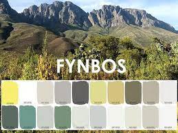
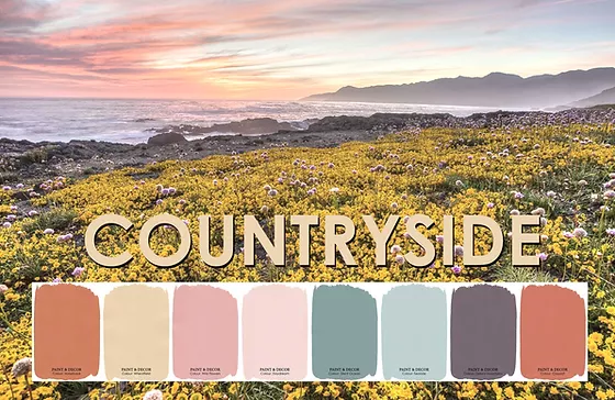
I looked at colour swatches of a local paint manufacturer and add two of the charts which I really like. The Fynbos range in Fig.1 is named after indigenous plants of the Cape Floral Region and names are such as Protea Leaf Renosterbos, Kooigoed, Wild Rosemary – I can absolutely engage with those names for the colours. In the Countryside charts, Fig. 2 names are, Seaside, Claypot, Silent Ocean, Daydream. These colours remind me of my landscape where I feel comfortable, live my daily life and get inspiration.
It is about textures
I can relate to both scenes in a physical way – so part of my landscape. I think I see colour and texture and even smells as being both important in the way my own ‘seeing’ is involved. Names of paint relate to a description that not only focus on colour – here is the whole package – plants, textures, colour, memories, biology….etc. I have learnt something about the way I look at colours around me – I felt textures was coming to the front in the way I perceive colour. It is like faded denim (soft and full of memories over time), a velvety green couch, a rugged brown carpet.
I remember a workshop I attended and how regional light was discussed – the artist showed the work of the Spanish artist, Sorolla, and discussed how the light is not so dominant in the Mediterranean as it is here in Southern Africa. Later when I find an artist who works with mesh I can almost see this as a landscape of soft coloured mesh floating around. Early days at the seaside this summer gave me that same soft feeling expressed in the light and colour. Sitting writing these notes, it is hot and the sun is very bright – intense colours of the sky and bare grainfields, and the mountain is experienced.
Obviously, I will work mostly with memory and photographic images, but I want to keep in mind that it is an exploration of colour. I am also aware that as an artist, when I want to paint a scene I want to ‘help’ my viewers to see differences in light – like direct sunlight and when dusk appears – so I need to consider illumination. Here I know it would be easy to learn from Monet.
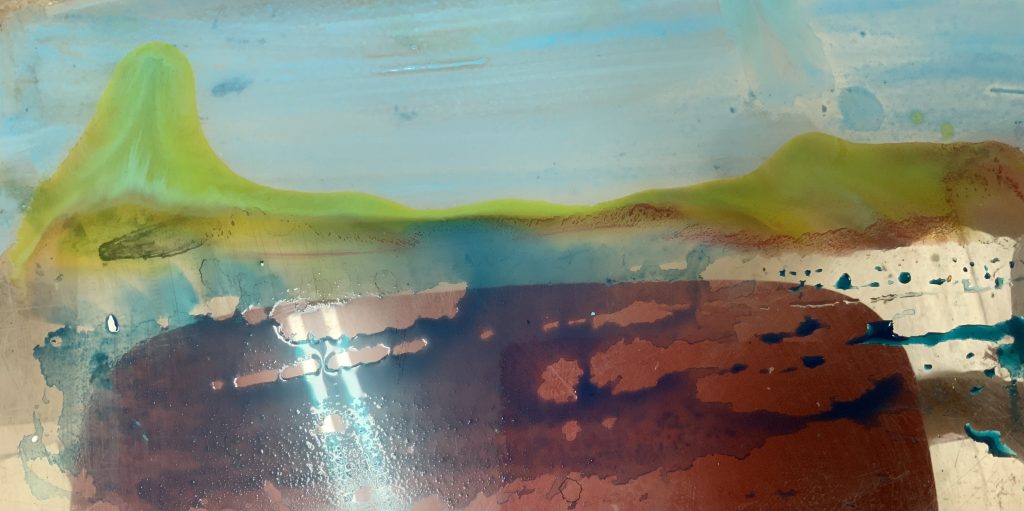
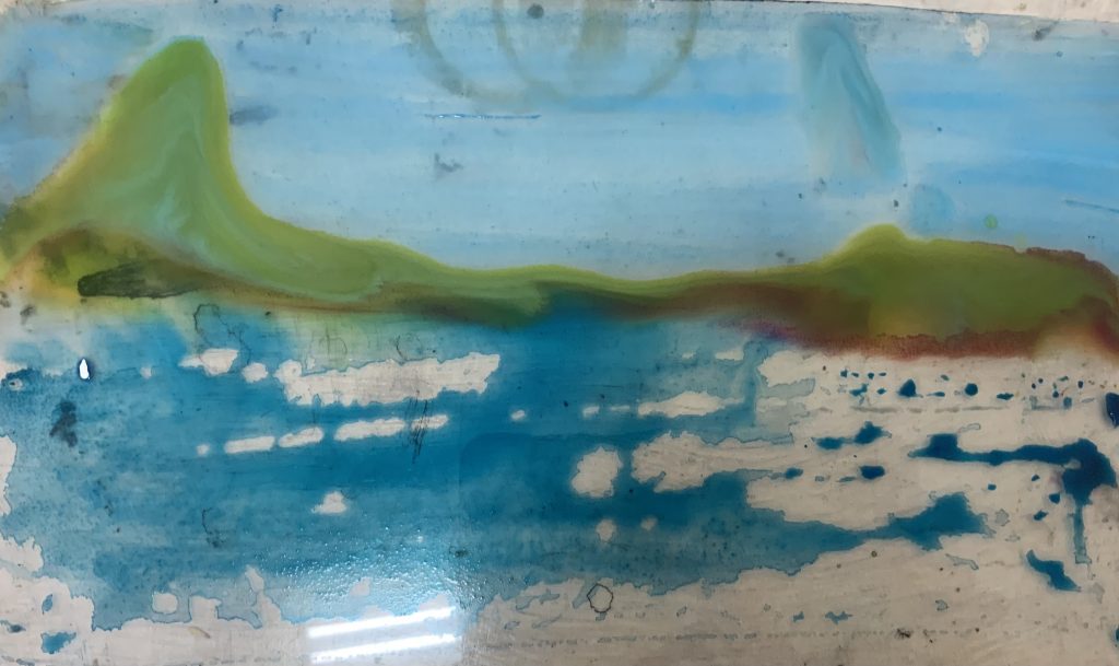
I will make colour samples of what I want to use in the work, then mix and see where this relationship take me in terms of my approach. I want to consider, texture and also be open to how the making will develop in this exploration. I start with the work on the seascape and place ink onto a piece of Plexi board I use as a palette board. l looked at ink and acrylic medium. I like the movement of the paint, almost as a movement of colour, changing over time. I could not control, due to working wet in wet, that the blues mixed with the yellow/orange and starting to change into the green.
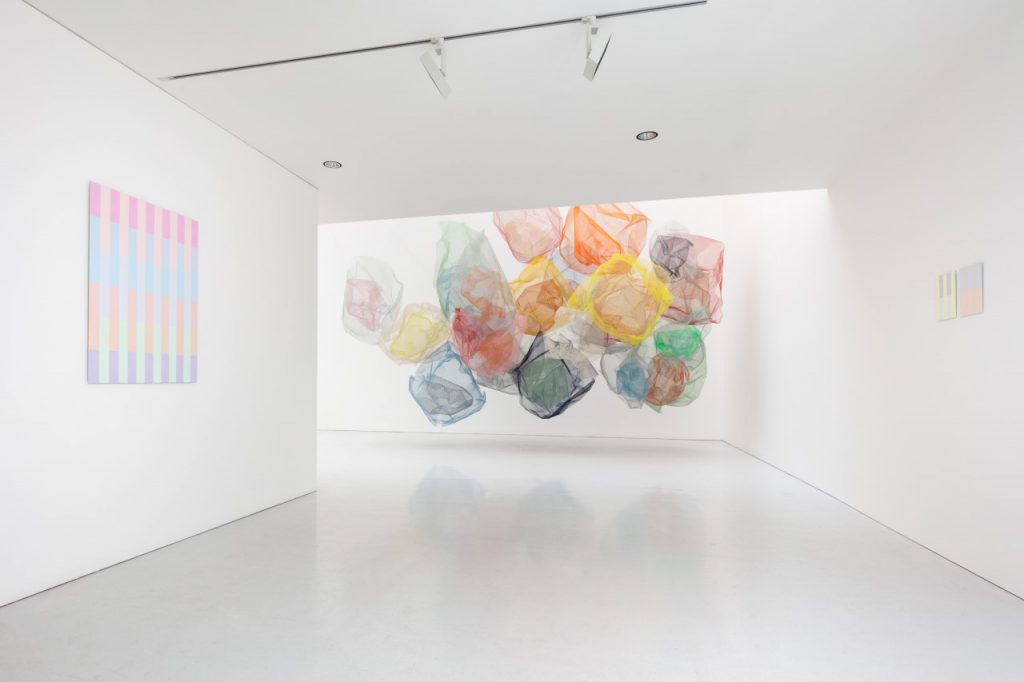
I was very interested in work by an artist I saw on social media and then did some research about her practice and found more images of her work. In the below work, the artist, Rana Begum, catches dappled light when she uses colour on a powder-coated mesh. I see her work as colour with a sensory experience – I can just imagine walking around this work – in a way the colours of the objects will feel as if it flows into each other – surely one can see through them, light inside the gallery will play a big role in how the colours are received by the viewer.
Light becomes of more interest whilst I am developing these ideas as making: I have plenty of Velum paper and decide to explore. I am aware that I can create something that could be changing with the way light is changing during the day. I will stick with my memory of seaside colours and work mostly with acrylic inks and acrylic paint. Part of enjoying seascape view is sitting and enjoying the colours moving or changing – moments which is just so beautiful and too difficult to capture as colour and mood, but always temporary and changing.
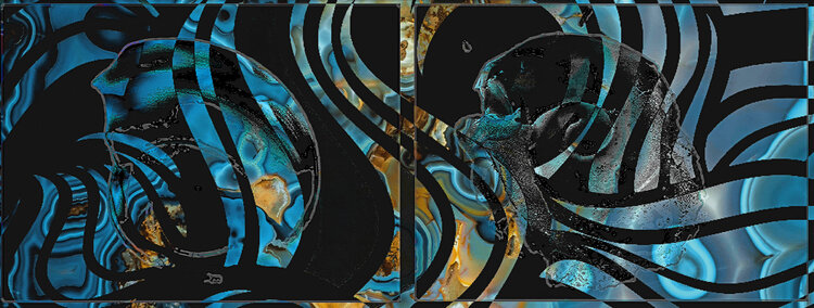
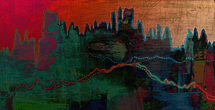
Whilst reading about colour charts I came upon websites where graphs, charts, numbers and words are reflecting how digital paintings is changing the way we see the visual world. The reason why I show these images is awareness of how colour is used together with charts in the digital world to create visual images.
I developed a palette, influenced by the orange colour I found in the poem, Colours, by George Szirties: burlywood. My interpretation is a mixture to get to an orange by mixing Red, Blue and Yellow (acrylics) I like this colour as part of the transition to evening, when the yellow light of the sun, reflects on the blue see – a time of the day when I enjoy these periods of colour transitions. I hoped to find more of the plastic bags I used in the image as material to create texture, as I remind myself of the work done by the artist, Rana Begum.
MAKING of ASSIGNMENT FOUR:
I can still tone down my Burlywood colour to a softer orange – getting closer to the yellow side of orange. Here I think it will be easy to do with my watercolour paints, but I can also imagine working on a copper plate with this colour against the white and blue/greens of the ocean.
Working with scrapers and texture I decided to paint the colours of the seascape at sunset. This is a crude painting, but potential develops in using the tools and working more abstract with colour in mind.
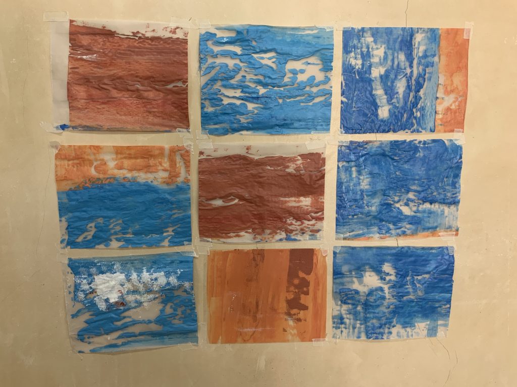
I now start to work on a series of colour plates painted onto Velum and staying with one size. Here I used blue and my Burleywood colour. I painted the colours onto a flat piece of Velum, first with a layer of acrylic medium, for some texture and then I used a big scraper (window cleaner) to apply the paint. I cut these charts out after it was dry.
Whilst making I read about the work of Carl Andre and looked at his use of a wide range of materials and placing them in space – and the idea of displaying matter in a place. I am thinking about colour in this way – does not have to transform it into something…it can be something as is. I feel one encounters materials in this way – as well as a process of making. Reading a bit around how we perceive colour I found the following and think it can hold up to my idea of colour as matter: “Advancements in neurobiology showed us that our perception is a multifaceted kaleidoscope that creates colour out of nothing. Colour isn’t divine but fabricated.” Interesting to me is that I worked with two primary colours in this assignment.
By now I am not using the acrylic medium as a ground d layer and using the scraper more to move the colour into the support. I try to be cognitive of the colours of the beach – blues and yellow and orange stays the palette – scraping is revealing how the paint flows with the tool – I have little control over how these colours connects with the Velour paper. I feel I am exploring the materials, reacting to their conditions.
List of Illustrations
Fig. 1 and Fig. 2 Paint & Decor [Advertisement] At: https://www.paintdecordiy.com/countryside-colour-collection (Accessed 01/02/2022)
Fig. 3 Stander, K. (2022) Painting on Plexiglass sheet [painting, landscape] In possession of: the author: Langvlei, Riebeeck West.
Fig. 4 Stander, K. (2022) Painting on Plexiglass sheet [painting, landscape] In possession of: the author: Langvlei, Riebeeck West.
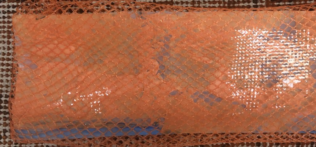
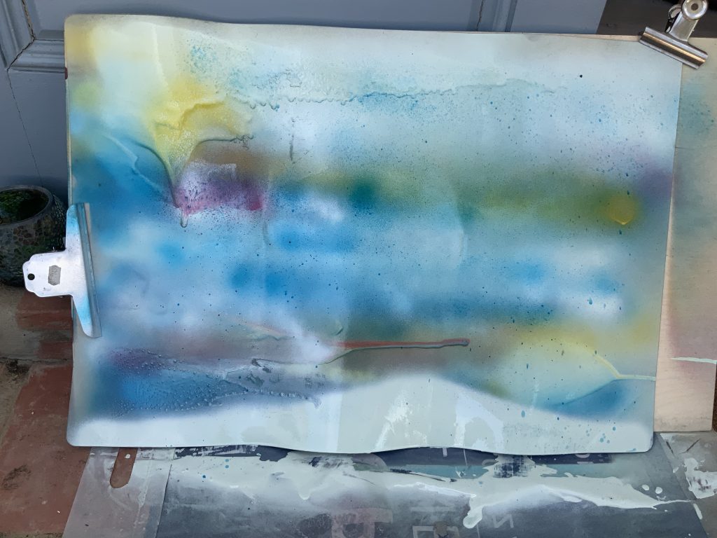
Fig. 5. Stander, K. (2022). Sea Spray [spray painting on plastic mat ] In possession of: the author: Langvlei, Riebeeck West
Fig. 6 Begum, Rana (2020) Installation view at Kate MacGarry, London [paint on powder-coated mesh sculpture] At: https://artuk.org/discover/stories/rana-begum-sensory-and-hopeful-forms (Accessed on 28/01/2022)
Fig. 7 and Fig. 8 Data to Art [Photographs] At: https://www.data-to-art.com/ (Accessed on 03/02/2022)
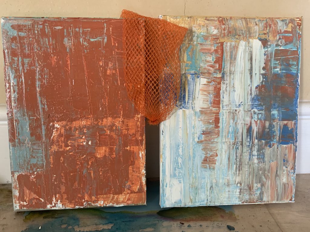
Fig 9 Stander, Karen. (2022) Image of work in progress [Paint and mixed media] In possession of:the author: Langvlei, Riebeeck West.
Fig. 10 Stander, Karen. (2022) Image of work in progress [Paint on canvas] In possession of: the author: Langvlei, Riebeeck West.
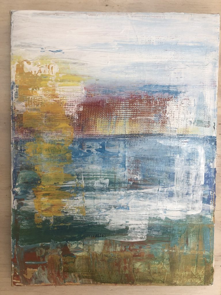
Fig. 11 Stander, Karen. (2022) Seascape Jacobsbay [Paint on canvas] In possession of: the author: Langvlei, Riebeeck West.
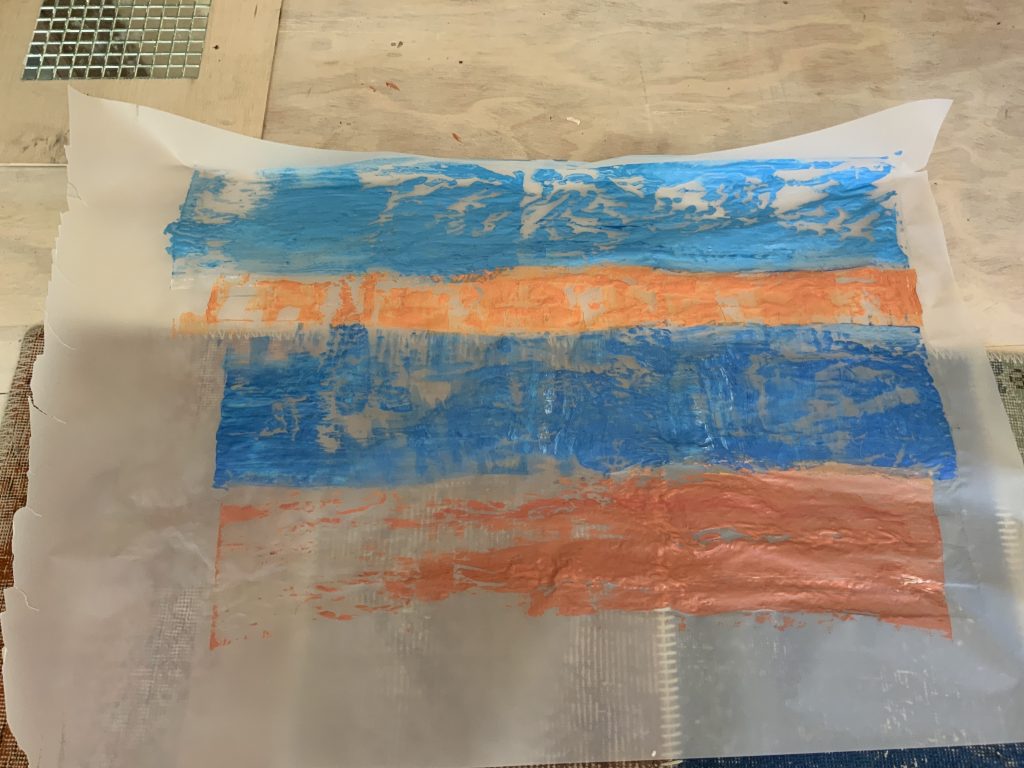
Fig. 12 Stander, Karen. (2022) Work in progress [Paint of Velum sheet] In possession of: the author: Langvlei, Riebeeck West..
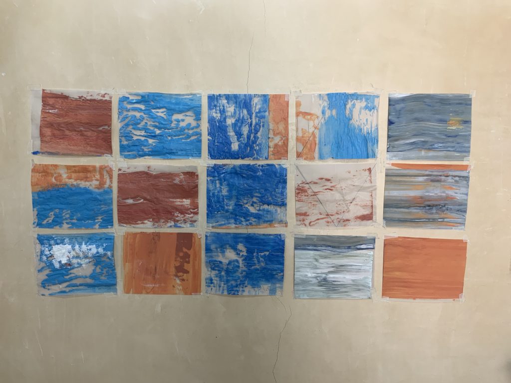
Fig. 13 Stander, Karen. (2022) Work in progress as charts on wall [Paint on Velum sheets] In possession of: the author: Langvlei, Riebeeck West.
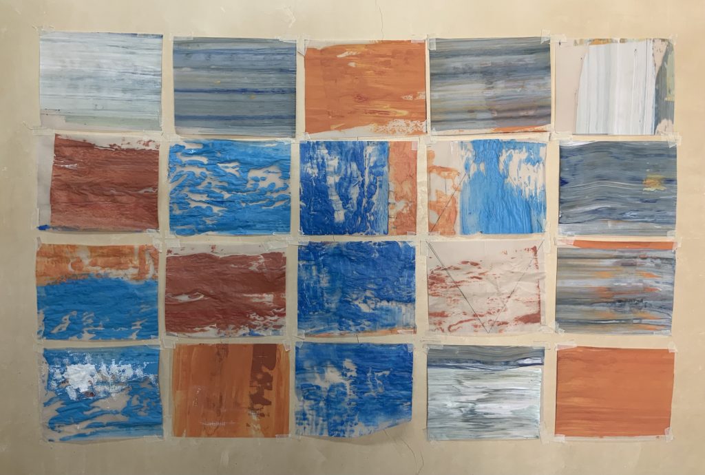
Fig. 14 Stander, Karen. (2022) Work in progress as charts on wall [Paint on Velum sheets] In possession of: the author: Langvlei, Riebeeck West.
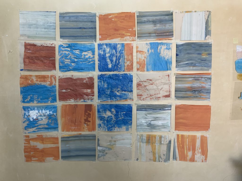
Fig. 15 Stander, Karen. (2022) Work in progress as charts on wall [Paint on Velum sheets] In possession of: the author: Langvlei, Riebeeck West.
Fig. 16 Stander, Karen. (2022) Beach@Jacobsbay [Series of 25 paintings on Velum sheet, acrylic paint] in possession of: the author: Langvlei, Riebeeck West.
Bibliography
Ashby, Chloe, (2021) Rana Begum: sensory and hopeful forms [Downlaod] At:https://artuk.org/discover/stories/rana-begum-sensory-and-hopeful-forms (Accessed on 29/02/2022)
Szirties, George (2013) Bad Machine. Tarset, Northumberland: Bloodaxe Books, p.10.
Considering Assessment criteria
Demonstration of technical and visual skills:
I worked and experimented with materials and techniques that I would not have used to make a painting of a seaside scene. I worked around colour observation and tried to display them as a visual language of colour. I felt it stretched my normal considerations, but also made me consider the influence of light and the understanding of contrast, hue or saturation of colours.
Quality of Outcome:
Looking at these charts, I feel there is mark-making and colour residue that reminds me of mechanical interventions or wavelengths as we ‘see’ colour. The works are tactile in terms of texture. It can be placed on lightboxes and illumination can be further explored. These colour charts interact with the ones around them, and one can play with the display/outlay, or if framed/installed on different background colours.
Demonstration of Creativity:
The outlay of a series of colour charts was asking me as well as the viewer to delve into one’s idea of landscape and materialism. Working with scrapers and texture was a new experience that I will continue to use in my making. I could have considered making more charts – could say that the colours are not sufficient in terms of the original palette of the seascape. These charts could work well if done on board or canvas and hung properly on a wall.
Context:
This part of the course took me to different parts of paintings in terms of surface, using alternative painting media and questioning my relationship with colour and materials. I think the research of work of other artists also opened new thoughts around how to interact with materials. By the time I finished the work I thought if I had juxtaposed it with charts with only white (no colour) it could have shown a deeper conversation with colour as material.
REFLECTIVE ACCOUNT (REVISED on 8 February 2021)
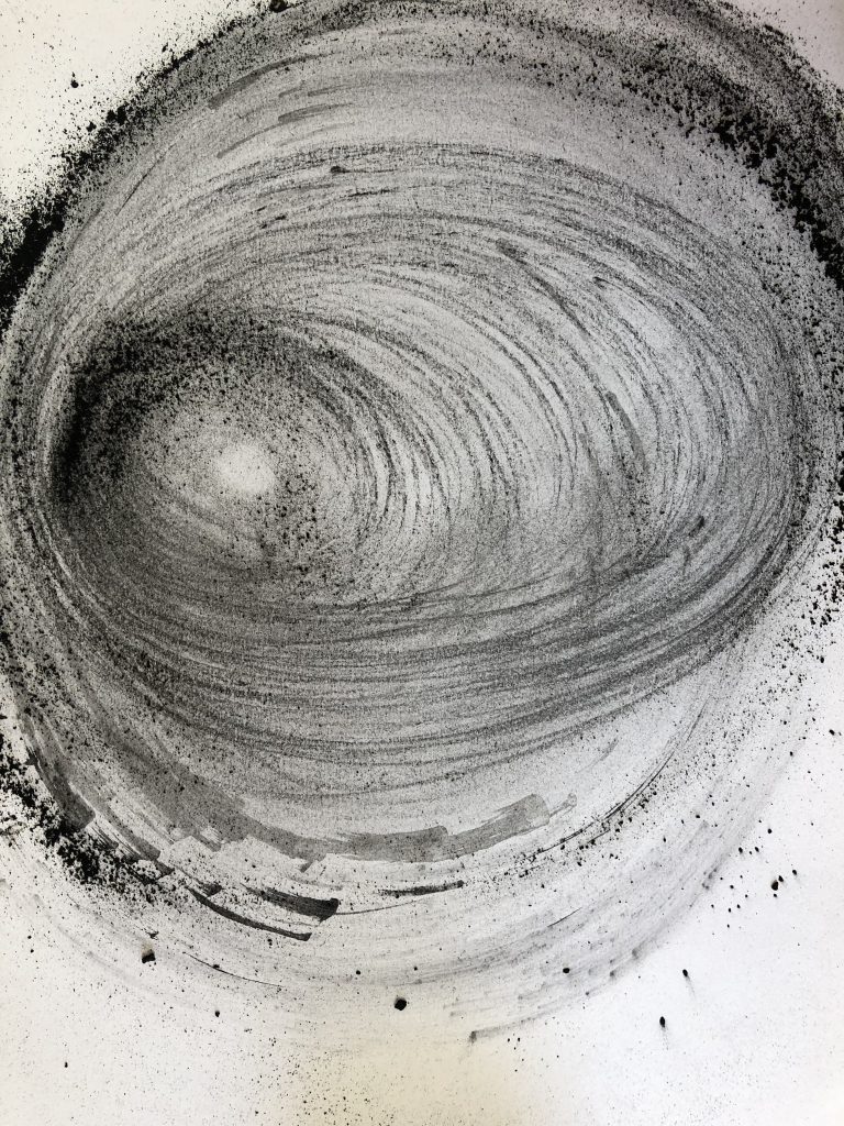
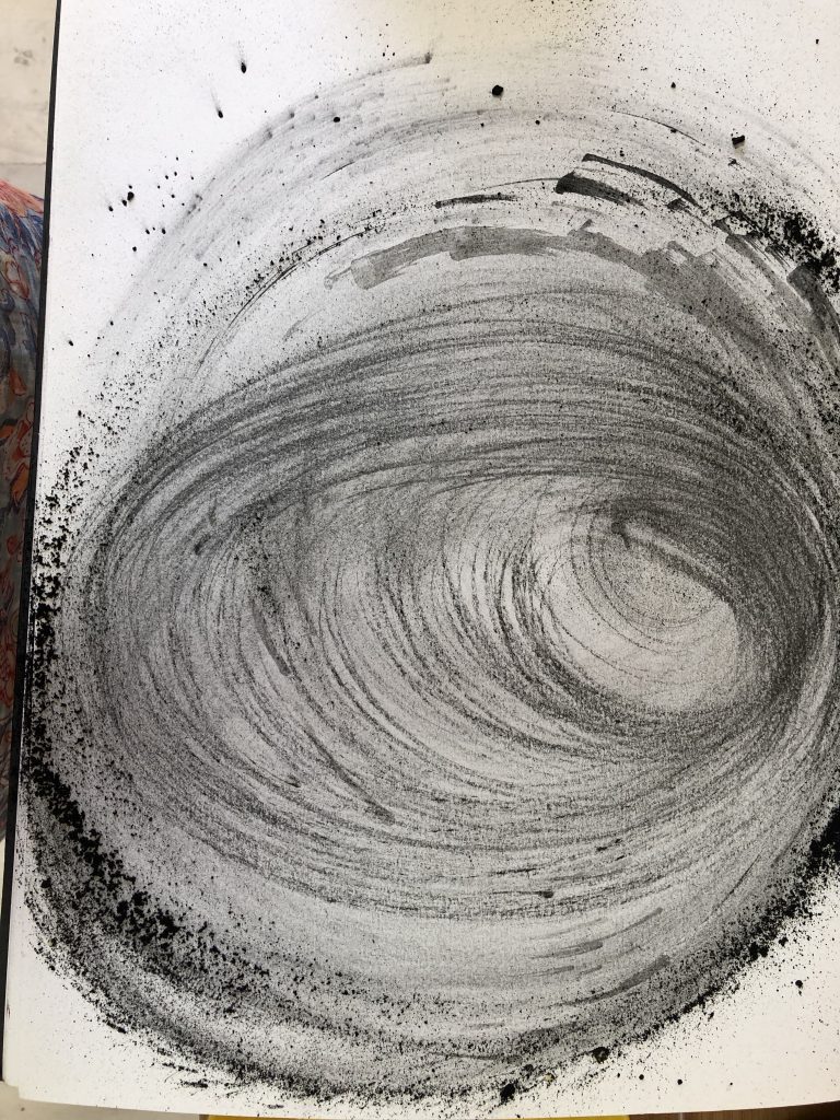
Having finished the above wall paintings I was not really satisfied with my final work as an assignment. I wanted to attempt my hand at spray paint. I bought red, blue, yellow, black and white….all that I could find in our local town. I used an old plastic non-slip surface as a canvas to explore another way of using colour as shapes or lines in a landscape. The surface allowed the paint to move and flow and I do like the outcome – I can imagine more work on this type of surface. I did find it difficult to ‘dilute’ the colours tonally as they are very bright. I could do with more hands to work at the same time. I enjoyed the freedom in the process of making this work and feel it connects with the ideas of looking at colour and materials and my relationship which is clearly growing or even shifted? As an experiment to the colour of the sun and the light that it caused to reach my eyes and experience the landscape, I started making drawings in charcoal and thinking of them as to how light disperses. I think about the meaning of these colours to me – a representation of things I became aware of, but also feel that touch on the nostalgia and temporality of moments. I still ponder with ideas around if colour speaks more to my senses than to my mind. Considering when I draw with charcoal, am I then more ‘in my mind’? I reflect on the three years living in Dubai – somehow I had a sense that colour, form and line became the dominant visual ideas of art, almost as if the physical and sensuality that could not be expressed in the figure was translated into the colourful abstract works of repetitive patterns or schemas. I read later that Aristotle called colour a drug – pharmakon. I can consider looking into this in my fungi work – thinking of psychedelic mushrooms.
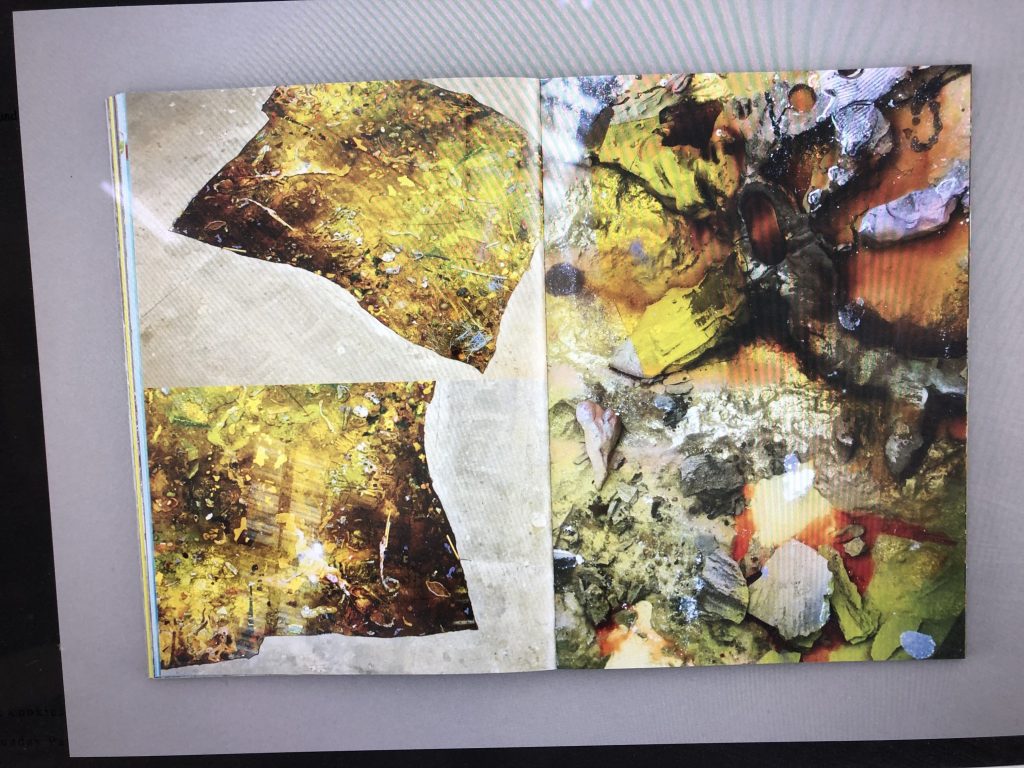
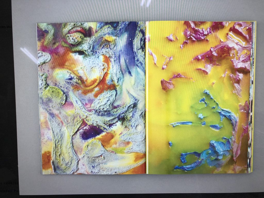
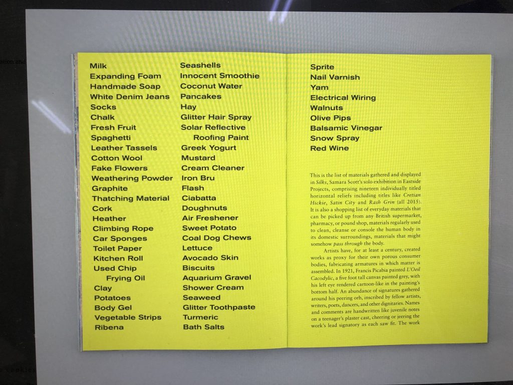
I found the work of an artist who inspired me to rethink what I tried to accomplish. Samara Scott is an artist who I think looks to how we see consumables in the world that is overflowing with visual stimuli and hyperreality. I think that colour is one of those ‘attention-grabbing’ phenomena and she uses this in a very productive way – it becomes tactile and I see materiality is investigated and may be exposed: does it also talk to me in terms of how easily superficial becomes part of everyday life? I looked at materials she uses, painted silicone, tin-foil, felt, make-up and how she almost create theatrical environments. I do like her use of colour and installation choreography. When I did some research on her work practice I found a book that she has published and read the following on the Amazon website: This book documents the production, installation and decomposition of English artist Samara Scott’s (born 1984) solo exhibition Silks, at Eastside Projects in Birmingham in 2015. Scott’s sculptural interventions in the space’s concrete floor used perishable materials to create colourful abstractions. I realize her work joins very well with my research and work done in project 4 of this course. She adds a list of materials she “gathered and displayed ‘ in her book. I add a few screenshots I took from the book here:
I was inspired to look in my studio and I found the dead sunflowers is used earlier this year to do some paintings and drawings with – mainly as a memory of my first sunflowers growing here on the farm. I stuck one onto the door window as an idea of looking at my landscape. I then thought about the idea that yellow is a bright colour, carrying memories and sensations of being warm, alive, bright… How to translate this to my own search for colour and visual stimulation? I pulled the yellow spray can closer and created a spray booth on the floor:
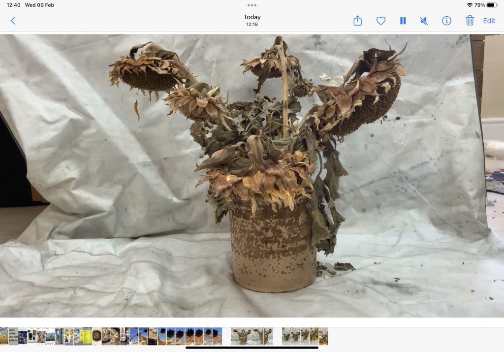
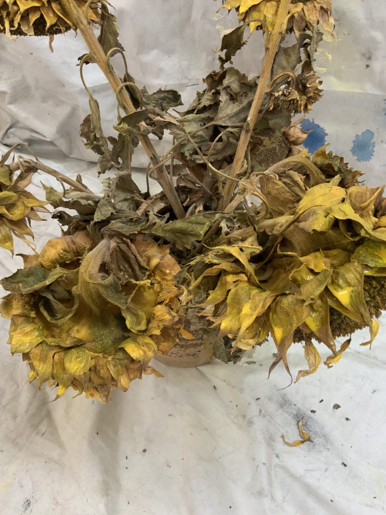
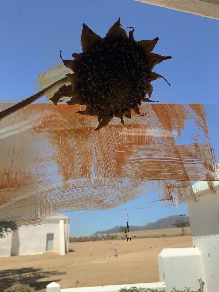
I made a video of the transformation of the sunflowers. My experience of this work confronted me with my own dilemma when it comes to expectations around assignments. I find that the pressure to present something fresh, makes me question my creative ideas up to that stage – I arrive at a place of insecurity. I thought about why the work of Samara Scott touched me and made me reconsider drastically, and came to the conclusion that deep in my ideas about making art, there is this belief that I am learning from others and building on that. I doubt fresh ideas coming from myself. Can I really be original – is it important, is it possible? I thought about feeling almost artificial in my making – I looked at a dead sunflower I stuck with masking tape to my window and thought here is what is going on in my head! I am trying to work out a memory of colour, I am not showing realism – this dead flower is real, the colour has gone. My effort to make is a metaphor for taking the spray can and colouring the flowers.
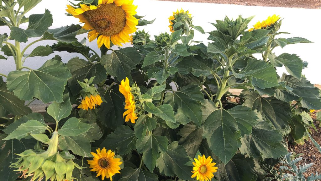
My memory was captured in a photo I took in Spring last year – time has passed and they died and I recently removed it from the flowerbed. I know they will grow again in the next season. I consider if this work could be combined with text – and would like to consider this question in the next part of the course.