Exercise 1.2 On perspective
Using gouache and/or household emulsion, paint flat colours onto pieces of paper mirroring the colours you see on the table. Paint a base paper the colour of the tabletop. Make a series of colour studies, with these papers, which explore shape and the spatial relationships that exist between the table and its inhabitants. You do not need to work from the whole table; you may want to explore some of the sections and details you explored in Exercise 1.1k
The first thought that came to mind when reading the notes on perspective in my study guide, was the verb, to experience. I am more aware of embodiment in my making and think of Kant who contemplated how experience can be possible. I want to consider the ways my body informs me, in abstract ways, in my art-making. (refer to Parallel Project considerations)
Looking at what I am asked to do, I am more aware of what visual message(cue?) I read or get from an object, like depth, distance, space.
METHOD
Looking at colour studies
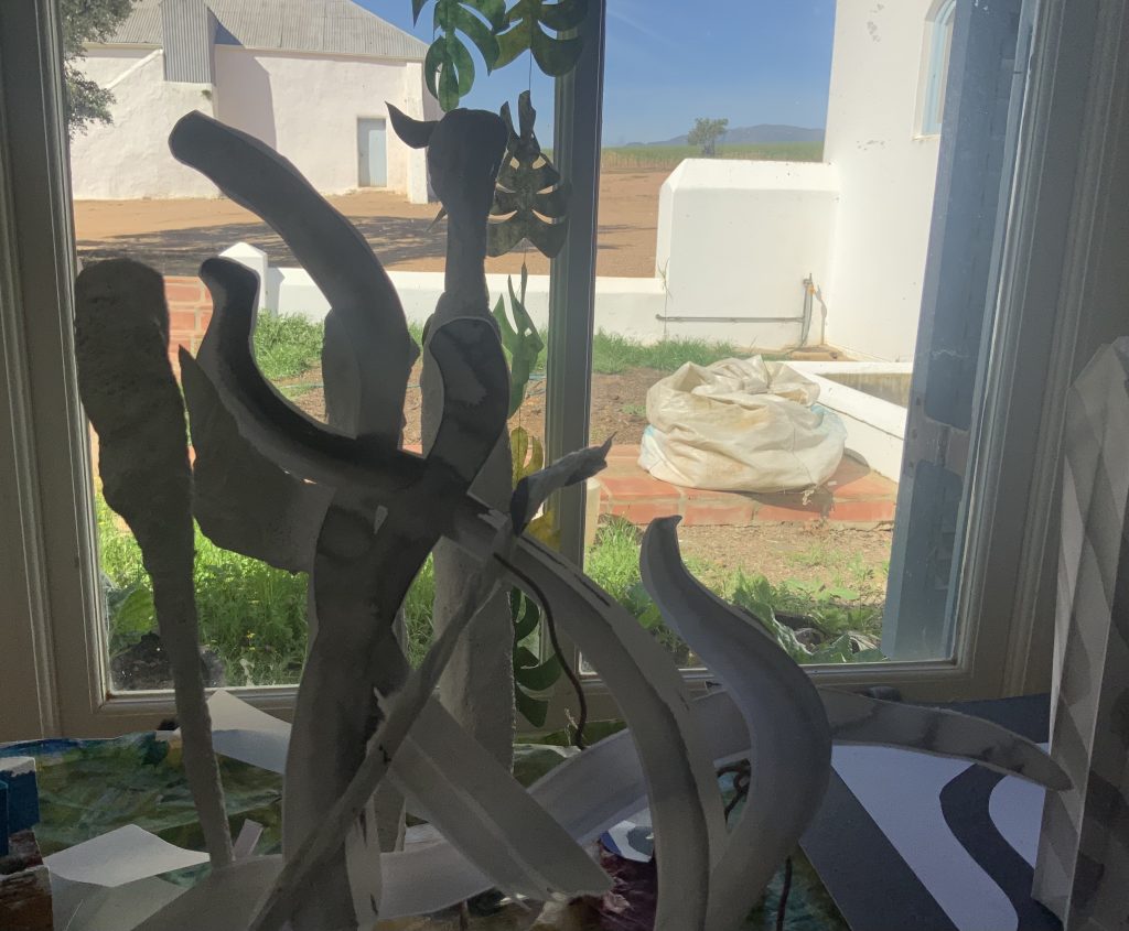
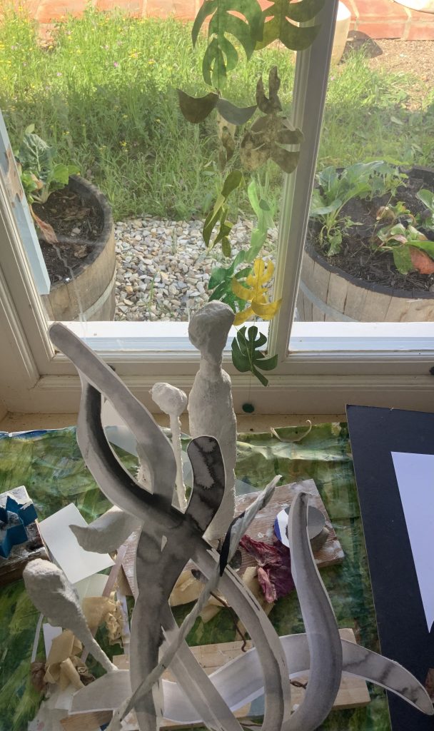
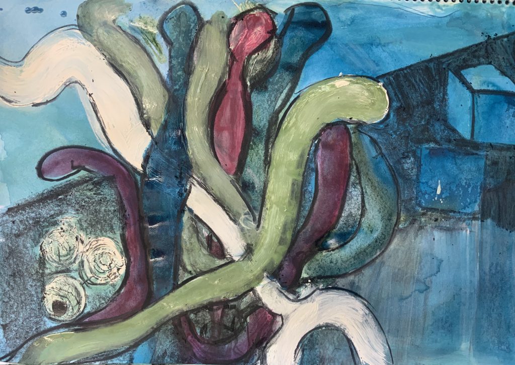
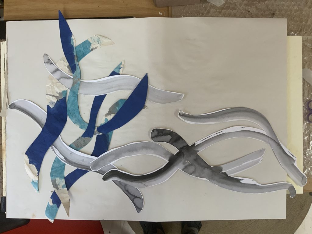
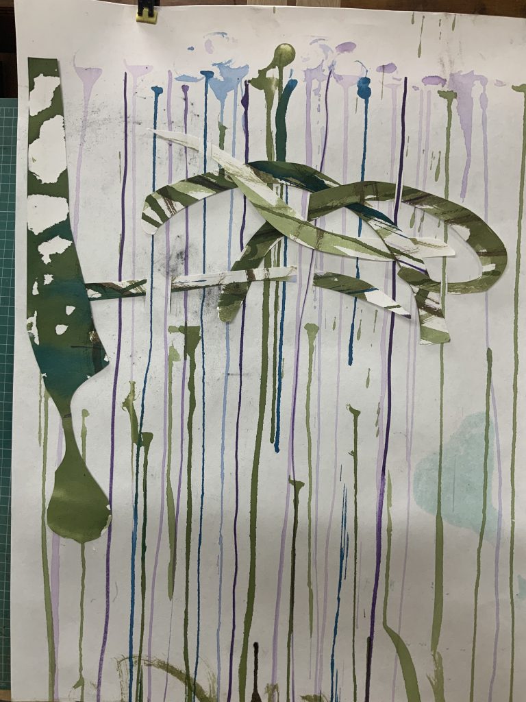
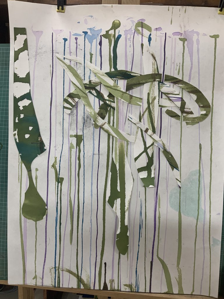
Above are two views of the objects on the table. I like the window behind, with the paper leaves hanging in it. My cut-outlines are placed over the plaster of Paris figures and look like swirls around these objects.
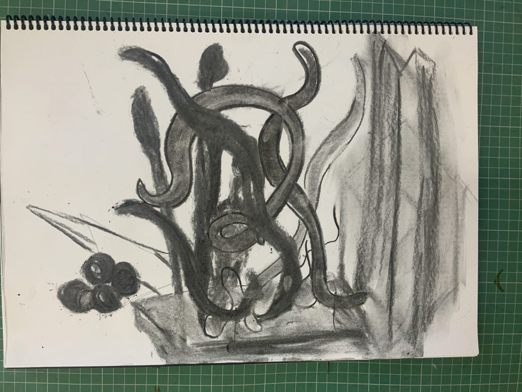
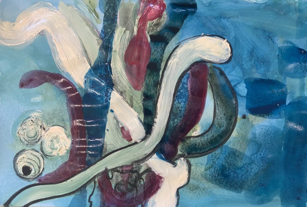
I realise that the colours on my table are very monotone, after a quick sketch in charcoal I paint with acrylic ink and a cream household acrylic. I used black charcoal for all the edges as I try to paint a view from above, with a base colour of blue for the tabletop. I want to get a depth of field by looking down into the 3d objects and making the space around the objects darker and focusing on the cutouts.
Exploring shape and spatial relationships
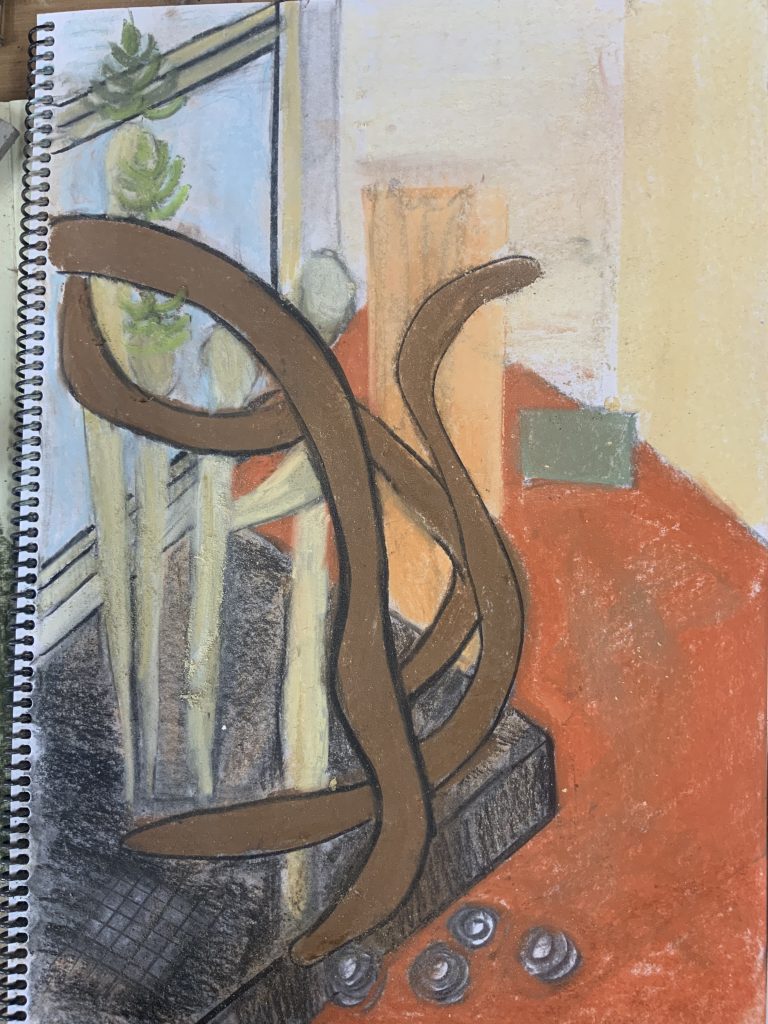
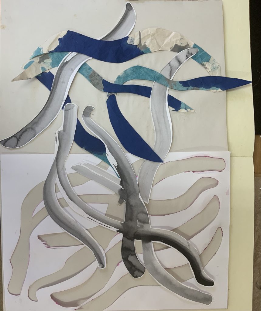
In the work below I use soft pastels and focus on the space around the objects on the table. My focus stays on the cut-out shapes of line marks on the plaster of Paris objects. Making dark line marks around them, helps, but using the background space should also be considered, as well as the overlapping objects and if I can create good converging lines for example showing the table, window and wood pedestal the objects are placed in. I also need to focus on colour…
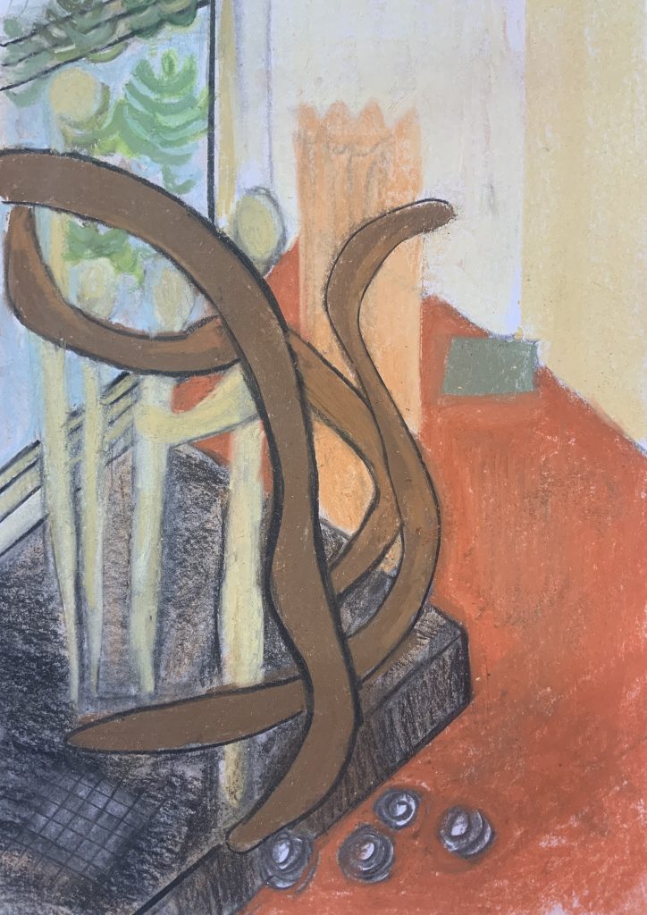
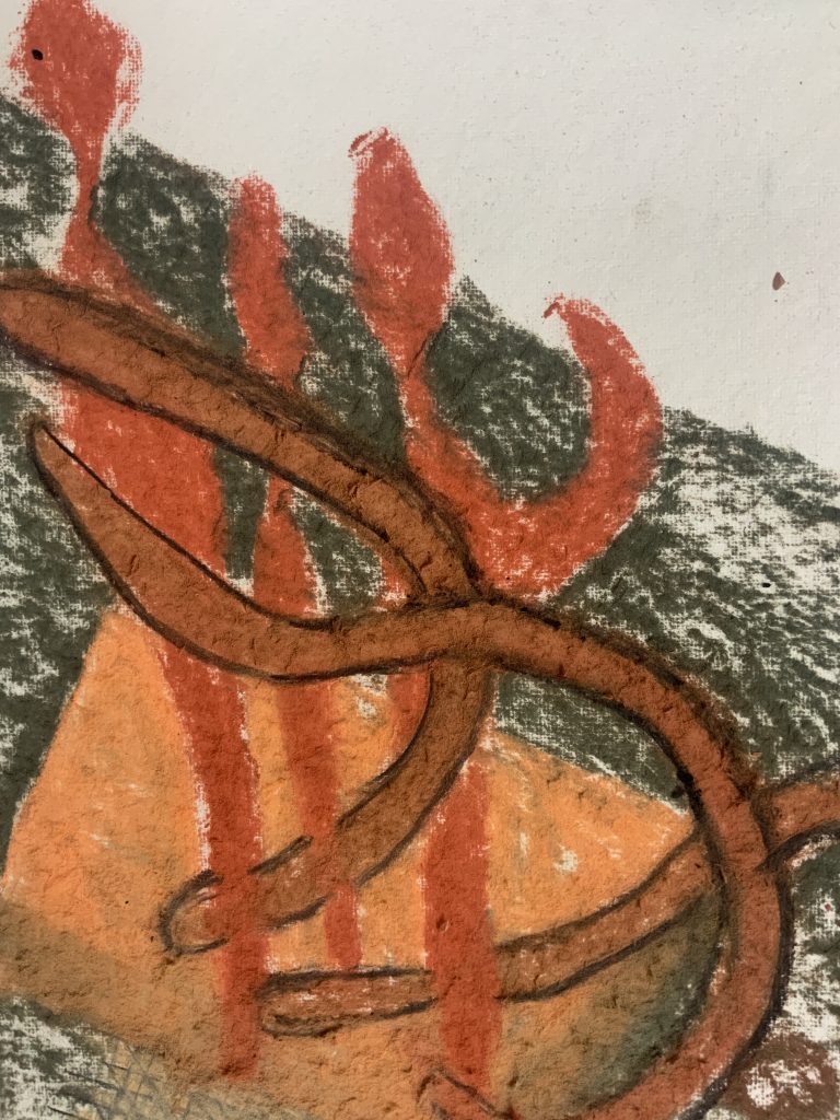

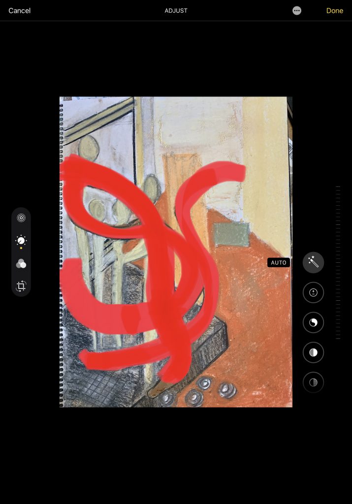
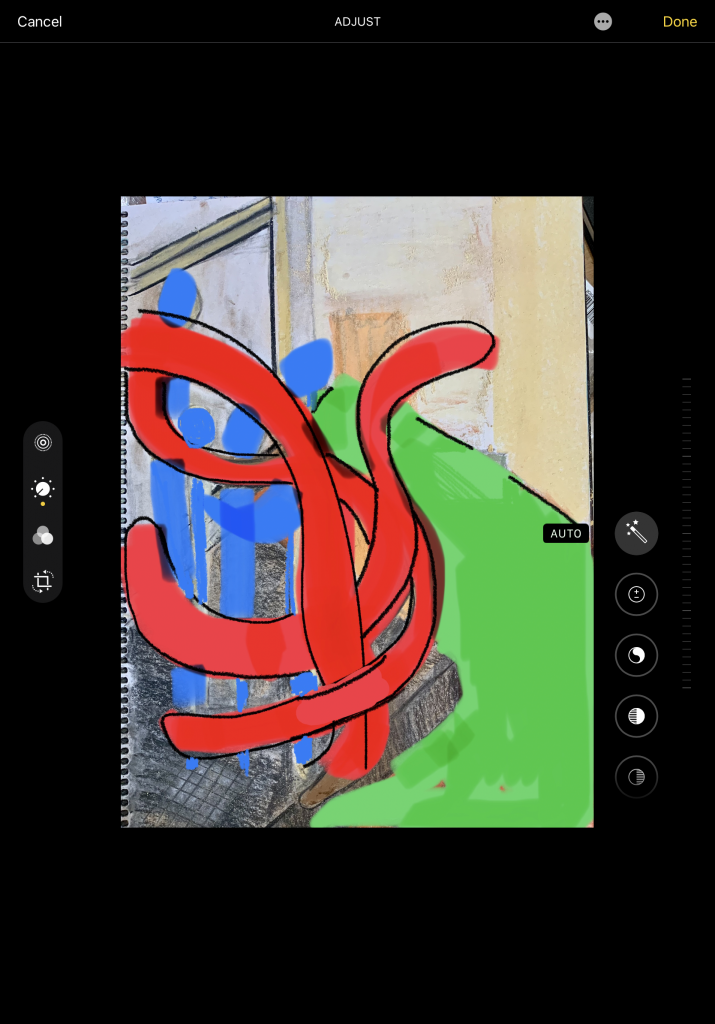
I consider using primary colours for the two main forms in the 3d object, namely the plaster of Paris forms and the paper cut-outs. I use the edit function on my Ipad and ‘draw’ in the new colours with my fingers.
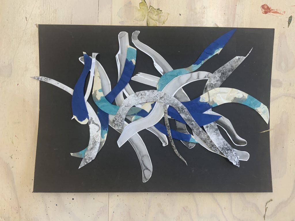
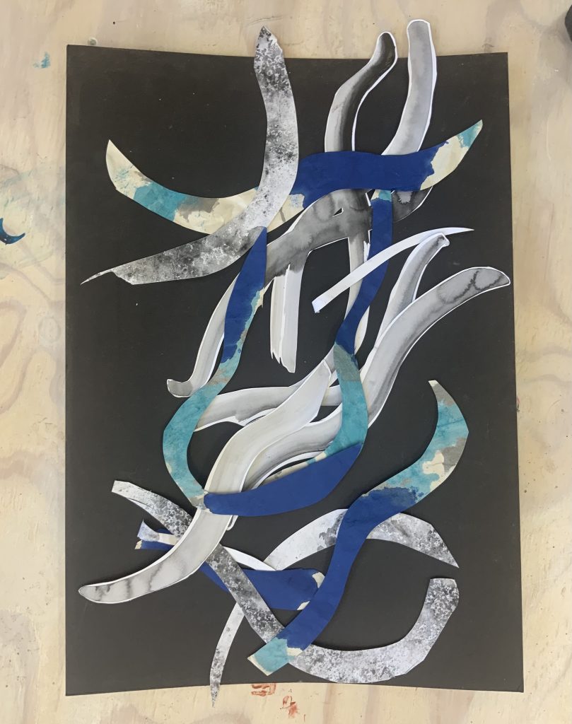
I like the uncomplicated composition and start making cutouts of other works as well as the above paintings. I am influenced by the cutouts of Matisse, as well as his use of colour which fills a portrait or canvas.
I a, thinking about the objects as lines, but with the freedom of going outside the normal frame and flowing almost as a woven or interconnected piece.
Cut-up and Collage
REFLECTION
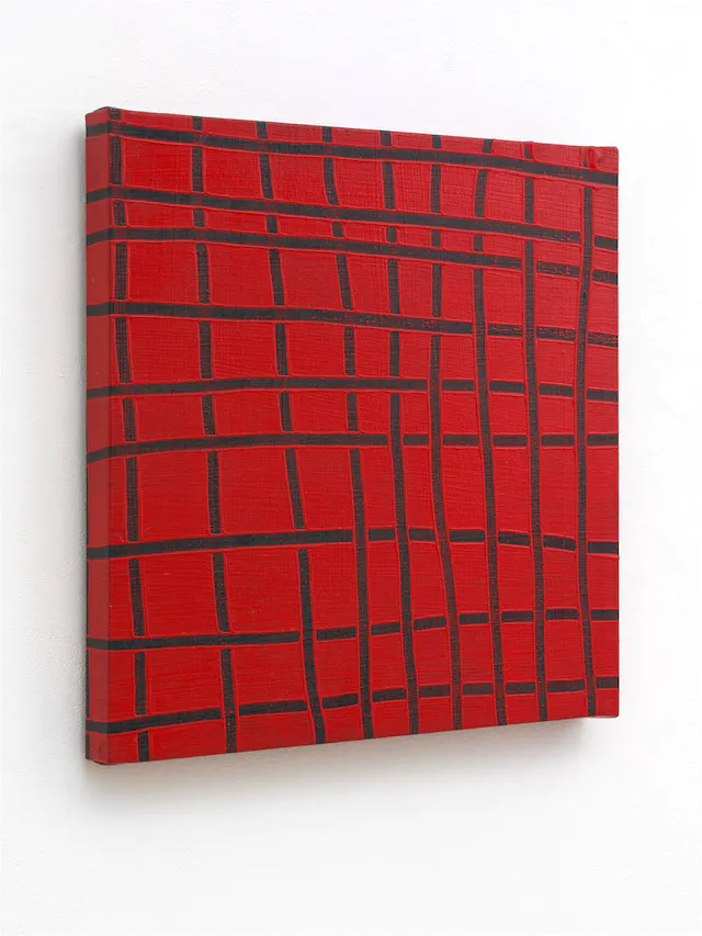
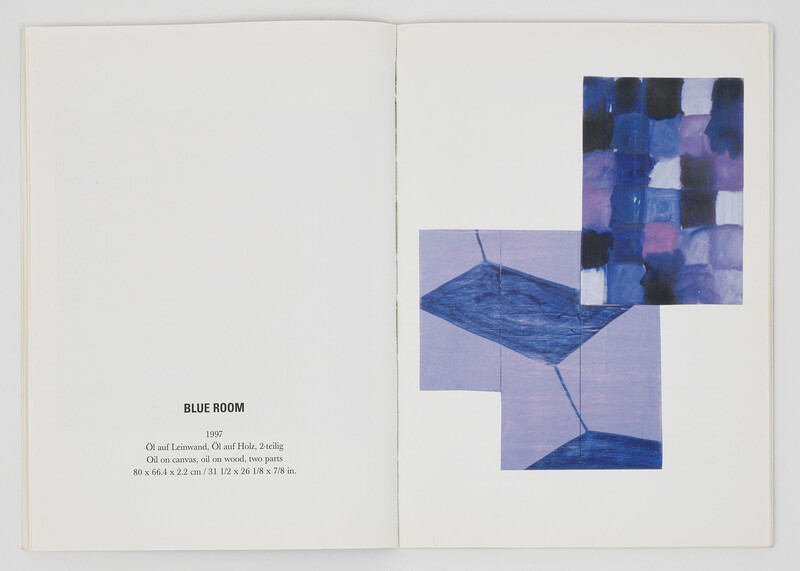
Looking at and researching the work of Mary Heilmann
I had never looked at her work before and found an interesting article that looks at two works, which she did at different times of her career, namely Little 9×9, made by her in 1973, and Blue Room, made in 1997. It seems she was a Post Minimalist artist with a close relationship to sculpture. I read that she studied ceramics and poetry before she moved to New York to pursue her art-making. At this time the easel painting tradition was very much questioned and it becomes her practice to deconstruct abstract pictorial form with painting as her medium.
Little 9×9 is a simple structure of nine vertical and nine horizontal lines, but not a square grid pattern when viewed. The canvas is covered on all four picture sides, so the lines extend beyond the picture’s surface and give the idea of how it extends into space outside the canvas. Is it because she was a sculptor and she thinks about spatial qualities? I do not find a focus in this work as it can be seen from various angles, even foreshortened views. The artist clearly made deviations of the grid, it is not orderly or placed in a linear composition, like using the square of the canvas frame itself – almost illogical. It reminds me of the work of Matisse as she uses primary colours so boldly and that of a landscape or mapping. Looking at her grid, it reminds me of weaving or even the Spiderman superhero’s costume. In a way, there is a geometric painting, but there is looseness which shows the hand of the painter and the materials used as not as perfect as hard-edged geometry. I feel comfortable in such a space – relaxed, spontanious and even something of joy. Later I listened to a voice recording and here the artist explains that the paintings are finger paintings: “I made the image by either scraping through the paint to the undercoat or by squeezing through the paint with my fingers”.
I attempted to use space from different angles with my painting for this exercise. My own style is a bit wonky and loose, I do not mind drips/smudges as it is the trace or history of my making onto the canvas and it is about the materials I used.
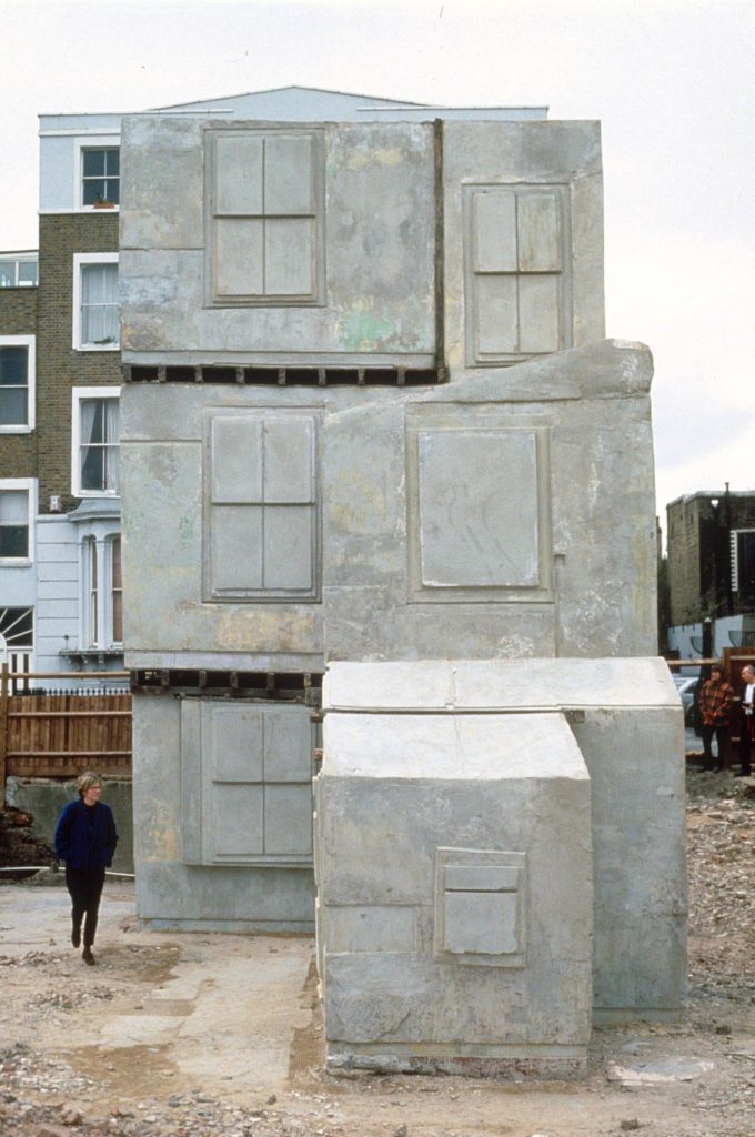
On the OCA website, I read an article on creativity by Daniel Tollady, called Thinking about making and physical objects (posted on 27/07/21) The article referred to Kazimir Malevich who used his making large constructions to explore ideas spatially and to understand how his planes and volumes could create a single architectural assemblage. The value of making models and assemblage of objects comes to the front as they allow us to explore materials and how they could feel around them. The article referred to Rachel Whiteread’s cast sculptures as a record of something that exists, but also represents the volume that they occupy in our everyday environments. This helped me to reflect on how my paintings played a role in my understanding of the objects I made. I understand there is something about my communication about the object that could become clearer in my own mind, as well as that of a viewer.
LIST OF ILLUSTRATIONS
BIBLIOGRAPHY