RESEARCH POINT 1
Angela de la Curz ( b 1965)
On the Lisson Gallery, I read that this artist’s practice is situated between painting and sculpture and she engages in the discourse of painting by targeting the stretcher, which is often twisted, slashed, or bent out of shape. I watched a video of her working on her exhibition Bare, on YouTube. Here she worked with aluminum. Her works are colourful and shiny – as a viewer one can move around them to experience their form. She is bound to a wheelchair and the height of the hanging pieces are related to her body in all works. She uses her body as a reference.
Dianna Molzan (b 1972)
Again I read that her paintings are described as sculptural. Her work, Untitled, 2009. Oil on lines shows the bare area within the frame of the work, where the canvas was removed, the stretcher bares or frame can to been seen. Will the viewer understand that they could be having a dialogue with art history and of the history of abstract painting? One can admire the painting as a subtle hint to difference with a normal canvas hanging on a stretched frame.
Sarah Crowner
Sarah Crowner’s diverse practice ranges from paintings and ceramics to sculpture and theatre curtains. Her bold and colourful paintings and tile works incorporate forms found in architecture, nature, and in the history of twentieth-century art and design.
Her stitched paintings are created by using an industrial sewing machine to sew painted and raw irregular panels of canvas together, simultaneously revealing the painting’s composition and construction. Sections are painted in saturated primary colours to imply a form, a presence, a possibility. The stitched seams remain visible, like plant veins or arteries, reflecting her interest in systems and patterns, production and reproduction, in culture and nature. At times the seams, and forms they suggest, recall hard-edged paintings of the 1960s, in others curved lines conjure biomorphic abstraction. She treats the past, the natural world and popular culture as a medium; zooming in, rotating, reversing, cropping, repeating, mirroring, shrinking and enlarging the familiar to engage the viewer, revealing connections between micro and macro, individual and context.
In recent years Crowner has exhibited her paintings in conjunction with ceramic tile murals and floor installations installed on elevated platforms in the gallery context, creating a bespoke, intimate environment and stage. Each individual stitched and painted fragment of canvas and each hand-crafted, hand-painted tile, (complete with surface irregularities), is a unique element, a world within a world, yet reliant upon its neighbour in order to contribute to a greater whole. Crowner embraces the idea of painting as object and her works embody the experience of architecture and space both within themselves and their display. Her work draws attention to the surrounding context, from the painted walls, brick patterns, concrete floor or plate glass windows.
Anna Lise
Ideas to consider:
- the canvas as a surface
- the relationship to the stretcther
- work that becomes objects that talks about a relatioship with sculptural practice
- relationship to space
- relationship to the viewer
RESEARCH POINT 2
LYNDA BENGLIS
APPROACH AND WORKING PROCESSES
The above work was first made with foamy globs and then lead was poured into the mold to create this idea of solid masses of metal. After reading on the Tate website one starts to understand her research into form and excessiveness of materials and that these works signal her sophisticated understanding of the differing nature of materials. She started with wax painting as she was interested in the material qualities of Pop Art and also reacted to Minimalist ideas. She wanted to bring the idea of a “closed deductive reaction as to what art might be” to be part of what her work was all about. “I’m not depicting something I’m making a feeling or I’m making a form, and the edges often create a kind of reading, the way we read into clouds or tree forms or landscape forms. I think form and texture create the mood and the magic of the work. (comment of the artist, on Tate website ” ( https://www.tate.org.uk/art/artists/lynda-benglis-7290/lynda-benglis-form-and-texture-create-magic)
Looking at more of her work, I see her as a good colorist, and that although the works become hard and solid, it reminds of softness and something pliable – I am also aware of the fact that it requires labor and is hand-worked. I like that the work looks at gravity or physical resistance – which I understand as a type of tension within three-dimensional artworks. I see the colors and works as buttery – and understand this can be seen as sexual and sensual. The floor sculptures, made out of poured latex are bright and presented onto the floor. I see that the work challenges limits and the larger communication around it – physical and psychological and is mostly about materials and process. I do believe there is also a playfulness in her process of making – she lets the material do its part and takes her cue from there. I like the idea that not all the work makes sense or can be seen as logical, I feel art does not have be about something we understand or can interpret. I think her work is also experimental and leads to the wide development of materials. She has a long career and her works are constantly developed.
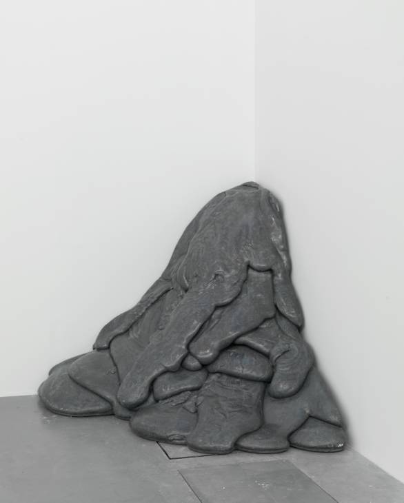
Lynda Benglis. Skowhegan Torso, 1979
Chicken wire, cotton, plaster, gesso, oil-based size, gold leaf
RESEARCH POINT 3
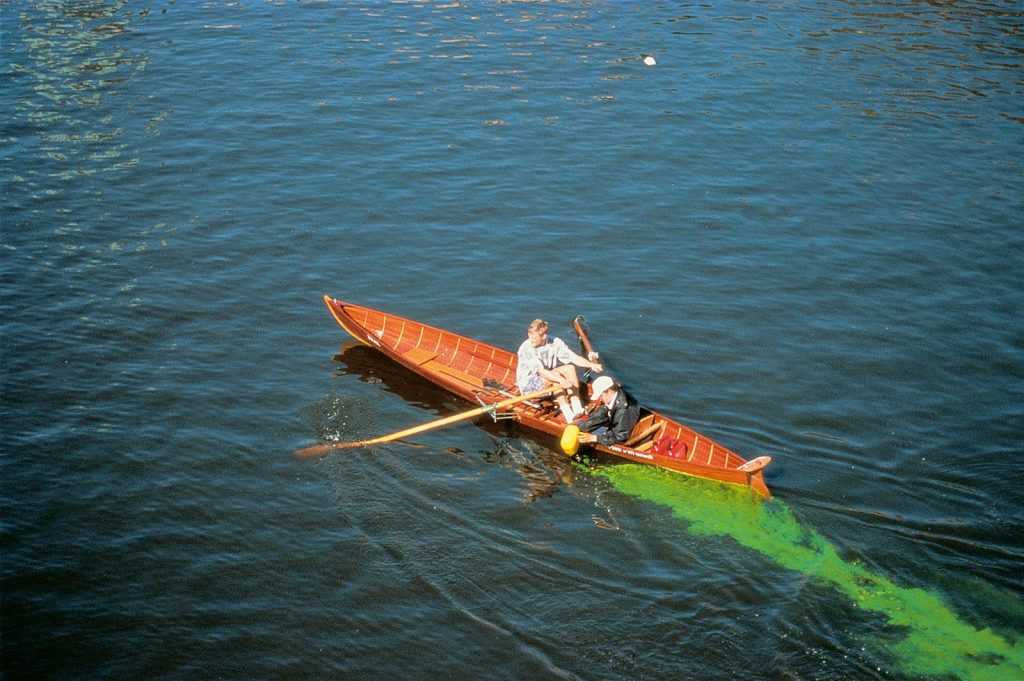
Consider the use and impact of material in Olafur Eliason’s Green River Project and in the work of Karla Black. Reflect on these artists’ choices and use of materials in your learning log/blog.
The Green River Project: Here the artist used a water-soluble dye, Uranine, which is used to test ocean currents to intervene in six different locations of rivers in, Bremen (1998), Norway (1998), Iceland (1998). Los Angeles (1999), Stockholm (2000), Tokyo (2001) Response to these interventions varied and was dependent on the location. This dye is not at all toxic and is fully biodegradable, and the project ran from 1998 to 2001.
Eliasson’s colour changes were unannounced and drew quite different responses in each locale, despite the artist having just one, distinct goal in mind. In downtown Stockholm is an example of this phenomenon, according to Eliasson, that many individuals are completely disconnected from their environments, particularly urban spaces, which users perceive almost as a blank, external image of no personal consequence. The city’s downtown river appears to inhabitants as picture-postcard perfect, not a flowing, dynamic natural force. So Eliasson set out to make people take notice, expressing a goal of making the river present again. A particularly intense green dye made it hyper-real. Eliasson described the jolt of “encountering something familiar but wholly changed. Eliasson used colour in this work to draw viewers unwittingly into a new relationship with their surroundings,” explains Stella Paul in the book, Chromaphilia: The Story of Colour in Art. “
Public involvement, central to the piece, was itself dynamic and unfolded differently with each installation. “To observe phenomena in the world at large is different from observing ‘art’ in a prescribed setting,” Paul writes in Chromaphilia, explaining how Eliasson wanted “to capture that difference, and to bring in new viewers unfamiliar with art’s special contexts and subtexts.”
Apparently in Stockholm, the newspapers featured the intensely green river on front pages, with a fabricated but reassuring explanation for the colour change. Some reporters blamed leaking fluid from a government heating system and assured the public there was nothing to worry about. Of course, the green had nothing to do with leaks, and everything to do with art.
“For a moment, the city became real”, Eliasson said. “The point was not even the Green River; the point was how it looked before and after. Understanding of past and future has been transformed, and the vehicle for this re-thinking is green.”
Bremen, Germany, 1998
Photo: Helmut Wieben
The river, Moss (Norway) ran through, at that stage, an industrial area. Green river became an extremely powerful image for the people of that city, as river was there before them and thinking about the effect they have on its qualities (pollution). I immediately relate to the many rivers here in South Africa that became heavily polluted over the years, due to industrial and human pollution.
Clearly this intervention by Eliason contemplates how art can alter nature; it presented viewers with a new version of the landscape. In this project the artist also explored our perception and our relationship with the world around us by challenging viewers to confront real-world issues such as pollution and the value of clean water. I also like that he wanted to look at the reaction of viewer in different places, taking cognisance of cultural differences. Like most of his other work, the scale of the work is huge. He uses a river as his canvas into which a dye created the work.