RESEARCH POINT 1
Looking at the intention behind artworks that use text, as well as the media used:
Tracy Emin
This artist is seen as making a confessional artistic project in all her work. Her messages or commentary in her use of text as art is explicit and carries messages. She uses neon tubes or has sewn them into textiles, but has also written directly onto her works. With these neon works the interesting visual idea is that she uses her signature hand script. To me, this says something about her intent to emphasize the personal nature of words as commentary in her works. The colours of neon lights are mostly pastel-coloured light tubes that illuminate her thoughts and feelings, which talk of fear, love declarations, insults and disappointments.
According to Miguel Ángel Medina (2014:63), this becomes complicated when one looks at artistic intentionality around the relationship between words – state “meanings can be complicating the relationship between artistic intentionality and viewer assumptions, as well as the relationship between words and their multivalent meaning.”
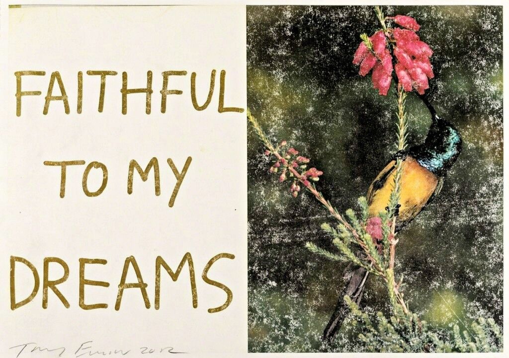
As an artist, Tracey Emin has a ‘confessional’ relationship with her viewers; which can even be seen as a type of voyeurism in which viewers find themselves when viewing most of her work. The learning from her is how personal and intimate this becomes. Later when I read Barthes things became clearer for me to understand her work better. I think she blurred lines between artmaking and writing when she uses words or text in her work.
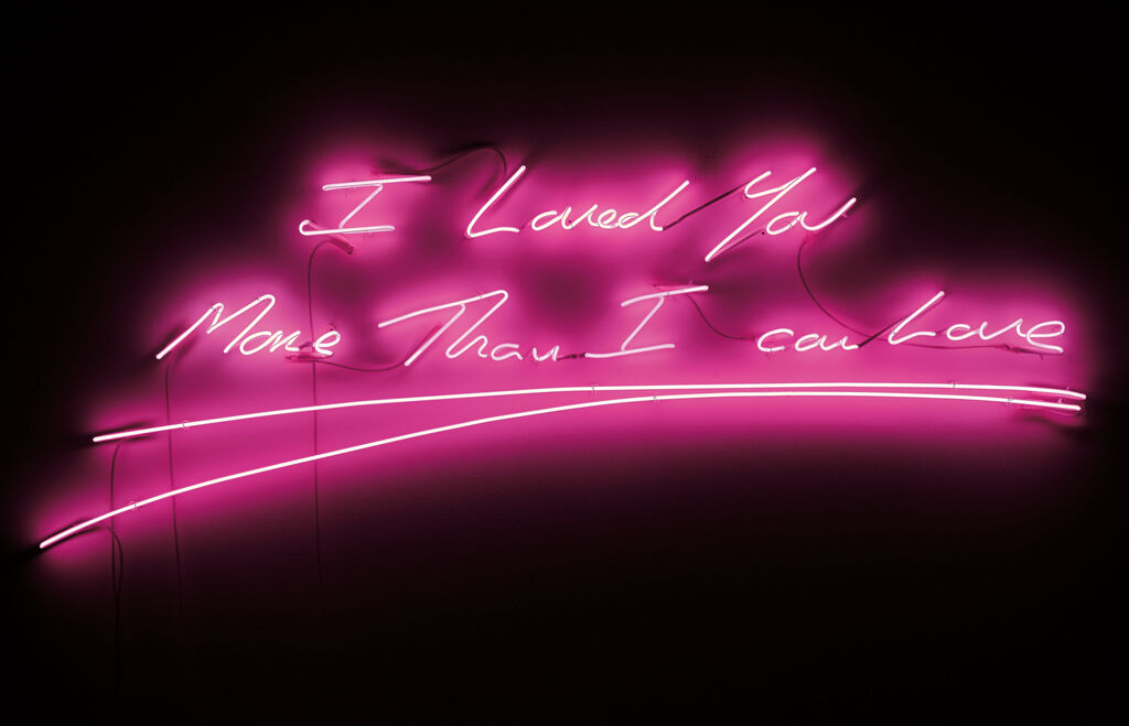
I do think the latest news, as recent as 19th January 2022, where she demands the return of her ( £250,000 ) neon ‘More Passion‘ artwork she gifted to Downing Street in 2011, in protest of the ‘shameful’ party gate of the current government, is worth mentioning here. On her Instagram feed she shared the following: “This is my neon that hangs at 10 Downing Street. It was a gift from myself to the Government Art collection. I am now in the process of requesting that my artwork be removed from 10 Downing Street.” This is a bold statement about compassion and how the leader handled it. I do admire her action. I later read that it was moved to the ambassador’s residence in Paris.
List of Illustrations
Fig. 1 Emin, T. (2012) Faithful to my Dream [online image] artsy net website images
Fig. 2 Emin, T. (2009). I love you more than I can love [online image]
Bibliography
Warde-Aldam, Digby (2019) Tracey Emin’s Unlikely Journey from Vulgar Upstart to Art World Establishment [online article] At: https://www.artsy.net/article/artsy-editorial-tracey-emins-journey-vulgar-upstart-art-establishment (Accessed on 10/02/ 2022)
Emin, T (2022) Instagram post by traceyminstudio. At: https://www.instagram.com/p/CY6af0ooksi/?igshid=NmNmNjAwNzg= (Accessed on 10/02/2022)
Medina, M. A. (2014) Tracey Emin: Life Made Art, Art Made from Life. [Pdf online] At: https://www.researchgate.net/publication/276033383_Tracey_Emin_Life_Made_Art_Art_Made_from_Life (Accessed 11/02/2022).
Ed Ruscha
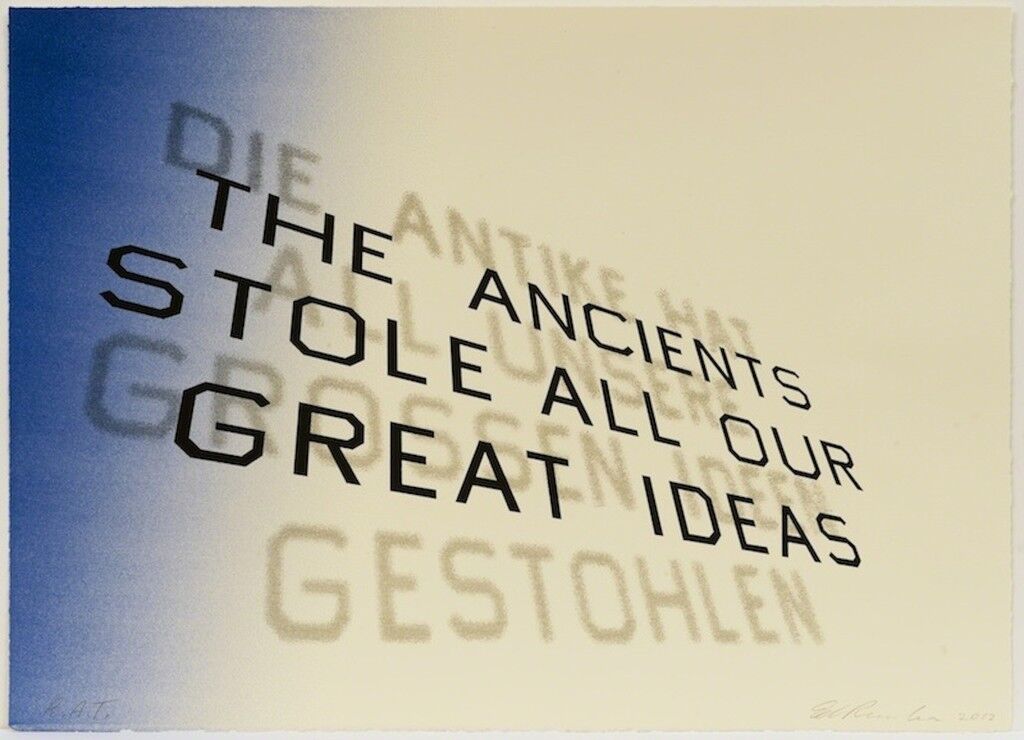
According to the Tate website, who is also in possession of a print of the above work, Mark Twain Quote 2012 (Tate P20485) appropriates a quip from the autobiography of American author and humourist Mark Twain (1835–1910) It is one of 18 works that the Tate have of Ruscha’s work.
I like how the words appear diagonally and read on the Tate site that he made it in such a way that it transitions from blue to white. Interesting is that behind the quote, in larger print, a more transparent print is written in German. This is a translation of the quote that appears (‘DIE ANTIKE HAT ALL UNSERE GROSSEN IDEEN GESTOHLEN’). All the words are done in Capital Letters, does it indicate an intention to place emphasis on words, thus making them the subject? In his other works where he uses images of landscapes, I feel this becomes even stronger.
List of Illustrations
Fig. 1. Ruscha E. (2012) Mark Twain Quote [Lithograph on paper] At https://www.artsy.net/article/editorial-text-message-typography-in-the-work-of (Accessed on 12/02/2022)
Artsy Editors. (2014) Text Message: Typography in the work of Ed Ruscha [online editorial article] Available from: https://www.artsy.net/article/editorial-text-message-typography-in-the-work-of(Accessed on 12/02/2022)
OWN EXAMPLES FOUND
More artists I viewed after an online press release about an exhibition on the use of text in visual art at the Yi Gallery, Brooklyn, NY from January 8 – March 5, 2022. The exhibition is called, “And, Already, Words.” The press release states that the exhibition is ‘both a love letter to the use of text in visual art and a probe into the power of words as a medium of expression.
Anne Katrine Senstad
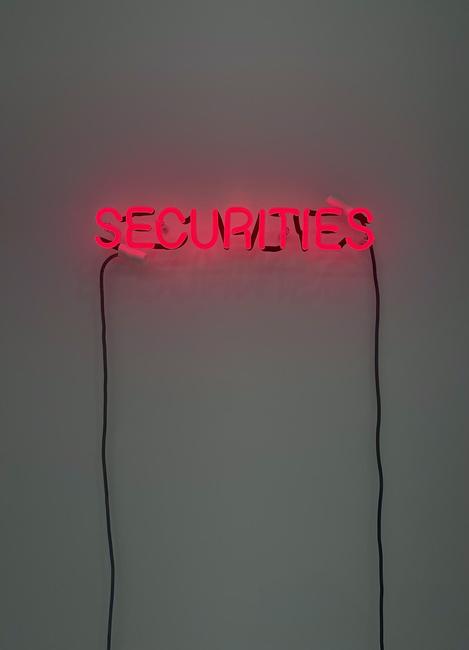
In the above work red neon is used to have a philosophical inquiry and make a social-political commentary. It is part of a series she has started which plays with the following fragments of the word: Secure Ties and Securi Ties. I see them as statements and invitations to think about the meaning. Clearly, the word brings in the Capitalist ideas of having something to trade with, and I think the colour red is also part of the meaning to be found in the work, as a sign or warning maybe. I cannot help but think about questioning things like healthcare, finance systems, consumerism, ownership of data, of land of money and how we think critically about these things in our societies. The red also makes the work provocative, it is the colour of power as well as being stimulating and becomes a vehicle for the viewer to reflect.
Katherine Duclos
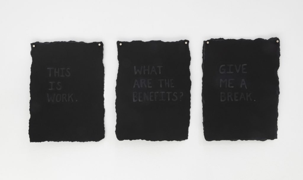
Below is a series done with expired breastmilk as the paint. It is part of a bigger series of work, called Low Supply where she explores maternal labour, invisible labour, human labour, and nonhuman labour. these works are 30.5 x 22.9cm each. One can also view these as ephemeral drawings as over time they will surely change. I read on her Facebook page that the milk becomes more visible over time – giving it permanence, but about a time in the life of a breastfeeding mom, which seems fleeting. Apparently, the milk is invisible when she starts out with work on paper. It is very personal and about emotions of deep and overwhelming experiences as a mother and carer of a baby. I also breastfed all three of my sons. The last one up till 2 years old. This is most of the time invisible labour by a mother. I can relate these works to later reading of the book, Matters of Care, by Maria Puig de la Bellacasa. I continued to follow this artist on social media and after reading that she has given up her studio to work at home and care for her children since 2019.
On her FaceBook account she writes, the following: To become a mother is to disappear and reappear as a different person; it is not immediate, but rather tortuously slow at times, leaving us in a liminal space of invisibility, wondering when we’ll be able to see ourselves and be seen again.”
She talks about her work being all over her home and how this interaction with her work, kept her practice active and thriving, between her work as a mother. It reminds me of my studio which has a door to the kitchen as well as a door to the living areas – I am always connected to my house, but I have a space where I can close the door and walk away without concerns that my things/art are lying around the house.
I learned she has ADHD and finds it hard to focus on one thing and has a work process by which she constantly returns to things and would tend to hyper-fixate on certain things. She shares her personal struggles and I see them so much as part of who she is and why she makes and explores what she does.
Considering contrasting thoughts
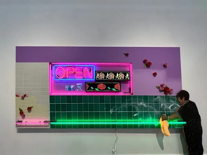
I found the following comments by Maya Garabedianon the Fair very interesting: “For some reason, smaller galleries featuring impressive works by lesser-known artists harboured an unfortunate issue that reoccurred throughout the entirety of Frieze: lacking exhibition labels. One such piece was a captivating multimedia work presented by Charlie James Gallery (Los Angeles). Having to speak with the gallery’s on-site director to find the name of the piece and its creators, Labor of Love by local artists Jay Lynn Gomez and Patrick Martinez, forced a realization that became impossible to ignore. Insightful and inspiring works of art would be placed on an otherwise empty wall without any information, let alone the handy QR codes featured on many labels – with a quick scan from a phone’s camera, an artist’s biography and body of work would be at one’s fingertips. In some instances, labels would be present, but dramatically offset from the pertaining work, displayed in a vertical listing of everything nearby. Countless fairgoers seemed to receive the message while passing by such works that they would be needing to do identifying guesswork themselves, subsequently deciding that these works were less of a destination stop on their journey through the fair.”
At a local art fair, I visited the past weekend, I had the same issue – information was either not close by, and part of a vertical listing, or only QR codes on labels. It was a busy show – the movement of people, and with Covid still prevailing. It asked me to stop and spend time – getting acquainted with the unknown way of viewing. I am not sure that I enjoyed the experience, but the artist thought of a different way to engage me with his work and that seems curious. In our own exhibition, WWW with the OCA EU group we found that videos being played in the virtual studio will be experienced completely different than in a white cube gallery. Some students (younger) liked the idea that they were in control of listening to a sound/video work, they could decide the flow of their engagement with work, and when to stop and move on.
I found a book and believe it relates so well to this part of my studies: The Pleasure of the Text, by R Barthes (pdf download) Throughout my reading and thinking about this part, I was reminded of the experience with words I had in a workshop presented to OCA students by dr B Eccleshall. The workshop was called Chain Reaction, see blog post (https://karenstanderart.com/chain-reaction-workshop/) I am thinking about an image translated into words or is it just a type of commentary in words about an image?
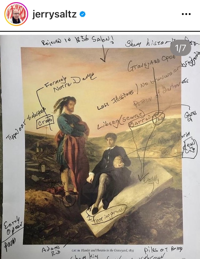
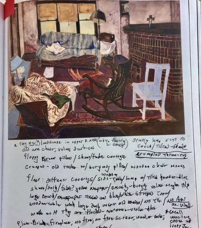
Later I came upon an IG post by the New York Art Critic, Jerry Saltz. He tried to illustrate how his process of writing about artworks, or could I say, how he invented his own way “of seeing art’. He describes his process as forming a sort of matrix constellation map of ideas and words and then considering on the map the different approaches he could take – possibilities are written down. He describes his notes as:”…. a sort of night sky I can always look up at and see where I am – or might be going – or search for a way through a problem.” He shares 7 illustrations to explain his making. I took screenshots of a few and share them below:
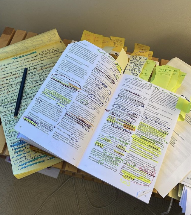
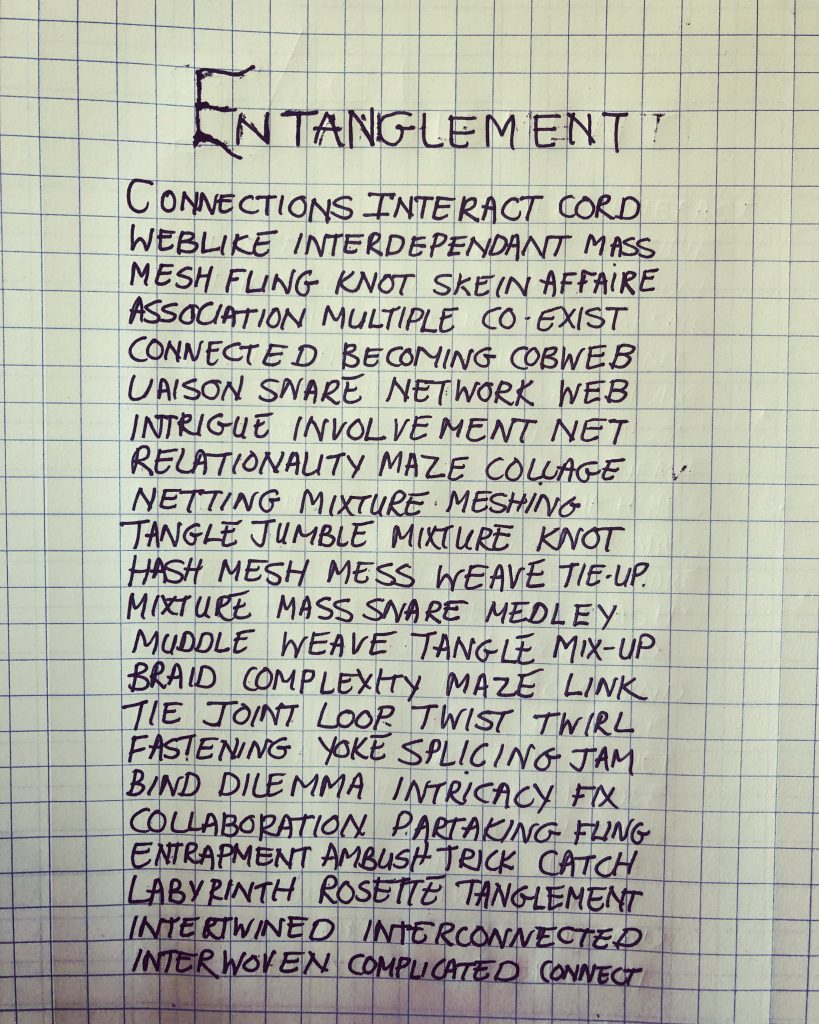
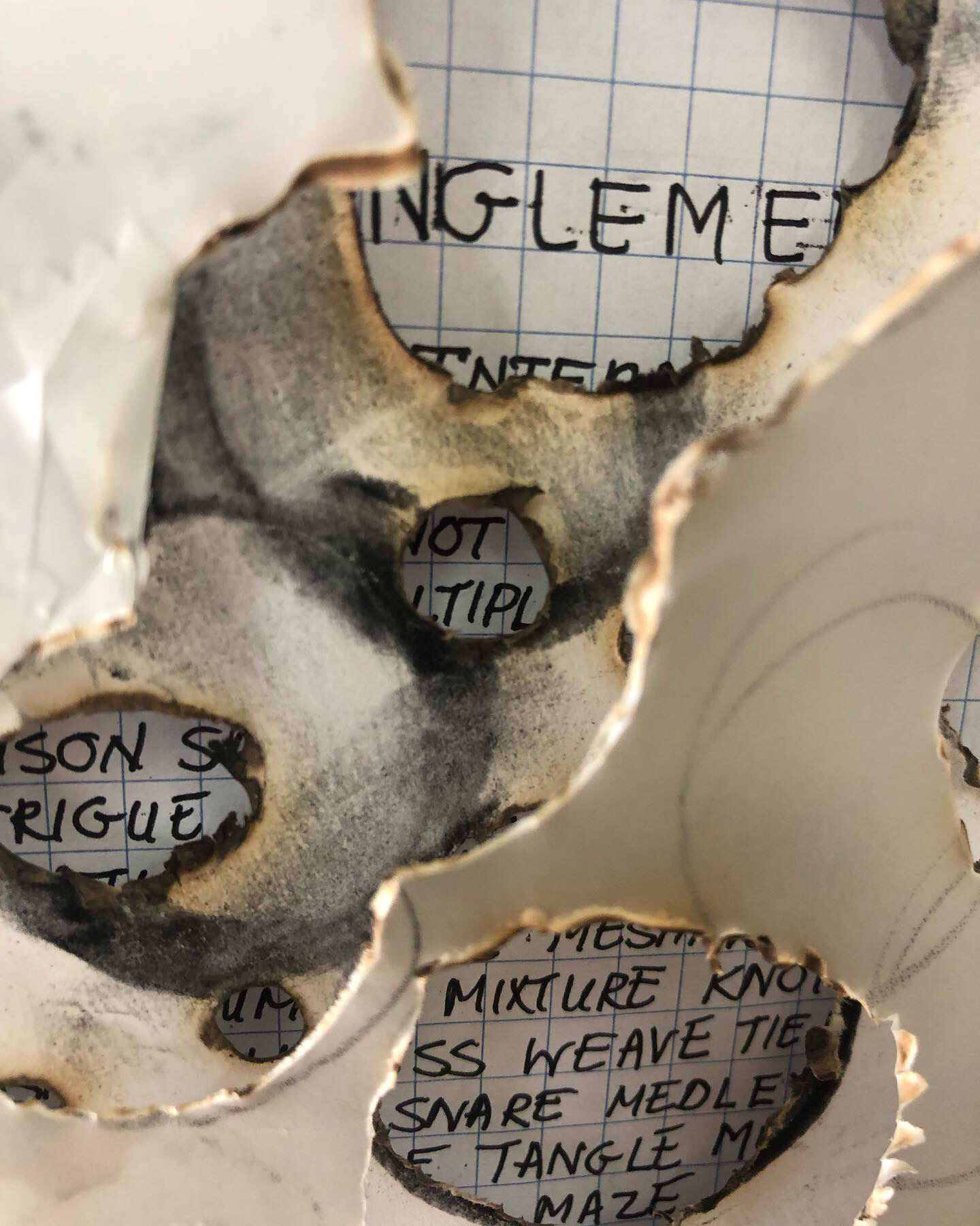
I think it is apt to share my own exploration with words which was inspired by my Parallel Project around the Fungal Kingdom.
Reflecting on this research
In our tutorial session around the work done in Part Four and had a short discussion about ‘containment’ and how to use it as a space to breathe or pause and the space where intention should be considered. I ask myself how I negotiate this space, where the viewer can find space for observation, but also where I can use and develop my own intentions. My tutor wrote in her previous tutorial report, as a comment on resolving problems in my practice through reflections on my own learning experience: “Continue to consider and develop your intentions in the work so that your good insights can breathe.” It is looking for that evocative thing in the making—staying with my own passions, finding my voice.
In the Pleasure of Text, Barthes shows that the moment of pleasure lives not in the reader but in the text. He also directs or indicates that space must be created for a reader (viewer in case of art viewing) to be seduced into pleasure and bliss. It is the engagement one is looking for, even if it contradicts your own ideas. Ideas of rhythm come to the front, instead of linear reading – is it the interruptions we see in the works above, which can make the viewer struggle, but also keep him/her interested?
I think for artists it is great learning to consider the space where the text comes from and how it can be used. I like the idea of looking at my own work – sometimes coming back, like reading a book, dipping in and out; taking time to think and digest. Looking for more to come to be said. Did Barthes show us a way to say that what (text/art/words/language) comes from the body is deeper, truer, and even more natural, not confined? That text can almost be felt, that it has texture and colour and feeling? I do think this is what I take away from this powerful tool of communicating intent in work.
Medina in the article I read about T Emin, discusses that there are artists for which life and art are inseparable. Having looked at K Duclos as well, I think it is fair to say that for both these artists, their life events, sustain their own artistic works. I do think Duclos is now working more with things and materials and exploring a wider practice of making. How people view Tracy Emin could almost be seen as that through her work, she became a public spectacle: to have celebrity status. Comparing their work with each other I see something of Duchamp in their work – the ready-made, but also with Arte de Povera, by using things/waste materials. They are both sharing their truths and inviting viewers into their personal life.
“What I hid by my language, my body writes.” “There is a chance of avant-garde whenever it is the body and not ideology that writes.” R Barthes
List of illustrations
Fig.1 Senstrad, Anne K. (2021) Securities [neon sculpture and text base artwork] Viewed at: the artist’s website www.annesenstad.com (Accessed on 23/02/2022).
Fig. 2 Duclos, K (2021) This is work, What are the Benefits, Give me a break [Breastmilk on paper] Online at: artnet.com/artists/katherine-duclos/give-me-a beak-a-w30UoqS43fJyz160SWKseQ2 (Accessed on 23/02/2022)
Fig. 3 Gomez, L.M and Martinez, P. (2022) Labor of Love [stucco, neon, ceramic, acrylic paint, spray paint, latex] Online at:https://www.mutualart.com/Article/Noteworthy-Moments-From-Frieze-LA/444DFC7DF1FF0D0E?login=1 (Accessed on 24/02/2022)
Fig. 4 Instagram post by Saltz, J. (2022) [Instagram screenshot] At: https://instagram.com/p/Ch_VyQdtg-E/?igshid=NmNmNjAwNzg= (Accessed on 02/03/2022).
Fig. 5 Instagram post by Saltz, J. (2022) [Instagram screenshot] At: https://instagram.com/p/Ch_VyQdtg-E/?igshid=NmNmNjAwNzg= (Accessed on 02/03/2022).
Fig. 6 Instagram post by Saltz, J. (2022) [Instagram screenshots] At: https://instagram.com/p/Ch_VyQdtg-E/?igshid=NmNmNjAwNzg= (Accessed on 0n/03/2022).
Fig. 7 Stander, K. (2022) Entanglement [Text on graph paper] In possession of: the author: Langvlei, Riebeeck West.
Fig. 8 Stander, K. (2022) Entanglement layered installation [Text on paper and layers of paper] In possession of: the author: Langvlei, Riebeeck West.
Bibliography
Artfix Dialy. (2022) AND, ALREADY, WORDS [Contemporary Text-based Work] At: YI GALLERY Viewed online at: https://www.artfixdaily.com/artwire/release/5573-and-already-words-contemporary-text-based-work-at-yi- (Accessed on 18/02/2022).
Barthes, R . The Pleasure of the Text, (pdf download) At: https://emberilmu.files.wordpress.com/2011/08/roland-barthes-the-pleasure-of-the-text.pdf (Accessed on 01/04/2022).
Duclos, Kathrine, (2022) This is work [Facebook post] At: https://m.facebook.com/story.php?story_fbid=1913461058815668&id=105053183989806 (Accessed on 03/03/2022).
Medina, M. A. (2014) Tracey Emin: Life Made Art, Art Made from Life. [Pdf online] At: https://www.researchgate.net/publication/276033383_Tracey_Emin_Life_Made_Art_Art_Made_from_Life (Accessed 11/02/2022).