PROJECT BASIC PAINT APPLICATION
I am intrigued by the painting example under the heading, Introduction. This work reminds me of Adrian Ghenie – but it is the colours, not the way the paint is applied – and this part of the course will focus on application of paint. ( I added an extra blog to rethink my thoughts on the two artists) Exercises that follow will explore what brushes can do when applying paint – I will first attempt making a range of marks and shapes with brushes. I have mostly different size filbert brushes to my disposal for this exercise. I have not been painting in the last year since I started my OCA course – drawing was mostly my practice of work. I have limited colours of acrylic paint, more oil paint and decide to make do with what I have. I plan to use canvas paper for the exercises. I was glad to read in the notes about spike lavender oil and will try to obtain it, as I am not good with the smell of turpentine and have mostly used only linseed oil to dilute.
My current range of oil paint colours (Windsor & Newton, Winton) are as follow:
- Flake White
- Titanium White
- Raw Umber
- Burnt Umber ( Griffin Alkyd)
- Burnt Sienna
- Yellow Ochre
- Indian Yellow
- Cadmium Yellow pale
- Lemon Yellow Hue
- French Ultramarine Blue
- Prussian Blue
- Terra Verte
- Viridian Hue
- Permanent Alizarine Crimson
- Cobalt Violet Hue
- Magenta
- Cadmium Red hue
- Permanent Crimson Lake
PROJECT BASIC PAINT APPLICATION
I have a limit range of acrylic paint colours – but prefer to use it for ground colour. I discovered that I did not have white acrylic paint to use for opaque mixes – I fill up on this during my visit to South Africa in August 2019..
Exercise Getting to know your brushes
From the onset it is clear that I have lost my confidence around handling my brushes as well as applying the paint . Exploring marks and shapes was not easy – I felt limited with only the filberts and working on my small papers with big brushes was just not comfortable. I decided to start the first painting – from memory a simple landscape. The desert immediately forms in my mind – a while ago, whilst driving to the mountains, I made my husband stop for photos I wanted to take of a lovely dune with big trees in front. I think this is what was my idea. I used an A4 size canvas paper which I have prepped more than a year ago with a diluted grey/blue acrylic ground. I decide to not look at the photo whilst doing the painting – maybe can insert this when my painting has dried. Making lines with the brushes was great – especially if loaded with paint and trying to create texture and form. I have to say I used too much fat in my medium and could hardly work the surface! Not happy with this first painting after a long time of drawing. Should I re do the work – use a photo or just give it another try is the thoughts I am sitting with. I see my clumsiness with the medium and overeagerness to get it done in one big mixture of paint and action.

In the meantime I prepared another A4 canvas paper sheet with Burn Umber Acrylic paint – I would like to paint some fresh aubergines and bell peppers. I decide on one aubergine and really loved the process of defining the form by using direct light and then also finding these spots of light on the object – feels great to be painting, again – have to say I did use the palette knife, almost without realising I was needing to use it.

PROJECT TRANSPARENT AND OPAQUE
Exercise Tonally graded wash
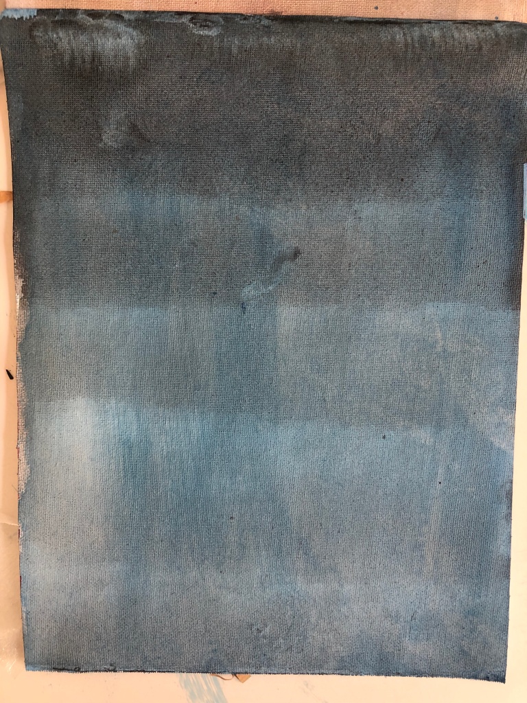
I started laying the paper in portrait format and decided to use acrylic and oil paint on the first wash. I did not read the instructions well enough and started of with thick paint – no fluid mix. I would almost see this as working wet-in-wet as I started diluting the paint, but the control was just not there! My realisation was the amount of paint I was using – next papers I used diluted mixes. I stayed with my two colour choices – French Ultra Marine and Cadmium Red


I was not happy with my exercise and later used the same sheet. Added another layer of Magenta wash and then used Prussian Blue. I think the learning is very much about the possibilities of washes as an overlaying not just as a ground layer, but during the painting process. Overpainting can become very layered and should be experimented with. I did find that have the right amount of paint loaded made a difference when I worked on the edges – not good, but learning indeed! I felt I could have made much better colour choices – to have harmony – but saw this as trying out different applications and not about aesthetics of the work.


Exercise Overlaying washes

Looking at the work of Mark Rothko brought home the benefit of exploring with a limited colour range. I read the following about the mentioned Seagram Building paintings. The artist was commissioned at US$ 35 000 to paint a series of murals for the Four Seasons restaurant in the Seagram Building on Park Avenue in New York City in the late 1950’s. Interesting that Alfred Barr referred the owners of the restaurant to Mark Rothko. The artists then rented a studio and although the restaurant would need 7 murals, he in the end did 30 paintings. Interesting that this idea of having his work exhibited together in a room, took his ideals of painting which go beyond the individual canvas to an environment where one would find yourself in . Recognising that the setting of a restaurant would not be the ideal location for such a work, Rothko withdrew from the commission and presented the series to the Tate Gallery. Interesting that this was a turning point in his career where he started working on series of works. In particular I found a video at Tate, where an exhibition, Shadows of Light., 2009, interesting. Here composer Jim Aitchison responds in music to Rothko’s 9 Seagram Murals.

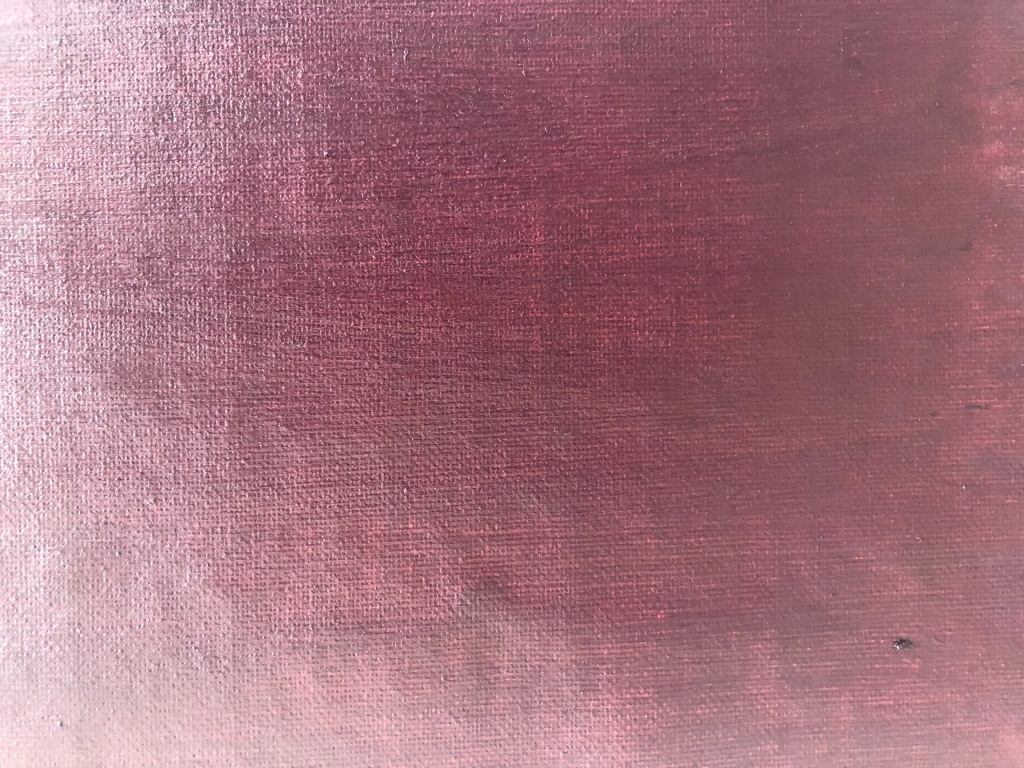
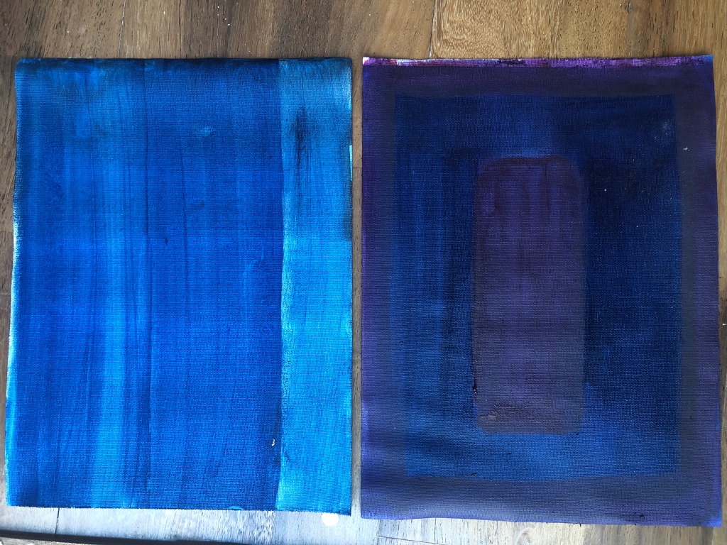

I have had the opportunity to see a Rothko at the Louvre Abu Dhabi- for me a great encounter with an abstract expressionist. Interesting to read about the exhibition from 2 October 2009 – 21 March 2010 at Tate Liverpool’s ground floor gallery. The floor space was transformed into an emotive display of these nine significant paintings, by painting the walls grey according to Rothko’s specifications, and add atmospheric lighting to enhance the dramatic qualities of the works. It is clear that when looking at the works in reduced light and in a compact space, the subtlety of the layered surfaces slowly emerges, revealing a solemn and meditative character of the works. Interesting that he was very involved in how his work should be perceived/viewed and if one links this to the challenge for viewers of relating to abstract painting, this makes sense that Rotho’s work is seen as easy to relate to. It is also understood that he took his work serious by getting so involved in the curating of his work, as the viewer, who is considered, becomes very much part of the work. At this stage I can see the value of theses overlays as a groundcover – even working back on a painting, one would be able to almost erase some of your paitinglayers on top to uncover the groundcover.
Exercise Opaque colour mixing

Overpainting with Acrlyic was my preferred option as it dried quickly – but I am not happy with the blending. The notes stated one should do it fast.
Exercise Monochrome studies
The subject suggested is the outline of a winter tree seen against the sky – it can be made as simple or complex as I choose, and working from an observational drawing preferable. Two (at leastA3) boards will be prepared. One with dark coloured wash and the other with a light grey ground colour, either mixed opaquely or with a wash, and use charcoal to copy the image of the tree on to the prepared boards – leave a faint image. I will use my photo images of trees to choose from. I choose acrylic colours for this ground colour preparations and used Prusian Blue and Paynes Grey on the first board and Light grey on the second board – I added some acrylic white texture paste to have an opaque colour board. (did not have white acrylic paint in my paintbox) Choosing trees in a winter landscape had to come from my photos from South Africa, or ones taken in Belgium on a visit to my sister in the winter a few years ago. It is summer in Dubai and winter does not really get cold.
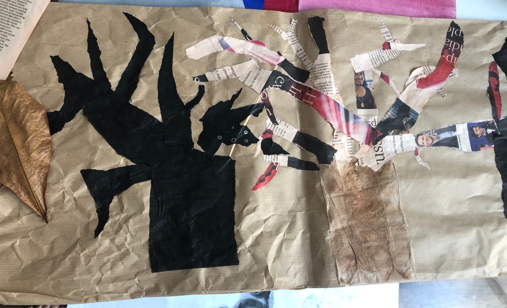
During August 2019 I visit South Africa – my kids stay on a farm in the Western Cape, where big trees are limited to the garden, very few trees are still growing on the farmlands as it is a sheep and grain farm. Near the house is a big growth of Australian Eucalyptus trees. During last winter I used some of my studies for my Drawing course. I do a pencil drawing in my sketchbook and contemplate to use this when I get back home. I am also influenced by the drawing in the study material – reminds me of a postcard I bought of a Van Gogh tree study. ( Pollard birches Nuenen, March 1884. This was a pencil, pen an ink, transparent watercolour I saw in the Van Gogh Museum in Amsterdam. Back at home on a drive to town I remember the Boabab trees that were planted to create an ‘astonishing’ landscape in the city. ( a friend of mine is a landscape architect with the company that brought these trees from Australia to Dubai). These trees are estimated to be between 150 to 500 years old . My photos over time shows that they hardly loose their leaves here in Dubai. In South Africa Boababs are indigenous to the Northern areas , are dormant in winter and loose their green leaves – I have many photos of these trees and decide to work from a photo my husband took whilst visiting one of our national parks. This is also the time when the surrounding bush is dry and grasses are brittle and dry. I am very much intrigued by the bark of trees – the textures always asks of my to take close up pictures – the Boabab does not fail to amaze one!
It is clear that I need to explore two approaches to the same subject, one in which the transparent qualities of the paint provide the dominant effect and the other which exploits the opacity of the paint. Thinking about the word monochromatic: having a single colour and using value contrast to create lights and darks. Payne’s grey is a neutral colour , like white and black. For painting I can sense the focus on value and or colour as part of the underpainting. I am aware that I would opt for white and more opaquely. Looking at John Singer Sargent’s work, Spanish Dance, 1880-1881, I read that for his studies from life, he used a light grey canvas into which he would rub a broad tone that indicated the major masses. He started by painting the mid tones, and sculpting the image with thick tiles of colour, and only later begin to bring in the extremes of dark and light. (Aristedes: 2008, 118-127) Rembrandt again favoured a warm transparent brown onto which he built up opaque whites to get the full range of half tones – I do like this way of working and try it with my paintings of the baobab tree.

Read: Although earlier painting methods allowed artists to produce some opaque and transparent effects, oil technique permits painters still greater richness in these regards. Opaque passages can be thicker without a risk of cracking, and transparent effects can be controlled more easily since the thinned paint remains wet for a longer time. The resulting range of contrasts between transparent shadow and opaque light can develop a striking variety….. By applying transparent deep colours over opaque tones, the painter can produce rich modulations of darks and can give the picture a tonal depth not available in most other techniques. [pp. 55-56.] Among the physical properties of the oil painting medium that set it apart from the fresco, encaustic, egg tempera, and distemper techniques are its slower drying rate, the greater flexibility of its dried films, and its capability of producing various effects of gloss, transparency, and opacity. [Kay, Reed. The Painters Guide to Studio Methods and Materials. Englewood Cliffs, NJ: Prentice-Hall, Inc., 1983. p. 54]

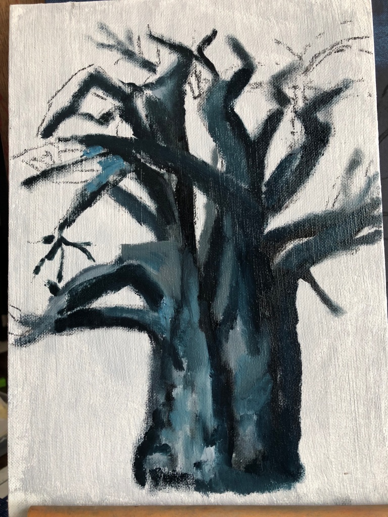
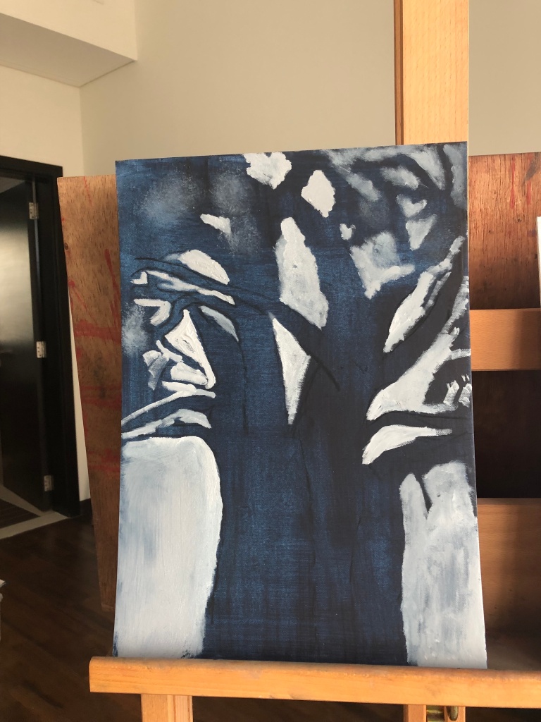
The first painting is on a light grey opaque ground of acrylic paint and then I started with oil paints – getting a dark Paynes grey was a bit of an issue, as I did not have it in oil paint. I am not happy with the thinner branches – should have used different brushes – as the study guide advised! The next painting on the dark wash seems a bit difficult to start as the drawing marks is not so easy to find – seeing that I had to work on painting the negative shapes. I did enjoy the more intense looking at different shapes – almost abstract, but again battled with the finer branches. I loved the process of creating shapes with layers of more opaquely mixed dark greys, and decide to work on more exercises.


My understanding of opaque is when this colour is painted over a dark or white colour it will not allow this dark or white to show through – in the previous exercises I found cadmium red and ultramarine blue be colours that is more transparent than say Burnt Umber, Cerulian Blue, Yellow Ochre and Burnt Sienna. Colours mixed with white also is much more opaque – can I also say it is colours with less intensity, as it does not allow light or dark to shine through it.


I recently watched a video of artist, Olafur Eliasson, who explored monochrome light. He feels strong about viewer experience. He created Room for one Colour, where one could only see yellow and shades of grey and black. I saw it was exhibited at The National Gallery, London in 2017. It very much creates a space where one questions your perception of vision, and how vision help us relate to the world around us. I do think that monochrome work is very harmonious in its way it add to the feeling of a work. My experience of painting in monochrome was that I was more aware of looking at forms and lines of the object I wanted to paint – I find that I saw more than what I would have seen if I just looked at the tree, and think that is why this

PROJECT WORKING ON DIFFERENT COLOURED GROUNDS
Thinking about coloured grounds in order to understand the different effects the ground can create in a painting seems to be a good point to explore at this stage. It is clear that a mid-toned ground of one uniform colour helps to establish tonal range – you already have the middle between darkest and lightest tones. I do like the idea of using an earth coloured transparent stain to act as the first layer of the work and giving it a luminous quality.

Exercise Tonal study on white ground
I used a flowerpot with an aloe hanging in it. I placed it in front of a large window in my studio – here I get morning sun ( facing south) and light stays bright till afternoon. It is a green glass pot and the allow makes interesting lines as it is arranging itself by hanging in the pot.
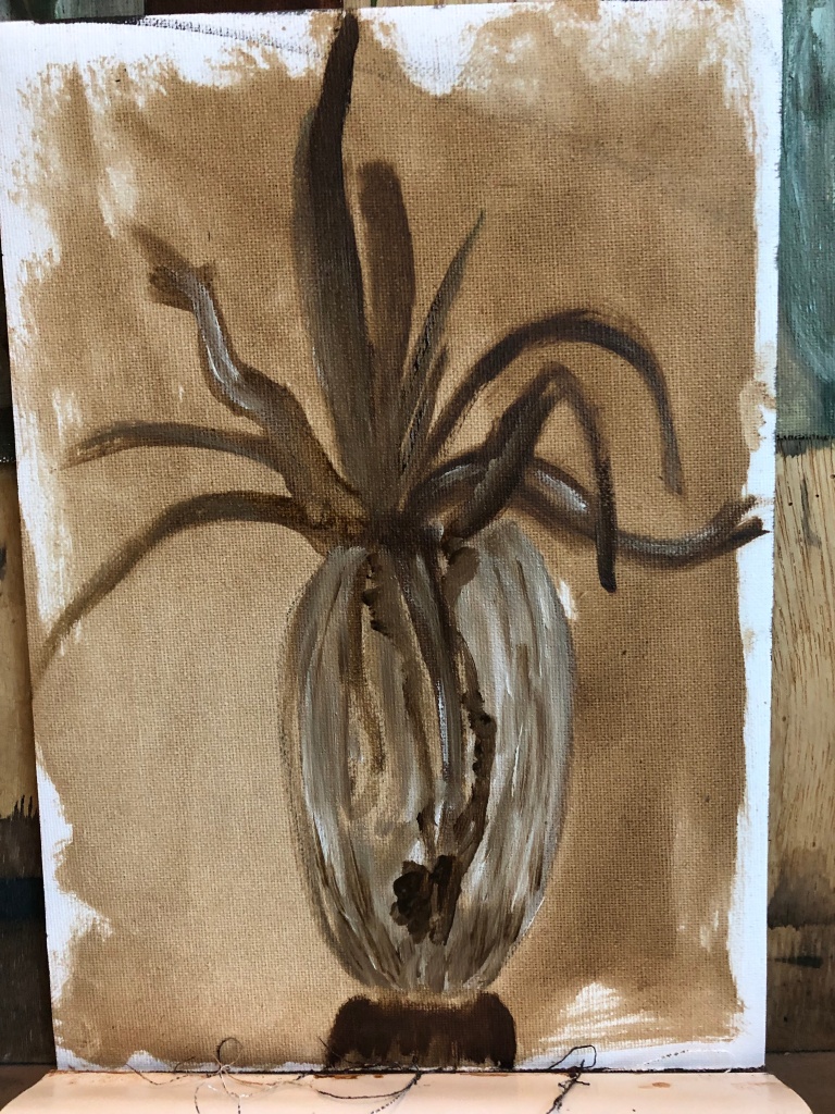
I diluted oil with turpentine to make a transparent glaze and rubbed it over the paper with a clean rag. I painted with flake white and raw umber. I worked directly and did not make a drawing onto the white paper. Looking at the exercise the idea was to work quickly, which I did, but also to practice form – not so sure this worked out well as the tonal values was not so well reflected in the work. I need to admit that I went about the tonal values incorrectly – I should have prepared a few values upfront and worked with them. I worked with white and Terra Vert to create these studies below. Squinting is so important to find the lights and darks – the most intringuing was those of the roots hanging inside the pot. I need to go back and work more on these paintings – I hope to use this for the still life part in the next chapter of this course. I have to admid that I did not focus on the background of the objects. I think this could make a lovely study for the effects of the Flemish style paintings.

RESEARCH POINT Chiaroscuro
Explore the works of some of the artists whose work chiaroscuro effects such as Tintoretto, Caravaggio and Rubens. Look also at the candlelit studies of some northern European artists, especially Rembrandt and Joseph Wright of Derby.
I am tempted to also write about my understanding of Tenebrism – which could be seen as a more intense form of Chiaroscuro, founded on the mysterious tenebra – a shadow so deep no light is able to penetrate it. Frequently the main subjects of tenebrist paintings are illuminated by a single source of light, as if a spotlight were shone upon them, leaving other areas in darkness. Such paintings have been called ‘night paintings’ painted in a dark manner. ( I was influenced by my art tutor in South Africa, who wrote his MA dissertation, ” Tenebrism in the painting of Odd Nerdrum from 1983 to 2004″, and shared this essay via an online access with me a few years ago) Conradie alludes to the the fact that from the 1600 onwards there was a statistical increase in Italian and Spanish paintings in which the artists such as Caravagio, Tinteretto, Jose de Ribera used darkness to half fill the canvas. It is clear that the Baroque artists were attracted to dramatic shits of value form the whole value spectrum – this added drama to their art works. Looking at the Dutch artists they seem to favour subtle shifts of light to give the impression of natural light. I take that I am understanding an important part of composition in the role of value – also that I am thinking about the role of transparency and opacity in the way it could guide the viewers eye towards form, distance and volume. I have looked at monochromatic and grisaille painting as a way to create from and did a view portrait studies as part of my own learning during the last few years. I did learn the raw umber makes browner and warmer greys that using white and black.


Looking at it now, I feel I can improve this work and will attempt this during the next view months of this course.

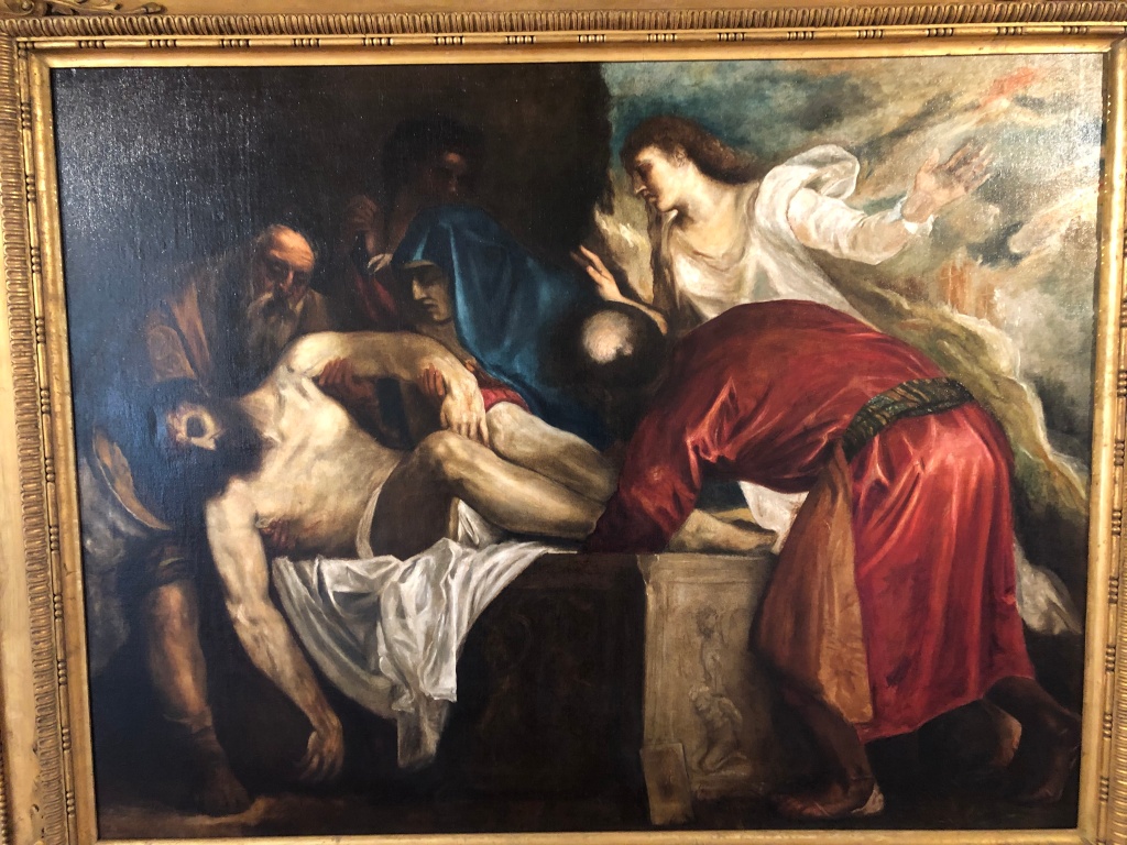
Reading about the work of Tintoretto I understand most of the work has a religious character and would hang in churches and places of prayer/contemplation. It is therefore understood that the use of light and dark is not just to indicate the time of day, but be more symbolic, almost as a conflict between dark and light. By using the method of Chiaroscuro these artists were subjugating colour to extreme light and shadow. As a Mannerist Tintoretto painted to get attention of the viewer of his work – his colours were sharp and heavy tones. He worked with reddish brown grounds, very much as Caravaggio.

Dimensions:
39 1/8 x 51 (99.4 x 129.5 cm)
Looking at the Madonna’s veil on her hair and shoulder the chiaroscuro technique and light painterly brushstrokes, Tintoretto conveys the delicateness of its texture, the transparency and shine of the fabric over her dark hair as well as through the red The delicacy and minutia used to render the veil contrast vividly with the “non-finite” rough rendering of the sun behind her. The mother and her child are placed in a dark indoor setting, the wall behind is a flat dark brown colour that makes her bright glowing figures the focus. When one focus on the rising sun in the background I am reminded of the first exercises in this course – much like the impressionists by placing two colours side by side and allowing the eye of the viewer to mix them. Reading about this, it seems like Tintoretto uses the sfumato technique here to create an atmospheric dreamlike effect. He creates depth by alternating light and shadow that pull the viewer towards the vanishing point which is the sun. About the use of light in this painting one has the impression of a second light (maybe a fire?) in front of the Madonna and Child and the light at the back, from the sun – hereby Tintoretto creates an intimate and tender scene, into which the viewer is drawn, even thought the viewer cannot see the light source, it is as if one can ‘sense’ it. I realise the value of standing in front of the real painting by using close up shots to view the painting in more detail. I am not sure that Tintoretto was aiming to show a ‘metaphysical’ display of light – but the light of the sun do give that idea – like a small aperture of light into a dark interior.

Here the light and dark contrasts are much more dramatic. Conradie (2006:11) writes the following: ” During the early Renaissance scientific discoveries of the time, relating to the direct observation of the world began to influence artists. This realistic observation developed side by side with the existing spiritualism. It could no longer
be ignored that every solid body produces and accepts a shadow. This observation
began to interest both scientists and artists. Leonardo da Vinci, being part of both
worlds, developed the science of light and shade , chiaroscuro, on an unprecedented scale.”
During my visit to the Venice Biennale (Sept 2019) I was fortunate to see some Titians up close and see a video on the works in the Manfrediana collection. I had a private tour at the Chiesa di S. Maria della Salute – was not allowed to take photos of the bigger Titian works, which were really almost locked away in rooms of the Church buildings and bought a few postcards as a reminder. I read the following about him: “Titian developed a color blocking system that has been taught in art schools since his death. He used a very thick rough weave for his canvases, which were prepared with an oil based white lead paint mixed with chalk. Beginning with the central figure he would block out all the shapes in a generalized color and value. Next he would develop modeling and chiaroscuro shadows. Skin was done with very thin layers of paint with a lot of medium and painted on like a glaze so that the colors underneath showed through. Fabrics were painted a solid color then textures were created with a dry brush technique on top. Backgrounds were painted very thinly, often very dark to increase the drama of the central figure. During his painting process Titian would often set the canvas facing the wall for several weeks and come back to it with a fresh eye. One can see this level of ‘finish’ in the surface quality of his paintings” ( website: )

Getting up close in this case
Looking at Rembrandt I have always admired how he uses umber tones. I find great use of an earlier blog on the OCA site (Bryan|posted on 3rd July 2019) on a recent exhibition of Jenny Saville at Gargosian and how she reveals her work process of a new self-portrait as a painting in response to what she has learned from looking at Rembrandt’s Self-Portrait with Two Circles – using many close up pictures of the painting. Amazing to me was the areas in the work where she relates to Rothko, and Bacon in using limited ground and impasto painting and how she describes Rembrandt as ‘turning up the volume’ when using blending to create tone. She also mentioned the influence of Velazquez.

On a video/filmmaking expert’s online class I read the following: “Tonal range and colour quality indicate the majority of Rembrandt’s subjects were painted inside under oil lamps or candle light.” Rembrandt uses his direct observation skills to find contrast of light to create mood, and uses light that falls of from colour.
In a recent blog post of the artist, Juliette Aristides, Aristides writes about his self portrait in his early 50’s, around the time he was declared bankrupt and his house was auctioned off. Her focus is on the face as a portal to the interior world of a human being, and how good Rembrandt was at this – language and painting that transcends. She makes me aware of my own connections with humans and how art should portrait this truth, and not just a simulacrum, as we experience more and more in our digital age.
Reference
Conradie, Johan, 2006 , University of Pretoria, MA dissertation (https://repository.up.ac.za/bitstream/handle/2263/29578/dissertation.pdf;sequence=1)
Borchardrt- Hume, Achim: Mark Rothko at Tate Modern, A You tube video presented by the curator, Achim Borchardrt-HumeTate Museum. Accessed on 25 July 2019.
Jones, J . (2002) The Guardian online article 7 December. http://www.theguardian.com/culture/2002/dec/07/artsfeatures . Accessed on 24 July 2019
Aristides, Juliette 2019, The Face of a Man, website: www.aristidesarts.com/blog/2019/8/22/the-face-of-a-man downloaded on 24 August 2019