Optical effects as used by the Impressionists, Post-Impressionists and Neo-Impressionists in their optical mixing. Also view the work of Bridget Riley or the Op artists.
My first thoughts is about the Impressionists painting on site – the plein air technique. They sought to capture the optical effects of light in order to convey the passage of time, changes in weather, and other shifts in the atmosphere in their canvases. Their art did not necessarily rely on realistic depictions, although naturalism played a big role.
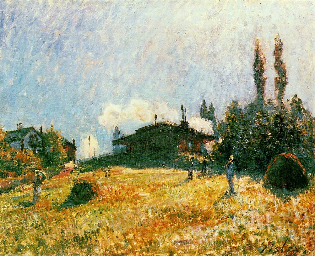
It is although in his work, Sisley focused expressively on representations of the atmosphere while diminishing the importance of the human figure. His brushstrokes are blurry and almost rough. In my research on his process I read that his painting process was more of an eye to colour and light of the scene than to the abstract notions of purity of colour and optical mixing of hues. The works are fresh and painterly in which the feeling of light and colour are more important than technique; and I find the focus of the artists on their own instinctive or intuitive reaction to light and colour.
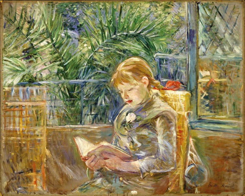
“In her paintings, including portraits, of the later 1870s and 1880s, she indeed seems to be exploring color and texture without being constrained by direct observation of her subjects or how light falls upon them. Some of these paintings, with parts of the canvas left bare, look more like pastels than oils.” I further read that the palm fronds in above work are variations on the theme of the merging of indoors and outdoors which became a Matisse, then Bonnard, signature in the early 20th century. She achieves this effect with intricate and fast brushwork that yields porous, tactile surfaces that absorb the eye and stir sensations of touch. She had a loose and almost unfinished-looking technique. Her paintings, indefinite at first glance, but makes one to contemplate once you’ve started looking. It is as if she had truncated a process that we, as viewers, can see through to completion.

Looking at the Post-Impressionists and how they exploited optical effects, I choose to research more about Seurat, who believed that by placing tiny dabs of pure colors adjacent to one another, a viewer’s eye compensated for the visual disparity between the two by “mixing” the primaries to model a composite hue. The Post Impressionists use more solid patches of colour as well as clearly defined forms. Seurat claims to have established the techniques of optical painting.
I found good research material on the Colourlex.com website, as well as a research abstract from Harvard Art Museums which I decided to use. Below is an image of the work of George Seurat that was researched by Harvard’s Dina Anchin, Vase of Flowers. Seurat did only this one Still Life and the mentioned research material gave great insight on the techniques he developed over his lifetime. The painting depicts a vase with red hydrangeas, standing on a table that is covered with an off-white cloth. The vase is centrally placed on the corner of the table. The light source comes from the right side of the painting – one therefore see streaks of sunlight on the tablecloth. The table is positioned off center within the composition. It seems the ground is a thick layer of off-white in colour, even a small amount of yellow ochre added to it. Anchin also established that Seurat would sand/scrape paint of layers when they were completely dry. If layers would be applied too soon, they would disrupt and blend into the brushwork below. It seems that his paint surface is fine and intentional – sanding the surface was done in a slightly circular or curved stroke and lifting the sandpaper after each stroke. Cross-sections reveal that this texture is not in the ground, but rather in between paint layers: it is part of a layering system that involved abrading the top paint layers to reveal certain colors side by side. Seurat would use staggered broken and directional painstrokes of contrasting colours in the background. He places complementary colours alongside one another to produce this striking optical mixture. Chevreul would state this as maximum contrates in his laws of simultaneous contrast of colour and tone. The effect is more exciting to the eye than that of a single unified colour. One can look at the deep red and pink flower petals alongside shades of a deep blue and a lighter blue and yellows in this bouquet. These colours vary in length next to one another without being blended. It clear that he uses particular pigments to create this optical formula.
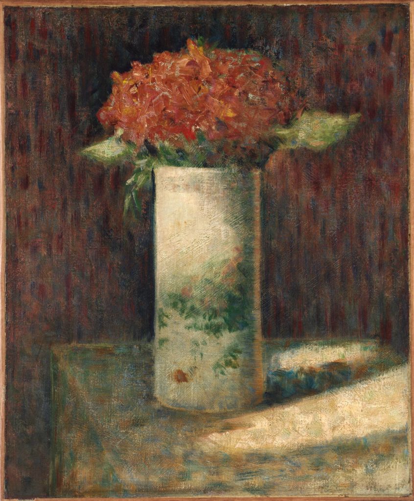
This is a small work in size and great to compare with his mature style, pointillism, around 1886 as seen in the work below.
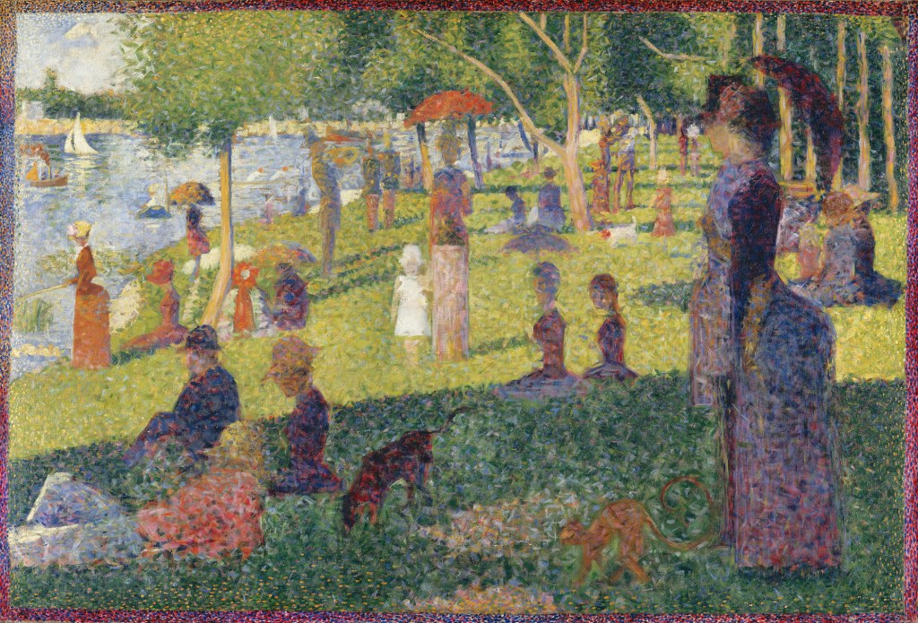
In the final work, after above study by Seurat, he used tighter, dot-like dabs of paint, a technique which came to be known as Pointillism (from the French word point, or dot). He preferred the term Divisionism—the principle of separating colour into small touches placed side-by-side and meant to blend in the eye of the viewer. Anchin ( 8 :2013) states that his divisionist technique became even “more polished and tightened with the application of individual small strokes of paint and subtly and thoughtfully constructed harmonies and contrasts of colour.”
Hoffstatter (Hoffstatter:2013) states the following: “Mixing pigments physically is a subtractive process with cyan, magenta, and yellow being the primary colors. On the other hand, if colored light is mixed together, an additive mixture results, a process in which the primary colors are red, green and blue. The optical mixture which characterized divisionism — the process of mixing color by juxtaposing pigments — is different from either additive or subtractive mixture, although combining colors in optical mixture functions the same way as additive mixture, i.e. the primary colors are the same. …… in reality, Seurat’s paintings did not actually achieve true optical mixing; for him, the theory was more useful for causing vibrations of color to the viewer, where contrasting colors placed near each other would intensify the relationship between the colors while preserving their singular separate identity.” I wonder what the size of the work had to do with how Seurat intended the viewer to perceive the divisionist principles of his painting technique.
REFERENCES
Anchin, Dina, 2013, Refining Style: Technical Investigation of an Early Work by Georges Pierre Seurat in the Maurice Wertheim Collection, PDF Straus Center for Conservation and Technical Studies, Harvard Art Museums, page 1 -42, online accessed on 12 December 2019.
https://www.flickr.com/photos/huffstutterrobertl/8392596020) Hoffstatter, Robert, January 2018 Our changing social graces illustrated, blog accessed on 11 December 2019.
Online reading on the website of colourlex .com
Bridget Riley and the Op Artists
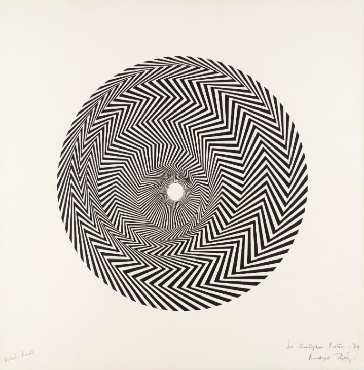
According to the Tate website, Op Art was a major development of painting in the 1960s that used geometric forms to create optical effects. They state the following : “The effects created by op art ranged from the subtle, to the disturbing and disorienting. Op painting used a framework of purely geometric forms as the basis for its effects and also drew on colour theory and the physiology and psychology of perception. Leading figures were Bridget Riley, Jesus Rafael Soto, and Victor Vasarely. Vasarely was one of the originators of op art. Soto’s work often involves mobile elements and points up the close connection between kinetic and op art.”
By juxtaposing lines of complementary pure colours Bridget Riley can affect the perceived brightness of the individual colors, or as in below painting where she used achromatic colours, the work appears to flicker, pulsate and move, encouraging the viewer’s visual tension. Her intent is to challenge the way viewers looked at a painting by eliminating all representational content. In this way she simplified her visual language to utilize only black and white and the elements of line, shape and form.
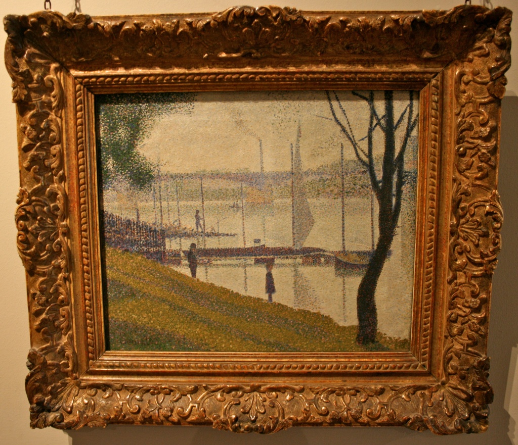
Apparently she spent two years copying Seurat’s painting, Bridge of Courbevoie, to learn about his painting technique and his use of complementary colours.
I am thinking of how the use of colourful and eye catching patterns geometric forms, graphic motifs and monochrome designs have come into our homes, not just as art works, but in the form of fabrics, tiles, carpets and other flooring and furniture.