INTERIORS BY DUTCH REALIST GENRE PAINTERS
Traditionally, genre painting is understood as the art of the everyday – and it’s something, the history of art tells us, at which Dutch Golden Age painters excelled. On the Museum Del Prada website I read that the Dutch Genre painters made small sized paintings of interiors ( 45.7×40.6) and that this formula allowed these artists to focus on the representation interior spaces, the geometry of the composition and the depiction of light and of the textures of the different materials. Paintings of domestic interiors most often deal with the virtues of domestic life, seduction and love. The protagonists of most of these works are women, who are given a prominence that hitherto they had only received as religious or mythological figures, or as personifications of allegorical concepts. On BBC I read the following, which makes on think about intentions of artists: “Looking at a Dutch genre painting on its own, it’s tempting to assume that the artist was carefully transcribing whatever was before him. Seeing so many genre paintings together, we realise that Dutch artists weren’t interested only in reality: they were also keeping one eye firmly on other artworks by friends and rivals.”
Samuel van Hoogstraten

Born of the painter’s particular interest in spatial construction, this work is typical of Dutch genre painting in that it depicts an interior scene. For me this is also an example of an exercise in perspective:The illusion of perspective is enhanced by the oblique lines of the various tiled floors, as well as by the alternating contrast of warm light and shadows. One is immediately aware of the absence of human figures. The view that we see is into a space where there is a key in the door, a broom, slippers, a candle, a chair and a painting within a painting. As the eye moves around this silent space, the objects draws the viewer into the scene that is most probably very bourgeois and gives the idea of something not resolved – a deliberate moment maybe?. Reading about his intentions on the Louvre website, it becomes clear that here is symbolism with a moral intent.
- the slippers are a womans small house shoes, which become a sign of a depraved existence now that they have been discarded
- The mistress of the house has abandoned her domestic activities: she has negligently left her broom leaning against the wall and interrupted her reading (the book, significantly, is closed) for a vain past time, an amorous adventure.
- The painting within the painting – a Father reprimanding his daughter, done by Casper Netscher – is a variant of a work by Gerard Ter Borch denouncing venal love.
- The snuffed candle, is the symbol of time wasted in following loose morals.
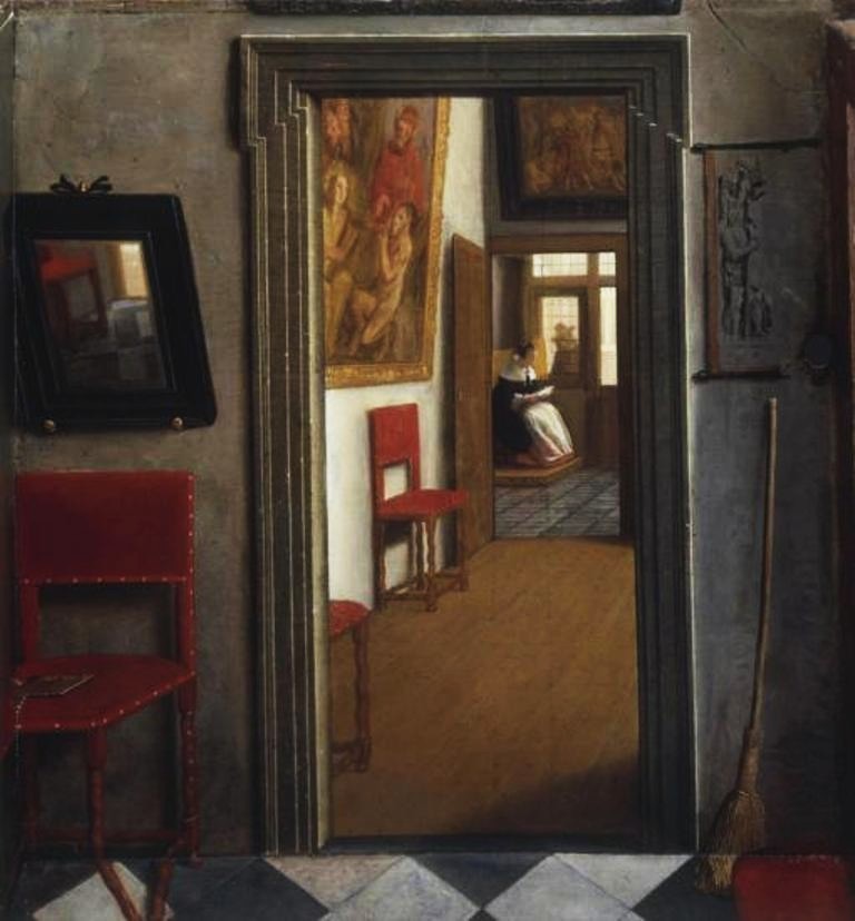
Samuel van Hoogstraten, 1655-60
Oil and egg tempera on wood 58 x 88 x 63.5 cm
National Gallery London
I found above perspective box – the interior immediately reminded me of the painting I discussed above – colours were changed of the floortiles and chairs – but for the rest it could be the same home.
Reading on Samuel van Hoogstraten on the website on the Louve Museum https://www.louvre.fr/en/oeuvre-notices/view-interior-or-slippers-traditional-title-given-19th-century
https://www.museodelprado.es/en/whats-on/exhibition/vermeer-and-the-dutch-interior/462d572e-bbb2-4b22-9f18-9b4e2591dc05
Johannes Vermeer
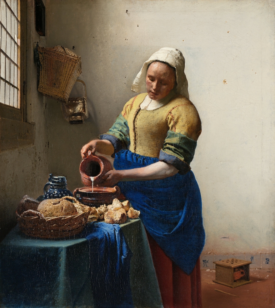
An interesting observation I read is that in above painting Vermeer no longer relies on a chiaroscuro to create this nuanced luminescence. Instead, here he uses alternating primary colours and areas of light and shadow. and one could think here we have direct observation of the artist of the scene . Vermeer restricted his palette mainly to the primary colors of red, blue, and yellow.
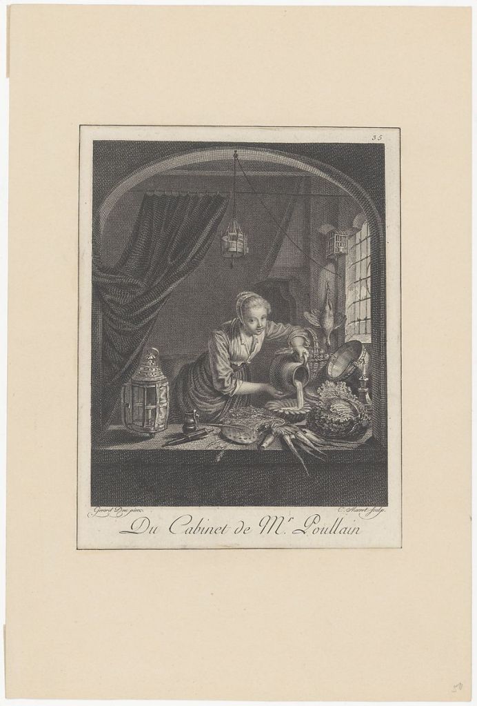
In the article in BBC Culture, Ducos gestures towards The Milkmaid, which Vermeer painted when he was only about 25 years old. “The Louvre has the source for this painting,” he says, referring to Dou’s Kitchen Maid of c1645-53, a tour de force of detailed realism, which also depicts a female servant pouring liquid into a bowl – in this case positioned beside a bunch of suggestive carrots.
“Obviously, the two compositions are much alike,” Ducos continues. “But I think Vermeer was unnerved by what Dou had done, because he thought it was anecdotal, even a bit ludicrous. So, he reacted against Dou’s painting and simplified it, peeled away all the accessories, all the unnecessary impedimenta. In the Dou, the face of the lady and the carrots are given the same importance. But in The Milkmaid, there is hierarchy, and everything is meaningful.”
How, then, would Ducos describe the nature of Vermeer’s genius? “Vermeer’s art is an art of transformation,” he replies. “In The Milkmaid, he transformed Dou, by getting back to the essential, and turning a humble servant into a queen. Once you’ve deciphered Dou’s Kitchen Maid, it’s done. With Vermeer, there is more psychological complexity, more to dwell on. You can spend your life looking at The Milkmaid.”

I do like the use of light and mood of above painting very much.
http://www.bbc.com/culture/story/20170425-why-vermeers-paintings-are-less-real-than-we-think
Looking at interiors by artists in different period
Below are works of two French artists who captured children playing, and called their paintings, Soap Bubbles.

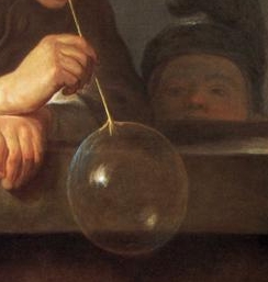
According to the website of the MET Gallery, idle play of children was a favorite theme of Chardin, who was a naturalist. His inspiration is from the seventeenth-century Dutch genre tradition for both the format and the subject. While it is not certain that he intended the picture to carry a message, soap bubbles were then understood to allude to the transience of life.
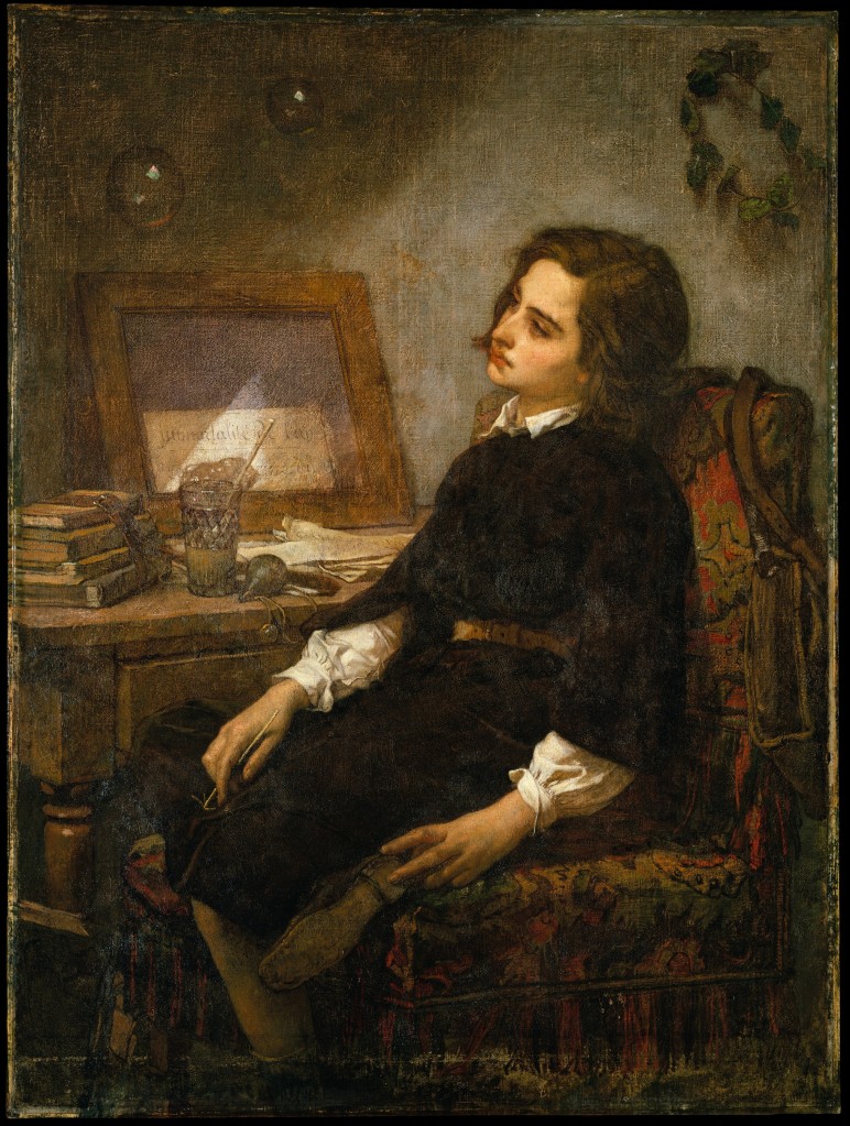
It seems Couture presents his Soap Bubbles as a philosophical meditation on mankind’s inescapability of transience,. He brings a straightforward allegory into the work and make dramatic use of light and colour.

Bonnard never painted from life, only from memory and was a great colourist of his time. These paintings gives the idea of reflections and memories of rooms – I do like the appearance of mirrors and the way the room looks like a lived in space. Looking at the reflection of a person sitting on a bed it reminded me of work I did in Drawing 1 course. I did go back to reading from my blog and

I found his colours very interesting and read that in this time, Kandinsky was evolving from figurative to abstract art – and the shift in tone was very obvious in this work. His choice of colours for this piece were likely subjective rather than what he was actually seeing.
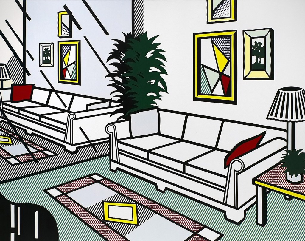
Then there is Roy Lichtenstein’s Interiors, which are based on advertisements, most of which Roy Lichtenstein cut from the Yellow Pages. Being a pop art painter whose works, in a style derived from comic strips, portray the trivialization of culture endemic in contemporary American life. Primary colours (red, yellow and blue) was heavily outlined in black. Occasionally he used green. I did note that he used his own artwork as art hanging in these interiors.