• Detailed observation of natural objects: detail and tone
• Still life:using line, using tone/colour, experiment with mixed media, monochrome
• Home: subject, light source, quick sketches around the house, composition – an interior, material differences.
In this study log I will present Project 1.
COMPOSITION
It seems to me composition is the placement or arrangement of objects and shapes in such a manner that the viewers’ eyes are caught to look at tone and shape as shown in the work of art. It is important to consider the light source, positioning of objects/shapes, colour, size of objects. It is to create some form of symmetry and or rhythm or flow. I need to make a study of two theoretical art concepts – Elements of Art and Design and Principles of Art and Design. Composition is about creating a scene, almost using a viewfinder for the exclusive use of looking at atmosphere, subject placing, lines, light flow into the scene as well as contrasts in tone and colour. It is how the Elements of Art and Design – line, shape, colour, value, texture, form, and space – are composed according to the Principles of Art and Design – balance, contrast, emphasis, movement, pattern, rhythm, unity/variety – to give the painting structure and convey the intent of the artist.
I looked at the work of Balthus ( Balthasar Klossowskil 1908 – 2001) and the following quote stood still with me for some time: “Real modernity is in the reinvention of the past, in re-found originality based on experience and discoveries” the artist once said (Balthus, quoted in Vanished Splendors A Memoir, New York, 2001, p. 81).
To do small poster studies as preparatory sketches would help to test composition for drawings and or paintings. I feel it would also release me from the idea of doing it right and taking risks in terms of expression and growth by the different approach of media. Henri Matisse defined composition in his ‘Notes of a Painter’ in this way: “Composition is the art of arranging in a decorative manner the diverse elements at the painter’s command to express his feelings.”
I did a quick Aquarell pencil drawing of fruit and vegetables – ready to prep for a curry dish. I added the pitcher to the scene but did not find the composition to make me interested in following through with a drawing.
Coloured pencil in A4 Sketch book
Further experiments in the kitchen – with pencils and pastels
Kitchen experiment on Tiziano paper
I liked the fact that I did not mind the mistakes, but tried the medium out. I started off with pencil, added coloured pencil, burnished it with with and draw on top of it again. I should have planned better – used the odd fruit and vegetable that was in the kitchen on this moment. I think one could create beautiful everyday compositions with fruit and vegetables and other things in your environment to draw forms and focus on line, tone, marks, light and shadow. I do not feel a natural inclination towards coloured pencils as it seems to get messy and out of control.
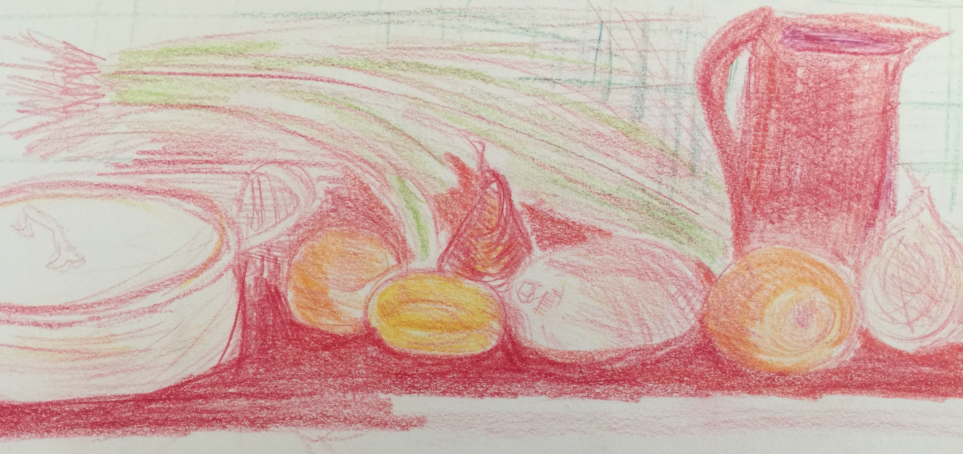
I also used my clarinet in a composition – it is getting winter and it could be a cosy scene about everyday life. I add lemons (yellow) for a contrasting colour for the green bottle, as well as more shapes, and change the thermosbottle for a book. I am not sure about creating depth in this composition, so I add a black board , which also create lovely cast shadows of the tall objects. I am considering to add some autumn leaves which I can collect outside.
The clarinet came out really bad, as well as other lines and perspectives. I start over, fix my lighting to work any time of the day. I add light from the left, attach it to my kitchen shelf. I can see that after a quick poster sketch that I could do more to create atmosphere and reflection of light. I understand the value of working with everyday life objects, as this will apply in other drawings as well. I cannot say I think this is a good composition.
Pencils and soft pastels on Canson paper
I can do much more with shadows and reflected light, and focus on the forms and negative space around the objects.
Experimenting with still life objects and exercises whilst researching the topics of Still life and Positive and negative space:
I used the same exercise as above to indicate positive and negative space and then did a pattern exercise on black paper with white and green soft pastels.
Coloured pencils on White sketchbook papernegative space on black paper
STILL LIFE GENRE
One can define a still life as a painting composed primarily of inanimate objects. Still life includes all kinds of man-made or natural objects, cut flowers, fruit, vegetables, fish, game, wine and captured inside a home or homely setting. No human beings are portrayed in still life, the arrangement and composition of things in this genre show a world in which humans have deeply intervened by moving, crafting and sometimes destroying objects. It seems that doing this genre in art, gives the artist the ‘control’ on exactly what subjects they want to depict, as well as how these subjects will be arranged.
A Still life can be a celebration of abundance of material things such as food, wine, or the modesty of living with little; it is all about the vanity of life theme. I love the idea of a still life being something abandoned. I looked at photographer, Matt Emmet’s genre of abandoned places, where the frail beauty of once lived in spaces is captured.
In my research on the topic and the traditional approaches to Still Life, I came to understand the French word for still life, ” nature morte” – refers to live and death, not just as the objects in the still life are all dead/natural and indoors where most of our daily lives take place: but to a life lived to die in any way, everything will decade despite all the opulence or modesty, vanity and worldly ambitions.
A still life holds in that moment often a warning of the ephemerality of these pleasures and of the brevity of human life. There is also symbolism hidden in this genre. The purpose could be to suggest to the viewer that there is some significance behind meets the eye.
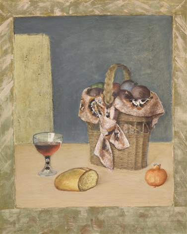
Jan Vermeulen, Vanitas Still Life
Interesting story I wanted to read about: An early example of the value placed upon the artist’s illusionist skills , how well he could paint real lif, is a well-known story from Pliny the Elder’s Naturalis Historia. The ancient Greek painters, Zeuxis and Parrhasius competed in a contest to determine which o f the two was the greater artist. Zeuxis’s rendering o f a bunch o f grapes was so convincing that birds flew down to peck at them. The legend holds that Zeuxis then asked Parrhasius to pull aside the curtain from his painting. When Zeuxis realized that the curtain was Parrhasius’s painting, he conceded defeat. ( I heard this reference on on a you tube event of the National Gallery about Still Life, 12 May 2018)
The painting generally considered to be the first still life is a work by the Italian painter Jacopo de’Barbari painted 1504. Still-life painting was born as an independent and international genre around 1600. No single country can claim a right to its origin, and no single artist can be said to have painted the first still life, as the genre’s beginnings can be found in pictorial traditions all over Europe, ranging from Flemish Marian paintings of the fifteenth century to Spanish bodega and stone-niche pictures, from natural history books to Italian meat-stall imagery. Diverse as they are, these images share the rendering of foodstuffs, flowers, bowls, and other mundane, insignificant objects at the margins of their compositions.
What happened around 1600 is that these prosaic objects suddenly became the focal point of a single picture. The “golden age” of still-life painting occurred in the Lowlands during the 17th century, although the 17th Century the French Academe did not regard still life as an important genre. During these times still life and landscape were considered lowly because they did not involve human subject matter. I t was during the 17th century that Dutch painting truly flourished. With their new technique of oil painting, ascribed to Jan van Eyck, Flemish artists could paint more naturalistically than ever before. These artists enchanted their audiences with bedazzling surfaces that reproduced in minute detail both the natural and manmade world. This style was referred to as Vanitas. These painters also had a deeply reverential attitude towards the physical universe because they saw it as a mirror o f divine truth. Their artworks contained both traditional medieval symbolism and subtle and obscure symbolism. In Holland the Reformed faith had become the official religion. For the first time in the history of art private collectors became the painter’s chief means of support. The general public collected art on a grand scale. The unprecedented demand for art produced “an outpouring of artistic talent not seen since early Renaissance Florence (Janson 424). Because artists no longer relied on patrons they had more freedom to choose their subjects, though they needed to produce work that they thought the public would purchase. Most buyers wanted paintings of subjects with which they were familiar so particular types of still lifes were produced for target audiences. Some of these were kitchen scenes, meat and game still lifes, flowers, depictions o f the five senses, vanitas paintings, confectionery still lifes, food still lifes, banquet still lifes, fruit, musical instruments, and books. Trompe l’oeil painting became popular later in the century as an innovative and amusing extension o f the still life genre.
On Friday 11 May I viewed a life broadcast from the National Gallery on a current exhibition by artist Tacita Dean; Still Life, I later viewed a 45 minute discussion between Bart Cornelis and Daniel Hermann on the exhibition on YouTube. The curator of Dutch and Flemish Paintings, Bart Cornelis, discuss her paintings and bring relation to Still Life perceptions as from the early paintings in the history of this genre. He commented on Still Life being ‘ the ultimate from of imitation’ and the paradoxes it underlies. The exhibition is curated by the artist herself and the viewer is guided by her understanding of the genre of still life within a landscape, a rootedness of trees and rocks. She almost juxtapose works of the history of this genre together with her own film installations to demonstrate the relevance of this genre, Her film diptych made especially for the exhibition, ‘Ideas for Sculpture in a Setting’, and ‘Prisoner Pair’ (2008, 16mm) – It seemed that the video of the work, In Prisoner Pair was a challenge to the genre. She has filmed ( moving image, compared to Still Life) pears slowly dissolving in jar of schnapps. The camera dwells on stems and bubbled skin, light on the glass and refracted light within the jar. Things in jars have a kind of anatomical, forensic quality. Here, decay is suspended, or turned slowly into alcohol. The pear dissolves in the liquor. This is juxaposted with a watercolour painting of two apples done in early 19th century.
Still Life has a new meaning to me – not everything is dead, but it is is going to die. She still uses traditional 16mm film in her works. Bart Cornelius refers to ‘pre conditioning’ of the Art Historian to look at art in a certain way (very liniar, sticking to categories,etc) and this is what this artists really achieves with the still life exhibition, which she also curated, that we look different, it is a fleeting moment.I think her own comments :“All the things I am attracted to,” the artist once wrote, “are just about to disappear”, makes the artistic choice for how she curated this show, clear to me. It also leaves one with the idea that Still Life is almost entirely artificial. The exhibition feature works by Dean’s contemporaries, including Thomas Demand, Roni Horn, and Wolfgang Tillmans, and paintings from the National Gallery Collection, such as Zurbarán’s Cup of Water and a Rose, works by Paul Nash and Henry Moore. Interesting to note is the artist is also a collector of things natural (clover and round stones)
For me a Still Life, at this stage of my understanding, makes a connection on our human nature to “gather and show “, sometimes to the point where it almost become vulgar, when compared to the reality of the huge poverty so many people suffer. It also is a story about the history and bear witness to changes in people’s awareness within their cultural history. Artists choose their subjects for their visual, emotional, psychological, spiritual, political and sometimes, as in the case of many 17th century Dutch artists, economic appeal, and therefore it is also a study of beauty. No matter what the subject, the painter must observe keenly, render with care, all the while keeping formal concerns in mind.
Van Gogh, I noted during research about Still Life, made around 200 still life’s. These include sunflowers, portrait-chairs, battered shoes, heaps of novels and twisted torsos, baskets with fruit. It reminds me of everyday objects, not necessary ‘composed’ for the painting, but as objects his artistic eye saw and to train and develop his skills. Then, his Still Life, Still Life with Open Bible, Neuen, April 1885 has interesting observations with regard to what we ‘read’ into it. In this painting the family Bible is juctaposed with a small paperback novel by Emile Zola. The bright Yellow of this book, contrasts sharply with the dark Bible. This is shortly after his father died and he departed to Antwerp and then Paris. This painting can be seen as a way to lay his past to rest, his religious upbringing, his distance from his father, a bible to commemorate his father or his religious upbringing, a candle that is blown out (his father who is dead), as well as a much read book of Zola, “la Joie de vivre — in it I almost read his search for happiness and or his interest in the socialist ideas to challenge poverty and the lives of the peasants, which Van Gogh at this stage of his life has seen and came to identify with. I also think it says something about his hopes that he would start selling his art works when he moves on.
Henri Fantin-Latour: He took the opposite view to academic principles. Many of his still life paintings, which tells no story, is intended purely to appeal to the eyes, thus
embodying one of the main aims of modern art.
I read on the website of the Musee d’Orsay the following: “Fantin-Latour reveals his fondness for the past in his still life paintings. Here, the painter openly claims the legacy of Chardin, the master of the 18th century French school. In the classical style, the triangular arrangement of the flowers, the plate of fruit and the bunches of grapes constructs the space. In addition to these elements, a knife is placed at an angle on the edge of the table, a traditional accessory for increasing the perspective. The pale, subtle light brings out the shapes and bright colours of the flowers and fruits. We can see the thicker brushstrokes expressing the textures of different types of flowers, and the lighter, transparent brushstrokes that the painter uses for the grapes. This painting is a good example of the meditative, intimate world beloved of Fantin-Latour, where tranquillity is skilfully harmonised with the liveliness of the tones and colours.”
Looking at the work of French artist, Paul Cezanne, his style in this genre was to use angular forms and he is seen as a forerunner of Cubism. Cezanne was interested in painting still lifes of things like fruit, bowls and cloth. I love his bright colours
George Braque’s Violin and Palette (1909) has the subjects of a violin and sheets of music. His forms of the subjects are angular and spread across the picture plane – to me it looks as if they are broken up into fragments that almost fuse and flatten with the background. It is a study in limited colours of shades of blue grey. It is also showing how artists were influenced by science – in the way they would think about space and time, and finding new ways to represent the world of things. It looks like a braking down or an analysis of form. The other painting of a guitar and jug (1927) looks much more like the paintings of Cezanne. I saw the white outline around the jug as a way of indicating the form, in a dark and muted scene, and almost leading the eye into the picture.
POSITIVE AND NEGATIVE SPACE
Look at the work of Gary Hume and others
It seems that artist Gary Hume is mainly concerned with the abstraction of form, shapes and colours. His modern art style paintings are easy on the eye and made with shiny gloss paint. They consist of bright colours, sharp edges, rendered as big blobs or strong outlines and silhouettes, which make for the effective use of negative space of his image or abstraction. I particularly like this floral painting and the use of negative space to make this image identifiable as a flower, although this painter wants his viewer to create his/her own narrative.
I loved his latest work, Mum, which was shown at the MatthewMark Gallery, Nov-Dec 2017. Again the use of flat colours, but the works on paper was just to suited for the topic of memory and loss – his mother is suffering of Dementia. The paper literarily curl under the weight of the enamel paint full of large, shiny, vertical lines and flowers.
I see the work of Harold Garde, an American abstract expressionist, as contemporary when put next to the work of Gary Hume. The objects are placed in the white negative space on the first painting, below, and a lovely balance is created in this monochrome Still life. The second very bright painting, below, reminds me of Matisse, very sharp edges around the different forms.
In Cindy Wright’s painting Nature Morte 2, a bloody, gutted salmon is coiled in a goldfish bowl. It sits heavily on a dainty white doily and we see the refection of the room on the surface of the bowl.
The doily might add to some pathos and the fishbowl could be a normal domestic setting, with a gold fish in it, but , instead, here the dead fish’s eye stares out of the frame in an accusatory fashion, confronting viewers about the real nature of the foodstuffs we eat. Her images remind us that eating fish comes at a real cost, the death of once living creatures. “By juxtaposing domestic objects then rendering them in oils with exceptional skill, she turns the mundane into sensuous and disconcerting imagery that forces viewers to reconsider their every-day.” (Debbie Chessell critique on Guildhall Art Gallery’s exhibition, Nature Morte, Sept 2017)
Other of her works: Festoon of fruits and fly, 2016 which references the traditional Dutch still life painting by the Dutch painter, Jan Davidsz. de Heem, Festoon of Fruits and Flowers (1660-1670) that hangs in the Rijks Museum, Amsterdam, shows her reference to traditional Still life painting.
BIBLIOGRAPHY
Brittanica.com/art/still-life-painting
Michael Petry, Nature Morte (Thames&Hudson PDF , 14 October 2013)
National Gallery: youto.be/PgMmKHD30q
Still Alive: Celia Perrin Sidarous, Peter Morin and the Still Life Genre Clintberg, Mark C : International Contemporary Art; Spring 2015; 125; Arts & Humanities Database pg. 10
REVIEW of my work after the last two exercises
In modern art simple still life arrangements have often been used as a relatively neutral basis for formal experiment, for example by Paul Cézanne, the cubist painters and, later in the twentieth century, by Patrick Caulfield. Whilst doing the exercises I am confronting ideas about life and death, why I hold onto stuff and what it means to me to have stuff. I come to the understanding that the nostalgia that is attached to this stuff on the table in my entrance hall to my home, is about my loving old things, value of their place in a time when life was much more simpler and honest or real. I question pretence and materialism, and I value honesty and truth. I find beauty in this place where I ‘play’ with pastels and objects — is this a road to a composition? I need to make decisions on what is important. I have to utilise size, colour, shape, tone, colour, materials and my own ‘theme’ to create a story of this Still life and almost bring l ife to it.
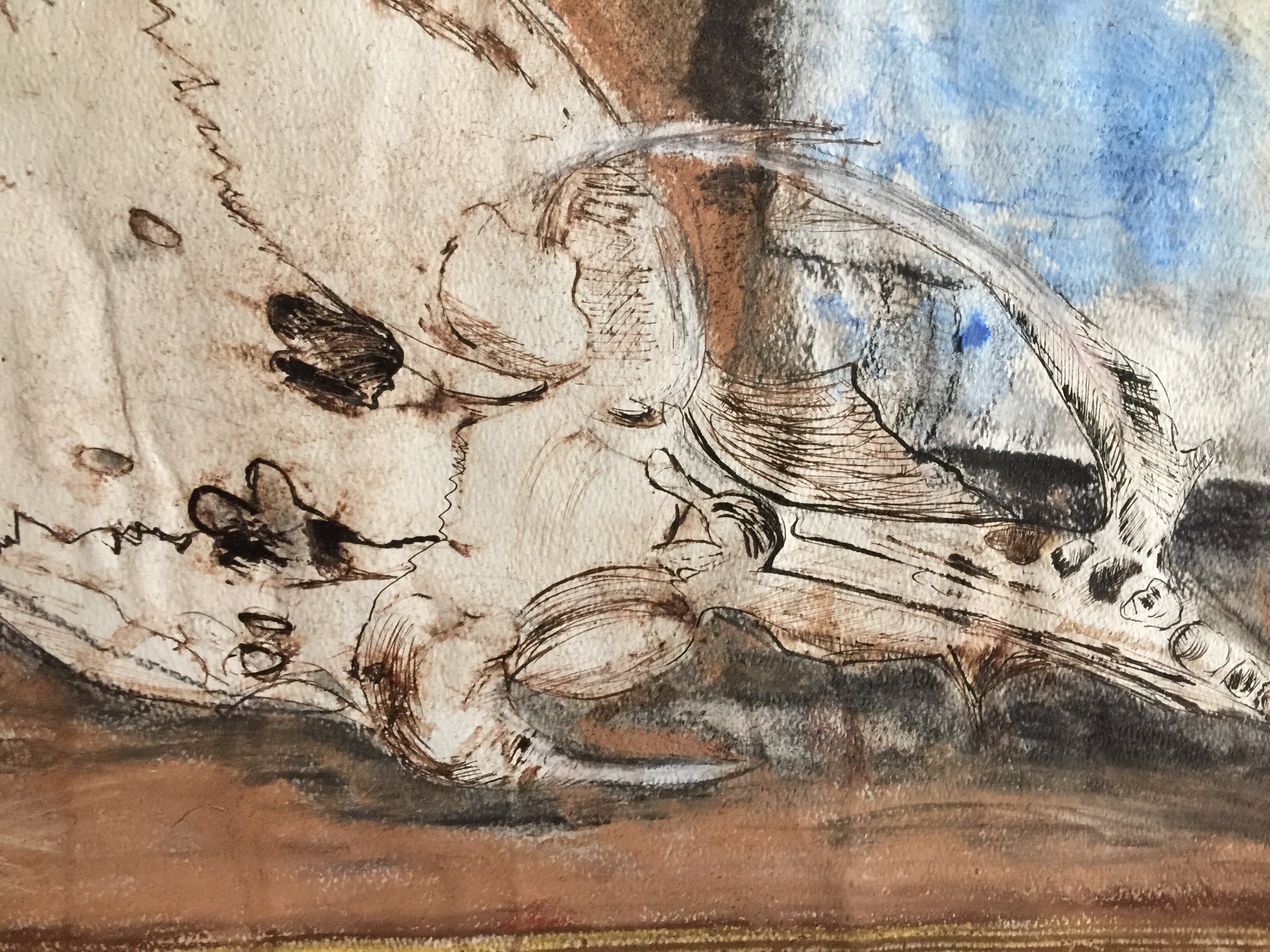
It is almost a review how I make connections in my own art. My research at this stage gave me an opportunity to think about Contemporary Still life as a positioning of the ‘Vanity’ ideas of Still Life within our current lifestyles. Whilst continuing with the exercises, I decided to attempt a Still Life in preparation for the assignment. I use a seal skull and books for my composition and place it on a book, and think this repetition of shapes can bring the composition together. I restrict colour and the strong verticals of the big book after Harold Garde (Still life in monochrome, which is also the featured image in this blog.)
Ink and pastels on A2 Mixed Media paper
The skull of a seal was picked up after the waves at the beach left it behind. I see it as a found object and it is part of a collection of found objects I collect in nature. I juxaposed a book I am currently reading behind the skull and also placed the objects on a bigger (precious) book from our bookshelf. I read on the Tate website that the artist (sculptor) Henry Moore for example collected bones and flints which he seems to have treated as natural sculptures as well as sources for his own work. I think the sea is a great place to come to terms with the forces of nature and natural life, and then the sea is never ‘still’. I see a form of frail beauty in something like a skull – it is something that once lived. I worked on A2 Mixed Media paper with dipped ink pen in sepia ink as well as charcoal and soft pastels. I used my mechanical eraser to create golden pages of the big book. i was not sure if I should have added more background colours. I am pleased with the composition and like the strong lines of the books, all manmade objects as opposed to the bony edges of the skull, a natural object. The idea that skulls symbolise mortality and ephemerality is great for this composition as I think it leads to contemplation about life and knowledge and death. I decided to change the paper size when I placed the skull and wanted to experiment with the drawing media. I did not feel to precious about the drawing and tried different hatching lines with ink as well as with the other media. I did find it easier to draw the books as the skull – being more intricate and challenging due to different planes and the form.