9 July 2018
Research point
Look at the work John Virtue did whilst being an associate artist in residence at the National Gallery during 2003-2005. His ‘London paintings’ were on display there in 2005. Virtue said, ‘ I have no interest in recording a rhetorical history of London; really I’m interested in making exciting abstractions from what I perceive.’ His black and white paintings are all on on canvas, using white acrylic paint, black ink eand shellac. I read an article on the exhibition in the Mail&Gaurdian : The only paint the National’s “associate artist”, as it calls its artist in residence, has used on his huge canvases is black and he has clearly got through buckets of the stuff. Take the one entitled Landscape No 760, which shows the length of the Somerset House facade seen from the Thames hanging luminously behind what looks initially like the black pall from some noxious industrial fire.” Day in, day out, in all seasons and weathers, he has begun his day by drawing London from three vantage points: the roof of Somerset House looking over the river to the City; a position on the south bank near the Oxo Tower, looking north; and the roof of the National Gallery looking past Nelson down Whitehall and beyond. He has also frequently taken boats up to Greenwich and worked from a spot on Observatory Hill.
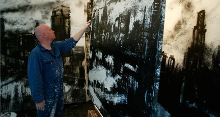
The Mail & Guardian also refers to an even bigger panel, “a quarter of a gigantic work that, at 14ft by 28ft, is twice the size of the biggest painting in the gallery, is a segment of a Thames panorama painted from near the Greenwich Observatory and following its sweep from the Dome round to St Paul’s and the City.
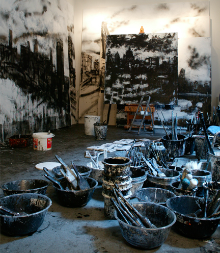
Virtue abandoned using coloured material in 1978. According to him he couldn’t express what he clearly wanted to express with coloured materials, and therefore got rid of everything. He found himself returning more and more to the etchings of Rembrandt and Durer and the drawings of Seurat and Van Gogh. “They seemed to give a sense of actuality far more than anything I could achieve with paint.” The etchings in the Rembrandthuis in Amsterdam, he says, form one of the “most tonally rich” collections in the world.
I do appreciate the following comment of him: “I don’t think in colour. I think in structure, in light and shade – it’s very hard to define.”
In a Ted Talk about Movement I heard the artist talk about how we move, glance and gaze at our landscape and imagery around us. He talks about early 70’s when he stopped used chromatic materials and started with daily routines of drawing on postcard size, what he saw as he moved/walked. glanced and gazed, in the process building up thousands of images. He referred to the process as a minimalistic repetition. The fact that he stopped using oil paints and canvasses – helped him to create his own set of media, black ink, which he mixed with shellack, for a permanence and durability. He saw this process as as a form of mapping with pens, in stead of brushes.
The context of the research is to find a theme increasingly adopted by contemporary artists who revisit the art historic subject of ‘landscape’ to offer insight into today’s fast changing society. In my view, due to modernisation, the historical connection of dependency between humankind and landscape has undergone a transformation that has broken old patterns of co-existence, so that today it seems that humans and nature exist more disconnected than ever. I feel strong about this and it lead to a process which I call “exploration with lines’ , where I try to create a conversation around the killing of rhinos for the usage of their horns, with charcoal drawings. ( see my blog, contemplatingrhino.com) I believe the connection between landscape and art runs deeper than allegory or metaphors. More and more contemporary artists are working with communities where landscape art represents a vector of solving disputes, finding solutions, learning, behaviour change and enrichment, to name but a view outcomes.
I also looked at the work of Olafur Elliasson, an Icelandic-Danish artist, (born 1967) who is known for his large -scale installation art employing natural elements, like water, light, fog and makeshift technical devices to transform museum galleries and public areas into immersive environments. His famous, The Weather project, Tate Modern, 2003 is a great example of his work.

The weather project tells of the climate and of its social effects, in the context of a museum, Tate Modern, which is located at the heart of a large post-industrial city. In Eliasson’s view, the weather acts as ‘nature’ in the urban context, for, even though it is possible to control the climate inside buildings, it remains out of human control and can never be forecast with certainty.


Work done by visual artist, Xomatok, that covers the streets of Lima, Peru.
I read the following on a blog on a discussion of a book by Michael Jacobs, Everything is happening: journey into a painting on Velázquez’s Las Meninas (1656) something that I found awesome to think about. “Proust, writing on Rembrandt, had spoken about paintings as being not just beautiful objects but also the thoughts they inspired in their viewers. [Svetlana] Alpers was cited as saying that “looking at a work in a museum and looking at other people looking at a work in a museum is like taking part in the life story of this work and contributing to it.” I like the idea of having a theoretical and scholarly manner to look at art, but never to loose one’s wonder. I felt very strong about this when I looked at the work of John Virtue, after listening to the mentioned Ted talk he gave. His rituals of walking, glancing and gazing is not without conscious awareness when you look, a place of being in awe – this is where his works talks to me. In my reading/research about Evidentiary Realism and the work of Paolo Cirio, I came upon the following words written: “…. where there is the opportunity to ‘push the boundaries of what is made visible beyond the gaze”

I live in the capital city of South Africa, called Tshwane. The area I live in is called Centurion and it is situated on the South Easten border of the city. Irene town area is an older part of the city and was once the farm of Genl J Smuts. The town of Irene was established in 1902 when 337 plots were laid out on the farm Doornkloof. Jan Smuts later owned this farm, and died there in 1950. The original Smuts House is a museum today, and regularly hosts open air fleamarkets on its grounds. Centurion is an area with around 250, 000 inhabitants in Gauteng Province of South Africa, located between Pretoria and Midrand. Centurion was granted City Council status in 1962 but by 2000, the Centurion local government became part of the newly-created City of Tshwane Metropolitan Municipality, which also includes Pretoria, and the town ceased to have its own Town Council.
During 2016, Cool Capital, as content of the South African Pavilion, was showcased to the international audience at La Biennale di Venezia 2016. Eric Duplan’s artwork captures Cool Capital’s intent to connect the detached parts of Pretoria ( the inner, both physically and theoretically by firstly creating an awareness of spatial design and secondly by organising a platform for people of diverse backgrounds to interact. It is an aerial view of Pretoria which reveals a sprawling metropole originating from a rigid Centuriation grid structure with Church Square at its core in the CBD.
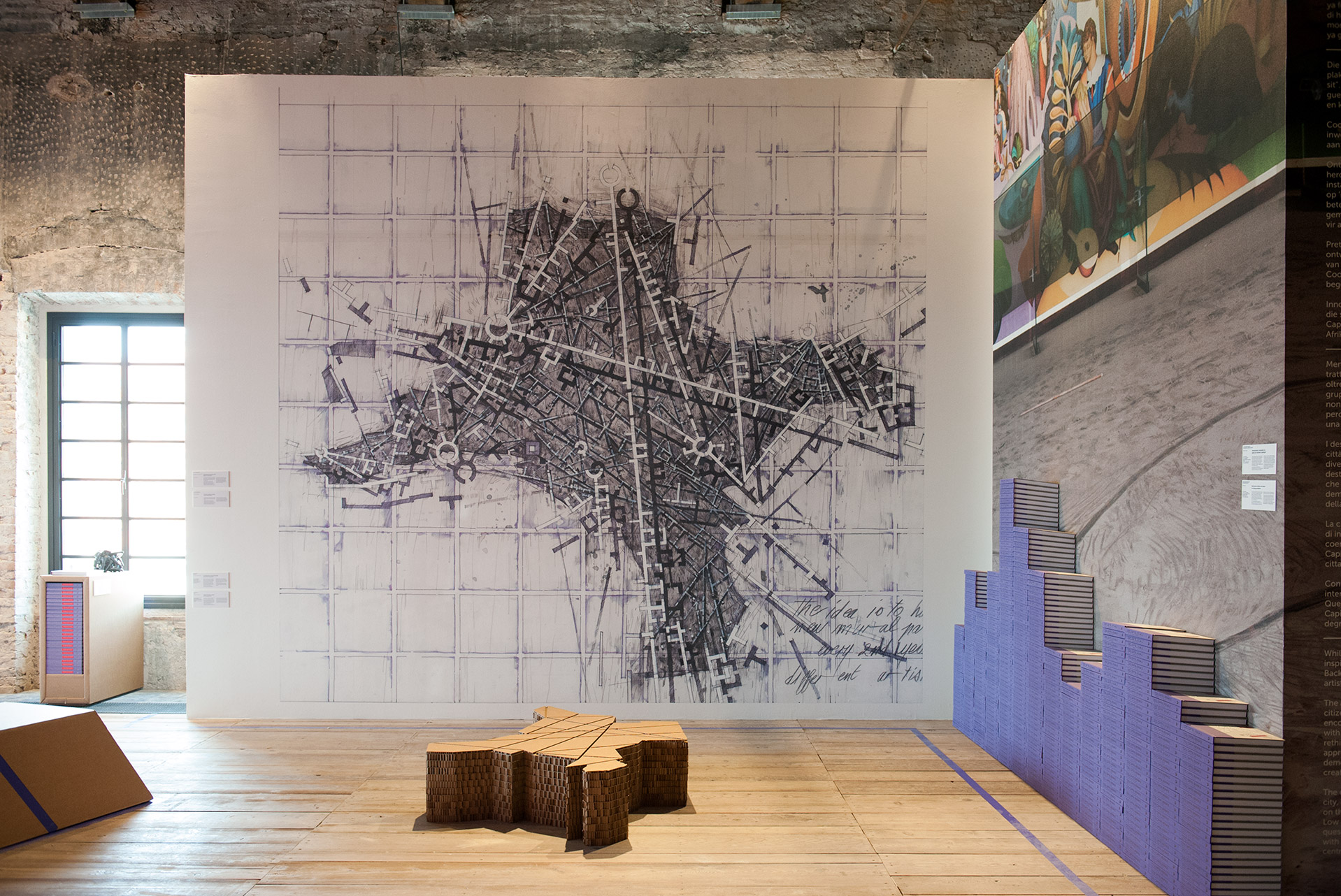
The development of the city was indirectly informed by the landscape and heavily influenced by institutionalised racial segregation during the Apartheid era. The result is a series of disconnected and isolated but diverse pockets of development in the city.
 Exercise 1 Sketchbook of townscape drawings
I looked at my own area (Southdowns Estate, Irene Country Farm) as a study for townscapes and downloaded google earth maps where I could pin it to our own house. The Estate consists of more than 700 stands, the large majority being single residential stands with an average size of 1,200m². The Estate is covered by 46 hectares of conservation corridors and agricultural areas. The landscaping consists of indigenous planting designed to maximise bio-diversity.
I used google earth to find our street view map, the idea intrigued me as it was an interesting view to look onto where I currently life and wonder how the landscape has changed. I decide on a map showing my regular walks inside this ‘contained and safe’ living area, as it is so much different to the lifestyle of a person in a shack in an informal settlement.

Our home is the red spot; the ‘butterfly shape area, the Doggie walks. I indicated the green areas – here farming is done and cows graze the fields. Many indigenous trees line the walkways. I draw onto ‘tracing’ paper. Below is a drawing of the concept master plan of this estate.

I read about an artist blogger, Benjamin Grant, who uses Google Earth as a source of inspiration for a ‘new perspective’ for his landscape painting. This is what he says: “This blog is literally all about a new perspective for landscape painting: looking down on earth from a satellite up there in space! Google Earth has made it possible for anyone with a computer and internet to roam the Earth like a birds or even an astronaut. For an artist like me this has become a huge new source of inspiration. Is this the revival landscape painting needs?” I also listened to a Ted talk by the artist and was touched by the feelings of awe an outer space view of the earth gives the viewer. Here I hear about his ‘daily overview’ project, where he uses images from a company who operates at least 5 satelites, and focus on areas where humans have an impact.

Satelite images of Antarctica by Benjamin Grant.
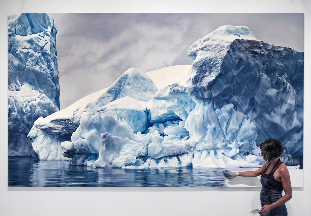
I also discovered an artists ZariaForman’s, large-scale compositions of melting glaciers, icebergs floating in glassy water and waves cresting with foam. She works with soft pastels and uses her fingers to sculpt and move the lines of her drawings. Wearing latex surgical gloves to protect her hands, she rubs soft pastels on paper and spreads them with her fingertips. “Since I was little,” says the 32-year-old artist who lives in Brooklyn, “it just seemed like the most natural way to move the material around
Read more: https://www.smithsonianmag.com/arts-culture/can-fingerpainting-save-world-180953033/#A2ZbiyY8PMIs6kiM.99
Her work is a documentation of climate change. In a Ted talk she discus the meditative process of artistic creation and the motivation behind her work. “My drawings celebrate the beauty of what we all stand to lose,” she says. “I hope they can serve as records of sublime landscapes in flux.” She explore moments of transition, turbulence and tranquility in the landscape and their impact on the viewer.
I made short sketches of my daily walks and one from my car around our house. I folded newspaper print into block of 12×10 and used a Cretacolor B graphite pencil. The first drawing of the cows grazing is late afternoon, shadows in front of the cows and looking through a tree. The second drawing is on the walkway with the doggies – on the tree there is a lovely little reminder and info of Scrub Hare we find in the veld, a drawing as well as the diet this animal follows.
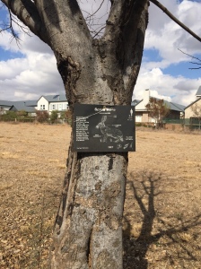
The third drawing is of the electric pylons running on the boundary – it was a cold afternoon, the previous day we had rain. The sky was filled with clouds and the landscape a muddy colour of grass dying due to winter. The fence is electrified and reminds me of safety in our country and living behind walls to create a sense of safety and control against trespassers. The fence has beautiful rock built pillars – these red stones/rocks are endemic to our area – it is called, Irene stone. The view from my car is something I have been contemplating for a few days – it is a view of a tree lined entrance – in the red/orange colours of autumn and the sky was full of bright white clouds with little specks of blue skies.- the overall colour is brown/yellow/orange along the road – leaves falling and dying grasses. I took a picture with the idea of capturing my face in the front/ rear facing mirror. I have the opportunity to spend a few quiet moments to do a sketch from the car – this is something I have been wanting to do for a while and I find this drawing a great way to look at the changes of season in my immediate landscape.

Below a house I pass on my daily walks – the thorn trees and grasses make lovely negative shapes around this house – it looks although it is placed in the veld.

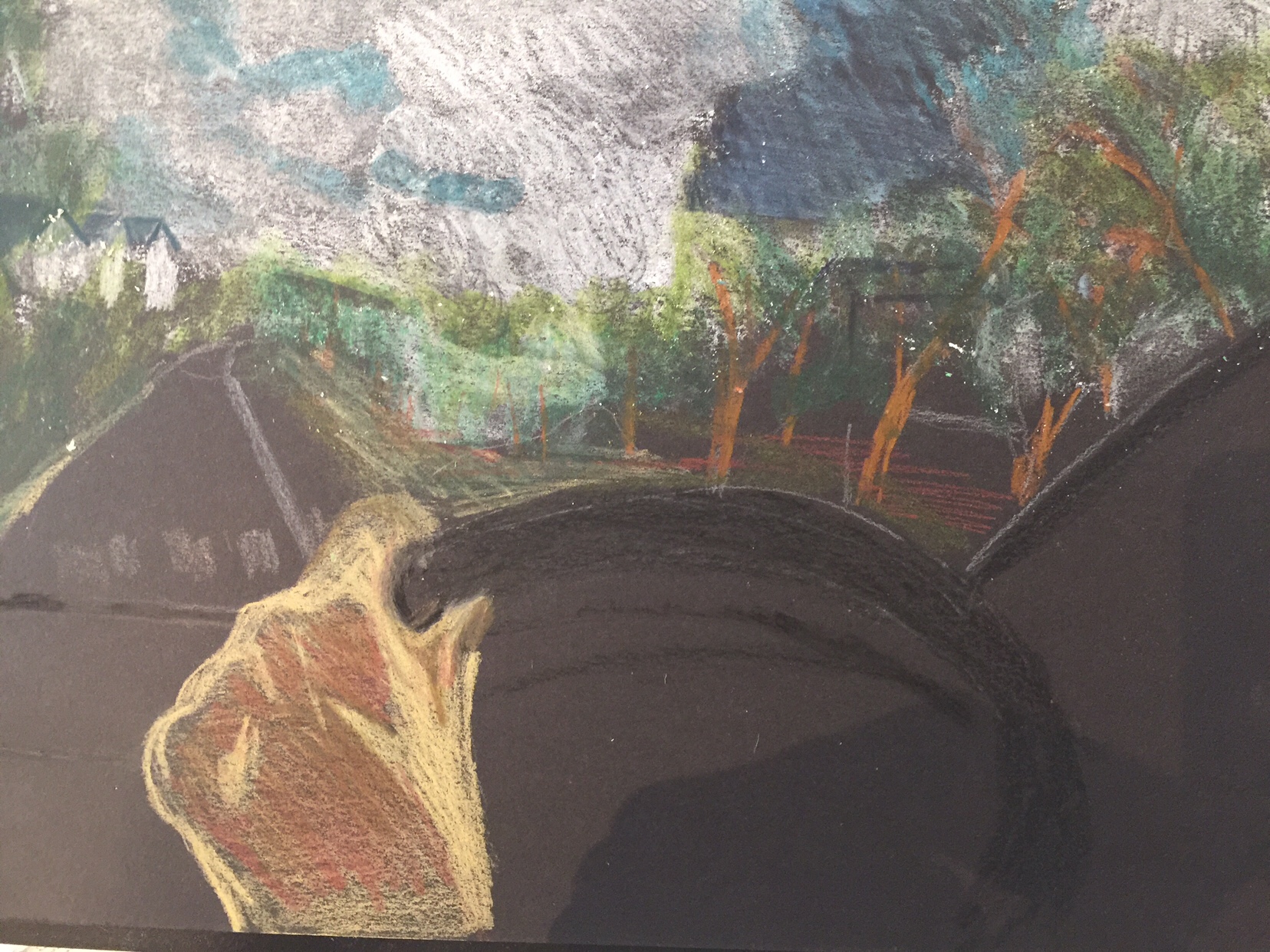
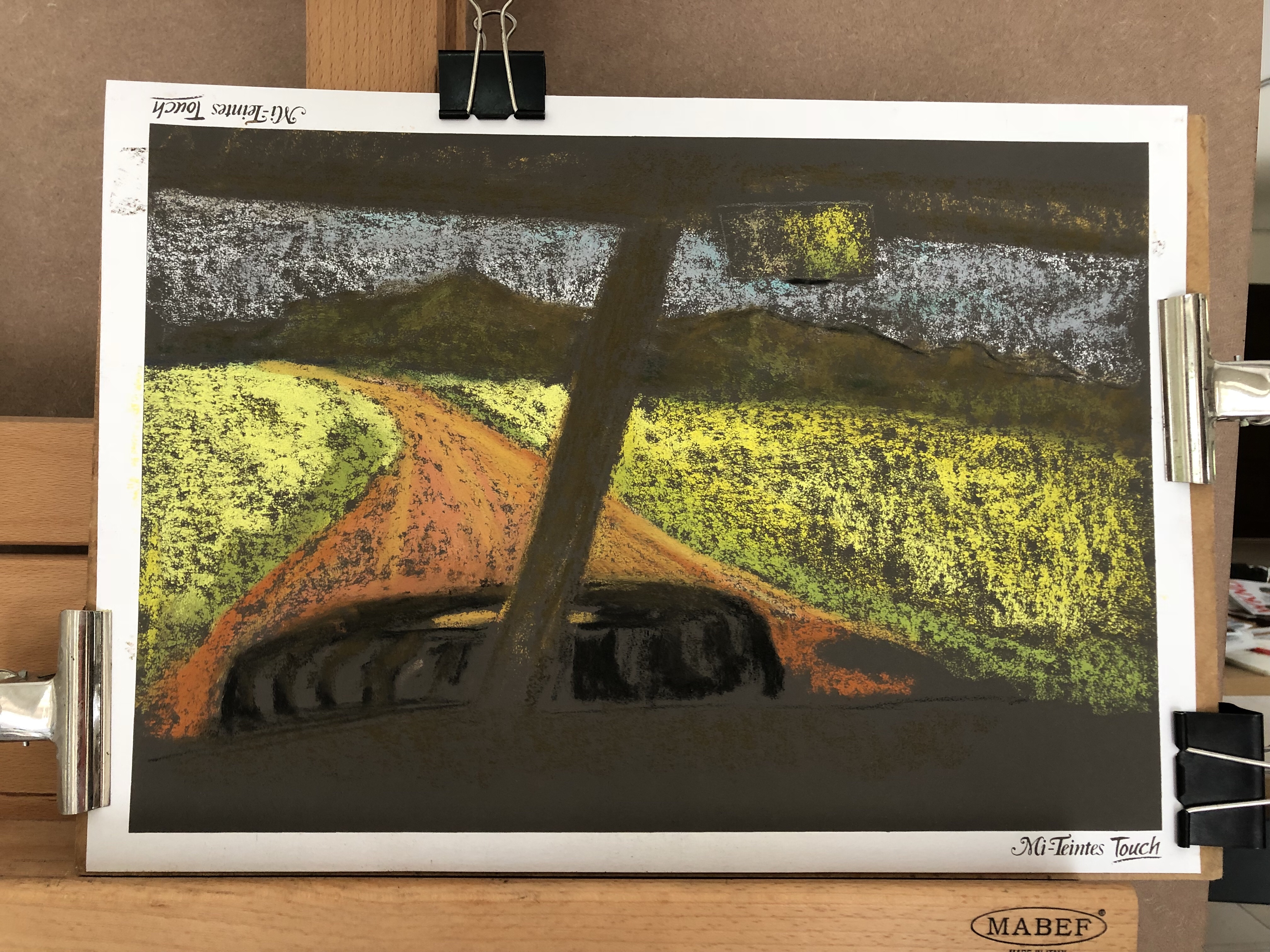
I like the landscape unfolding whilst driving to my home. I think I can work on the houses in the background as well as tree lined pavements and work around this moment. I feel above sketch have potential to develop further in soft pastels and or charcoal. At this stage I decide to buy pastel bord for a better drawing in pastel, as I seem to like using this media. I opt for a Canson A3 Mi-Teintes Touch ( 12 sheets of earthy tones). Whilst visiting our kids and family in Riebeeck West, Western Cape, South Africa during the last weeks of July, I decide to use a view from my son’s Landrover (beloved series 2) – we were driving to town, passing the fields of yellow granola.
3 August 2018
Exercise 2 Study of a townscape using line
During the first week of August 2018 we have moved to Dubai in the UAE. I was stuck without any drawing materials, except a few charcoal and pastel pencils, and small piece of charcoal stick, no eraser and paper. The first few days of our ‘introduction’ into this city, was spent in a hotel, as our home was unfurnished and we needed to start buying furniture before we could move in. My art supplies were still en route and little did I now about the waiting time, due to all administrative issues of this move. I found a roll of white packaging paper in the new house and decided to get drawing and get myself into the rhythm of a new environment. Drawing outside during June/July/Aug/Sept of the year seems to be impossible due to the heat and high humidity. Luckily the house in centrally cooled, so I had an airy and light very empty space to start – on the floor – with roll of white paper! The daily newspaper came to mind as surface to lay my material on – and I found great pictures of the skyscrapers to draw inspiration from.I found a role of white packaging paper and decided to at least continue with my daily drawings. I had by now been overwhelmed by the sky scrapers and the cityscapes, whether it is by day or night. I made a quick drawing of a view of downtown and decided to add it to this part.
I worked from a photo in a newspaper and tried to google more views as well as add my own visual experience – which was unfortunately, for this view, mostly on the motorway.


10 July 2018
Exercise 3 A limited palette study
Traditionally these would have been deep brown, sanguine, black and white. consider conte pencils, coloured pencils and ink and work on smooth or rough paper.

I used my small Fabriano sketchbook – toned paper, but an experiment with water and ink did not work so well.
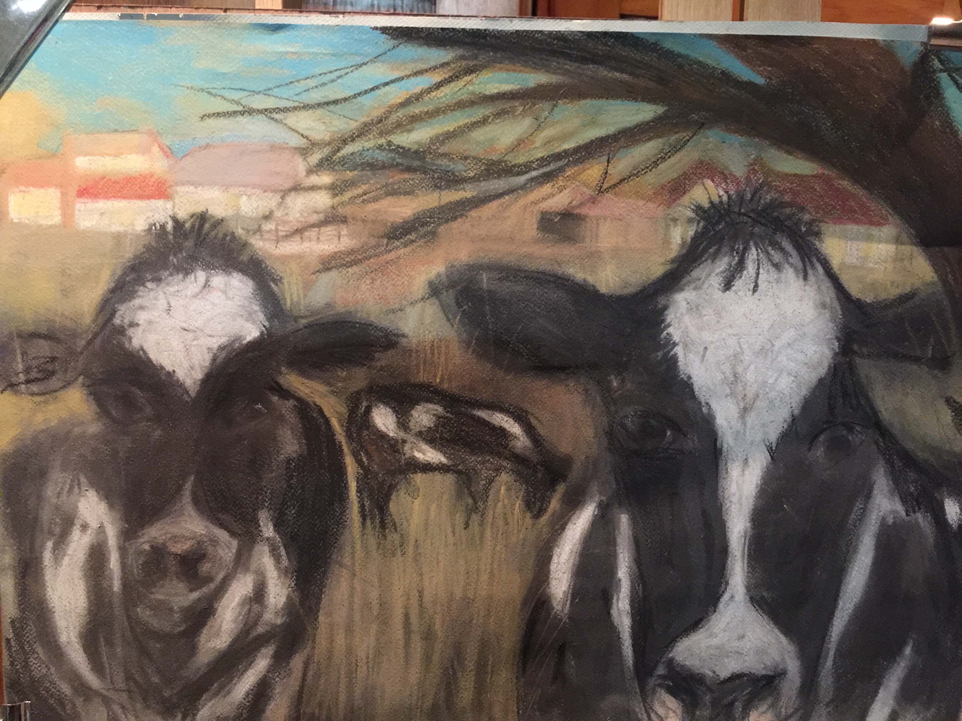
I find the combination of pencils and ink on the soft paper not working well, and decide to give this exercise another try. Part of the landscape I walked daily, is the dairy farm and the beautiful Holstein cows.


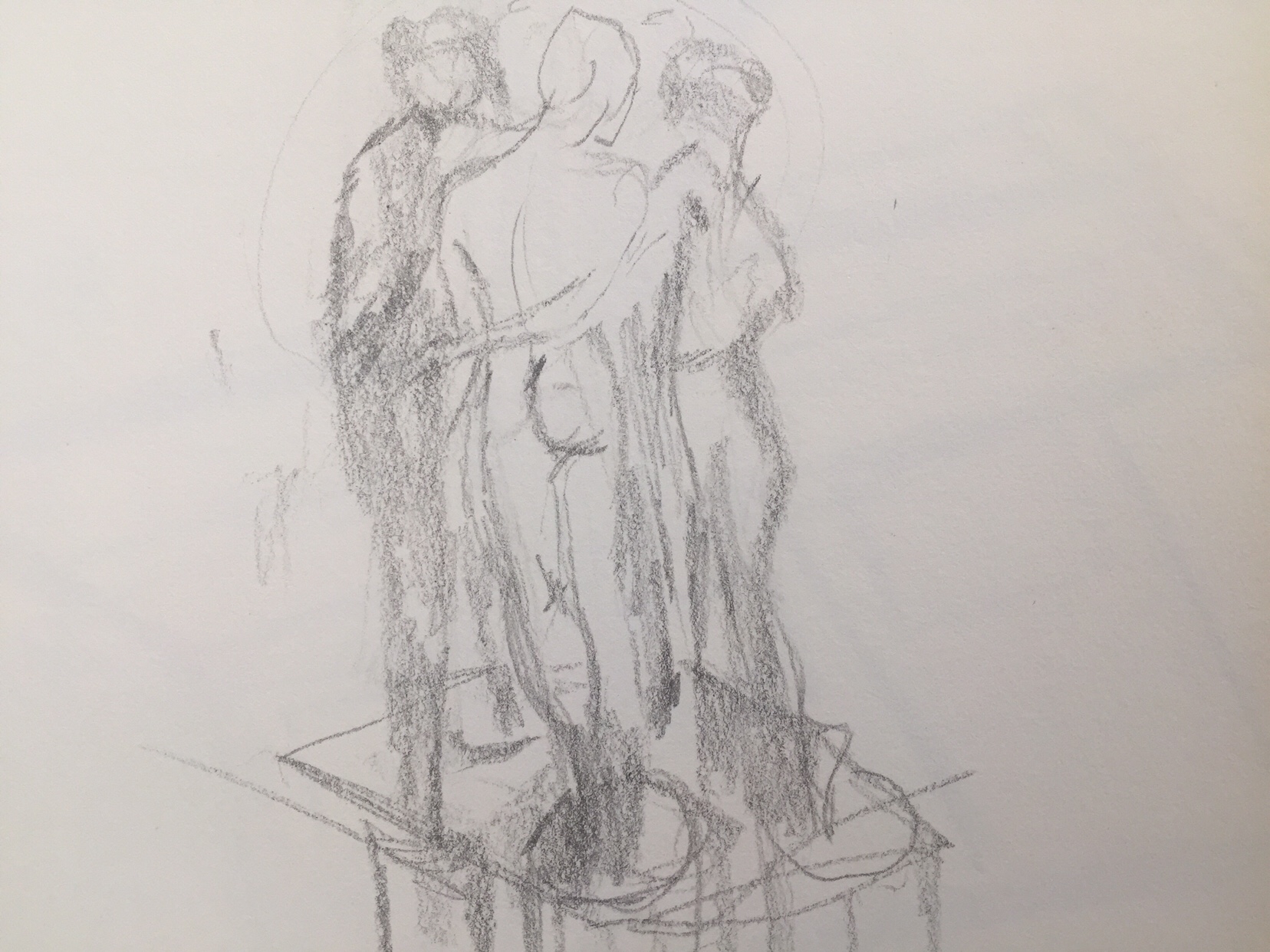
Exercise 4 Statues
I am not near statues of note – whilst still in Pretoria I drew quick sketches of the sculptures on our shopping area’s open space, whilst having a coffee.

Henriette Simpson, a Threadneedle prize winner of 2011

Inspiring ideas I looked at, was the work above: Bad Government. This is called pre-perspectival landscape art and aims to show how spatial construction works within a painting before perspective puts in an appearance on the scene. Not having people is about eliminating the element which contextualises it in the past and enables us to look at the landscape in a more contemporary way.