18 May 2018
Using a variety of media and different techniques
Exercise 1 Still life using line
Use an A3 sheet of paper to make a drawn study that shows your understanding of the forms, and the connections and spaces between the forms. Concentrate on patterns, textures and shapes – this exercise is principally an exercise about line. I decided to use sepia ink and dip pen and draw a pot of roses with a small piece of driftwood lying next to the roses. It is a very simple composition., but I think the pot as well as roses and other flower decorations add to an exercise about line.


I had a difficult time with the pen and ink, and have always wondered if the fact that I am left handed is a negative for my using this medium. I experience poor ink flow and that the nib does not touch the paper as I intend to or plan whilst drawing with an ink pen. I did some research on left hand use of nibs on the internet and found out that the broad edge nibs are not recommended for left handers. A pointed pen nib would improve my technique. I think i found a solution and hope I can order these pens: Speedball Left Handed Pen set (this dip pen set includes a straight nib holder and six nibs, five of which are specifically designed for left-handers. The Italic nibs in the Speedball Left-Handed Pen Set feature a flat edge that is angled in the opposite direction from those on right-handed nibs. This helps lefties achieve the appropriate slant for Italic and other edged calligraphy.)
Good news! I have a Speedball fountain pen and found a local provider to order above product online!
I wanted more flowing lines and marks, tried to use negative space between the flowers in the arrangement and thought a spray of water could add to the composition! The paper was taped to a board, but the water made the paper to change shape. I also think the lines should have more variety in tone and softness/hardness. This was an issue for me, which I did not achieve.
I next tried to draw a Vertebrae I picked up in Central Kalahari, Botswana, on a recent camping trip. The first drawing is with charcoal and white chalk and the second line drawing is with the sepia ink pen and a black roller ink pen.
I have to become more familiar with this medium… the truth is, I love ink drawing – it becomes such a calming experience to focus on lines and shapes and textures.
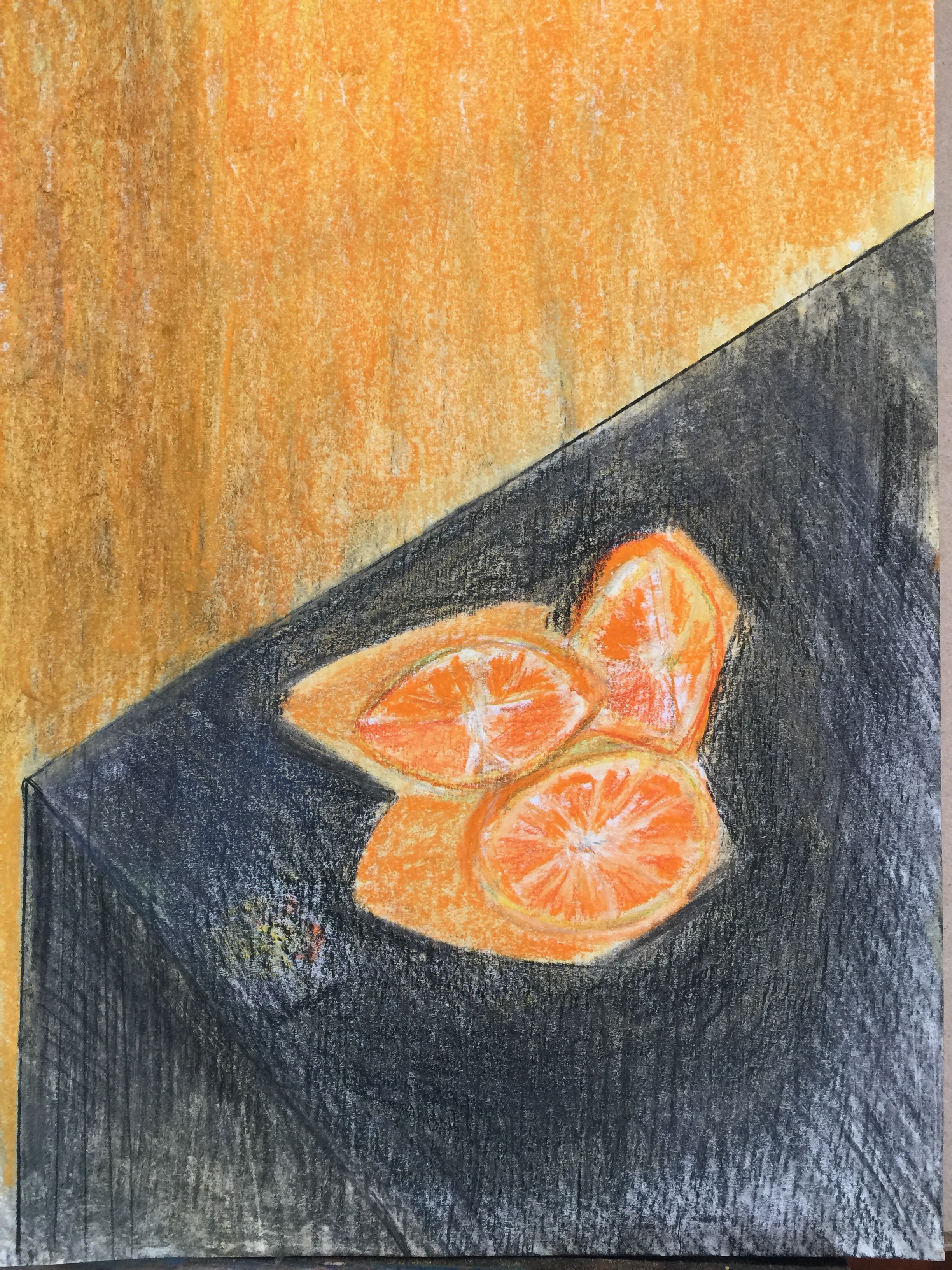
This attempt to use line in a way to focus on form was a exciting exercise, and I realise my lack of understanding of Cubism, but an interest was indeed awakened. I believe that shape will indicate an object, colour can be intuitively. I tried to use value to make an impact to the shapes of the oranges in this drawing, but think it was not effective enough.
Exercise 2 Still life in tone using colour
For this exercise a lot of squinting is needed to find the different tones in the still life group.
I decide to revisit my attempt with composition in an earlier exercise. I have to give my clarinet a fair change of creating this tranquil Still Life in tone. In music tone is also an important indicator of skill, with my B flat clarinet, I need to get the reed to vibrate as best possible for great tone. I have this note, taken from Kadinsky that I think will serve me well: “Colour is a power which directly influences the soul. Colour is the keyboard, the eyes are the hammers, the soul is the piano with many strings. The artist is the hand which plays, touching on key or another, to cause vibrations in the soul” Colour is a complex study field and many writers, theorists and artists have tried to define the conscious, subconscious, mystical or scientific qualities of the various tones that make up the world of colour.
I need to do a lot of squinting to see and find the darkest tones. I need to create depth between the book and the bottle of wine. I try to work fast, but choices of colour creates issues of building up tone in the lighter areas. I end up with darks varying from black to dark brown and grey and mauve. I use the yellow of the to create lightest, but do not think this was tonally good enough. Some areas are overworked as well. I used my fixative, but getting light on dark is almost impossible. It indicated that I did not take enough care to indicate the different hues of light tones in this composition.
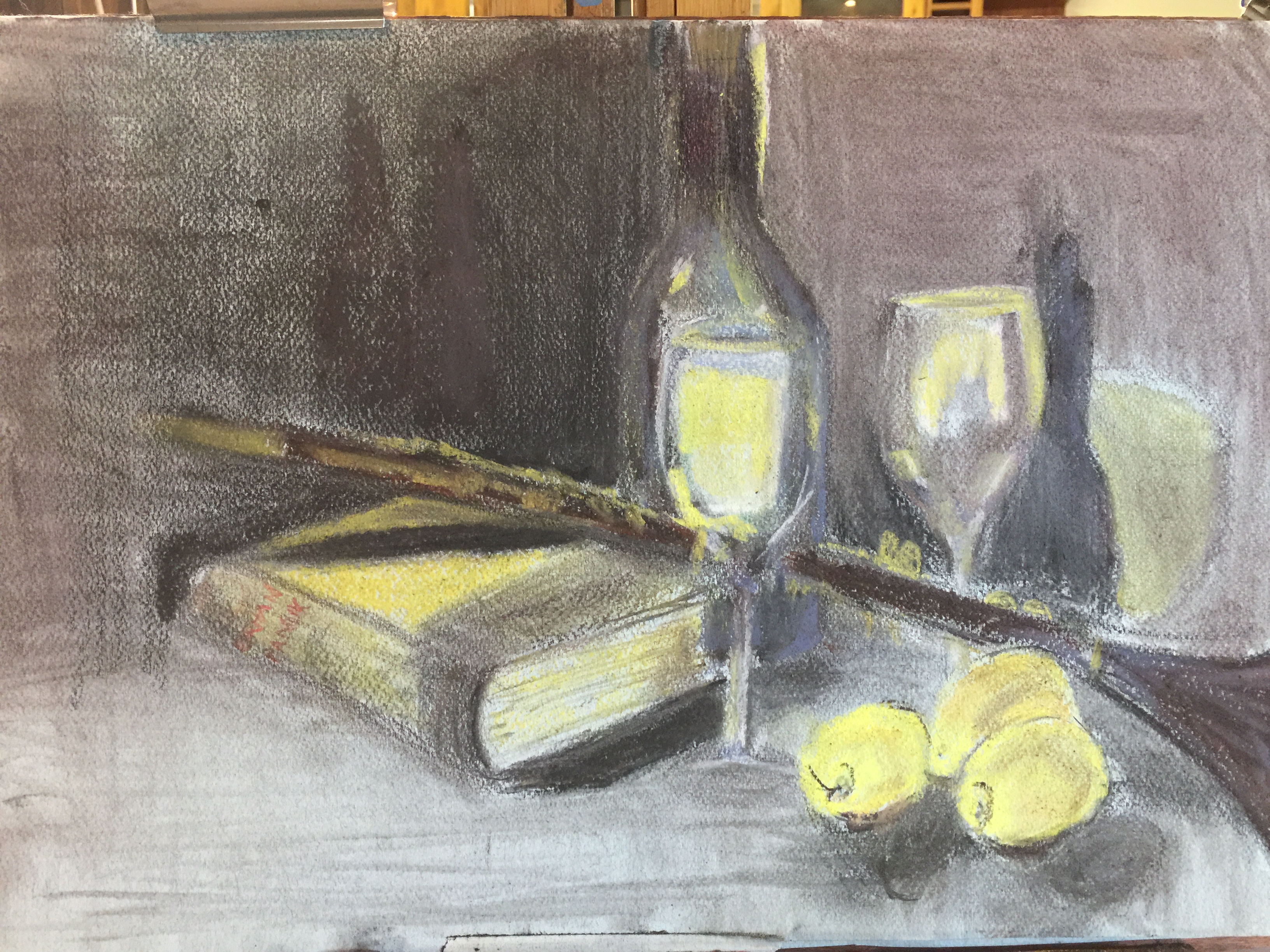
I do not think I that indicated the position of the clarinet as it is placed on the book in the tonal build up. The clarinet looks like it is balancing on the side of the book. The shadow at the open side of the instrument could be stronger to indicate solidity where it touches the table. Looking at it after I published the drawing, the lemons are not placed solidly either. Darker shadow lines where the form touch the table would have helped.
Note to self: Paul Cezanne said that colour is a collaboration of the mind and the world. I realise that my world is full of colour – it is my understanding of many things, my memory and my thinking and emotions.
Exercise 3 Experiment with mixed media
I decided to read about artists who use mixed media in drawing and the following interesting ideas I would like to take with be about what this process does to the artist:
- “I’m evolving form a ‘tight’ painter to much looser
- Whereas before I was obsessed with getting the exact details down, now I want to show emotion and feeling in a drawing or painting
- I usually develop my ideas for painting through a series of charcoal drawings in the studio
- Sometimes I incorporate pastels or acrylic paint at the paper stage, either monochrome to concentrate on composition and tone, or with more colour to explore mood and temperature combinations for the final outcome.
- Acrylic can be good fro ‘asking the questions’ and oil for finding different answers
- I used to consider my preparatory drawings as just experiment before the real work of painting, but not I value them as important and integral components of the work, displaying a freshness and spontaneity which is sometimes difficult to capture in the finished painting.”
According to Tate.org.uk, “the use of mixed media began around 1912 with the cubist collages and constructions of Pablo Picasso and Georges Braque. It and has become widespread as artists developed increasingly open attitudes to the media of art. Essentially art can be made of anything or any combination of things.”
I use a skull I picked up on the beach and use pencil, ink and pastel to create patterns and shape. I added epsom salts and then sprayed water. I still did not feel my experiment worked, and then added textured paste medium as well as art sand. By now the drawing is almost lost and I decide to let it dry and then see if I could work onto the texture I have created.

I use trace sheet which I to avoid smudging on my charcoal and pastel drawings. I once saw a demo of coloured pencil on tracing paper, and decided to give it a try. The pencil and the paper connects in a very soft and smooth way. For many artists it is natural to use layers of different media to achieve the artistic result they are searching for.
The process is different for each artist and need to find my own natural way – I do think it lies with charcoal and soft pastels.
I am very interested in the mixed media drawings of Marijah Bac Cam. I would like to read more about her work process.
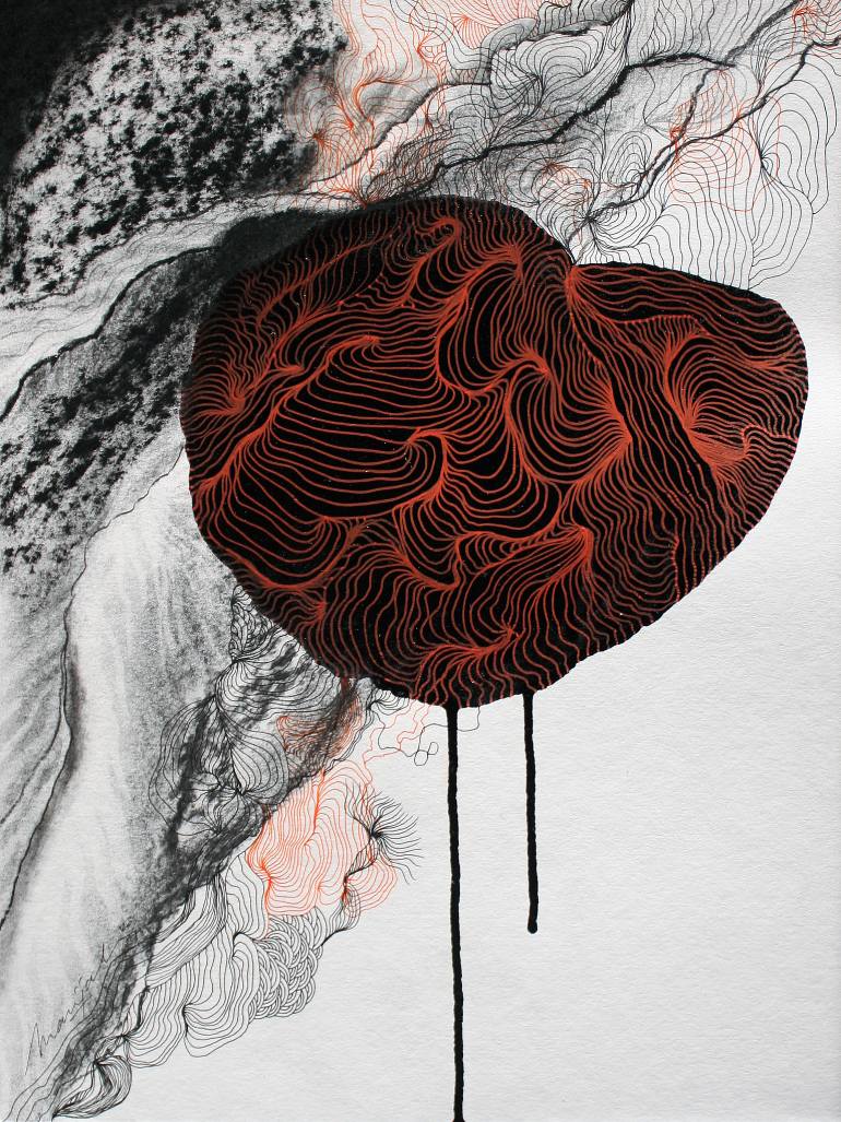
I visited and exhibition with the theme, Nesting, at a Johannesburg Gallery, The Henry George Gallery. Above artwork would have fitted very well in this exhibition. The selected artists were exploring the ‘Hygge’ lifestyle trend and reflecting on a current inclination towards re-turning, inward, to seek a cosy, contented, warm, safe and comforted, mode of being. From Danish culture the word “hygge” or “nesting” has a lot to do with our state of mind. It’s about yearning and learning to be happy with the simple things in life. I wonder how much this challenges my idea of creating a Still life at the end Part Two of this subject of drawing – Intimacy comes to mind.
Beautiful lines on the ceramic bowl as well as on the monotype bird.
Monochrome
I jumped into this exercise without first educating myself about monochrome, but decided to stay true to how I arrived at learning about this subject. When painting I prefer to use a Grisaille understudy, as I feel that by focusing on the values first, I get to focus on shape, form and space. After the composition of the painting is sketched and the subject blocked-in, one can now look for patterns of light and dark tones that make up the shadows; and with the shadow shapes, the painting gains mass and volume.
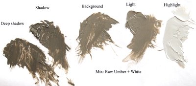
Monochrome literally means ‘one colour’. Every colour has different hues to it for the use of a monochrome study. During the early 20th century, avant-garde artists became obsessed with the idea of abstraction. By separating subject and form from art, they felt they could explore the very nature of art itself, in its purest and most objective sense. Monochrome painting has been, for decades, part of this tradition. By reducing a painting to a single colour, the artist reduces it into its simplest form. Adolph Frederick “Ad” Reinhardt (December 24, 1913 – August 30, 1967) was an abstract painter active in New York beginning in the 1930s and continuing through the 1960s. He wrote and lectured extensively on art and was a major influence on conceptual art, minimal art and monochrome painting. Most famous for his “black” or “ultimate” paintings. Picasso also used black and white extensively in his sensual and very ‘designed’ modern paintings.
I think with a monochrome study, everything becomes the form and structure of the design in a composition. I also look at it as a type of intellectualisation of design. I also find looking at black and white monochrome as a study of truth, and here think of works of Goya in his etching printed series, The Disasters of Wars. It is in the shadows and shade the you as a viewer can find the truth. I see the relation of monochrome with the Aquatint print method – using tone and line to create your art work, but in it so much is told, if this visual process is applied effectively. I also find that I can look at a bright Matisse painting, but see hues of colour, not just a burst of colour.
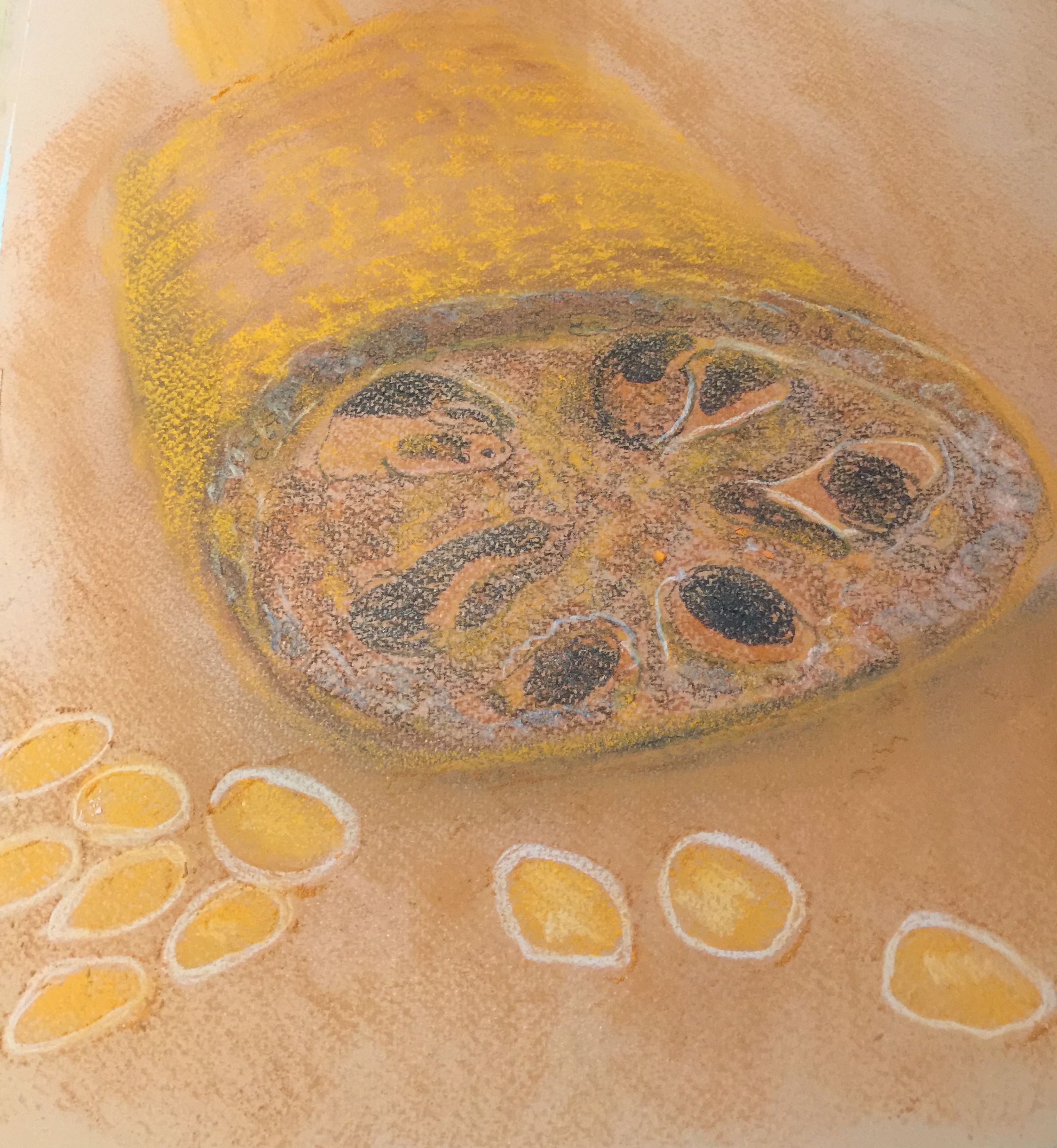
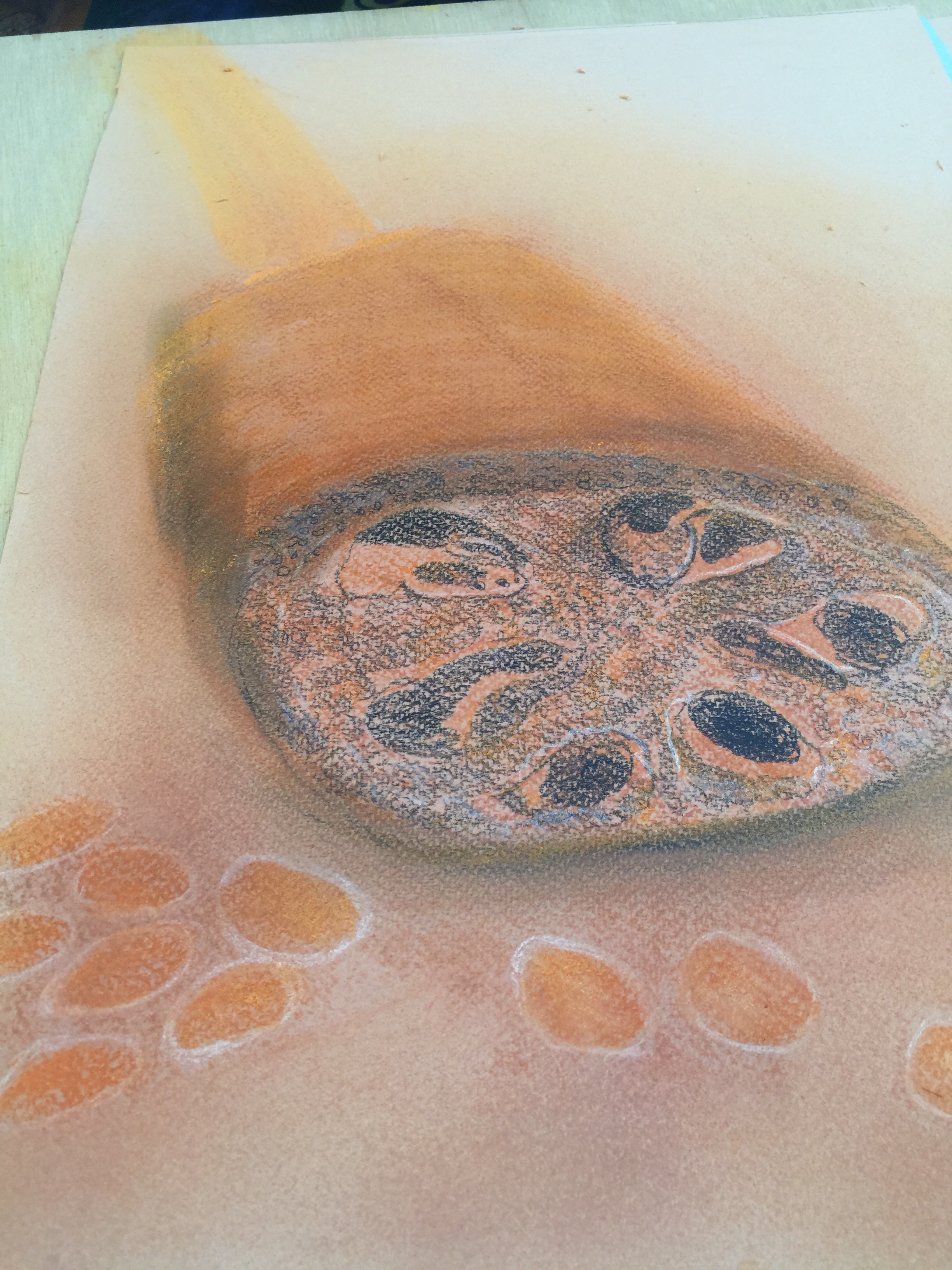

First drawing was a feather. I can see that I should have used the shadows much more in this little study of a guinea fowl feather. Softer lines could also add to texture of this subject. I decided to continue and create a still life by adding my black journal.
Looking back on my quick drawings, I do not think my choice of drawings displayed good composition, and enough contrast between dark and light. I decide to try again.
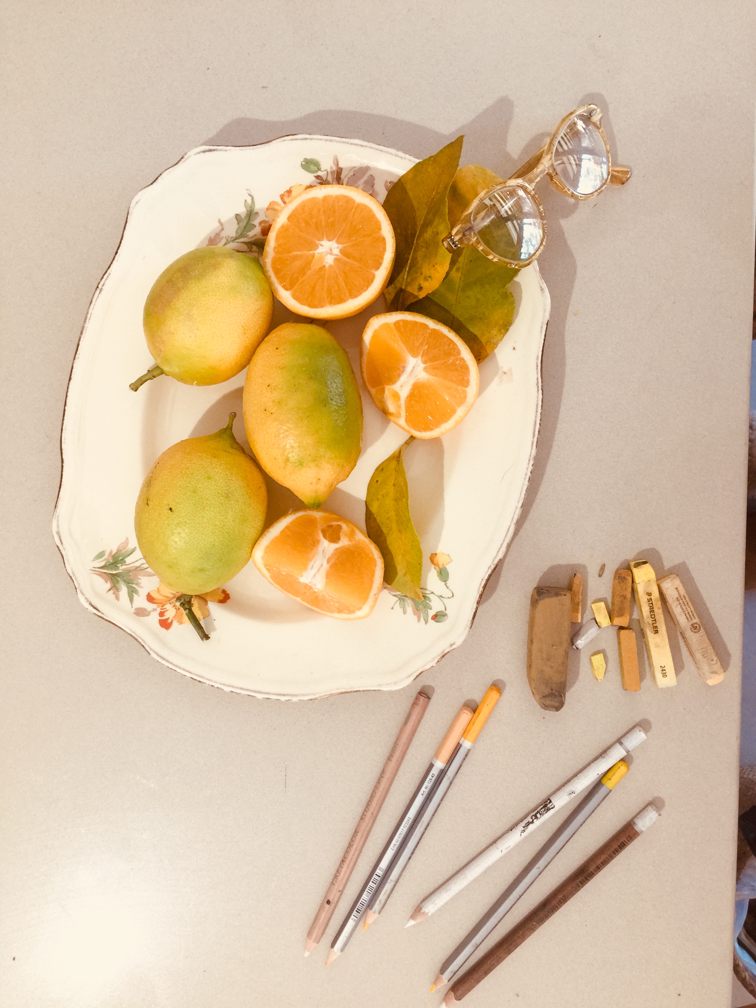
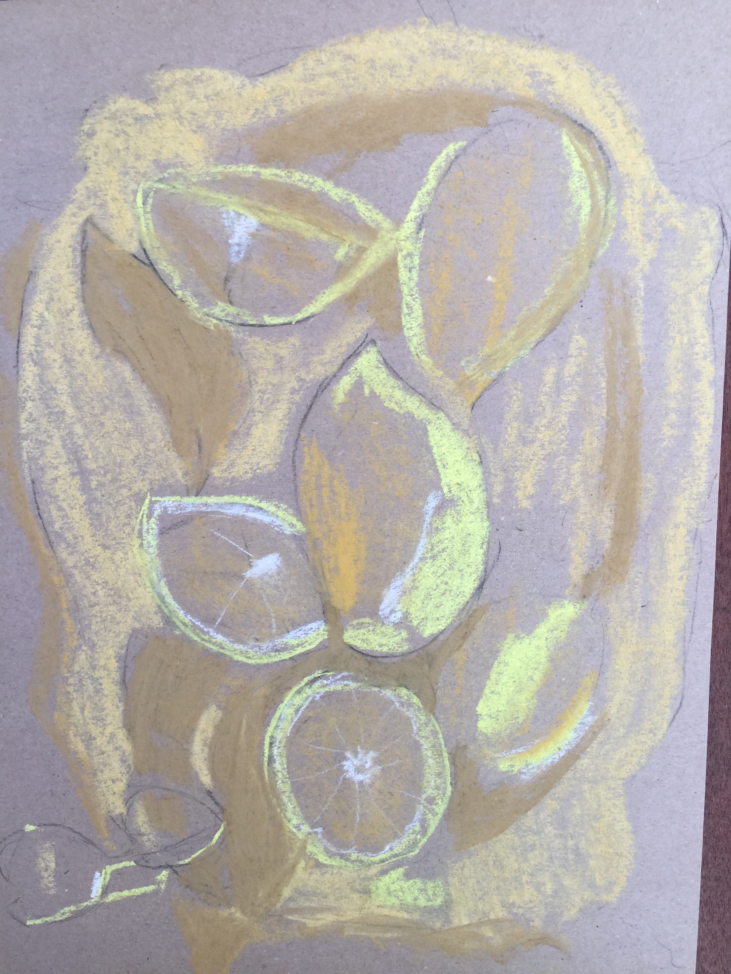
I draw with soft pastels and pencils on brown paper. I use white and black to create a range of yellow tones to work with.
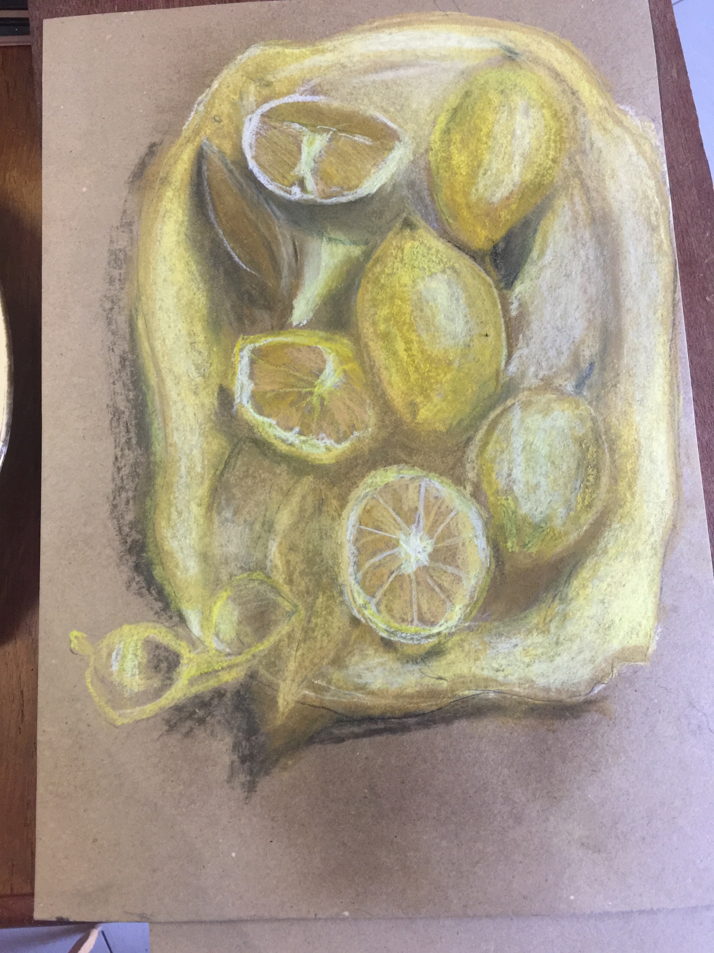
I also read that monochrome painting can be used as a transcendental tool, because aside from being a style of painting that only uses one colour, monochrome is a way for artists to grapple with the phenomenon of colour and emotion, colour and spirituality, colour and the mind. By focusing on a specific hue as the subject of a painting, an artist can explore the range of associations viewers have with that hue. If I think about Yellow as a colour – I can relate to the warm sun, being alive, or that taste of a juicy orange, a soft mango, peach or apricot — the sweetness also come to mind. I read in a book, Exploring Color, by Nita Leland, that specific qualities are sometimes assigned to individual colours, for example: Yellow= happiness, Orange= tension, energy.
.