Exercises within Part Two
The Modern in painting and sculpture
2.0 Find two paintings and one sculpture, each of which appears concerned with modernity, modernism and modernisation. Indicate the relevant features on annotated reproductions. The following should be addressed:
- Does the subject seem to be of its time?
- Does the work or its subject matter appear mechanical?
- Does the artist exploit the look of the medium?”
Fernand Leger
I read about this artist in a recent newspaper – with regards to an exhibition of his work at Tate, London. Leger lived through the First world war and through his paintings of photos of the war identified with the horrors and suffering by using industrial architecture in his paintings. His works are large scale, almost bulky, classicised compositions, limbs not always connected to the bodies – almost an assembly of forms. His version of Cubism favoured strong, graphic designs, with bold, black outlines and bright, unmodulated colours: he wanted his pictures to speak to the masses. His goal, he said, was “an immediate art without any subtlety” . The painting looks flat – Matisse like and the bright colours does not speak of any realism or use of a classical figurative style. His use of colour takes the drawing of forms to abstraction.
My tutors’ comments on this exercise was mainly on the lack of how I referred to the categories of the question when I described the 3 works. She suggested I turn to this again and make it clear how I was using these works as well as how I should have annotated the work. She was happy with the discussion of Leger’s work, but not in how I addressed the three categories and lack of annotation. Her example was clear and I redid this part as follow:
I shall hereby attempt to re write this exercise
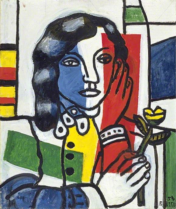
Painting 1 : Young Girl Holding a Flower, 1954 by Leger. The subject refers to the artist’s exploring to isolate complimentary colours and he also drew from his architectural training in his works by exploring shape and form. I see this as exploring oil paint as medium, as well as the classic portrait painting style of realism. It also refers to advertisements, pop art and collage-type images. It seams he first laid down the flat colours and then with black painted the contour lines over these flat areas of colour. The paint was boldly applied. He isolated the primary colours he used – unlike the Impressionists who juxtaposed the complimentary colours. On the Tate Website I read the following about his personal ideas and it is clear how this influenced his style: “Léger was a socialist. He believed the primary purpose of making art is to enrich the lives of everybody in society. In order to bring art into people’s everyday lives he worked on posters and murals as well as on the easel.” Making his work show an affinity with its own time of creation.

Painting 2: Tube Shelter Perspective, 1941 Henry Moore. Done in graphite, ink, wax and watercolour on paper. My tutor poses and interesting question: “Why do you think he might have been made an official War Artist? Such appointments were clearly about presenting a positive image to the British public, encouraging them to be stoical in the face of adversity.” On the Tate website I understand this work to be is as much about human vulnerability as it could be about resilience. In this regard I see the influence of the propaganda machine behind his appointment as a war artist.
He employs a wax resist technique which creates a scabby surface like water-damaged plaster. His marks were made with a light wax crayon and the whole page then overlaid with a wash of water-colour to darken the background. The figures are simplified in ways which call to mind the body-casts excavated at Pompeii. The bodies are elongated and some are ghostlike/skeletons. He was quoted to have said: ‘I had never seen so many reclining figures and even the holes out of which the trains were coming seemed like the holes in my sculpture’. When the drawings and paintings he made was shown to Kenneth Clark, chairman of the War Artists Advisory Committee, he commissioned Moore as a War ArtistsAccording to the TATE website these drawings and paintings were exhibited for the first time in 1941, and were often interpreted as metaphors for the stoic resistance of the British people in the face of war. After he was made an official War Artist, it gave him far greater freedom of access to the shelters. Although he visited underground shelters across London, many of the drawings derive from scenes on the Central Line between Liverpool Street and Bethnal Green. There is an awkwardness in these drawings which creates an atmosphere of unease and claustrophobia – almost like the appearance of death, although these people are sleeping/waiting to get out again.

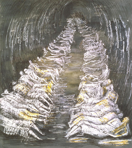
Added when I reworked this part: Interesting find in my research is the photos below. It became more evident that Moore might have used photographic images for his studies – he might not have wanted to disclose his appropriation for fear of ‘lowly art’, but it shows a modern thinking and mechanical way of making art.

I have removed the extra work I added of A McCollum from the blog, as this was answering the question ,which asked for 2 painting and one sculpture.
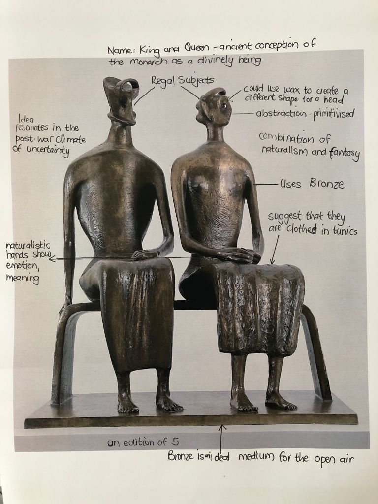
Sculpture KIng and Queen, 1952/53 Henry Moore
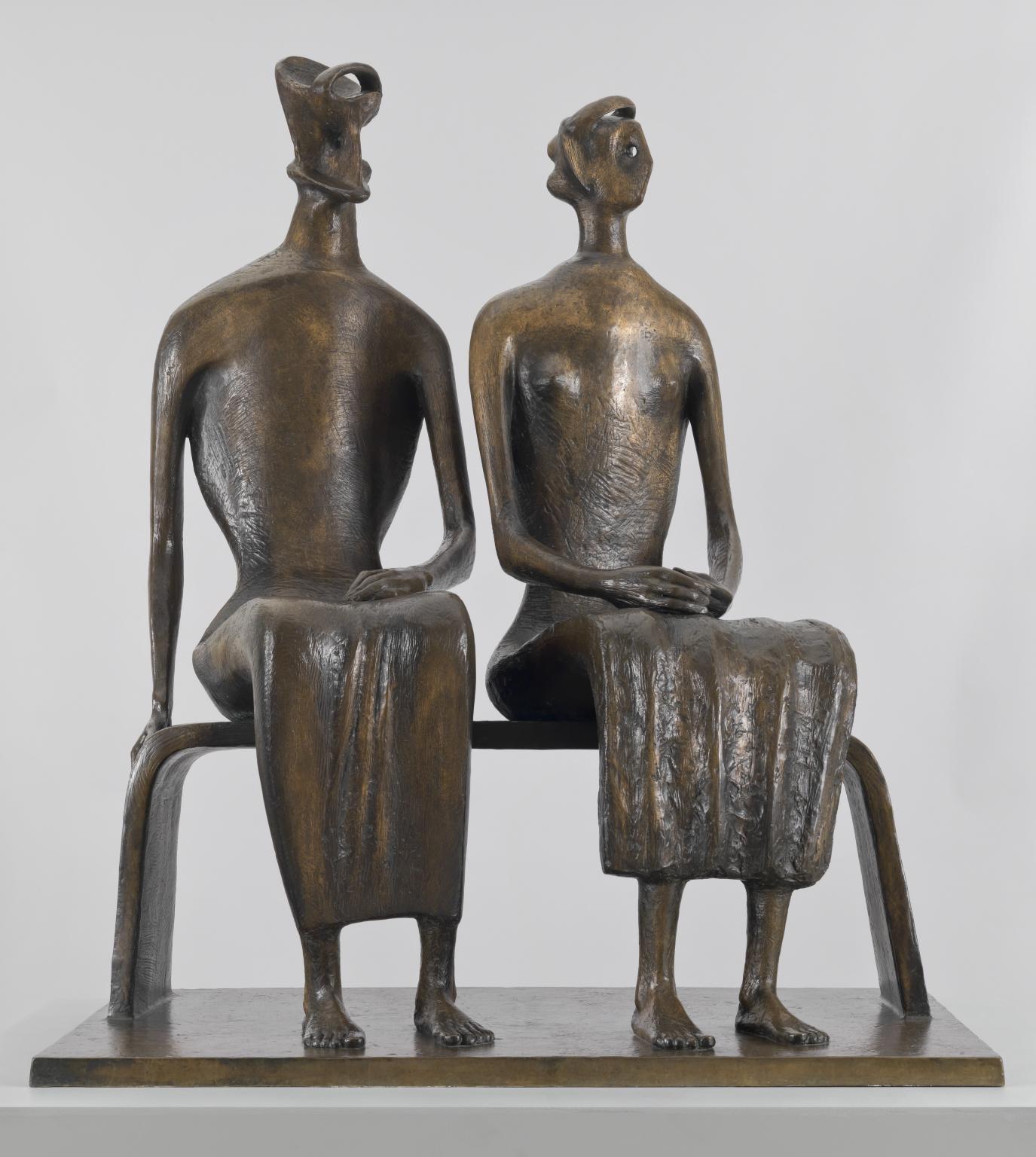
This work shows the tendency towards the organics, although the human figure features prominently in his work. Moore has combined naturalistic elements, for example the hands and feet, with more abstracted or mythical ones, such as the heads.
According to a Tate essay ( Tate website) Henry Moore first came to prominence as a carver of stone and yet he became famous internationally for his large bronzes, undertaken in the years following the Second World War. Bronze – a material associated with traditional, academic sculpture and based on a creation of a model that needed to be copied and cast – was not originally his preferred material. It would be a mistake, however, to see his choice of the medium as simply a late-career desire for greater scale and the provision of more works to meet increased client demand through the creation of editions.
Bronze allowed Moore new freedoms in his conception of particular sculptures, and changed his techniques in ways that significantly influenced his later production. Bronze was also a robust material and tended to age gracefully, an important consideration for an artist who wanted to leave his mark on the world. In an interview published in 1973, he commented, ‘You don’t have to be bothered about the problems of how it will stand up, how it will weather, how it will do from a purely practical point of view. This is the beauty of bronze.’
‘I feel that I can best express myself, that I can best give outward form to certain inward feelings or ambitions by the manipulation of solid materials – wood, stone, or metal. The problems that arise in the manipulation of such materials, problems of mass and volume, of light in relation to form and of volume in relation to space, the problem of continually learning to grasp and understand form more completely in its full spatial reality, all these are problems that interest me as an artist and which I believe I can solve by cutting down, building up or welding together solid three-dimensional materials.’
Henry Moore, ‘The Sculpture in Modern Society’, lecture to Unesco, published in 1954
I read the following : “It seems an unlikely coincidence that the only identified couple in Moore’s output – a King and Queen – should have been made in the same year that Great Britain and the Commonwealth welcomed a new monarch. King and Queen responded to the same communal desires embodied by Moore’s Family Group, which expressed the post-war ideals of the welfare state. For Read, the figures in King and Queen ‘have an air of authority, but their grouping side by side emphasises their domesticity. The realistic modelling of their hands and feet illustrate their humanity. This royal family serves as a multiple of parenthood and of the hieratic aspect of a couple who are also the symbolic parents of a nation, at one and the same time, stern, protective and remote.” ( https://www.tate.org.uk/art/research-publications/henry-moore/henry-moore-om-ch-king-and-queen-r1172098)
The Avant-Garde
2.1
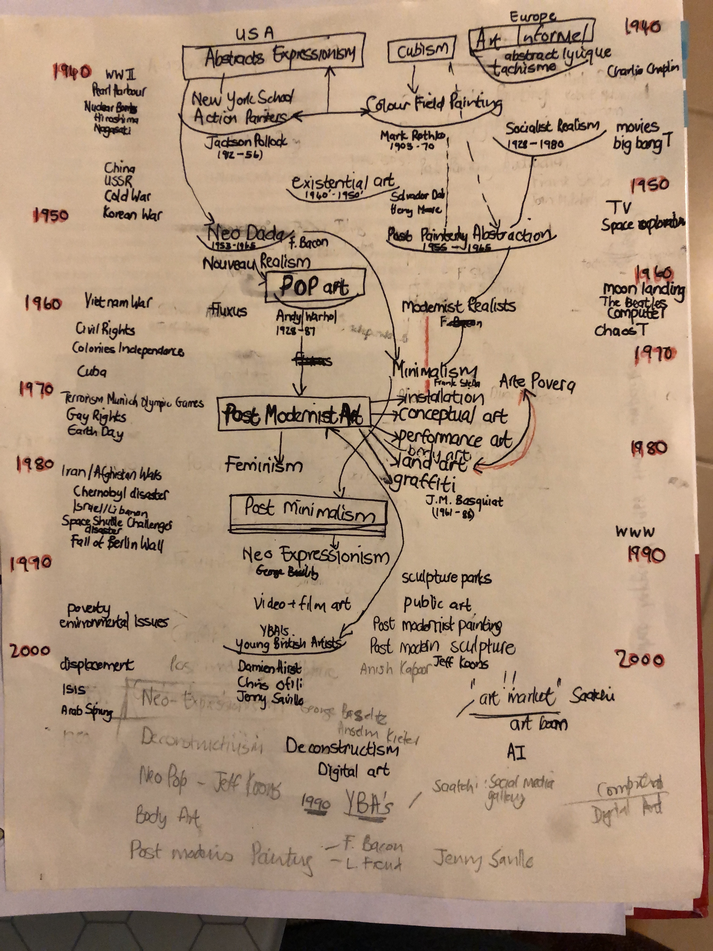
Copy of Barr’s chart extended up to the year 2000. Include movements such as Pop Art. In a separate column list major events in politics and culture that you think have had some bearing on the kind of art practiced at the time.
Viewing the Barr’s Chart -interesting ……. the chart ends with only two categories: non-geometrical abstract art and geometrical abstract art. In an article by published online by Brittanica, the following is said of Barr’s diagram : “According to the diagram, Cubism derives from Cézanne, Neo-Impressionism, and Henri Rousseau and leads directly to Suprematism, Constructivism, and De Stijl, finally leading to abstract art. German Expressionism, Dadaism, and Surrealism are shunted to the side, falsifying their influence and significance. Today Barr’s diagram looks academic and prejudiced, showing the limitations of a one-dimensional reading of avant-garde art privileging the formal. Again, the power of an institution to dictate and legislate art history is clear: Barr was in effect a modern Le Brun, and the Museum of Modern Art became the avant-garde academy, seeming to have more authority than the art itself.”
I took some time with this diagram as relevant events influencing art movements in this period was another research matter. I am sensitised how we will/ or may view this if we have the overall perspective and luxury of unbiased information. A main moment for me was contemplating the role of modern galleries, through to art publications and social media influencers. I am fascinated with the role social cultures played: here I refer to the bikers, surfers, hippies, emo’s, punks, skate borders, hip-hop, rap, hipsters, bloggers and social influencers. Immigration and asylum is still prevalent in our changing society, and new technology is advancing ever so fast.

Above is a chart by MOMA to document the birth of Abstraction! This image was designed for their show, Inventing Abstraction: 1910-1925 (December 23, 2012–April 15, 2013), and is an obvious node to Alfred H. Barr Jr.’s important Cubism and Abstract Art chart that accompanied a show of the same name at the MoMA in 1936. This web includes musicians, writers, choreographers – gives us a picture of abstractions transcontinental roots and connections that was created. I read in my research that Alfred H Barr was the Director at Moma till 1943 and a trained Art Historian in Princeton and Harvard, with first-hand experience of the European Avant-Gardes. From the beginning Barr envisioned a comprehensive approach to include all modern art.
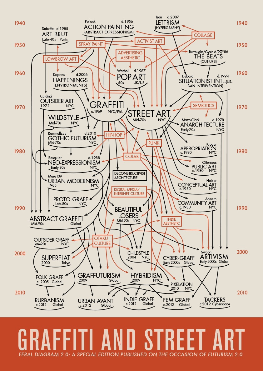
COURTESY THE ARTIST/FUTURISM 2.0.
Above, New York-based writer and curator Daniel Feral was co-organizing a history of street art and graffiti and decided to make a new flowchart adapting Barr’s original medium to his own message.
My copy of Barr’s chart to the year 2000 – the first attempt
The final attempt
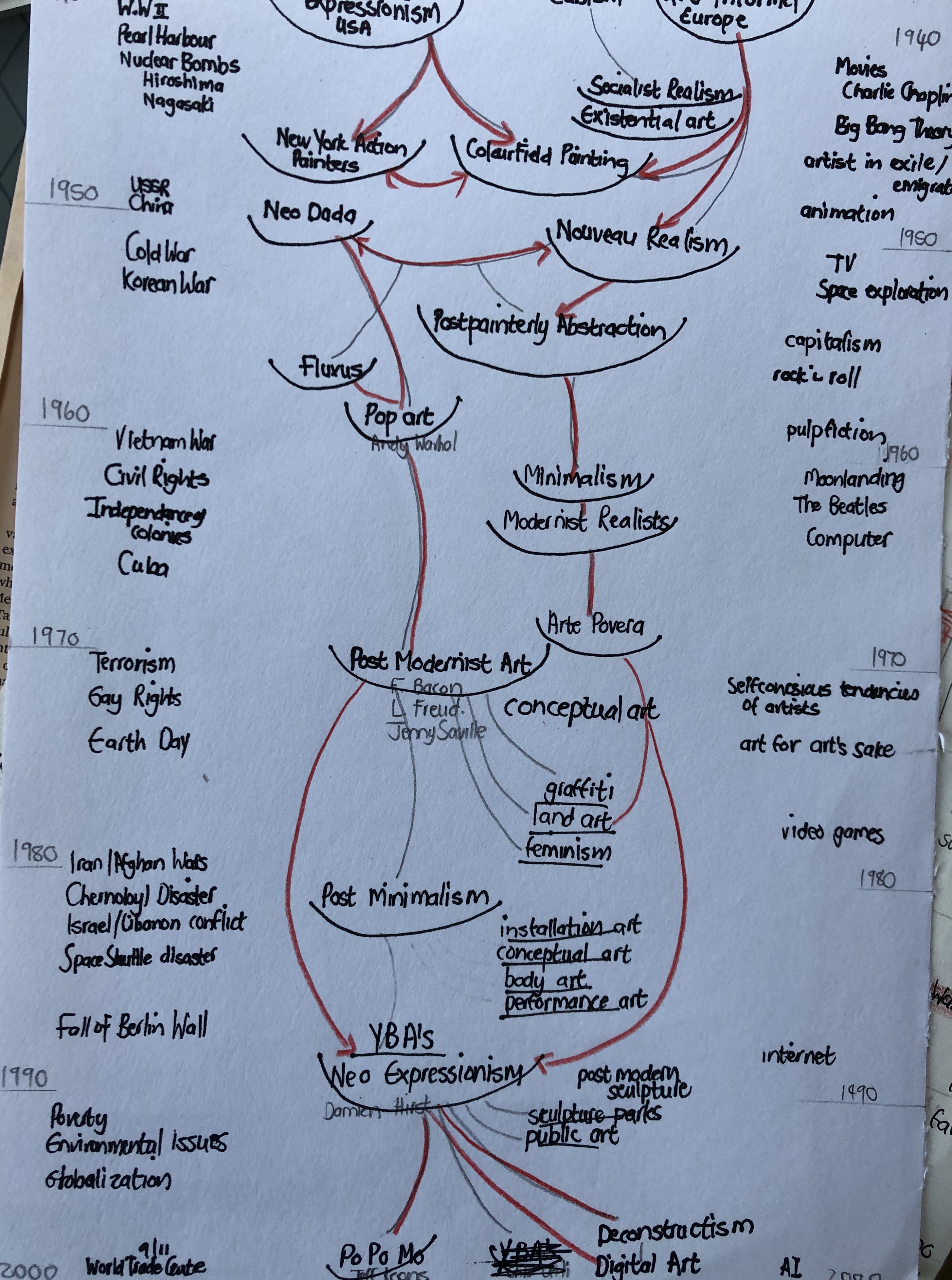
My tutor’s comments about an understanding that could have been taken from the way Barr almost suggested that various art forms arise out of another and then themselves spawn something new could be a questionable concept. It is then based on an underlying idea of progression and avoids the issue that any avant-garde art ( that which is inevitable written about by art historians) comprises a tiny fraction of the art production of any given period. I remember reading on the Tate Website that an avant-garde movement such as cubism have focussed mainly on innovations of form, where De Stijl or Surrealism had strong social programmes and that it is applicable to all art in its description as radical or a reflection of originality of vision.
2.2 Greenberg’s Kitch
Describe the features that correspond to Greenberg’s view that kitsch “imitates the effects of art”. Here my tutor reminded me that I needed to refer directly to the painting by Vladimir Trechikoff and Andrew Hewkin
Greenberg set out to make the distinction between a true genuine culture and popular art. From the very beginning of the essay, The Avant-Garde and Kitsch, 1939, he indicated that he would deal with a question of “aesthetics,” or how art is defined, and that he would do so by examining the experiences of a “specific” individual and the “social and historical contexts in which that experience takes place. Greenberg defends the view that there is such a thing as “high art” distinct from “low” or popular art. He defined the avant-garde as a “superior consciousness” which coincided with the emergence of modern scientific thinking. As a force for cultural critique, avant-garde art separated itself from the bourgeoise. The value of abstract art, Greenberg claimed, lay not in beauty but in expression. During the avant-garde, a radical critique of mimesis was developed, which led to abstraction from nature and even complete disconnection from nature in the design process. Greenberg, as a true formalist, had particular categories that he could apply to all works in order to make his qualitative judgments.
There were styles, such as Abstract Expressionism and artists, such as Pollock or
Picasso, that Greenberg considered good and interesting, whereas he entirely
rejected other styles, such as Pop Art or Conceptual Art, arguing that they were
useless and decadent and that they had nothing to do with art per se.
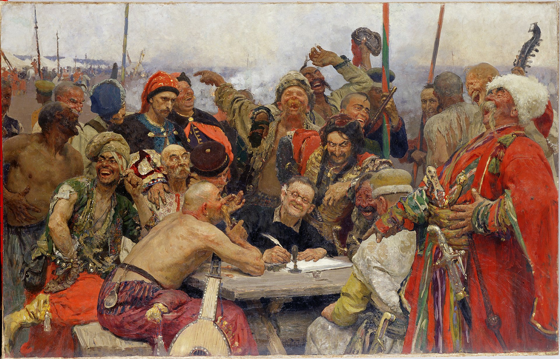
Greenberg compared Picasso with Ilya Repin, arguing that Picasso painted forms and shapes which generated aesthetic experience through their plasticity, therefore Picasso painted ‘the cause’, whereas Repin’s work only narrated and did not provoke thoughts or aesthetic heights, he painted ‘the effect’. Picasso’s work therefore represented high art, whereas Repin’s was regarded as kitsch. Repin’s works are figurative, easy to understand as there is continuity in his works and a dramatisation of life. In
order to understand Repin’s works we do not have to make a particular effort as
we can see that the artist wanted to express the realities and struggles of the
oppressed, the extent of the miseries of the human condition during the regime
of the tsars in Russia. Repin’s works could be compared to a soap opera, where the drama is related to real life where there is no need to make a particular
intellectual effort to identify with the works.
So if we look at the painting below Greenberg says:
- Picasso paints cause, Repin paints effect.
- Repin predigests art for the spectator and
- spares him the effort,
- provides him with a short cut to the pleasure of art that detours what is necessarily difficult in genuine art,
- Repin, or kitsch, is synthetic art
In the case of Picasso’s works from his Cubist period, we encounter a totally
different kind of art-making which Greenberg identifies with high art. In front of
Picasso’s art, the viewer has to contemplate, and make an effort to understand
the works, as form and content merge within abstraction re-creating its own
presence and statement. Greenberg compared Picasso to Shakespeare where
training is needed in both instances in order to understand these works, as their
work refer to problems within the process of art making. Greenberg also argued
that if we wanted to save high art, we had to separate it from the masses as the
masses corrupt. This was clearly illustrated by the example of Socialist Realism
during the Stalinist regime. Greenberg returned to the idea of l’art pour l’art
where art only revealed itself to a high elite, where good art could only be
created in an atmosphere of high culture.
Clement Greenberg argued that figurative painting was dead. “The alternative to abstraction,” he wrote, “is not Michelangelo but kitsch.” Every attempt to make the painted image vie with the photograph, he believed, would lead to disaster, as clichés took charge of the canvas. Painting must provide its own subject matter: it must be self-sufficient, pure, uncontaminated by the figurative image. It makes me wonder about Realism and where the work of Hopper would fit into Greenberg’s theory. I found the following on the Smithsonian website :”Critic Clement Greenberg, the leading exponent of Abstract Expressionism, saw the paradox. Hopper, he wrote in 1946, “is not a painter in the full sense; his means are second-hand, shabby, and impersonal.” Yet Greenberg was discerning enough to add: “Hopper simply happens to be a bad painter. But if he were a better painter, he would, most likely, not be so superior an artist.” For Greenberg the future of painting lay with the “abstract expressionists”. In Collected Essays and Criticism, I read that Greenberg wrote in 1964 that he admire many contemporary representational artists’ work, here he mentions Hopper in his list of artists. In further readings Dante referred to Greenberg saying that there was no basic difference at all between the abstractionist and the realist, since there was a level at which all that mattered was quality, not kind. Painting by this time became one of a large number of artistic possibilities.
So: If avant-garde is purposeful beauty, kitsch is accidental beauty.
The one artistic style which he put on a pedestal was Abstract Expressionism. Abstract Expressionism was also seen as the allegory of high art, which was understood and accessed only by art professionals. One direction is the development of the high and low taste concept, based on the Kantian pure aesthetic experience. This is an elitist view that can also be connected to the modernist museum. I read some of this reaction into the work of Allan Mc Collum as discussed in the Assignment of this part of the course.
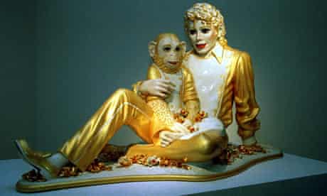
Koons portraits Michael Jackson not as the talented song-and-dance man everyone seems to want to remember, but an icon of the banal.
An interesting viewpoint from a M student (thesis used for reading) is the following: “Feeding the distinction between Modernism and Postmodernism was the
artistic use of low art or popular culture—what Clement Greenberg referred to as
kitsch—and successfully raising it to the status of high art. Referencing popular
culture allowed artists to incorporate many different components within their
work. Instead of Kitsch representing the end of culture, it became the definition of
culture and was most effectively used by such Pop artists as Andy Warhol, Roy
Lichtenstein, Richard Hamilton, and Claes Oldenburg. Kitsch became a dominant
mode of representation for almost all of the smaller art movements that came
collectively to construct Postmodern art.”
I hereby reference the M student: Paul B Hartnes, 2009, MA dissertation: THE POST POSTMODERN CONDITION, George Town University, Washington DC. (online access: Microsoft Word – $ASQ15445_supp_2558C9BE-3535-11DE-917C-1E00D352ABB1.doc)
Hewkins’ work:is a parody of poster art or advertising
Tretchicoff work:
- uses clichés of beauty
- work was easily reproduced
Modern Criticism
2.3
Utter flatness
Advanced painting clarifies its essential uniqueness as a two dimensional, flat surface where the optical takes precedence over such traditional elements as subject and pictorial space. According to Greenberg, the emergence of abstraction was also a consequence of the avant-garde. When art turns to itself, it no longer has the need to be
representational; it steps out of mimesis, where form and content are free to merge. For Greenberg, this coming together of form and content within painterly flatness was the highest form of art. These principles served as a foundation when he propagated Abstract Expressionism
“Toward a New Laocoon” (1940), Greenberg further details the historical progress of painting:
“But most important of all, the picture plane itself grows shallower and shallower, flattening out and pressing together the fictive planes of depth until they meet as one upon the real and material plane which is the actual surface of the canvas: where they lie side by side or interlocked or transparently imposed upon each other. Where the painter still tried to indicate real objects their shapes flatten and spread in the dense, two-dimensional atmosphere. A vibrating tension is set up as the objects struggle to maintain their volume against the tendency of the real picture plane to re-assert its material flatness and crush them to silhouettes.”
By deliberately calling attention to the natural flatness of the canvas in a work of art, artists have exercised a uniquely modern phenomenon, wherein the viewer is not meant to appreciate the depiction of anything, but the act of painting itself. What makes this a self-conscious act is that the artist is openly acknowledging the mechanical limitations of trying to apply visual depth to a two-dimensional surface. Thus Greenberg defines narrative structure in which, according to Danto ( Danto: 76) ” the substance of art slowly becomes the subject of art.
Examples of utter flatness
- The very nature of the bare canvass – before a picture is a flat subject matter, it is first of all a surface covered with lines and colors;.
- Focus on only two dimensions – Multiple perspectives of the same subject were achieved on a two-dimensional surface. Expressionist painters, such as Pollock, Rothko and Newman, applied paint in such ways that viewers’ eyes were not drawn to any particular central point on the canvas, but rather offered multiple perspectives; flatness of the canvas was for them a surface in which to create an infinite space, seemingly with no discernable beginning or end.
- Lack of figuration
- ignorance of subject matter
- Minimalist painters applied precise colour and used the painting’s support system, the canvas, to draw the viewer’s gaze to the flat canvas itself.
- Leaving large portions of the canvas bare and untreated
- In Matisse’s work we see his pictures grew bigger as if, in a topological paradox, depth were being translated into a flat analog.
- On this, place was signified by up and down and left and right,
- by colour, by drawing that rarely closed a contour without calling on the surface to contradict it, and by paint applied to every part of that surface.
Scopic Regimes
2.4
Point of view
Paintings such as The Mona Lisa, Girl with the Pearl Earring and Velazquez’s Las Meninas, comes to mind – the viewer is being looked at – both from the subject/image (viewed) of the painting as well as from an onlooker( viewer) onto the paintings. In all of these paintings the viewer is drawn into a ‘story’/meaning by the eye contact of the subject being looked at. In Las Meninas, Velázquez painted himself, the royal family and their maids, but the other figures in the painting are seemingly oblivious to Velázquez´s presence. With regards to ‘perspective, Velazquez painted what the King and Queen saw. The infanta is the focal point – in full illumination.
In this painting so much is represented
- A stark depiction of reality.
- A critic can uncover new details that were previously overlooked.
- A deconstructionist sees the unending levels of meaning encountered in Las Meninas, and is overcome by the painting’s complexity.
- The Marxist sees subtle contrasts between rich and poor.
- The feminist sees female power residing in the infanta
My tutor recommended the following: The choice of Velazquez’ Las Meninas was fine, and here it could have been interesting to really analyse the comparisons and contrasts between it and the Picasso painting of the same subject (you do this with the latter, but comparing both would have been worthwhile).
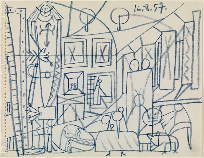
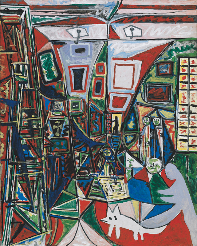
Below is the work of Picasso, part of series of more than 58 paintings
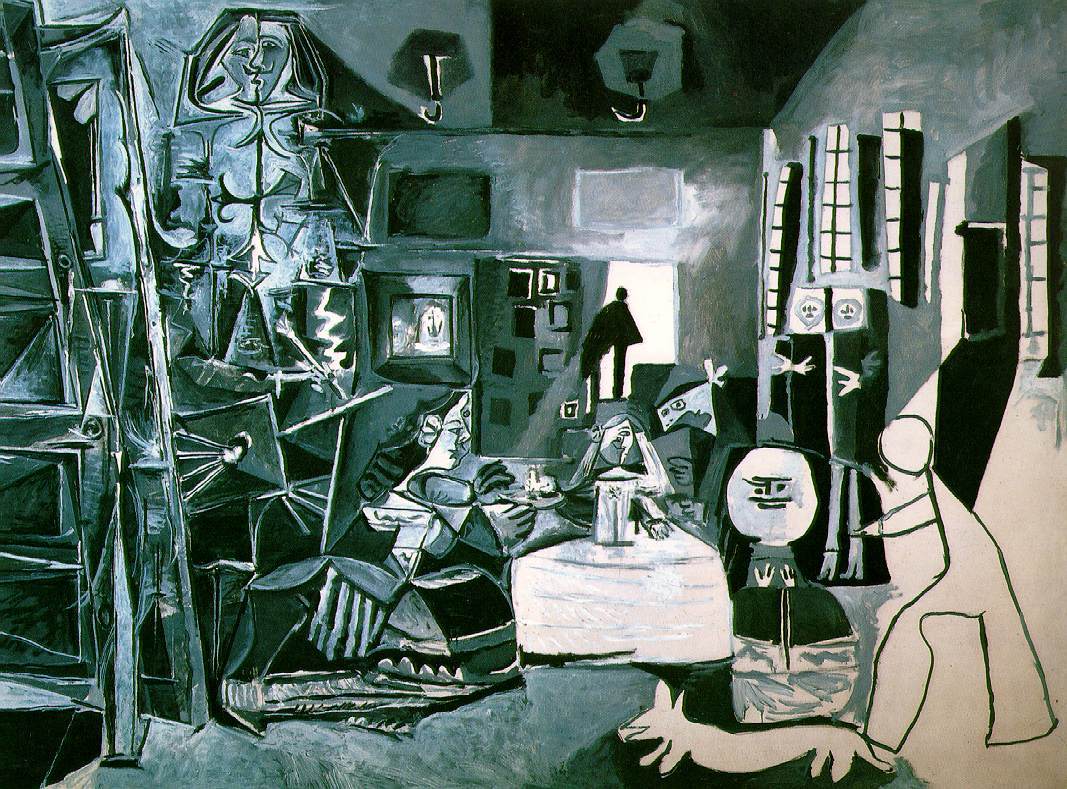
Through these variations, Picasso has preserved the infanta and his notion of innocence and purity forever. It was his legacy – his crowning masterpiece. It could never grow old unlike its flawed creator. Through Picasso’s quest for the innocent child I am reminded of John Ruskin’s idea of a painters perception – that being called the ‘innocence of the eye, a childish perception without consciousness of the significance. Picasso, in this work, gives a more essential role to the figure of the painter who, shown in disproportionate size and holding two palettes, takes a major role, reinforcing in this way the idea that the most important thing in the entire creation of art is the artist himself. In this way, moving towards the right of the composition, the form simplifies and the figures to the right contrast with the more elaborate figures of Velázquez and the first ‘menina’. Another major variant is the treatment of light and colour, and it has a direct effect on the painting’s luminosity with the opening of large windows to the right which, in Velázquez’s work, remain closed. The lack of colour contrasts with this luminosity. Blacks and whites dominate the composition.
Comparisons between the paintings as recommended by my tutor ( I added on 6 March 2019)
- Velazquez uses a portrait or vertical format style to paint on his 318 x 276 cm canvass
- Picasso uses a landscape or horizontal style to paint on his 194 x 260 cm canvass
- Velazquez places the Infanta at the centre of his composition
- Picasso also brings in the figure of the painter, very complex painting and in disproportionate size – holding two palettes and hereby reinforce the idea that the artist is the most important thing in the creation of art – is he representing himself, or Velazquez? I am not sure. The blog of the Picasso museum claims that this is a self portrait.
- Velazquez did not make many versions or other separate paintings of Las Meninas
- Picasso made 50+ separate and different versions of Las Meninas, all a personal interpretation of the whole of Velazquez’s painting.
- Velazquez was a court painter, had a studio in the Royal Palace where it was expected of him to document the life of the Royals and here he depicts his way of his notoriety whilst at work for the Royal Family. He was a devoted Royal servant and the only painter the King was happy to have himself painted by.
- Picasso painted in his own house – he most probably followed a creative process when he started working, in a separate studio, on the painting/paintings. Line gave way to multiple geometries; the focus on certain figures widened to include variations of the ensemble and even of their emotional state, he distorts the reality of the original painting, by playing with imagination and metamorphosed the personalities of several of its components – he makes an almost superhuman statue of Velazquez as the court painter in the in the work
- Velazquez used space and colours to show how this almost occupy the space between art and reality. We are very aware of the decor, dress and fashion of the day.
- Picasso uses blacks and whites which contrast with the luminosity in the room. Hy opens the large windows of the palace room. Colour appear in the other interpretations.
- Velazquez documents every character/subject in action – like they are caught in an instance between one position and another, which brings out perspective, the role of the viewer and something which I read the artist Vic Muniz referred to as making things ‘visible’, where one looks at the semiology of the image: a slow perception is created in order to focus our (viewer) attention more carefully.
- Picasso simplify many of the forms/subjects – uses the illumination to re interpret and create his own Las Meninas – he substituted the dog, a mastiff with his own dachshund, Lumpito.
If someone set out to copy Las Meninas . . . I would try to do it in my way, forgetting Velázquez. . . . So, little by little, I would paint my Meninas which would appear detestable to the professional copyist; they wouldn’t be the ones he would believe he had seen in Velázquez’s canvas, but they would be “my” Meninas. (Picasso, quoted in Museu Picasso Guide Barcelona: Museu Picasso, 1998, p. 94)
In my readings for above discussion about Picasso, it is clear that he was seen as a communist supporter and known for his dislike of the cultural and political repression under Franco – his is a very tactile reminder. From a socio political perspective it is interesting that, as I read from the online Prado Museums, archives the following: “This position inspired paintings such as El recinte in their series Policía y cultura, in which the individuals in Velázquez’s canvas have been replaced by modern works of art by Saura, Miró, Dalí, and Picasso. In several of their variations on Las Meninas the artists appropriated images from Picasso’s series, thereby complicating the political commentary through the polemic between the court painter of Philip IV and the avowedly Communist Picasso. Most of their works are biting parodies, condemning conditions in Franco’s Spain and commenting on the way Velázquez had been appropriated by Franco’s fascist government for propagandistic aims. 1960 was the tercentennial of Velázquez’s death, marked by many commemorations in Spain, including a major exhibition of his work at the Prado. The government-sponsored events
were seen by artists who opposed the regime as the confiscation of Velázquez’s image. This triggered new trends in the artistic appropriation of his oeuvre, which both in the visual arts and in literature became increasingly tinged with political protest…….The sense of social responsibility that motivated many of the variations on Las Meninas was understandably of particular relevance in the work of Spanish and South American artists, who through the transfer of the original’s surmised allegorical intent
onto contemporary conditions would use citations of Velázquez’s painting as a tool to address the present.” (Utley,2)
With the rise of conceptual art in the 1960s and 1970s Las Meninas attracted a growing number of artists because of what was then seen as Velázquez’s approach to the mechanics of perception and of artistic production.
In this article of Museo del Prado I read about the ideas of Michel Foucault and will try to read this chapter on Las Meninas in his book The Order of Things. Apparently Foucault defines Velázquez’s painting as ‘representation of representation’ and investigates the painting’s complexities of representation, its ambiguities of perspective, and the role and
position of the viewer versus that of the artist. They also refer to video work of the Chilean-born multimedia artist Juan Downey (1940-1993), his firm belief in the transformative powers of technology in the artistic, as well as the socioeconomic sphere. Downey’s video is a lyrical evocation of the painting, in which actors impersonating Philip IV and his queen appear with dancers whose abstracted movements engage in a dialogue with mirror images. The video and its action serve as a scrim for the artist on which to project his meditations on reflection, representation, and perception, as well as on sociopolitical issues. Lacing his words with quotations from Michel Foucault and George Kubler, Downey delivers a sharp critique of colonialism and of artistic, economic, and political conditions in seventeenth-century Spain, and, by implication, in his own time.
Photography of people/ pictures of people presumes that images possess qualities of reality. It reminds me of primitive people’s fear that the camera will rob them of some part of their being. We can easily relate (give meaning) to things that happen to us, as if it happened ‘like in a movie’ (Visual Culture: 84) Abstract art is not about mastering painting as art understood it at that stage, it is as though a new visual reality was discovered. Modern art became something no longer primarily to be ‘looked at’ , to have immediate enjoyment. Philosophically we need to explain “Why” and by attempting this artists were beginning to close the gap between art and reality. Here I am influenced by my reading of After the End of Art, by A C Danto.
There are a few films where it has been acceptable for the actor to look at the camera during filming, and this is to enhance the storytelling process. This technique is labelled as “Breaking the Fourth wall” due to the fact that the fourth wall is classed as the invisible wall at the front of the stage that separates the actors from the viewers. A great example is found in the Youtube video, “Can’t take my eyes off you”, performed by Manic Street Preachers. This is a tribute to the wink of complicity from the filmmakers to the audience when they make actors look straight into the camera. There are 150 different clips (from 148 films) in this video, also musical numbers, where it’s very common that the actors look at the camera while singing.
I read the following view: “As we read avant-garde dispatches, it seems that modernism paraded through a vast sensory anguish. For once the object of scrutiny becomes
active; our senses are on trial. Modernism underline the fact that “identity” in the twentieth century is centered around perception, on which subject philosophy, physiology, and psychology have also converged major efforts. Indeed, just as systems were a nineteenth century obsession, perception is a twentieth. It mediates between object and idea and includes both. Once the “active” artwork is included in the perceptual arc, the senses are called into question; and since the senses apprehend the data that confirm identity, identity becomes problematic. The Eye then stands for two opposite forces: the fragmentation of the self and the illusion of holding it together. The spectator makes possible such experience as we are allowed to have. Alienation and esthetic distance become confused, and not profitable. It seems like an unstable situation: a fractured self, senses on the blink, surrogates employed in tasks of fine discrimination. But it is a tight little system with a lot of stability built into it. It is reinforced every time you call on the Eye and the Spectator”
In the picture below, the eye contact is a conscious way of looking – Florence Henry, the photographer is looking at herself, using a mirror for the looking in this self portrait.
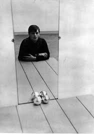
I also see this as a picture about photography itself -an artistic expression of the artist behind the camera.
Fried’s opinion on minimalism which he sees as a ‘theatrical’ and artistically self defeating, is an interesting take on how artwork interacts with viewers. He calls them “Literalist’ and refers to relationships in the work that becomes functions of space, light and the viewer’s field of vision. This makes the work more reflexive because “one’s awareness of one self existing in the same space as the work is stronger than in previous work, with its many internal relationships. One is more aware than before that he himself is establishing relationships as he apprehends the object from various positions and under varying conditions of light and spatial context.” Minimalism (or “literalism” as Fried called it) offered an experience of “theatricality” or “presence” rather than “presentness” (a condition that required continual renewal).
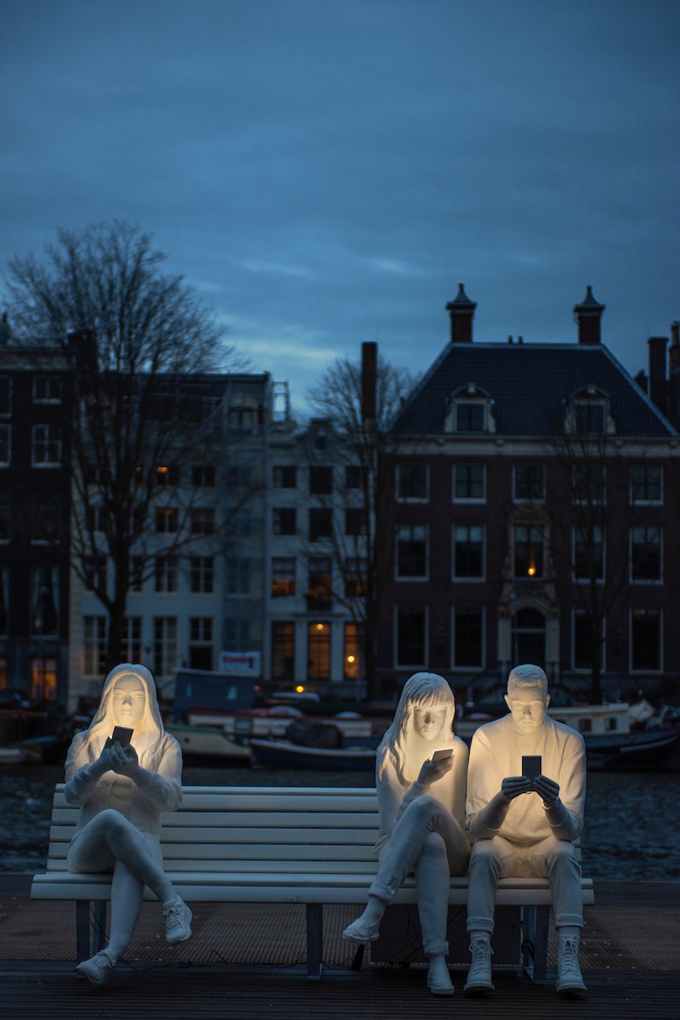
Below is a sculpture installation in Amsterdam which I found very thought provoking with regards to looking at/viewing a real life experience.
Tutors comments: You describe the unusual circumstances whereby the spectator’s point of view is indicated in cinema. (You the have another long quote which needs to be referenced). Your other two examples were interesting and completely relevant.
Reading list
Danto, Arthur C, After the end of art, Contemporary art and the pale of history, 1997, Princeton University Press, Oxfordshire
De Botton, Alain, Art as Therapy Phaidon Press, London, 2013
Edward Hopper: https://www.smithsonianmag.com/arts-culture/hopper-156346356/#beeS0Mm1160jglDP.99
Evans, Jessica, Hall, Stuart, Visual Culture: the reader in association with the Open University, Sage Publications, 1999. vol5, no 10 pp 12 -23
Fried, M, Art and Objecthood, Artforum
Greenberg, Clement, The Collected Essays and Criticism Volume 4. University of Chicargo Press, 1993
Utley, Gertje R, ‘Más Meninas’: Through the Looking Glass, Repeatedly, Museum del Prado online archives ( p 1 -6)
Personal visit to Museo de Picasso, Barcelona, November 2018
Blog of the Museo de Picasso, Barcelona, 18-11-2015 , The inhabitants of the museum: “Las Meninas”
Tate Website