The idea of Part One is to encourage me to draw with feeling and expression. ” The first exercise should be thought of as a warm-up session to help you stretch your drawing muscle, with some temporary drawings.” (study guide page 16)
01/05/2018 Project 1
Feeling and Expression
By starting to study Part one of this Drawing 1 course, I am sensitised to draw with expression and feeling. I need these exercises to try out and explore ideas of using drawing tools, and I see the growth opportunity and become immersed in thoughts of why I need to express my feelings and ideas with a piece of charcoal, a paintbrush or any other means I can capture onto a canvass or other surface. Yesterday we had a family day and I made soap bubbles for a play activity with my grandson – I admired the sun making beautiful colours through the bubbles and the short living bubbles giving so much pleasure to him – trying to catch them was almost the same as experiencing a pleasurable moment: I could use my eyes and my hands in those moments which were really just fleeting moments of pleasure.
The first exercise to use emotions to express with lines and using different drawing materials, reminds me of a visual language an artist use to communicate through every drawing/painting. Capturing emotions are challenging, as you have to be open and truthful to express and communicate it as best possible, and it lays bare the artist’s skill for all to see! I am always drawn to flowing lines and starting with the emotion of Calm is my first choice. When I think about lines for CALM I first try to play with synonyms in my mind. The following came to mind: serene, slow, going to sleep, being mindful, mild, soothe, still, motionless, restful, placid, soft, pastoral.
My first lines are made with a Willow charcoal stick – I have been using it for rhino studies during the last few months and love the fluidity it offers – I try to be soft and gentle, I do not like the paper surface and decide to first blend the charcoal into the paper, next I use a Red Chalk pencil and then a gold line marker and a black ink pen – I feel the lines could be more fluid, soft and gentle. I have no need to use formal shapes – the lines should just flow without much effort – by now movements is slower. I am aware that I tend to draw lines to fast, without finding that place of calmness in every move of the pencil or pen, I tend to have the need to blend the lines, or reach for the putty eraser, as if to calm it down. I need to focus on being in this zone of calmness and floating in a natural pool comes to mind or walking in a peaceful zen garden…
The second exploration will be marks and lines to express JOY. I immediately want to use bright colours, draw darker line and start thinking of marks that are expressive. I choose an oil pastel, and use red marks expressively and easily….here is energy in making these marks, spontaneous lines jump onto the almost too small block, the same easier flow of lines happens with the charcoal. More erratic marks are made with the 5B grahite pencil…I also feel the type of paper is not an issue as when attempting the calmer lines. The pen marks are also full of energy and excitement ( jumping, dancing, laughing, singing, feeling energized, feeling connected and content)
JOY in lines, marks and abstract shapes
To move to ANGER took some time to really inhabit the emotion. At least it is one I have come to know my life; on different levels from controlled anger to absolute rage! O my goodness….will the paper and pencils hold? I start off with charcoal and soon I ran out of space….spiralling into the web of anger, deceit, rage, darkness, out of control, drama, hate, lack of compassion and almost depression, a very exhausting experience, also very confrontational, not with holding negative feedback, blunt and brutal….just a big burst. Sometimes we use anger to protect ourselves….it could be a mask? I also think anger is deeply energizing….a burst of adrenaline that could allow the artist to dig deeper into the sometimes unknown. I do not think my lines are so convincing – I feel inadequate to translate these feelings into marks and lines, without a contextual story around it – this need to represent a tangible image…realism.
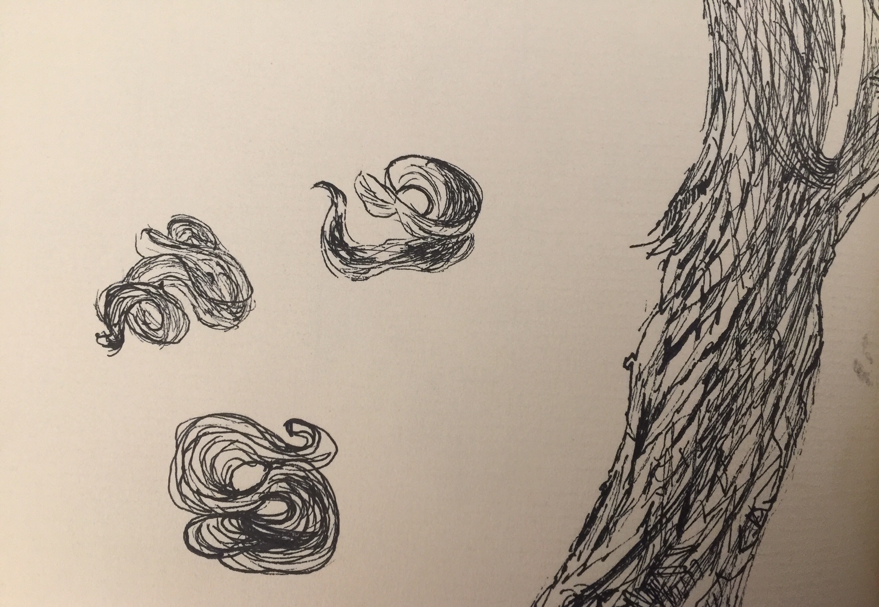
After looking at these images I decided to imagine the feeling of ANGST. I believe it will be a feeling that will always live close to me…a fear of rejection and or failure and fear of losing passion or soul. The Collins English Dictionary describe Angst (ängkst) a German word referring to “an acute but nonspesecific sense of anxiety or remorse” Intense emotional strife. Edvard Munch’s pastel painting The Scream and artists such as Egon Schiele and Francis Bacon come to my mind…their twisted lines express deep feelings.
I start off with my favourite charcoal and are drawn into a dark hole, trapped with only darkness of fear and angst around me. The big bad wolf is running free. I draw lines with red oil pastel , mad patterns with graphite and line that trap you with pen….you are stuck….alone with fear.
ANGST in lines, marks and abstract shapes
At this stage of the exercise I realise that although I was conscious of the emotions I tried to put into the lines, I did not plan the exercises – a spontaneous and intuitive process. I am not sure if this is the correct approach. The images now looks almost unfamiliar if I compare it to my usual use of lines in drawing. Looking at the lines I feel the need to become more at ease with different drawing media, and this means regular and planned time spend with my visual diary and sketchbook. I think the most difficult part of the exercise was the ‘abstraction’ of it – the fact that it was to be only lines, marks and abstract shapes. My ideas of drawing is much more captured within objective images.. forms (?) I am also under the impression that drawing these lines was a form of an activity to exercise my drawing hand with tools, but drawing is my mean or medium to communicate. I want to grow this communication skill.
I decide to read more about lines in an essay by Katharine Stout (drawingroom.org.uk) on the Drawing Biennial in 2015. I visit a page about the artists for this event. I also looked at the lines of Leonardo da Vinci’s, Tete de Femme Presque de Profil, a sliver point drawing of a ladies head. I am captured by these very few lines. The graphite drawings of Ingres and Eward Burn-Jones are also full of emotion and so delicate! I recently discovered a book by a photographer, Henri Cartier-Bresson. Line By Line. His lines and marks intrigues me – very flowing and expressive, whether it is architecture, a figure or a tree. I have heard the expression that lines drawn are “poetic”….Cartier-Bresson express this in my opinion.
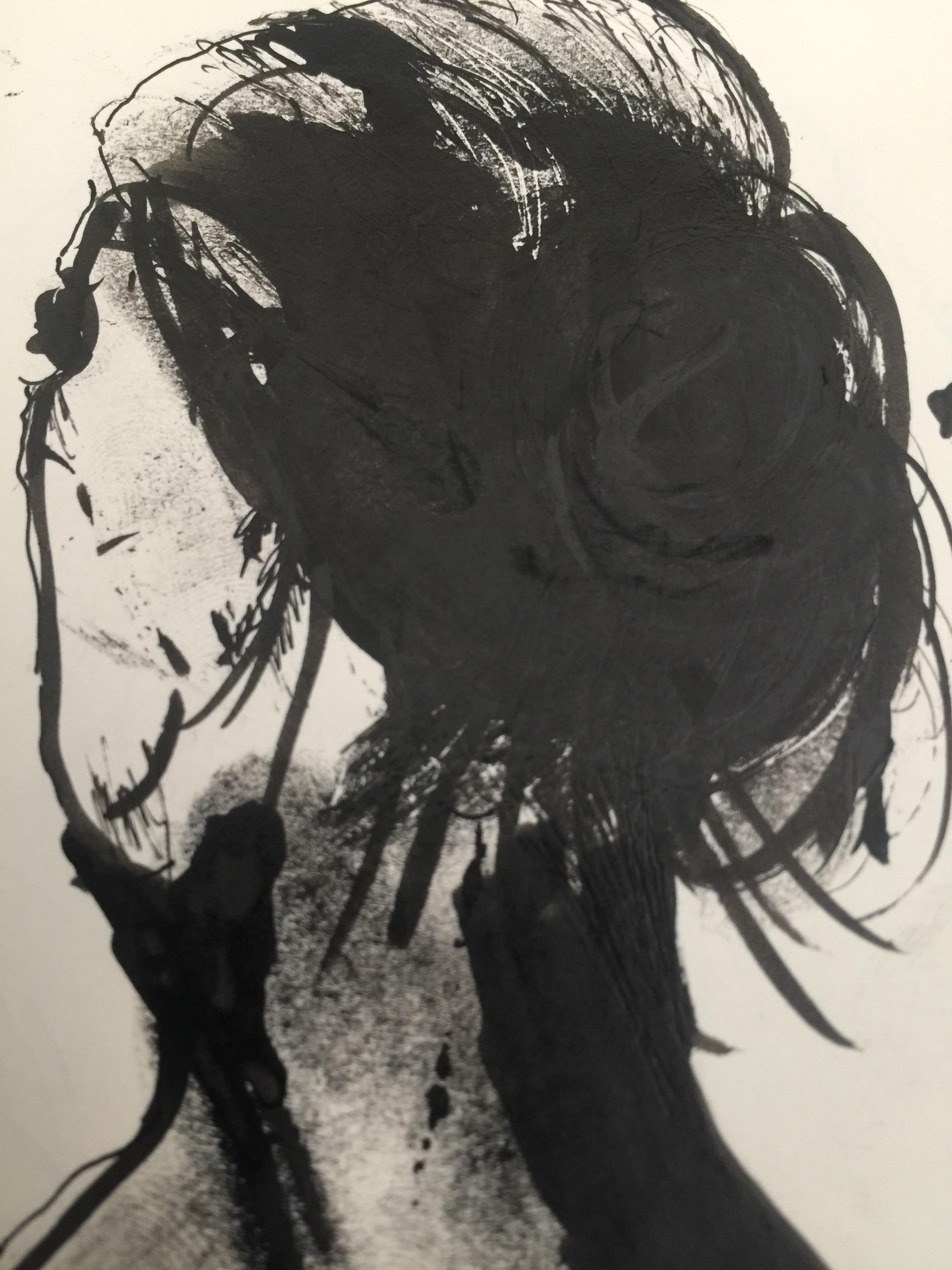
This is a photo of an artwork by a local artist, Gabriël Hugo, currently in an exhibition called Blurred Lines. I understand that the context in which an artist will use lines provides a visual work where connection via expression is achieved. Above image gave me an experience being in a foggy situation….I imagine dementia feeling like this.
I made a drawing of the lines in my hand to explore more line drawing techniques.
Experimenting with TEXTURE is the next exercise.
I love picking up feathers, dried indigenous flowers as well as stones as their textures are such great surfaces to touch and look at.
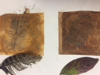
I decided to glue dried used tea bags onto my sketchbook and use their surface to experiment with frottage as well as drawing on them. Here I used a feather and a dried leaf. I can see the impression of these objects, although the feather did not impress that much onto the surface of the tea bag.
On another bigger piece of teabags I used texture from the tea leaves, as some stuck to the surface and tried to make lines with a black and sepia ink on it. The texture a a lovely surface of little bumps. I found it made an interesting surface for soft pastels. I would definitely use this idea for a more organic texture…..can think of Odilon Redon colours…dreamy and luminous.
more frottage on paper with charcoal and pastel pencil.
Hatching with charcoal pencil to create texture
Using ink to create texture and spilling ink to change the texture of the drawing.
I tried charcoal powder, charcoal stick and xl charcoal block on paper and first sprayed a fine mist of odorless solvent on it, then I tried EpsomSalt and sprayed water. I prefer the texture made by both experiments on the powdered charcoal; the EpsomSalt made lovely markings and I think it could add to tonality in drawings with charcoal.
I love the idea that texture does not necessarily have to come from the drawing, but can be added or created into a drawing surface. I am more aware of a wide range of textures I could use when drawing.


 Hatching with charcoal pencil to create texture