EXERCISE Writing a book review
Background
I chose to use a book of John Ruskin: Lectures on Landscape (Delivered at Oxford in Lent Term, 1871. These lectures were given during January to February 1871 and was addressed to undergraduates in his class where he was a professor. ) Ruskin is seen as a leading English art critique, good draughtsman, social thinker and academic. He has written many books, articles, public lectures on art as well as other subjects varying from architecture, natural sciences and socio economic ideas. The book has 8 illustrations of mostly the work of JMW Turner, whom I learned was much admired by Ruskin. I am aware of his desire to centre ideas of the sublime around the way Turner worked. The following that I read on a website of a gallery in New York, really intrigued me: “Landscape artists such as J. M. W. Turner depicted the natural world as ethereal and majestic—but also overwhelming and, at times, threatening. Turner’s great champion, John Ruskin—a Victorian art critic and social activist—argued that an artist’s principal goal should be “truth to nature.” In eliciting sensations of both beauty and terror, Ruskin asserted, Turner was able to render an authentic representation of the sublime, evoking feelings of awe and human insignificance.” (https://greyartgallery.nyu.edu/exhibition/landscapes-ruskin-redefining-sublime/)
Review: my thoughts about the book
When it comes to painting, Ruskin prefers to stick to line and design of the subject of landscape. He sees landscape as “natural phenomena in their direct relation to humanity” and to be a passionale representation of these things. He advise to start off a landscape by painting the simplest light, “outline the subject with delicate sharp pencil line”, then all the objects should be painted in their proper colours – to match them as nearly as one can. He uses colour engravings as examples and focus firstly on the line of the landscape (outlines), then its light and shade, and then its colour.
The lectures are also in this order and he uses Turner’s technique as the best – “sketched with the point”. What I take is how he suggests is that outline shows the limit, and should be as accurate as possible (resemble what it is, likeness) and when outlining a light object defined against a dark one, the line should be outside of it, but when drawing a dark object against a light one, inside of it. It does however pose a question to me – how much lines of an underpainting (underdrawing and even a preparatory drawing also) is used. I try to find lines as accurately as possible with an oil+OMS diluted brush. The idea is to draw/paint what you see, put those down in lines/tone. Drawing that line is the process of defining, or finding a shape, when it is put down, it is sometimes also to restore a lost line. (again he uses Turner as example) Ruskin prefers to talk about drawing as an expression by gradation of lights and shades as well as Greek chiaroscuro – he calls it, “rejoicing in light”. Clearly the focus is that of achieving form by tone – getting that right in the first place, colour can then follow. Light and shade enables the artist to realize form solidity, colour is flat, but he also says that colour is gay, where light and shade are ‘melancholy’. For Ruskin the truth of colour and the truth of light in nature are directly related. Sunlight constantly create variation of hues, and again I can use his example of Turner: “And it is indeed by this that the works of Turner are peculiarly distinguished from those of all other colourists, by the dazzling intensity, namely, of the light which he sheds through every hue, and which, far more than their brilliant colour, is the real source of their overpowering effect upon the eye”. He warned against the human nature to repeat, nature will teach variety if we attend to what it shows us. Our human brain can easily just repeat, not do what it sees, but what it ‘thinks’. Ruskin explain that a colourist look at things in terms of their colour -‘is this a white thing, a green thing…’ is this that the brain takes the wrong decision, and if we had just looked, we would paint nature/truth. He states that Turner in some qualities of colour has been far surpassed by the Venetians, but his strength lay in “exquisiteness of gradation”. His opinion is that no one in landscape could touch Turner in perfect rendering of form. Turner apparently got this by a perfectly gradated wash of neutral tint with an outline. Ruskin also states that Turner would sacrifice the effects of colour to the effects of tone. Ruskin shows that Turner focussed on form expressed with values and colour and clearly used the power of nature as his main concerns when painting.
I come to an understanding that Ruskin favoured the Impressionistic style of William Turner over the more visually “accurate” Classical Realism by John Constable. This stays in my mind that Ruskin suggest the artists first concern is to faithfully reflect truthfulness, which is Nature, an objective truth, Empirical Reality? I see/read about artist selecting and filtering by what he/she chooses to present for consideration, guiding the viewer in the direction of what really matters in his/her mind. It makes me think about reality – connections with our own realities and how we relate differently to that when we view a creation of this nature of things. Ruskin learnt me to think and give attention to my landscape.
Bibliography
Gedzelman, Stanley David. “Cloud Classification Before Luke Howard.” Bulletin of the American Meteorological Society, vol. 70, no. 4, 1989, pp. 381–395. JSTOR, www.jstor.org/stable/26227729. Accessed 18 Feb. 2020.
Lectures on Landscape, John Ruskin, 1871. National Library Association New York Chicago e book
PROJECT: From inside looking out
I look at the work of David Hockney as I see him as an artist who have been sharing the world as he looks at it – ‘appearances of our world’, as written in the study material. Some of his work make me think he was standing at a window looking out. I am aware that at that time in his life he also made use of his polaroid camera for many of his images, and worked on acrylic. Then I read this on the Tate website: “A Bigger Splash is inspired by a photograph Hockney found in a book about building a swimming pool, while the building in the background is taken from one of Hockney’s drawings of Californian buildings.” I think his observations is what made this a great view looking out, he also explored multiple viewpoints in the second image below. He traveled a lot, lived in many different places and has a wide/big experience of images that influenced his paintings – he described his in his lifetime work along the lines of a history of pictures.
Tate has this quote of the artists on their website: “I do believe that the problem of how to depict something is … an interesting one and it’s a permanent one; there’s no solution to it. There are a thousand and one ways you can go about it. There’s no set rule.“
David Hockney


I also looked at the work of Edward Hopper, who was as an artist mostly working on subjects with whom he almost did not have a connection – for me he is a person looking onto and showing that in his work. The eeriness and loneliness we see, it is almost the absence of the artists’ own interpretation – he just put it out there, this outward way of seeing life. In America his work was liked for its haunting familiarity of his scenes, and admired for his rigorous sense of form.

In this work of Hopper I almost feel as though he is looking from his window into this apartment, although I think the idea is the night view inside the apartment.


This painting of Hopper has many interpretations – being lonely, inward thinking, prison in room, looking onto a lonely city .. even the soft blue/grey, little soft yellow colours he chose are cold.
I decided to focus on my studio view. Here in our home it is mostly desert sand and other villas around me in the enclosed residency where we live. We live on the periphery of the residency and the boundary is surrounded by a fast growing invasive group of trees. (to protect us from an ongoing building site which consist of mainly water channels being brought in from the sea behind me.) These trees are now declared invaders. Sometimes I hear and see birds, or the noise of the big port to my left, or just the wind and sand and people going along with their day. Whilst painting this view, it is a cool morning. The trees are gently moving and we have some clouds in the bright morning sky, the trees are almost just a black silhouette, closing my view onwards and outwards. I realise that I can make a decision in terms of what the viewer will see.
The painting of the view from my studio below is done in a small format, A4, and in a way I would like to make the chair on the balcony part of the focus of looking at or looking towards a view of the trees outside the house. I use the doorway to get some linear perspective and lead the view out.

EXERCISE Hard or Soft Landscape
I found myself up early today, I decided to use the view for more paintings. There was a thick cover of mist hanging and the trees were barely shadows.

I was seeing the view in a thick layer of fog at around 4:30am this morning. The street lights were orange/yellowish. The painting has very soft edges and I need to work on value difference to create the fog and atmosphere of this almost hidden the landscape. I started with dark tone of the trees, decided to let it dry and then work with a soft brush to create soft edges and then when its really dry, work in some diluted white with a soft brush. I not very sure about the white and decide to read more about creating the fog layer. I waited till it dried and added a layer of Liquin and would then like to add a layer of fog onto the trees.
As the sun started to show in the East the sky turned pinkish/yellow and the trees as still dark shadows – the skyline is almost lines of pink/purple/yellow and soft blue.

PROJECT: Perspective
For this exercise I will explore linear and aerial perspective in order to create a sense of space. I am using a beach view and the bridge structures that will follow in the rest of the exercises.
Linear Perspective
The idea is to create the illusion of depth and space. view is looking over a dune onto the sea. I think my earliest memories of Landscape art has ideas of vantage point captured in them in that I had the feeling when looking at these works, that I could get an idea of the artists’ entire field of vision.
I did the painting on Vellum paper and experimented with brush strokes that would sit and give texture to the paper. I painted with oils.
Aerial Perspective
I will try to create a sense of space by showing the structures on the horizon line and the beach in the front of the pictorial space. There is a fence which blocks beach goers from the unfinished construction site. The structures in the distance will be fading out and I will also try and use cooler colours in that area.
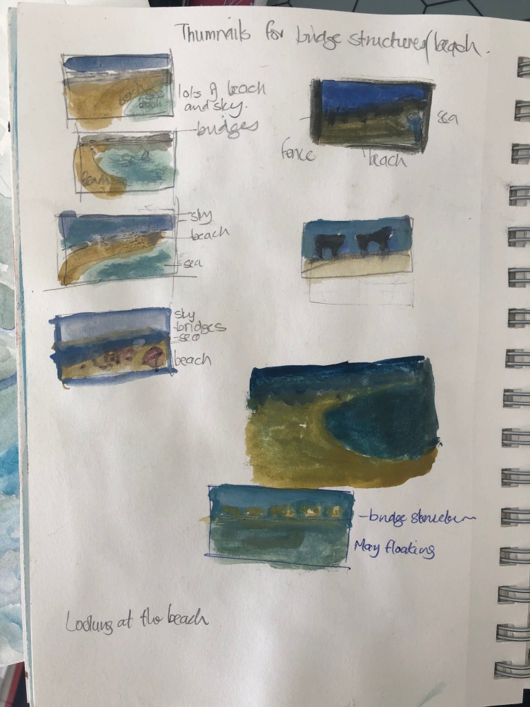
I like the idea of the palette being soft blues and sandy colours. I am beginning to see the value of making more thumbnail sketches before I start a work – I am sure my mind is clearer and more thinking goes into the process, before the brushes and paint takes over.


Preparing for painting outside
I have been spending many hours looking at these structures from different viewpoints. The double row of unfinished bridge structures follows along a crescent pathway in the way of a beach view onto the Arabian Gulf. The horizon is low as I am standing on the public beach area – I am not allowed to get much closer. We have blue skies and lovely clouds passing, the sun is hanging low as it is around 17:30 in the afternoon. I want to do the rest of this work on site and will take it with me to the beach late afternoons.
I went back for more painting on site and decided that I am not happy with the composition – I changed it on-site and on the paper, which by now had some colour added to it. I wanted to bring the real view, that of me sitting behind the fence. I changed the horizon line and see this as a work of learning – I will finish it and hopefully the marks of the learning will show the process I followed.
I think I will call above painting, In Line of Sight – I will continue to work on this. Below is quick studies of sunset – our afternoons are beautiful at the moment and I know I have to use this opportunity in my landscapes. Learning to look at his stage is important.
Looking at sunset daily now – some water colour sketches in my sketchpad.

PROJECT: Expressive landscape
I will attempt to create mood and atmosphere in a landscape painting and start to look and learn how landscape artists have responded to this challenge. In the notes there is a work of Frank Auerbach, Park Village East, Summer II which I decide to investigate. It seems he painted the urban landscape where he worked and lived – I love the idea that it was so familiar and that he repeated these views over time in order to reach for the essence of his subject. When searching for locations for his landscapes, Auerbach only liked to explore his immediate surroundings, like at most, twenty minutes from his studio. He could then hurry back with his sketches to record the activity of North London in the same day. Later I also read more about a contemporary Philadelphia based artist whose work I admire, Alex Kanevsky. His work practice reminds me of Adrian Ghenie and I like the fluidness of how he creates with paint. In the Artpulse Online magazine I read the following: “Kanevsky breaks the rules of motion and, therefore the parameters of time itself. But these are my words. Kanevsky will tell you, “I don’t think a painting is a record of a conception or a perception for that matter. It is a free standing thing, an entity onto itself, not a documentation of anything.”

I am becoming more aware of the importance of being aware of nature and my surrounding landscape, almost like testing my own memory of these experiences, which is something like observing and then trying to describe my seeing in words. I am writing about this more and would really explore this. My reading on Rushin/Turner and Constable made me aware of the moods created by clouds and other natural phenomena. and wondering if memory afterwards is helping the artist to get to the sublime. Thinking about Liminal spaces – landscape is between heaven and earth and the act of observing this space in order to represent in a painting or drawing.
Our Summer holiday in South Africa was at the beach and I did lovely long walks, played with the grandchildren on the beach and had loved body surfing opportunities, as well as just lying and floating in the ocean during low tide. Evenings during sun set on the beach was just glorious. I have been experimenting with Vellum paper and decide to do an expressive landscape painting. I made small watercolour colour study of the area, Pearly Beach in South Africa and decided to work with oils on the Vellum paper.

Even though the sky is very dark, I liked the almost mirror effect of the view of the sky and the sea below. I was walking around a sand dune when I came upon this view. Back home I painted a thin white gesso layer as background on the Vellum paper in the hope that it will keep the paper from to much buckling. The application of the oil paint was sticky; I did not want to wet the paper to much with solvent and the strokes as well as colour gave the mood of a brooding summer rainfall. The sea reflected the colours of the sky. I eventually painted with small up and down movements of the brush and by the time I wanted to lighten the sky, I used my fingers. I have to admit that I used a photo as my memory was not good enough. I do feel the idea was the colours that struck me in this landscape and I think the exploration was loosening my idea about landscape painting and more freedom that comes with being there, in the moment and trying to capture that essence of place.


The small painting above was a piece of experimentation with what paint can do on different support. I was motivated to use this support during a OCA group session and more work will follow in Part 5 of this course. I like the papery temporality/ fragile feel of the Vellum, it is part of the weather and cloud conditions in this part of South Africa, where we always say you can have winter and summer in one day. I could put the painting onto the window in my studio and work on the surface to keep it flat. I love the textures of the paper, but realise that the photo images does not do it justice. I will try to frame it on a cardboard frame.
In and article on mymodernment.com I read an article of an artist, named, Rachel Campbell whose work is contemporary and full of narrative about memories of that place we call home or have visited, being familiar. I do like the nostalgia and humane touch in her work. The fact that she uses her surroundings for inspiration brings her work into this landscape surrounding, something which one can so easily overlook and try to find a perfect spot for a perfect painting. I am also influenced by my reading of using memory to paint landscapes – I tried to remember the time of the day, the weather at that moment, the shapes, lines and colours and even sounds of the sea and how it made me feel. I do feel this need much more training and getting used to, but I do like the open mindedness of looking and trying to capture with words and memory what is being seen.
PROJECT: Painting outside
I have to choose a landscape or cityscape and work largely outside

I decided to use unfinished bridges built in our area. I have to apply for special permission as this is a building site, probably potential dangerous due to water around the area, as well as ongoing projects and movement of construction site workers and machines. I applied for permission today (12 February 2020, per email) I have photo images and can see the structures from the beach close to me, but I would like to get closer. It seemed I am getting nowhere with my quest and I have decided to walk around the area. I have found a few great spots where I can hopefully spend a few hours working on this painting. This view always captivates me when I do regular walks in the area. I am always ending with an almost nostalgic moment – what will happen if this project do get off the ground again…….or not….It shows human presence in the landscape of this coastal area, which is not yet ready for humans to habitat. A photographer friend of mine visited the area with me and took some great black and white images for me to use. The weather is great and I am looking forward to work outside.
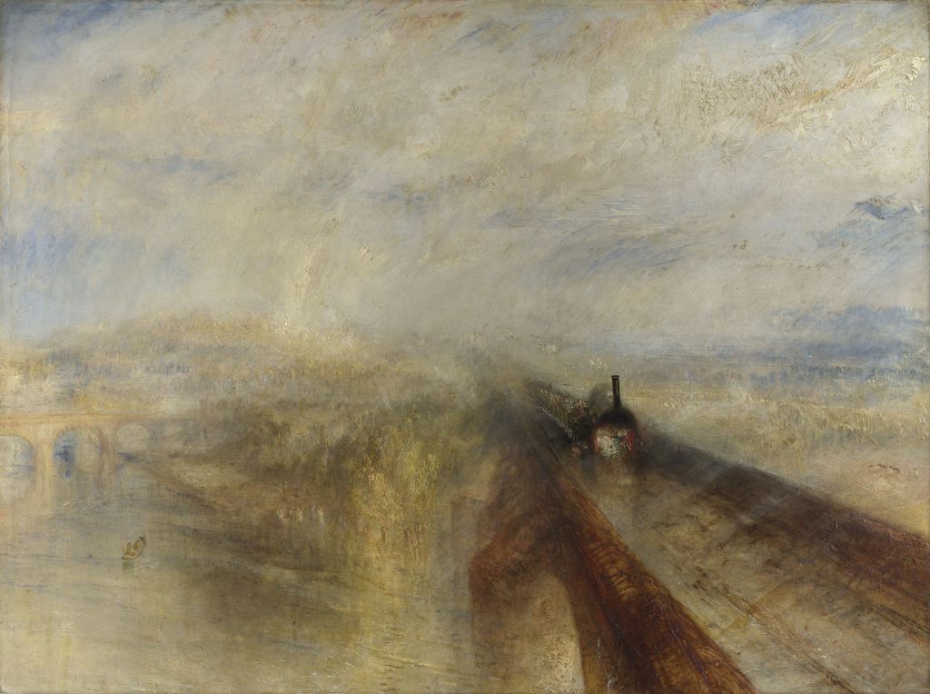
I looked at Joseph Mallord William Turner (1775-1851) and his painting Rain, Steam and Speed of 1844, currently to be found in the National Gallery of London.

I want to set out working thinly with the paint – scrape some layers. I spent days at the beach painting, drawing, reading and many times just observing. A wonderful moment was a noise that came from the sea – I made a short video. The water intrigued me – light on the water made little separations of colours and then disappearing into the mass of the ocean – ripples, waves, movement. I think about the colours from transparent to opaque and then transparent again as I look into or over the ocean.

I can get onto the beach and view theses structures from closer by. I do like the sky and sea contrast to the hard structures.

I started with a piece of Vellum – I added a pinkish gesso ground layer and then draw the scene out with charcoal, then added Gouache for colour. I find that oils settles best on the Vellum. I painted on site during the early morning – wind was an issue and my aluminium tri pod easel was not stable enough. The next day I took my fold- up wooden easel and it went easier.


At this stage I decide to start with a painting on Oil Painting paper, 45.7x61cm). After spending some time on the underpainting, I am not so happy with the composition, especially the foreground. I decide not to start over, but correct on the paper and learn from these mistakes. The sky is bright and the sea has a beautiful turquoise colour and I want to capture that.


I am not comfortable with the sky colours. I need to rethink this process and use of colours – more transparent layers and much lighter. I am adding detail to the foreground – the seagrass attaching to the fence captures my attention. Am I putting to much focus on the foreground? – is it because I am not allowed closer to the unfinished structures, a form of rebellion from my side? I feel this is part of a liminal space – a sort of threshold towards something. I find pleasure in the sea grass and water around me. but back to the painting, the middle ground need some texture and I look forward to start laying in the washes for the sky. I will also consider to create more form/structure of these ‘unfinished structures’ I had in mind to capture. It is about placing these ‘things’….Ruskin said to be quiet and modest, maybe the delicacy is in the natural things around these structures – the sand, the beach and life in the ocean and the humans like me, who come here for pleasure. A lovely realisation is: “I like what I am doing”, my state of mind to go back to Ruskin again. I am thinking of this landscape as some form of human development that had to be stopped due to unforeseen things happening and leaving this place hanging in the air and nature teaching us something here.
May 2020: After my tutor feedback I decided to come back to this painting. I packed it in with me to SA and decided to focus on some areas. Having read about the work of Yayoi Kusama I decided to explore some of the repetitive brustrokes in this work. Her works around the series called, Accumulations of Nets comes to mind. I recently watched a documentary on her life and then also learned more about her techniques in the Coursera course I am currently doing. The fence with the dried seagrass was really something I loved and would have explored more if I was in Dubai. I like the idea of paint leaving loud tracks on the canvas by using rich impasto paint application and think it could work on that area. A neighbour in Dubai also shared great drone images of the structures with me, which I would like to explore more in my painting.

I spent days at the beach painting, drawing, reading and many times just observing. These two chairs placed under the structures – for the security staff, fascinated me. I worked on board and find the surface slippery – my sky attempt is not successful and I need assistance to finish this work. I decide to look at the work of E Hopper and see if I can find any support/inspiration to finish off this work. As an artist he is mostly known for his city views, but in his landscapes there are signs of decay, banality and endless movement – no static images. I look at these bridges as signs of development and decay, the up and down of economic cycles and life? I look at how he used horizon lines in his landscapes and think I should have painted the sky more realistic.
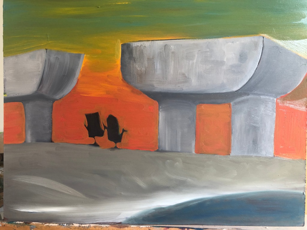


Above work looks more like a caricature study. I think it says something about the rather oddness/weirdness of these to office chairs next to the beach. I am thinking of doing a more realistic study of this image.
A wonderful moment was a noise that came from the sea – I made a short video which I will try to put into my blog. The ocean water intrigues me – light on the water made little separations of colours and then disappearing into the mass of the ocean – ripples, waves, movement. I think about the colours from transparent to opaque and then transparent again as I look into or over the ocean. I have become very interested in the seagrass I see on the shoreline and the dried ones hanging on the fence, when I realised it was of the same species. These green watery leaves look like a salad and I can imagine a sea turtle or Dugong foraging on it.
My reflections on the experience of painting outside:
Extra paintings that followed after these beach visits.


The opportunity to attend an art residency in the Liwa Desert has now been confirmed and will be two weeks during the last part of March/beginning April. My mind is very much going to that place of isolation in the desert and the opportunity to investigate space in relation to a place on finds oneself at. I read about a French landscape artist, a woman artist, 19th century painter, Louise-Josephine Sarazin de Belmont who did open-air landscapes. I imagine her leaving her home and into the French Pyrenees, and later Southern Italy. She was drawn to dramatic topography, strong light and impressive natural settings.

I love the attention to a very small piece of the natural world that Dürer was here representing in Gouache and Watercolor. I was directed to this work during a Zoom OCA session and this image has been with me since I started this Landscape part of my studies: I have contemplated in which way I can bring this into my work. I have started collecting species outside and bringing them into my studio for closer observation and possible identification. I love Drürer’s investigation into these plants – feeling overwhelmed by the reaction of my surrounding natural world to the recent good rains, must have stimulated my interest. There is also this question the work leaves with me – I think it was ‘curated’ by the artist but with the intention to achieve authenticity. And thinking about what I learnt from Rushin, this is so great that an inquisitive artist questioning art as representation and being interested in detailed individuality in the Rennaissance! Living in a modern world we can easily ‘re’create nature by composing a similar situation/set up, and in that way present what we want.

Behind the trees (my studio view) there is a sand dune where I do some walks late afternoon – I have been lucky to spot an Arabian Gazelle as well as an Arabian Fox. Since Dubai had some good rain during January and February it is amazing how many plants are growing and flowering on these dunes. I decided one morning to spend some time there and do a painting on site. I used oil paints and worked on a prepared board. It was difficult to keep track of all the detail of the variety of plants. I tried to find a line of the dune and work from there. I decided to take clippings of the plants and try and paint these as well. This is still a work in progress, I would like to add more shadows – I was working at around 11am and the plants in the foreground made lovely shadows on the dune.

I think I am looking a nature and the opportunities to find ‘expressive material’ to work with in my own studio practice. I would also like to work towards more fluid lines/brush strokes. I am learning it is about verbalising what happens in these moments when paint is applied – becomes almost an abstract action to represent a form/colour/nuance of what I would like the viewer should see. I need to discuss the issues and how I get to an answer.
PROJECT Working from drawings and photographs
So far the work was expected to be done from direct observation and it became clear that one do need additional skills to finish off a work or do more work inside the studio afterwards. Many artists work extensively from photographs, magazine cuttings, postcards as well as drawings.
Exercise painting from a working drawing
I am expected to do three small drawings, namely a linear study, a tonal study and a colour study. It seems the idea will be to learn from how well one observes whilst doing a study and possibly freeing yourself up by not being with the subject whilst creating a final work. I try a small painting of the trees in my view on Vellum paper – I taped the Velum paper onto the glass sliding door of my studio and worked with watercolours as well as ink. I love the soft markings of the brush, but the surface is becoming unstable, as it buckles under the wet paint. I decide to work with small areas, leave it to dry and come back.


For the final painting I consider to add Gouache with watercolours and I used gesso as an ground layer as I believed the paint sits better. I find it easier to focus on paint application and trying being a bit more expressive and experimental with the way I apply paint- I leave watery marks, let it flow and use the texture of the background to create leaves.
I have by now re read the exercise and realise that I did not change the final painting to a bigger format. I became involved in the Vellum as a experimental support and how the paint would react to it. I will consider to come back and to a larger painting.


Above work was done after the first two for the exercise of a soft landscape. Here I could work with much more freedom and loose brush marks. I feel this can be a painting I could come back to and add a similar one as a daytime work.
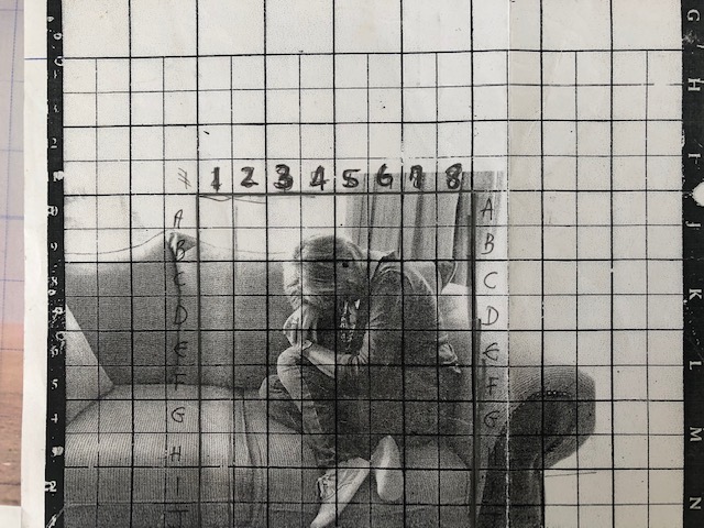
Exercise Squaring up
Here a method of enlarging an image will be explored. I found my own selfie, first portrait I did of myself, at least 8 years ago; here I used a grid – the teacher expected it. Never tried it again.
I decide to use a photo (below) taken by a friend recently here in the desert. I love the subject of the tree and the vast open space which the desert creates. I printed it on A4 paper and it measured 15.8×28.8. I made a grid on transparent paper with a blue pilot pen, using a grid of 2×2. The painting will be 58 x 32 and the block grid is thus doubled and is 4×4.

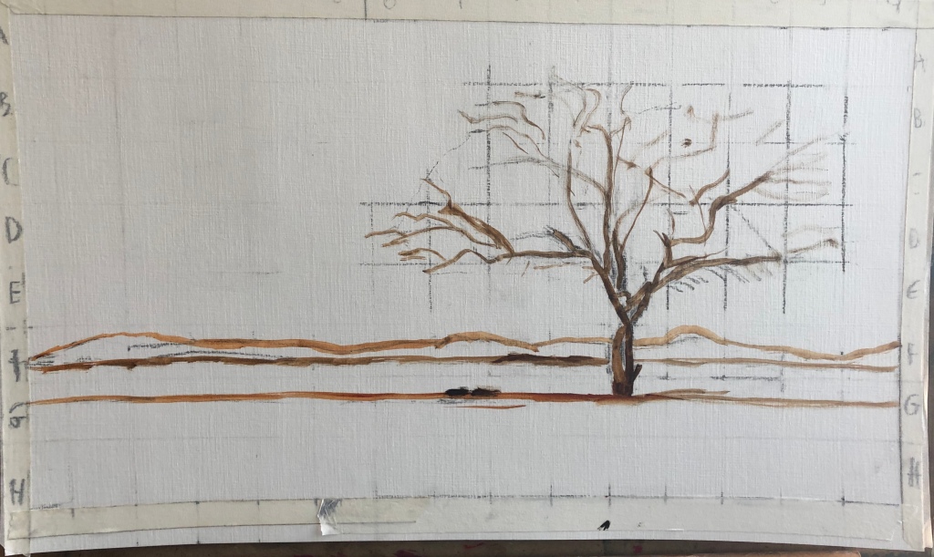
The fact the the subject is a tree with many makes the drawing more detailed. The tree is correctly placed within the space by using the squares as guidelines for the placement of the main forms and lines on the picture. In order to prevent the painting from becoming to tight, I decide not to draw all the detailed branches and instead use brushwork and tonal colours for the detail. This is a simple composition and tonality and brushwork will create the mood. I am keeping some of the blocks in the tree, if needed later for more clarity of lines.
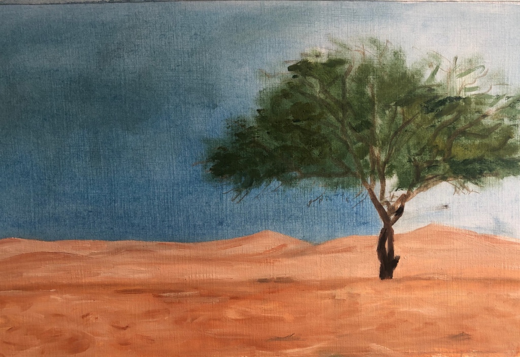
I think about what I read about the painter G Richter last night and consider to experiment with the painting. There is a foggines around the space, but I look at what I have done up to now, realise that the sky has gone to dark and the tree lost tonality and does not give the impression of standing alone within a vast open space. I leave the work as is and would like to discuss this with my tutor. I would like to develop the painting further, as a lot of learning has taken place. I have also decided to ask my friend (whose photograph I used), for a more raw copy – hopefully I can have more definition of the sandhills at the back and explore the tonal gradations.
Tutor recommendations: I need to look at how I went about to try and create this aerial perspective of the idea of infinity in which the tree finds itself. We first look at the sand dunes – the 3 lines one can see how the sand gets paler/foggier as it recedes into the background. I will to go back and enforce these lines with more gradation of tone , start from the palest and work to dark and then the darkest. The sand at the back should be the lightest, remove the dark lines at the back – look at the overlapping of the dunes. With regards to the sky, which is to dark and brings everything close, and loosing the vastness which I was supposedly set out to achieve. With regards to the tree – look at the shape, squint eyes and find the shape, bottom is darker – on the left it is almost as a parallelogram, and rounded. Look at the branches – get shapes of colour. Mix the three greens and block it in with the shapes, and then mix the sand and block in in three goes – back should be particularly pale, Work at the sky: mix a lilac blue (lots of ultra marine and white) and the palest of the sand colour – to harmonize the scene. Rub it on the sky, mask the sand dunes whilst doing the sky and cut it back into the tree, backwards, on top of the green. The tree will then become a dark object in a vast landscape – close to what the photo represents.

I mixed 4 shades of desert sand colours and started to cover the 3 main areas, then mixed the lightest shade into a blue mix to lighten the sky and added some to the tree. Already the tree is now standing in a vast space and I can work on the sand as it recedes, and then the tree. I found a Haiku poem about the desert:
Apr 2017
Desert Haiku
Walking in dry sands
Time without rain to quench thirst
Hope one drop of love
Exercise Working from a photograph

I decided to use a photograph I took during a day swimming at Jebel Ali beach. The water is very salty and floating is so easy and a wonderful way to be in nature. I prepared a hardboard with a mixture of gesso and acrylic – scraped it over and want to use layers of paint and gestural marks and scrapes to create the painting. I have done a small watercolour in my sketchbook.

I wanted to set the mood with the colour palette and the structure of the strokes and scrapes I wanted to try. Water is fluid and I hoped that by removing layers I can create the mood and feel of the person floating in the ocean – yes and still the bridges in the background. I started with thin layers of paint, diluted with OMS and put in lines of the ocean and the horizon and the sky – I tried to place the body by using the negative space in the water I was painting. I am also facing an issue with my blue mixes, I do not want to add white to the palette, but the sky need to be lighter. I re-visit my tutor’s advice in Part Two of her formative feedback (” You mention having trouble mixing blues. Can I suggest that instead of adding white you experiment with mixing colours like lilac, pistachio, grey, mauve etc and then add then to the base blue?“) I decide to wipe out the bridges and sand strip and work on the sky. The sky is now a more violet blue. I think the choice of support preparation should have been just one colour, as the brown and white of the ground colour does not compliment the sky in particular. I let the painting dry and will work more on it in a few days.
At this stage I am reading a book, Romantic Things: a tree, a rock, a cloud by Mary Jacobus and in this specific part of the book she is referring to the work of Dresden born artists, Gerhard Richter, namely his series of Apple Trees. I have to do some reading to understand the work and then realise that this artist was working from his own family photo images or newspaper/magazine clippings, and very much part of the Pop Art movement. In Apple Trees he made the landscape unrecognisable by blurring and enlarging the image, almost a re construction of the original picture. At first glance one would think of a natural phenomena such as fog. Richter describes nature as the total antithesis of ourselves – inhuman, mindless, not pity, no meaning, always against us. He says the beauty we see in landscape is our projection and a romanticization of nature. His work is then almost an art of indifference that he sees in nature. I also read that Richter asks what is the value of art itself — what is its use in the world. Apparently he makes slight adjustments to a photograph after he decides to use it. He will crop out, add in or cover over details in order for the painting not be a rote copy of the original, although he wants the composition to look as if it comes straight from a snapshot or news photo. These photos would then be thrown on a screen by a projector in order for him to trace/copy it onto his canvas with charcoal.
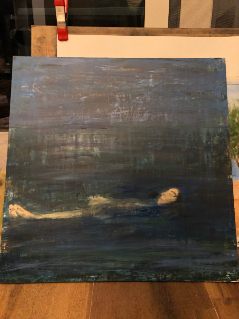
I have to admit that I am not sure if this is a finished landscape – did I succeed in capturing landscape, no! I enjoyed and learned from the exercise by experimenting with paint surface and layers of paint and using other tools for mark making as well as trying to create mood and atmosphere. I did not achieve what I set out to achieve, that is a painting of the photo, landscape. I am battling with paint – In order to manipulate it where I need it to go, I find I go off in a direction, loose the plan almost as to say , as well as not using colour effectively to create form.
I have a different painting in the final work – a psychological painting of a woman. Its how it feels to float with you eyes closed. It is an intense painting which has taken one element of the photo scene, namely an almost pre Raphaelite body, and looking at the inside of her eyelids and see a darkness that may or maybe not, something she’s feeling, or that I feel about her. She is placed in a very private place, a type of Monet’s garden and not in the Gulf ocean next to Dubai! Looking back at this after the tutor session, I feel motivated and inspired to learn and work at my own skills. I learnt that order and chaos intrigues me in nature – I love the tension it creates with us humans within this context of the almost limitless universe.
Tutor feedback: again this was very fruitful and I was open to a great critique of my work process and skill level as presented in the work. As the tutor explained by looking at the photograph – here is a blank sky, crisp bridge structures and a person floating, which could look drowned/dead in water which has around three colours, turquise, dark blue and lighter at back. The water has waves which reminds of shapes of fish, kite, eyes, leaves – tri angular moments of movement. First thing to notice is that I made changes to the original painting, such as removing the bridge, going darker with the water, bring the floating person/body far down in the picture and reversed the perspective by using big brush marks at the back and small marks in the front.
My learning here is: My tutor gave great advice and I quote her: “everytime you make a decision, or ignore a piece of evidence, and add replacements ( which I have made up), its one less thing that can help you make decisions. You cannot look back, because you have changed it” Here I need to reflect on my sketches, get more facts and use it as information in my paintings. I have not been succeeding at this.
We get the to fact that I have ended up with an effective painting, but not a landscape, as I rightly also realised whilst working and evaluating it. I will look at the ‘form’ of water, get to know more about it. My tutor suggest I look at work of Vilja Celmins on water, try and find the surface and depth, try and see it as a type of ineffective mirror, find kite shapes and curved sides in the movements.
https://www/sfam.org/watch/vija-celmins-saying-the-unsayable/
Added after tutor session:
I have previously been attracted to the work of Vija Celmins and will really put in the effort to learn from her investigative process. I realise I need to work accurately and add my personal touch, and this it something this artists has worked at over many years. There are many works available to look at and study her process – I do think that most of her ocean works were done with graphite. I already see that she works in layers when she paints, in order to create density, this involved sanding the painted canvas. Keeping in mind what I learnt from my tutur, with regards to getting evidence whilst painting the following remark I found on the internet by V Celmins will be close to my efforts to improve my practice of painting water/sky/dessert/vastness: “I see drawing as thinking, as evidence of thinking, evidence of going from one place to another” In a video on Youtube, a Secession (Vienna) exhibition talk with Robert Storr ( )with she talks about the importance of drawing. She says it’s impossible to do painting without drawing; drawing as making decisions about limits and proportion. To her painting is the most malleable material and the greatest to put your energy in. She said she was sorry for the long period in which she did not use paint. This artist really worked and put the hours in – she talked about moving from graphite to paint in the early 80’s and how she repeated work and gradually started getting a sensuous quality – building the image. I think what I hear is the attention she gave to the image she was painting. I learnt that she uses photo images and then made use of a grid to enlarge these images. She repeats the same process, she calls it her kind of obsession, she was adjusting, never erasing the images she was working from. From this I learn some discipline in my working process – I will use photos like she uses them and the effort will be more laborious but I will have an accurate drawing/painting on which to develop.

Looking at the work above, one sees no horizon or shore – one is just confronted by waves in the ocean. The artists says it is an ocean, our minds can see it, but in a way it is also an object that is made by somebody. I am intrigued by the fact that this artist gets the viewer to think on many levels: one perceives through the stimulation of the eyes, but also need to process that information in the mind. These are complex drawings but also brings a stillness, maybe it is the vastness? Celmins has described her working process as “making the image and mark develop together.” She likes looking and describing, and this is what I need to learn from her.
Reference list
Romantic Things: a tree, a rock, a cloud, Mary Jacobus, 2012 University of Chicago Press, Chicago.
Tate website for Vija Celmins and work on gouache paint https://www.tate.org.uk/art/art-terms/g/gouache :
http://deborahparis.com/Artists/34644/Paris_TRAC_paper_120715_for_web_smaller.pdf